
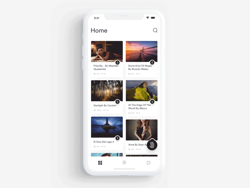
Design Inspiration
Mobile app design examples
Designers have a hard time using the right set of materials to design their screens with. This list is made up of some great mobile apps that you can use to get inspired while designing your next screens.
We curate topical collections around design to inspire you in the design process.
This constantly-updated list featuring what find on the always-fresh Muzli inventory.
Last update: 7/15/2025
Invest Mobile App UI UX
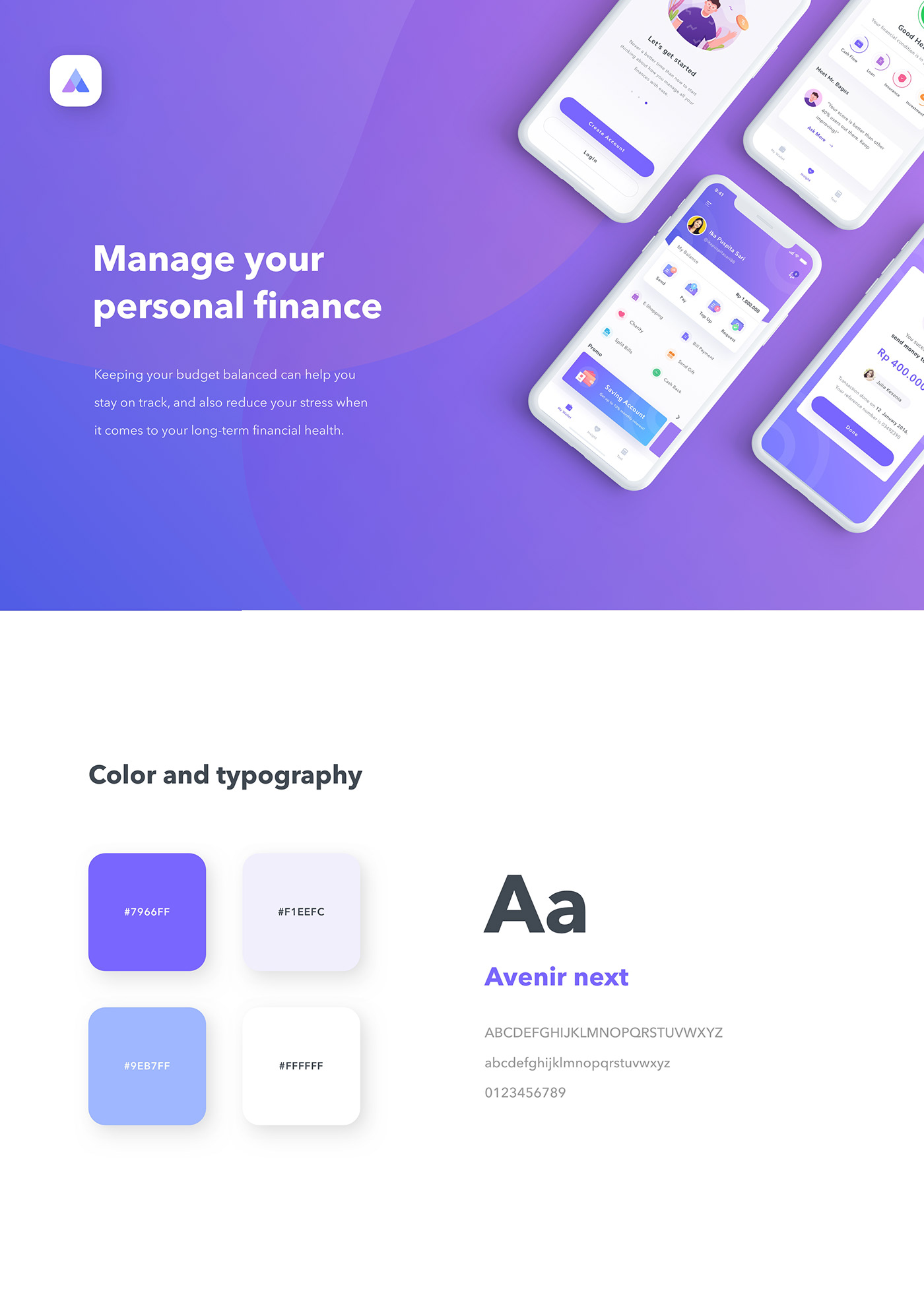
Finance Mobile App UI UX
Keeping your budget balanced can help you stay on track, and also reduce your stress when it comes to your long-term financial health. Designed to bring convenience into your everyday life. Allowing its users to make payments (send, receive, and spend money with ease). Special thanks to Saepul Rohman for beautifying the visual.
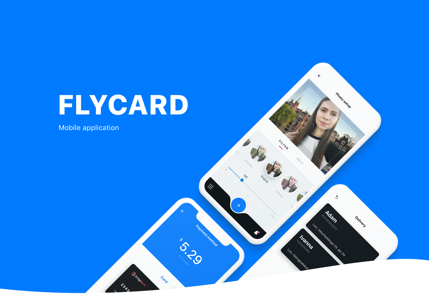
Flycard — Mobile App Design
The purpose of Flycard mobile application is to fulfil the dream of million people, which is to create a unique postcard here and now and send it to important addressee.
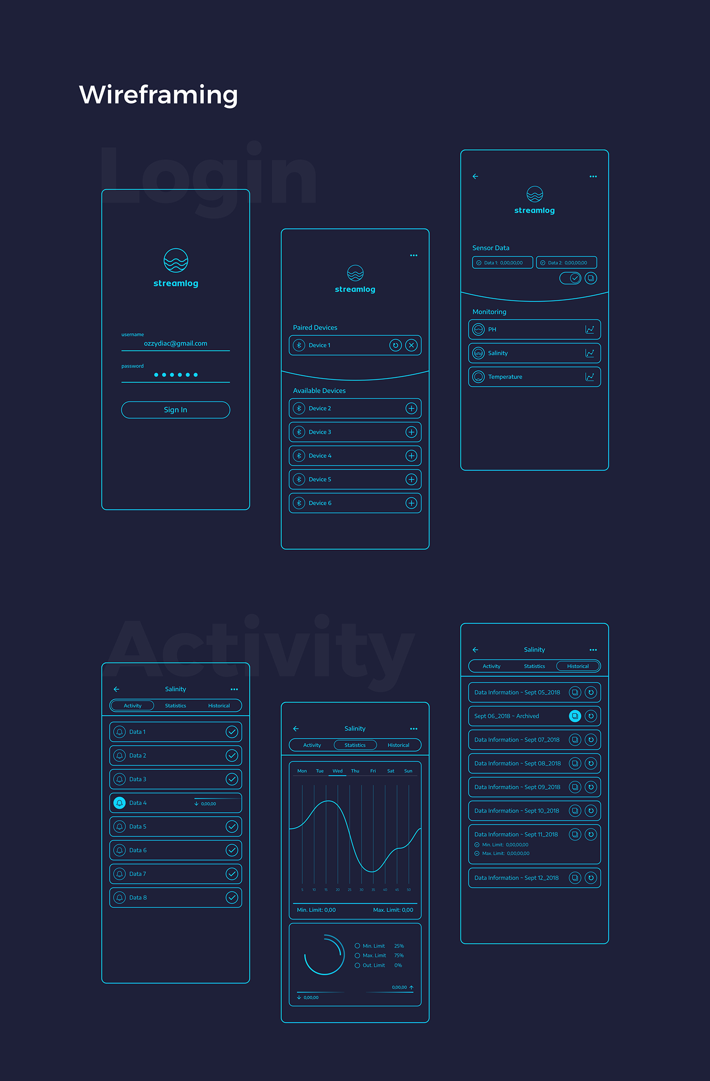
Streamlog ~ Mobile App
Streamlog is a sensor mobile App for Water Level Measure, content created by High Developer Agency and UI/UX Concept designed by TESLA Digital Agency/Richie Diac.
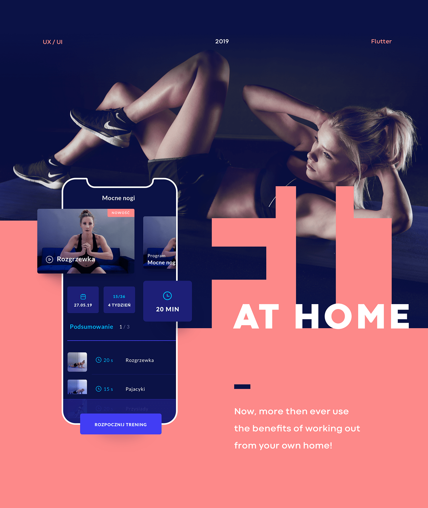
Fit@Home - Fitness Mobile App
Our client came to us with an idea for a fitness mobile app - and that's it. They wanted to offer premium, paid service for their customers that don't have time to hit the gym. Allowing people to exercise from the comfort of their own living room helps them to keep fit when they don't want to get tied by a gym membership or they don't have time to schedule long workouts into their busy days. After performing product workshops, we've created an easy to use but highly functional iOS and Android application using Flutter framework. Beautiful illustrations, bold styling and simple interface give everyone a positive experience. Our goal was to give every user a boost of motivation and keeping it requires the app to be accessible at all times. We achieved that by displaying everything clearly on the screen.
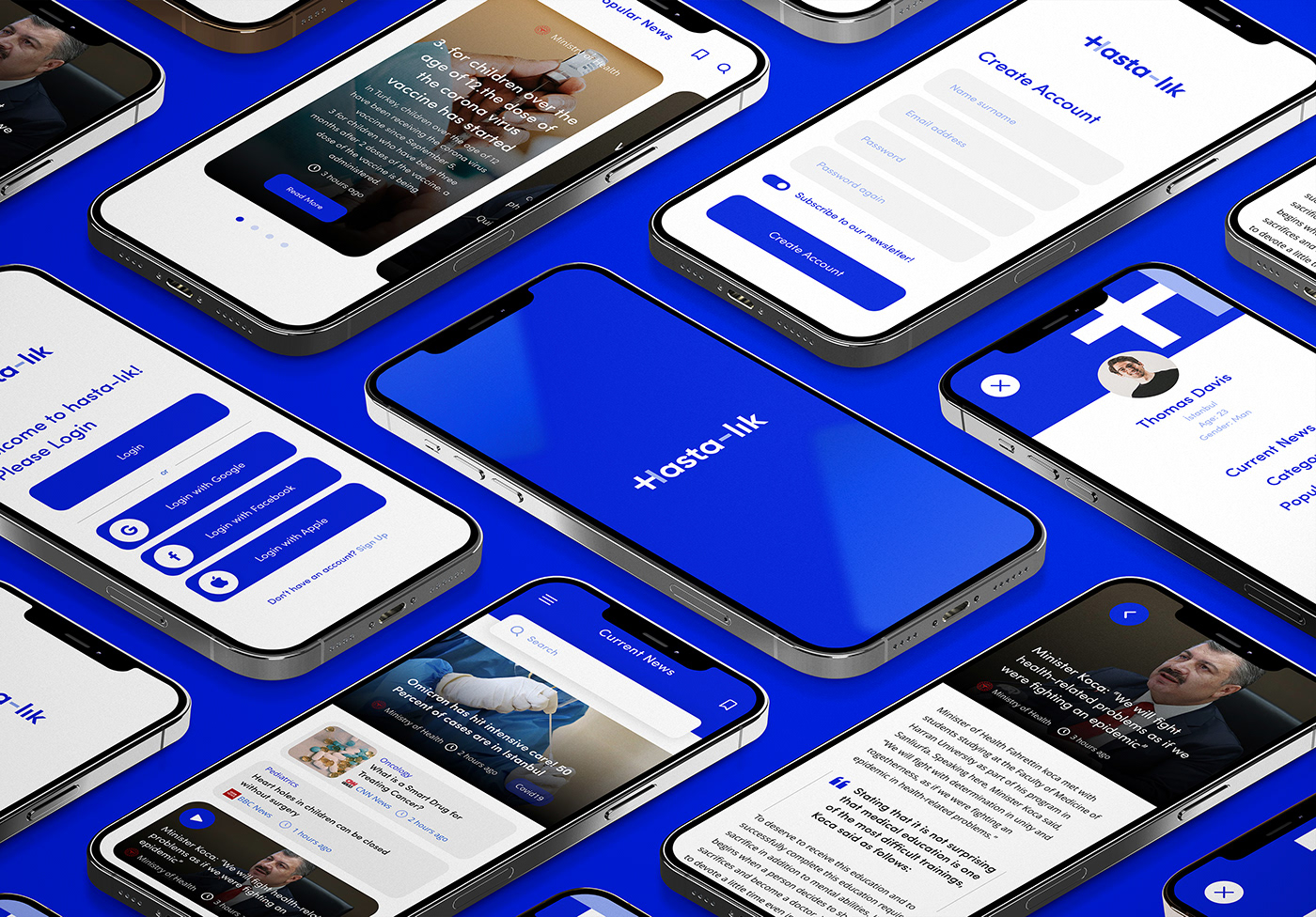
Hastalık — Mobile App
Hastalık — Health App EN People who are sick or think they are sick are diagnosing their illness online. This is a disease called Cyberhodric. But since there is all kinds of right or wrong information on the internet, I designed an application that contains health-related news and information. The application feature will be the application where the most accurate information and accurate news will be created. I used the name Illness, because these people were sick with the disease. TR Hasta olan veya hasta olduğunu düşünen kişiler hastalığını internetten teşhiş ediyorlar. Bu Siberhodrik denilen bir hastalıktır. Fakat internette doğru ya da yanlış her tür bilginin olduğu için sağlıkla ilgili haberler ve bilgilerinin oluştuğu uygulama tasarladım. Uygulama özelliği en doğru bilgilerin ve doğru haberlerin oluştuğu uygulama olucaktır. İsmi ise bu kişilerin hastalık hastası olmasından dolayı Hasta-lık adını kullandım.
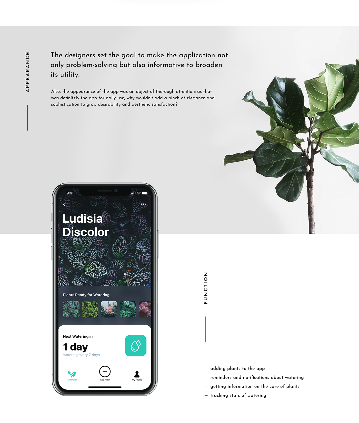
Mobile UI Design: Watering Tracker. App for Home Needs
In our routine full of diverse tasks, mobile apps have become great help. Today we share UI concept for one more called Watering Tracker, reminding users to water the plants as well as tracking the watering stats for every plant. To read a detailed case study, check Tubik Blog https://tubikstudio.com/blog/ Join in!
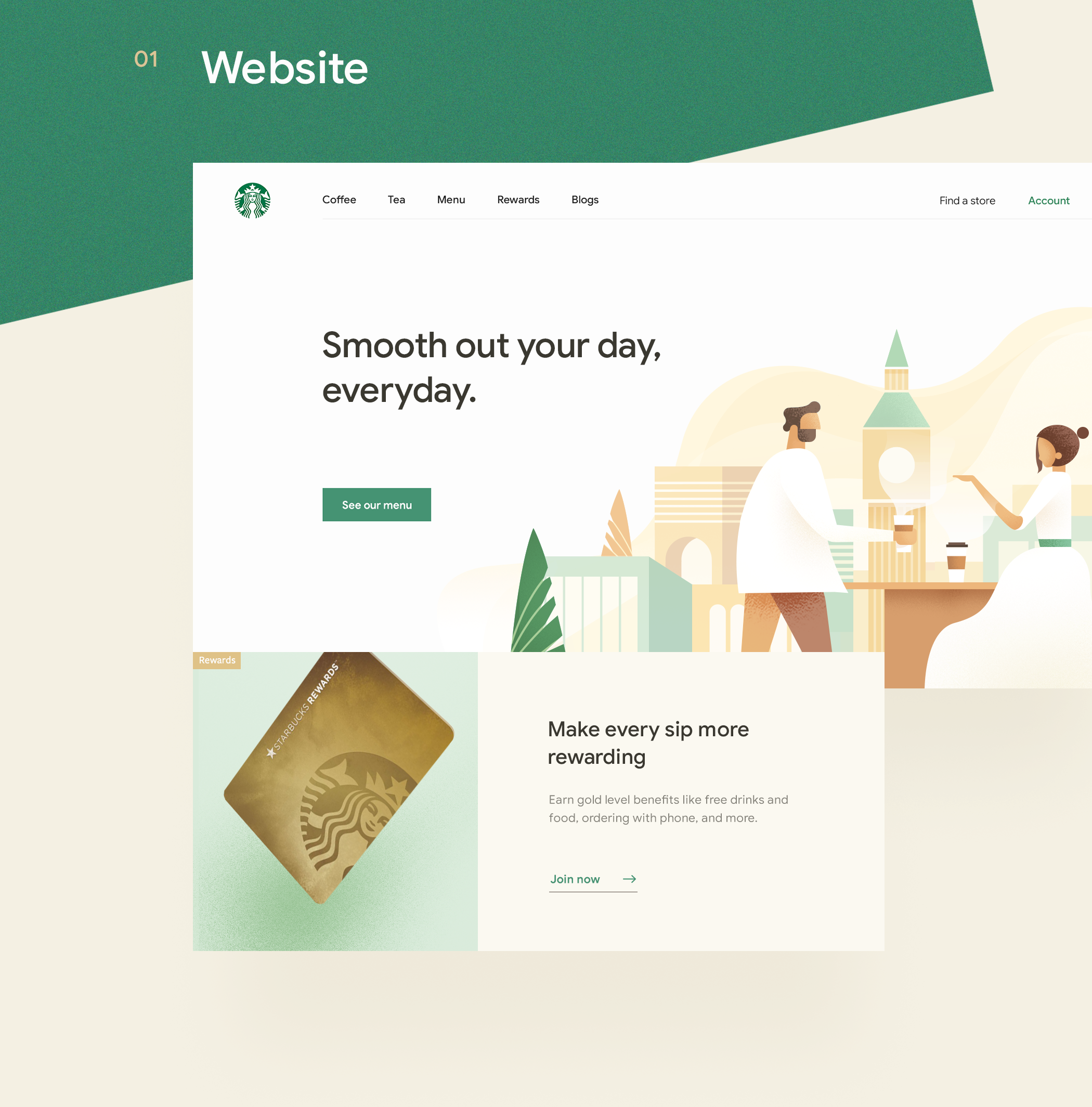
UI/UX Redesign Concept: Starbucks Mobile App
UI/UX Redesign Concept: Starbucks Mobile App AoiroStudioJan 15, 2019 Our first redesign concept on ABDZ this year, how about from a mobile app that some use to fuel of caffeine needs. Absolute beautiful redesign of the Starbucks mobile app by Daniel Tan and Daphnie Loong. Combo Duo of two creative directors based in Kuala Lumpur, Malaysia. For starters, their visual approach is absolutely stunning. They truly give justice to how our beloved Starbucks should look. I still don't understand why we still should load our cards within the app but this redesign animation is quite solid. Definitely check out their entire project on Behance. Credits Daniel Tran on Behance Daphnie Loong on Behance UI/UX Redesign Concept >
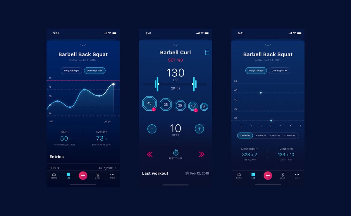
Stacked — Mobile App Case Study
Stacked — Mobile App Case StudyFitness and WellnessA new, exciting way to do your WorkoutsStacked was created by bestselling fitness author Mike Matthews to help reach the fitness goals faster. It is suitable for any kind of workout routine, ranging from a simple bodyweight program to a complex strength training block.The user can set goals for exercises and body measurements, and record and review progress toward them. Also, it has a 1RM calculator to avoid losing track of personal records.Goal — Improve User Experience and Visual StyleThe main goal was to improve user expirience in application. The key points: simplify navigation, make workout screen more intuitive, improve the way to interact with routiones.Also we worked a lot on look and feel of the application and created a new visual style. We put a lot of attention to details, interactions and animations.https://medium.com/media/65d2f59c7bc752a5e8a2cc03e06b7659/hrefFirst step — Creating a new user flowWe prioritized the app features and moved the main ones to the tab bar instead of using hamburger menu. So the main features became available in one tap as well as all important information is listed on home screen.What’s new on the workout screen?Now it is collapsible and available in any place of the app. The user can navigate in app without closing the workout screen, easily see the workout overview and summary.Routines and Goals -Improve efficiency of your workoutsThere are a lot of predefined routines that can be combined into phases and assigned to specific weekdays. The user can edit and create his own routines. All settings can be easily restored to default.What are workouts without goals? User can set his goal and see which ones are achieved or what is needed to achieve them.Log. Progress. History — Monitor your actvitiesAll user’s progress is shown in Log. User can monitor his activity by two parameters: weight and reps and One rep max. All data is visualized in charts.Results — Better experience for our usersBeta testing results showed great results: 84,2 % of 597 beta testers named their experience as “Very good” and “Excellent”. As well as 89,5% of users succeed 100% in usability studies.Created with love by Netrix team ❤️We are on Dribbble, Behance, and Youtube.Stacked — Mobile App Case Study was originally published in Muzli - Design Inspiration on Medium, where people are continuing the conversation by highlighting and responding to this story.
Fit@Home - Mobile App
Our client came to us with an idea for a fitness mobile app - and that's it. They wanted to offer premium, paid service for their customers that don't have time to hit the gym. Allowing people to exercise from the comfort of their own living room helps them to keep fit when they don't want to get tied by a gym membership or they don't have time to schedule long workouts into their busy days. After performing product workshops, we've created an easy to use but highly functional iOS and Android application using Flutter framework. Beautiful illustrations, bold styling and simple interface give everyone a positive experience. Our goal was to give every user a boost of motivation and keeping it requires the app to be accessible at all times. We achieved that by displaying everything clearly on the screen.
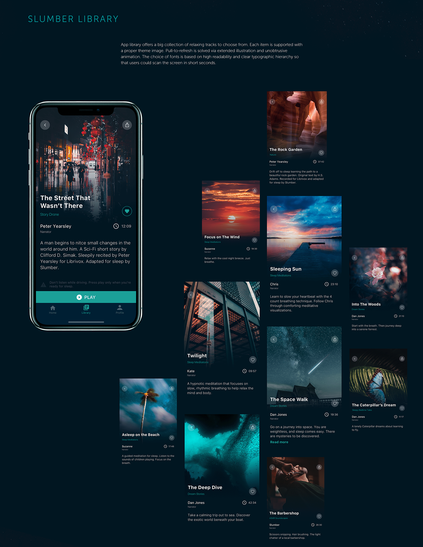
Mobile User Interface Design: Slumber App
Health is wealth, no doubt, so the variety of apps helping people to keep healthy lifestyle is growing day by day. Today we would like to present designs of a recent project called Slumber: it's a mobile app with a gallery of music and meditations for relax and good sleep. Check the creative flow and UI solutions supporting the app purpose and enhancing usability. If you want to read more about real cases of UI design, check them in Tubik Blog https://tubikstudio.com/blog/ Join in!
arty | mobile app
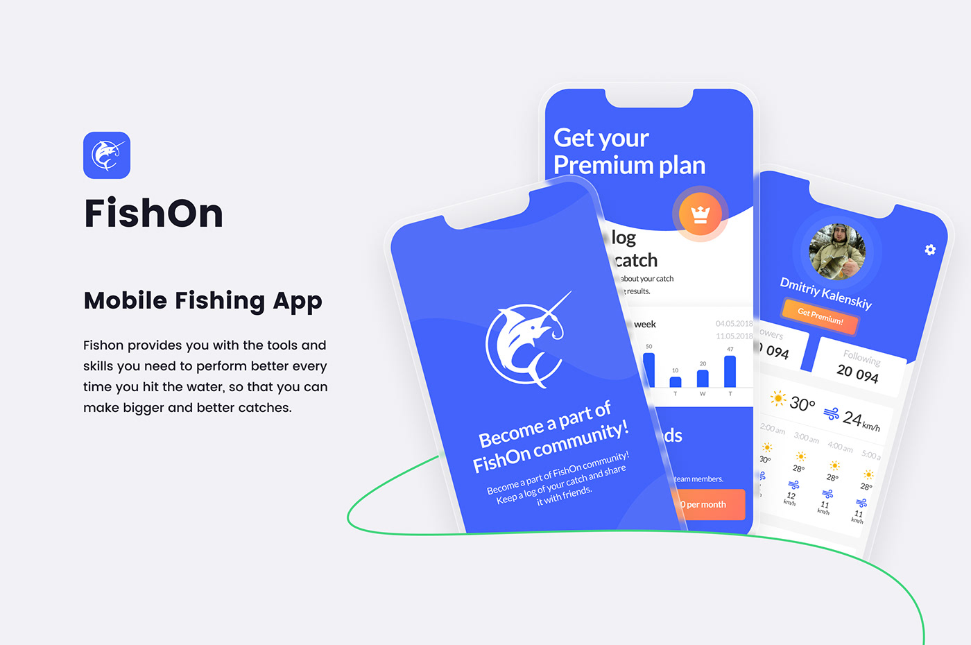
FishOn Mobile Fishing App
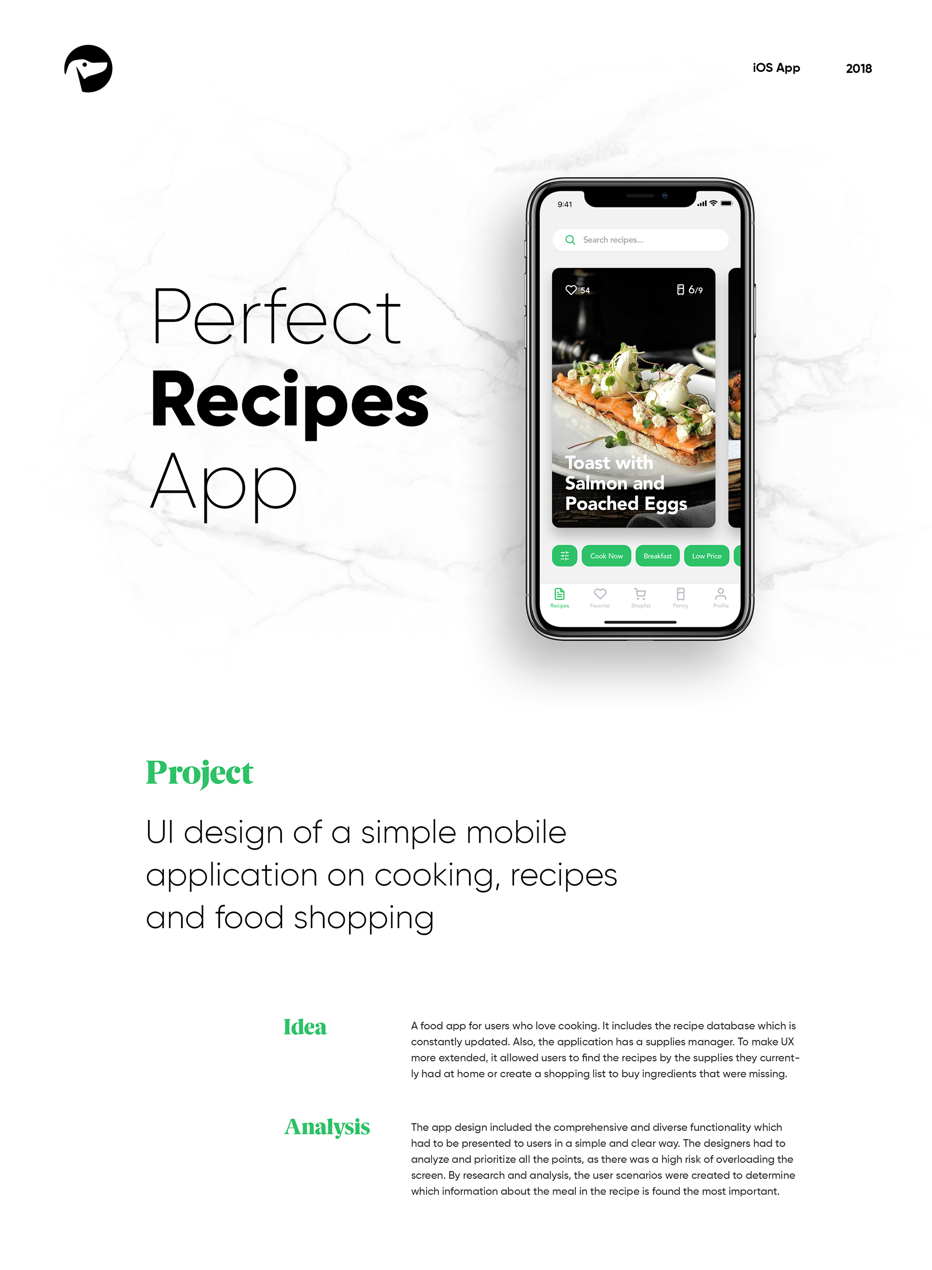
Mobile UI/UX Design: Perfect Recipes App
Mobile UI/UX Design: Perfect Recipes App AoiroStudio Aug 31, 2018 Happy Friday everyone! I wanted to end the week with this UI/UX case study by the folks from Tubik Studio, a kickass digital studio based in Dnipropetrovsk, Ukraine. We are showcasing one of their latest projects, the mobile UI design for a perfect recipes app. An application where you will be able to learn to cook by following recipes and also a food shopping experience. What's interesting from this particular cooking app is a concept of an integration with AmazonGo services where recipes can be generated in the relation of what you are shopping on Amazon. This could totally enhance our food shopping experience and becoming more intuitive. Let's be hopeful for the near future. More Links Studio Site Behance More on ABDZ Project Gallery mobile design UI/UX ui design tubik studio
Fit@Home - Fitness Mobile App
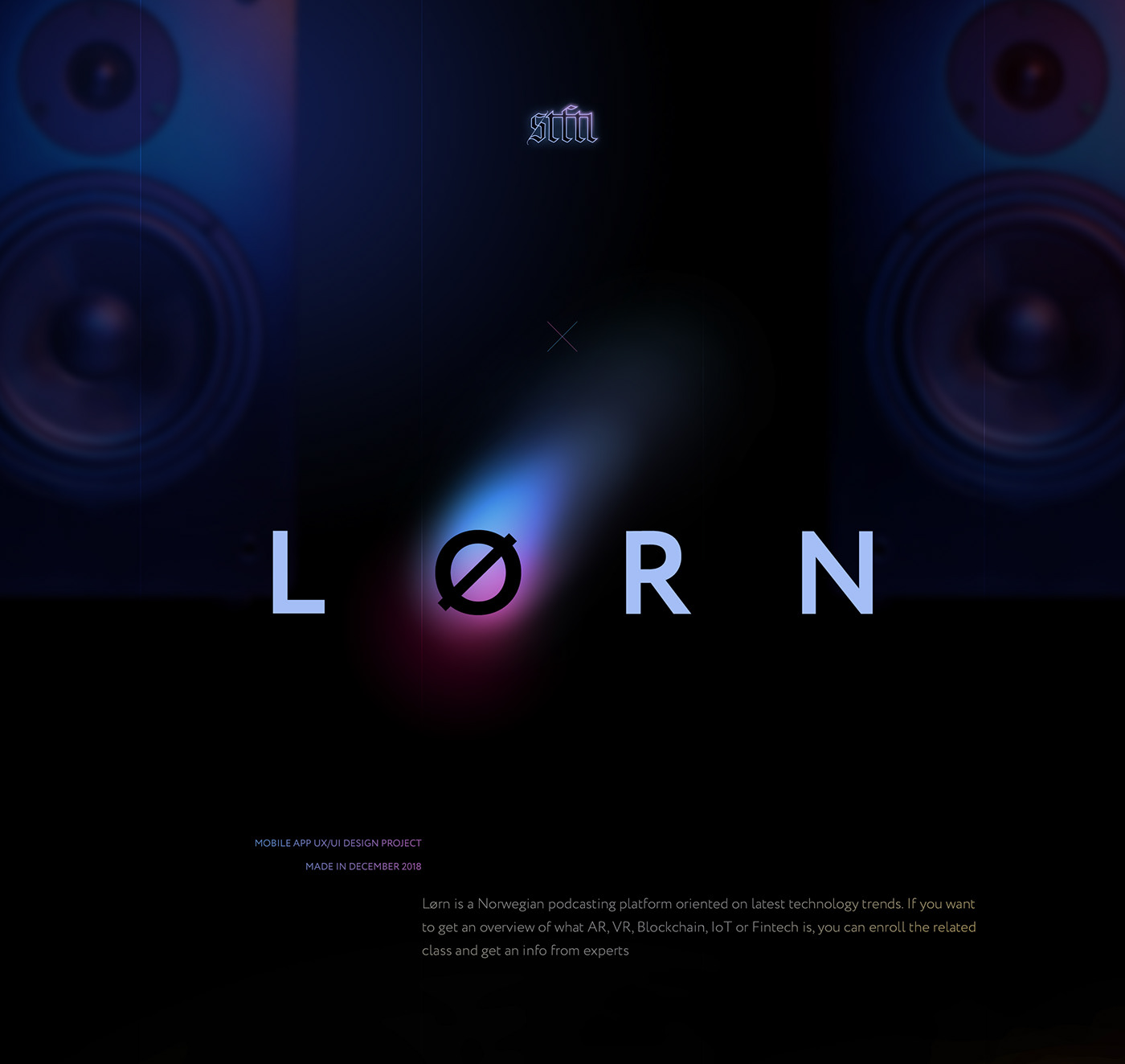
Lørn Mobile App
Lørn is a Norwegian podcasting platform oriented on latest technology trends. If you want to get an overview of what AR, VR, Blockchain, IoT or Fintech is, you can enroll the related class and get an info from experts It was a time to make a next step for client and transorm from set of podcasts to e-learning platform and go mobile. Our goal was to design a mobile app which combines both podcasting and study experience and the process fast and easy
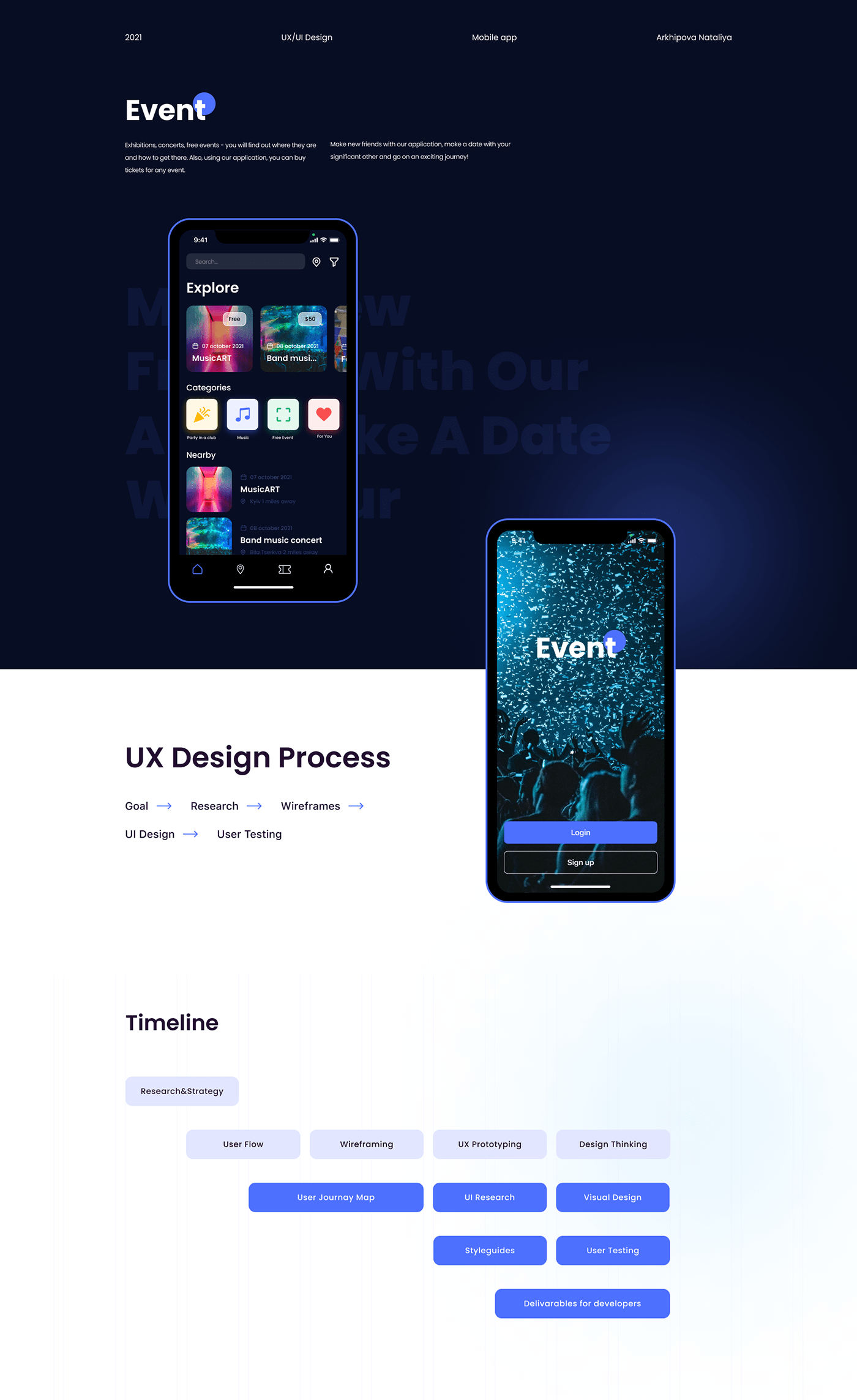
Event mobile app
Event mobile app
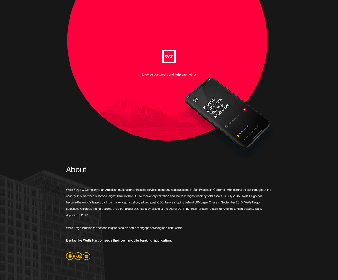
Wells Fargo Mobile Bank APP.
Mobile banking becomes more popular with every year and there is an explanation for this tendency. It is really comfortable to have all your financial information in one place. So, we have decided to create our vision of Wells Fargo & Company mobile app concept. In our, concept we wanted to combine notable colors and add to this user-friendly UX. We have analyzed apps of such banks as Privat24, Tinkoff and Monobank. We have found a tendency of bright and light colors. To differ, we have decided to use a dark background with bright colors for buttons. If you need to compare foreign currency courses and it is often a problem, that similar information provided in the same colors is unreadable. So, we have solved this problem by adding different colors to every different currency. You will not miss any important thing with this functionality. We decided to use Helvetica font which is popular among enterprises such as Google, Panasonic or Toyota and suit to serious apps. Cheers!
Muzli Mobile App Concept by Martin Strba
TinyLove Mobile App #flat #ux #ui #iphone #mobile
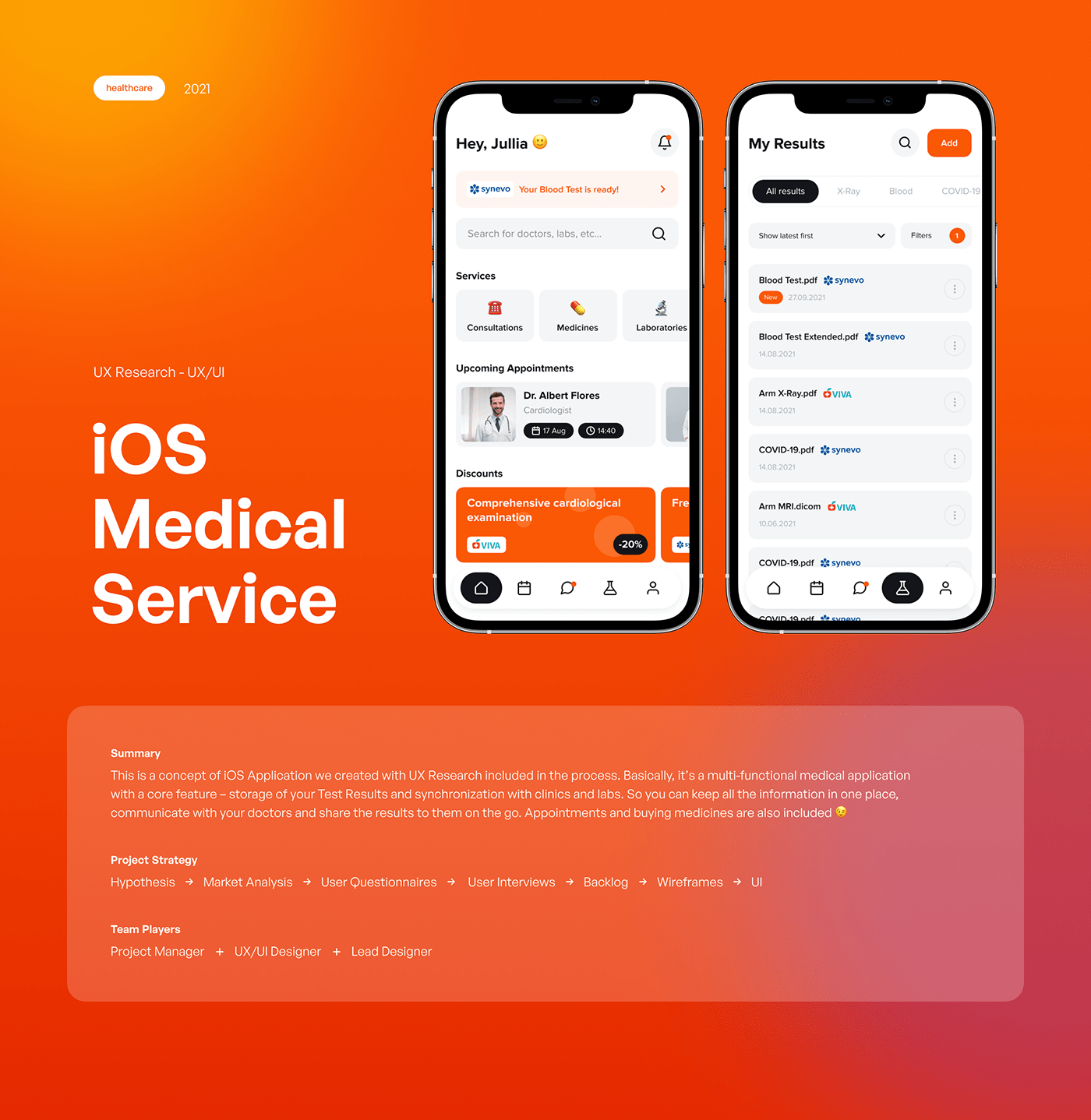
Healthcare app – Mobile app design & Design Research
Healthcare application concept (iOS) is a multifunctional medical app. This app collects your Test Results and synchronizes with the clinics. Thus, you can keep all the information in one place, communicate with your doctors and share the results to them on the go. Appointments and buying meds are included too.
Hastalık — Mobile App
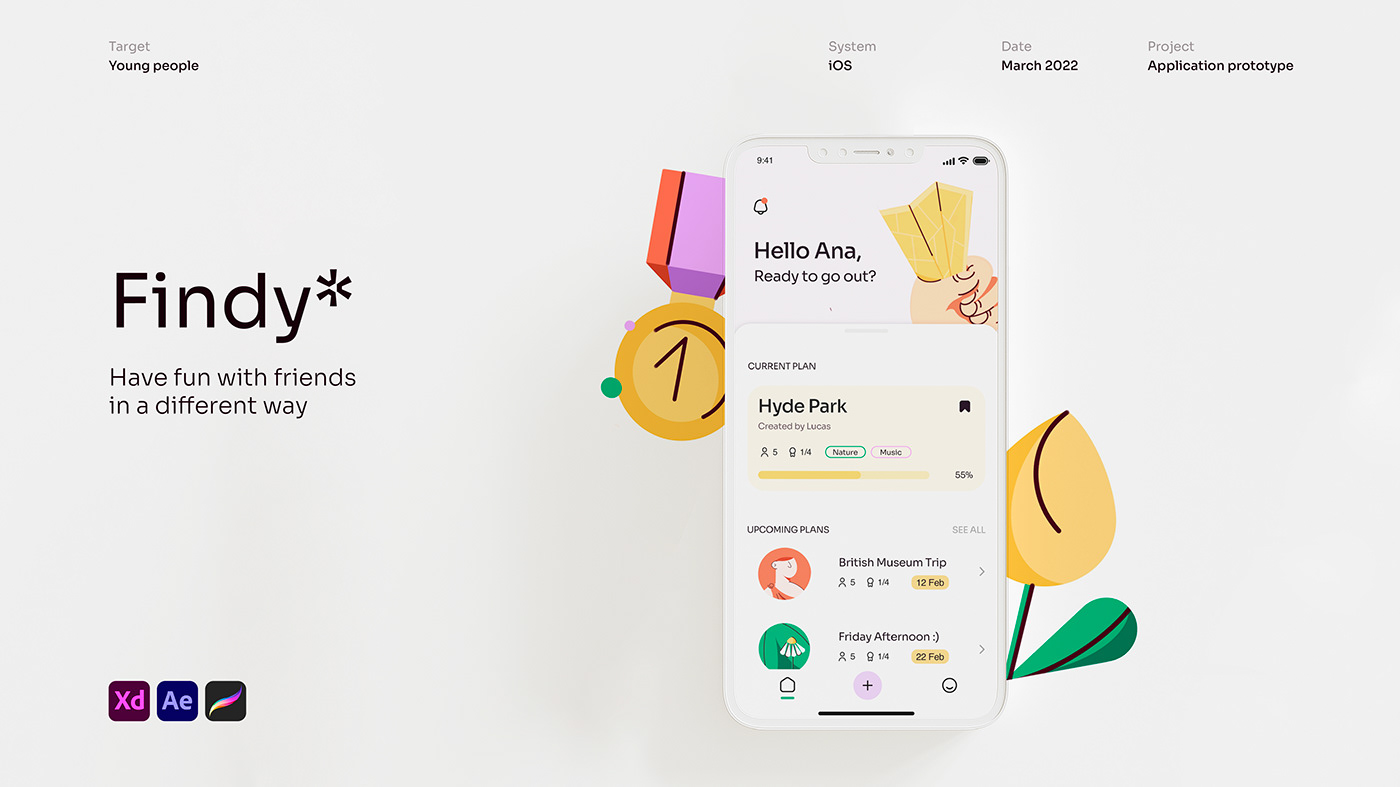
Findy* - Mobile App
Findy* - Mobile App
Healthcare app – Mobile app design & Design Research
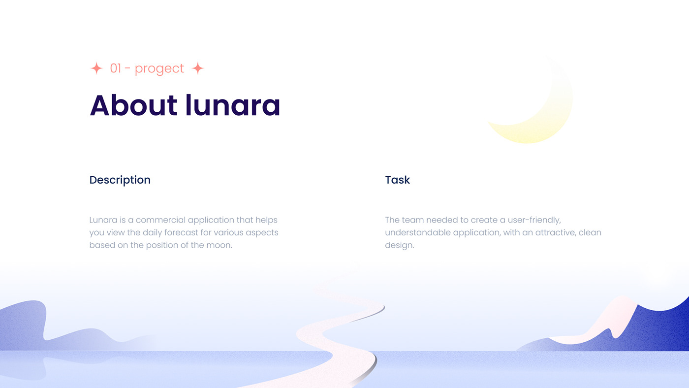
Lunara Mobile App - UI/UX
arty | mobile app
Iphone_sidebar_perspective #iphone #app #mobile #ux
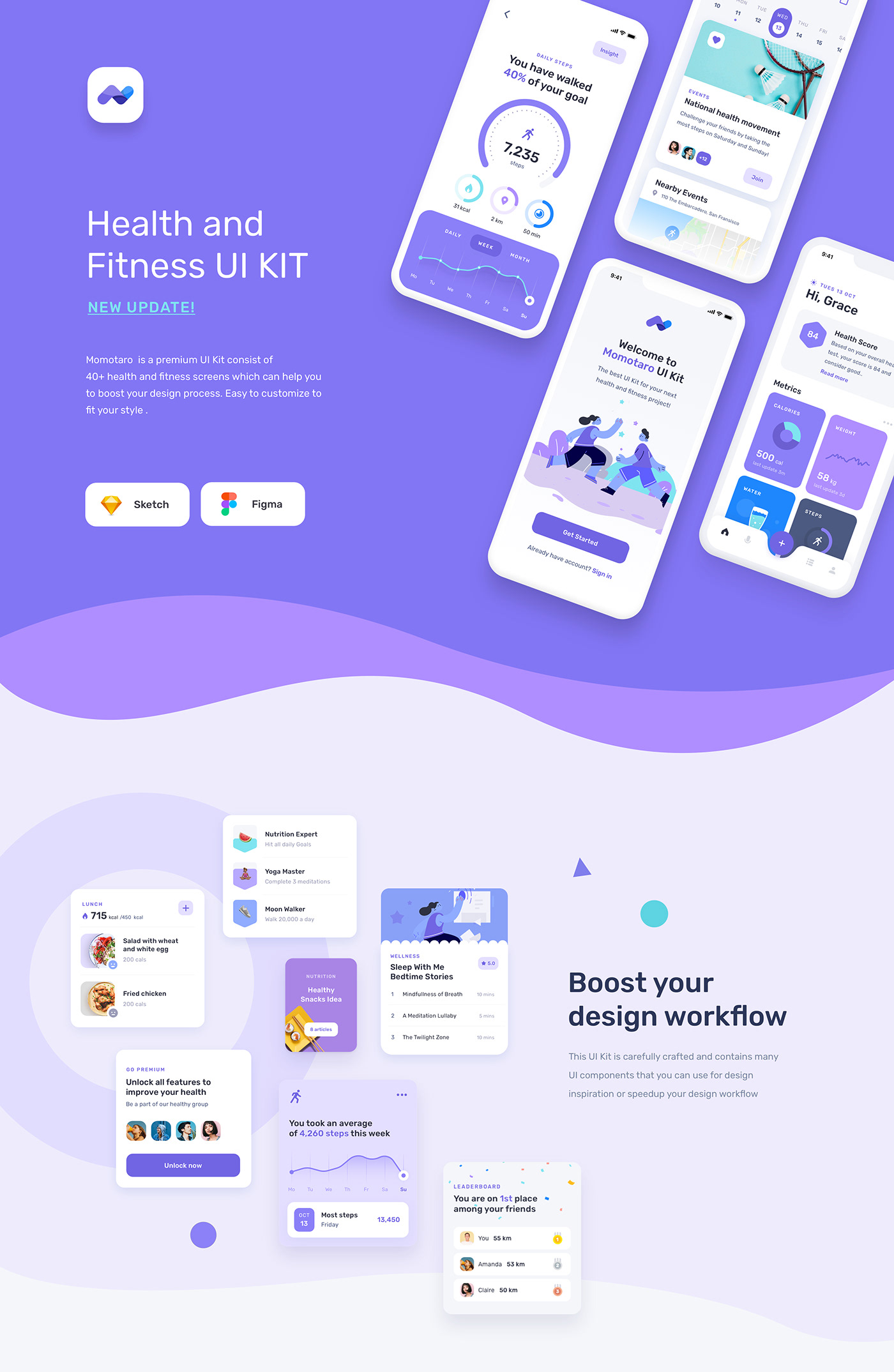
Momotaro Health Fitness Mobile App UI UX Kit
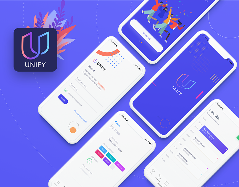
Unify mobile app
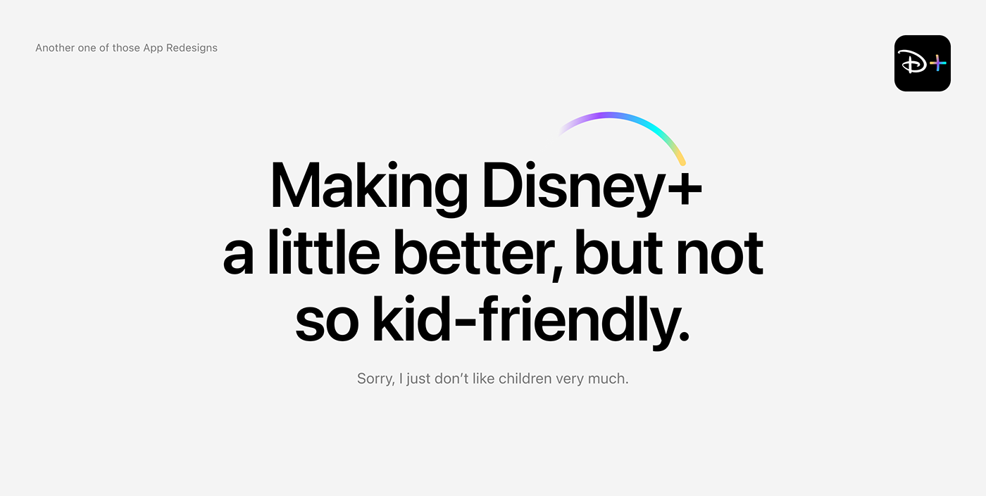
Concept design for Disney+ mobile app
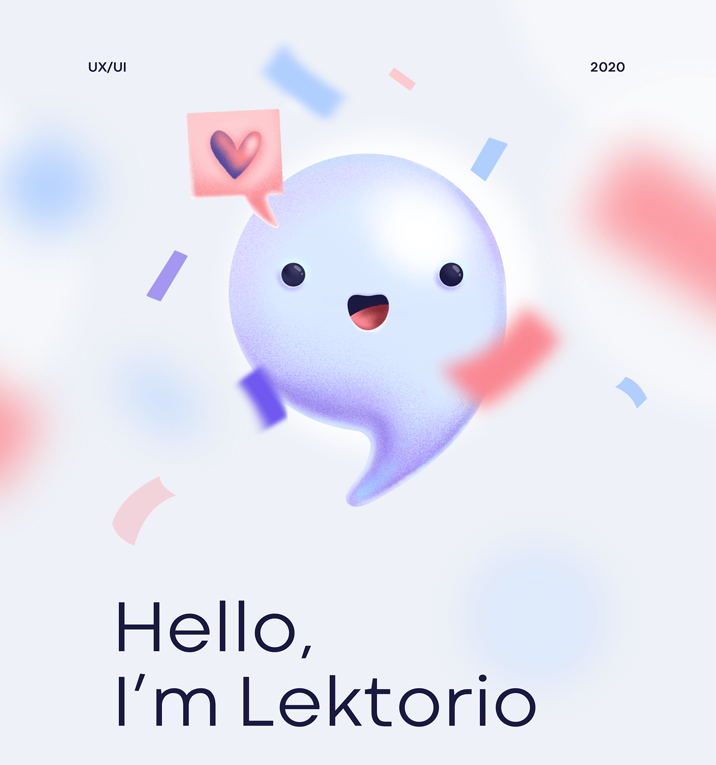
Lektorio Mobile App
Lektorio is an app that makes it easy for language teachers to keep an eye on their schedule, student attendance, organize remote classes and stay in touch with the students.
Lunara Mobile App - UI/UX
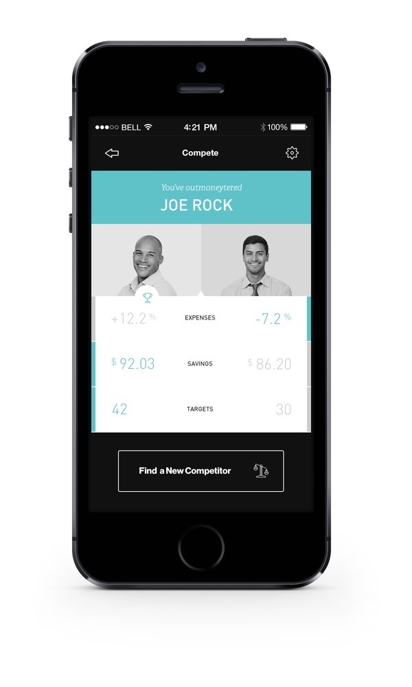
Moneytor on Behance #app #mobile
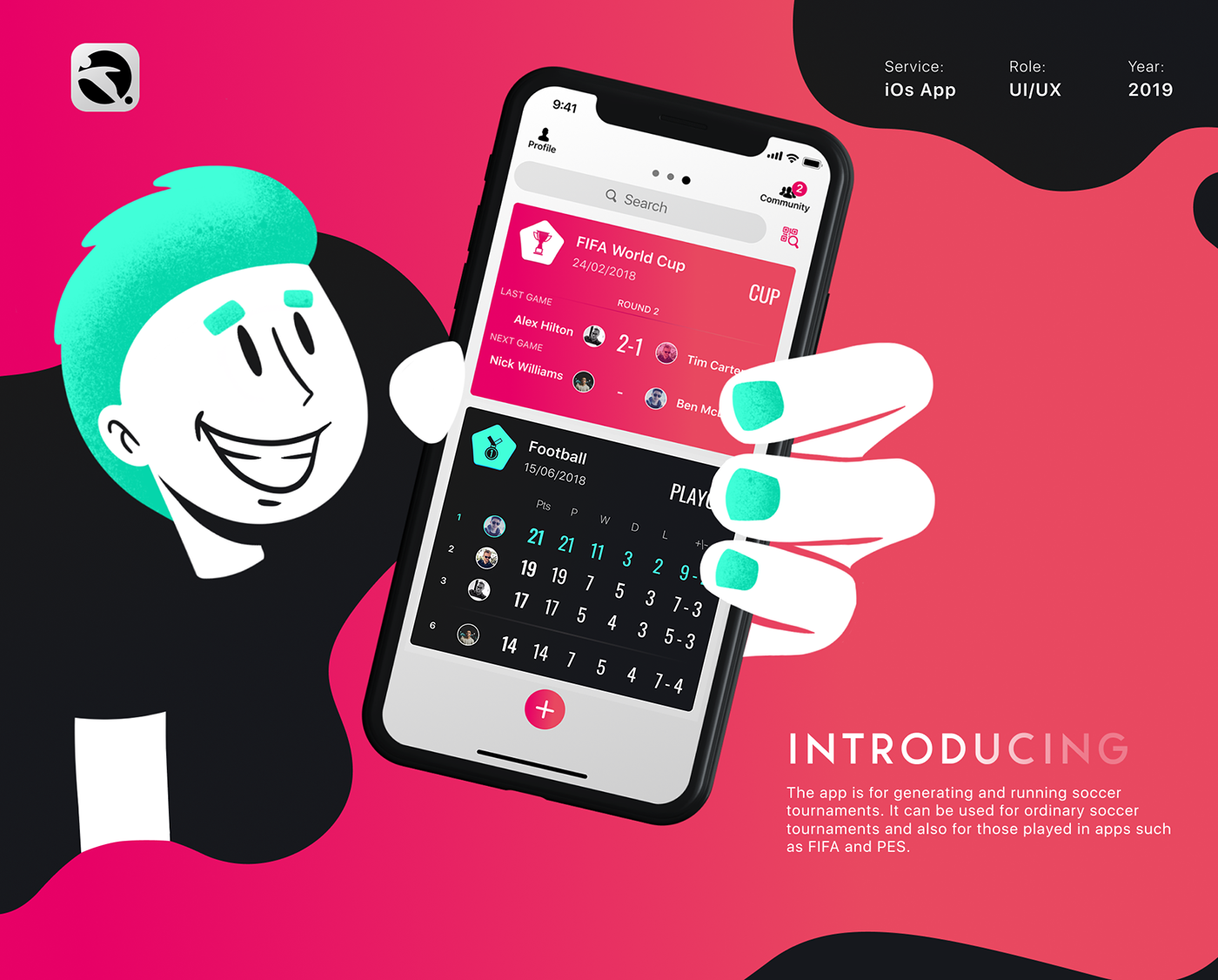
Tournament Mobile App
The app is for generating and running soccer tournaments. It can be used for ordinary soccer tournaments and also for those played in apps such as FIFA and PES.
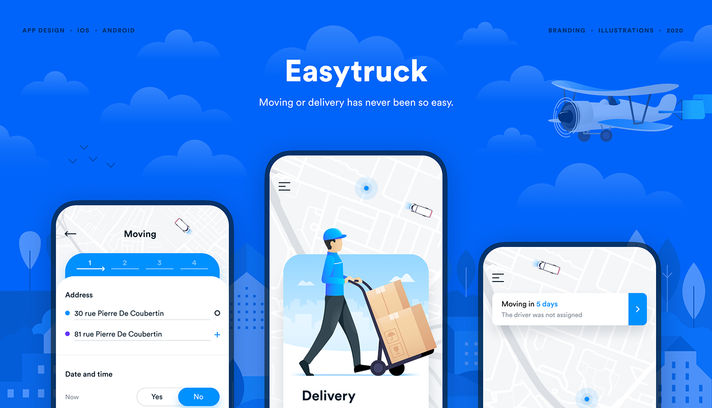
Mobile app for moving and delivery
Easytruck focuses on simplifying the experience for people who need moving or delivery in Europe and drivers work optimization. We created more than 50+ mockups then have been converted into beautiful designs and nice illustrations.
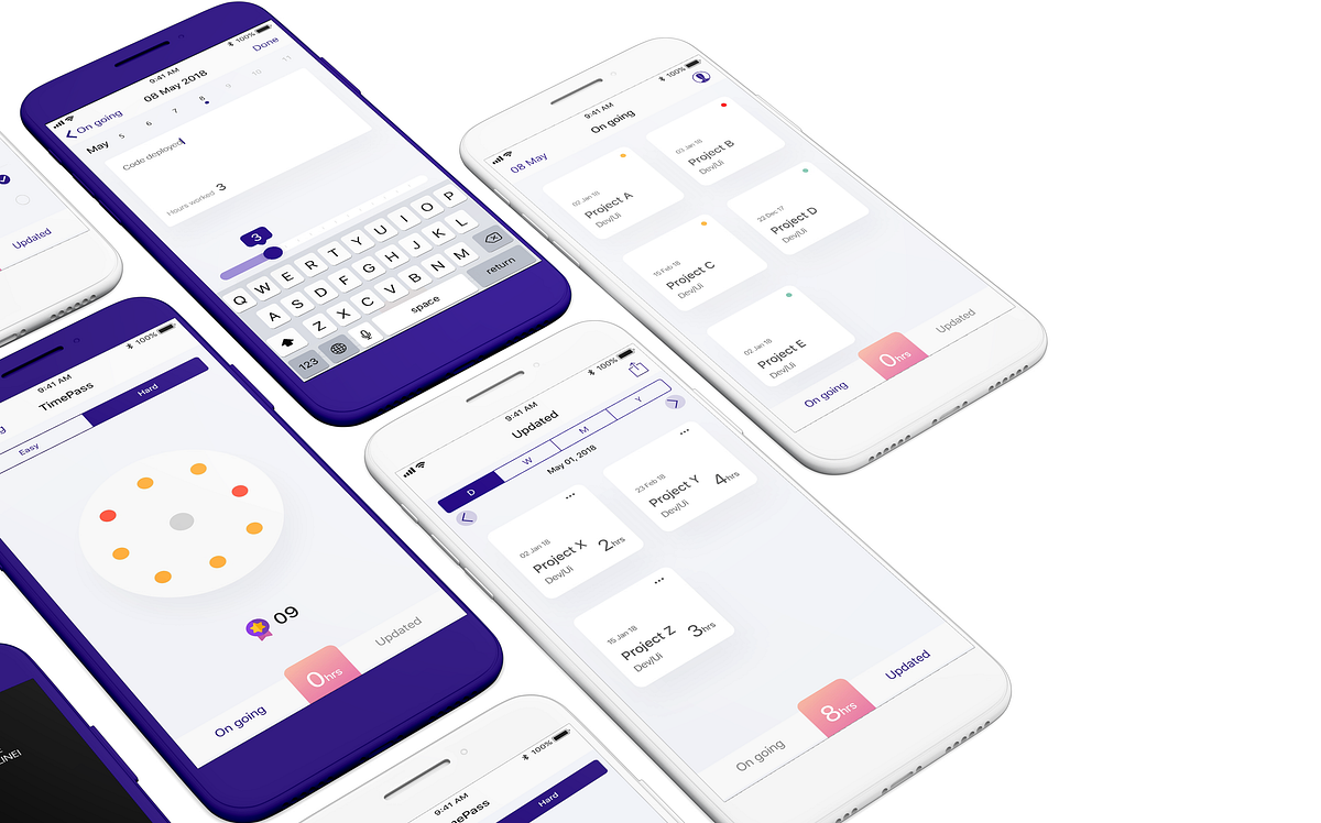
Gamification of timesheet entry — UX Mobile App Case Study
Creating a mobile app on Behance Live
I was invited to the 3-day Adobe Live to talk about UX/UI and work on a mobile app design in real time for the live audience.
Fit@Home - Mobile App
Dropbox weather photo #app #mobile #ui
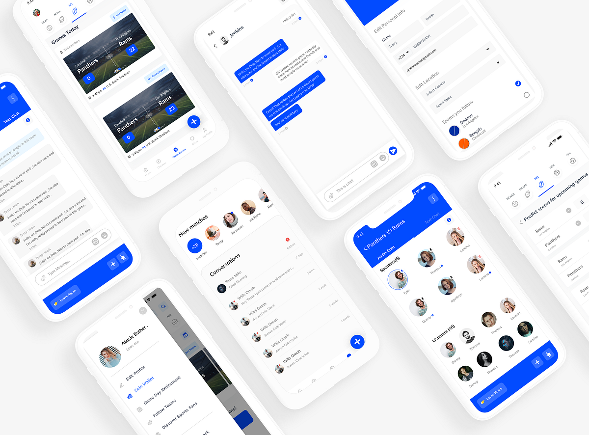
Case Study: Redesigning SportsYapp Mobile app.
Product designImproving the user experience of a sports app that connects Sports fans all over the worldDURATION5 WeeksROLEUser ResearchUX & UI DesignStyle guide & UI componentsInteractive prototypeTools Used:FigmaProtopieMiroOverviewSportsYapp Mobile is an app built to provide a personalized sports experience curated exclusively for sports fans while creating a game-like atmosphere that keeps the user not only engaged but addicted to the surreal feeling of being a part of a “Game Day”. SportsYapp’s vision is to connect and engage sports fans all around the world.My client comes from the sports reporting industry and she has a sole vision of providing a social platform for sports fans to share their support and energy wherever they may be.The ChallengeThe old application wasn’t getting enough engagement. The actual focus for this project was to make the app fun and engaging, make interaction with other sports fans easier, and introduce features to drive more engagement.The GoalThe goal was to redesign the existing app to improve the fan’s overall experience, create an aesthetically pleasing UI, and include additional features to provide more value to its users. These additional features are;Game audio-chat rooms; Think clubhouse/Twitter spaces but for sports/games as they happen!Game prediction; Users get to predict winning teams and scores for games before it starts and before it ends.Match feature; Just like in dating applications, the app matches two users who have the same location follow/support the same teams and games.Direct messaging; This means users can now have conversations with each other on the platform.Coin incentive system; Here users receive coin incentives when they like, comment, post shots, predict games, etc and when their coin gets to a certain amount, they receive rewards.The ProcessCompetitive AnalysisCompetitive analysis explores the companies in a given sector or market niche competing with a potential product or services for market share. Usually, it helps in understanding what competitors are doing right, their strength, their lapses, and weakness, but most importantly a way to improve a product to achieve a competitive advantage for both the business and customers. I carried out an analysis that carefully compares different sports applications that are similar to what I intend to design and equally analysed the business features and requirements intended for SportsYapp, to see how this research can help in improving the experience for the users. Some of the apps I looked into include;FancredYahoo SportsBallparkStats24ESPN, etcAlthough these platforms share similarities in terms of functionality, they still differ in a lot of ways. One major difference is that they don’t provide a way to directly match with or start a conversation with other sports fans who follow the same teams or are in the same location as you.User ResearchKicking it offSince I’m not so much into sports, I started out doing desk research, reading articles, and watching videos to get a better sense of how sports apps work, to gain every possible knowledge required to design the best experience for my target audience.Going further, I had meetings with the client. We brainstormed and assessed the existing product, and discussed additional features we would have and how they would work. In all these, I noted my clients’ biggest concern was that the app wasn’t engaging enough given its low user engagement rate. Using this issue as a starting point in research I performed a heuristic evaluation based on Nielsen’s heuristics to detect usability issues that may occur when users interact and identify ways to resolve them. This helped with a lot of valuable insights and ideas used to narrow down a roadmap.The UX phase began with getting to know the users and their behaviours and the research goal was aimed at getting a clear idea of the problem as it directly affects the users, and to uncover their needs and frustrations to better understand how to create a better experience for them.To understand where the problem was coming from and to know the areas to improve, I had to conduct some research with my target audience. I created a survey form and shared it with sports fans and some sportsYapp users. Had a virtual interview with about 3 sports fans to understand their thought process while using the app. I also observed my behavior and the frustrations I encountered on the app.For my quantitative research, I created a survey form tailored specifically for my target audience to know their views and experience with using the mobile application and other similar applications and to know their pain points and improvement suggestions. And for my qualitative research, I interviewed 3 sports fans. Some of the questions I asked in the survey are as follows;What their preferred sports app was?Why they prefer it?What challenges they were facing and what improvements they wish the app could provide?Asked them about the issues they may have encountered with recent sports apps over the past year.Asked them to identify issues with the existing sportsYapp mobile application and a lot moreAnd during the interviews, I walked my users through the app and tried to figure out what they couldn’t do right, where they got stuck or had issues in the app. This was done to;To gather unbiased user opinionsTo find issues with complex flowsTo get the insights to help create a better overall user experienceSome screenshots from the user survey formFrom the feedback, some key challenges were identified.Survey form screenshotUser PersonasTo support my thought process and to ensure that I don’t create a biased solution, I used the qualitative data gathered during the research process to create two personas that would serve as a guide for me to keep the design process user-centered since they had varying goals and needs, and to make better design decisions.Some fans were very dedicated to their supporting team and wanted to be as engaged as possible, while other fans are not as extreme and sometimes prioritized community connections more.Going through their feedback from the research, I figured the importance of allowing fans to have multiple access points and incentives for posting shots. After ascertaining user pain points, I started working on possible solutions for the app flow and an aesthetically pleasing UI.Wireframes and IterationsWhen I started approaching the design problem, I sketched out some options of how I could improve the existing design and resolve the above-mentioned problems. I got to iterate on what would work and what wouldn’t and then I converted my sketch to Mid-fidelity wireframes, this made the visual design process easier and faster.Wireframe iterationsUnderstanding game-day experiencesThe next step taken to better understand our users was to understand how their game-day experience works.Since this app focuses on game-day interactions, I needed to consider how to enhance the experience for onsite fans' and bring the live-action closer for offsite fans.Gameday flow for the old design and redesignLet’s look at the problems discovered!A crucial step I took for the redesign was to audit the Old design to figure what’s working and not working. The idea wasn’t to renovate the design entirely, the idea was to improve on the existing design with an introduction to new features. I placed this step after user research because I wanted to re-evaluate the features with the business goal and user needs in mind.Based on the insights, I noticed the app's core goal, which is bringing fans closer to each other on game day, wasn’t engaging enough. Fans only get to follow each other and view posts of each other but they don’t directly interact, there’s no group or forum for fans to connect with each other. so I can say it’s not serving the purpose of the core goal. Before the redesign, the only interaction between fans is on game days when they get to take photos and video shots of the game to post on the virtual field of the game for other fans to see.Onboarding/sign upProblem: The problems discovered are gotten From my personal experience as a product designer and research insights from sports fans and other users; the problems and their solutions are explained below:There is no onboarding flow to introduce new users to this app and its features.Lack of visual consistency in the buttons makes it harder for people to verify the authenticity of your communications, making them less likely to convert. Lack of visual consistency looks careless and unprofessional and tends to have a negative impact on users.Onboarding/sign up screensSolution:Designed an onboarding using the combination and progressive onboarding approach to help the user ease into the app’s experience. Instead of bombarding them with everything at the start, provided users with just enough information to keep things moving; This approach ensures that the user is enlightened and knows what to expect at every point.Maintained consistency across the onboarding and sign-up.Bottom navProblem:The old bottom nav isn’t so effective because people find it difficult to post. Here, for a user to post a shot, they have to go into the “game day’’ of a game which makes it harder for them. First-time users find it difficult to figure out how to post and where to post from.Since there weren’t a lot of features, the bottom nav contained less.Solution:Made the home, discover, game rooms, Chat & profile pages accessible from the bottom navigation.Clearly understanding that navigation is generally the vehicle that takes users where they want to go, tailored my navigation to help them get there faster by adding a Floating Action Button for the most important user action on this app which is “posting shots”.Home pageOld home pageProblem:Visually, the interface doesn’t look great, starting from the hierarchy, contents, structure, etc.The home page takes up so much space just to show the games leaving other interactive parts of the app out of the picture.There are no quick links to make it easier for a user to perform primary actions once they get on board.The sports Icons without a text to them make a user think twice before choosing a game and confuses some users who are only familiar with the name of the sports.Home page redesignSolution:Added a Floating Action Button in the bottom nav for users to be able to easily post shots.A search icon for users to easily make quick searchesAdded the name of the sports to each sports icon for easier identification so a user doesn’t have to think twice to select a sport they like with reference to Steve Krug’s book Don’t make me think.A date picker was added so a user can still find games according to date.Since we’re trying to drive more engagement, we included a points rewarding system and it works in a very simple manner. Users get to earn coins when they actively engage and post shots. So their coin wallet which sums up the total coins they have earned over time appears on their home page.Users can also start their predictions right from their home page.Most Important actions were included on the home page to make it easier for a user to access a lot more.Discovery pageProblem:The discovery page doesn’t do enough discovery for the user, because here you’re discovering games and only games.The discovery page lacks consistency, consists of different cards for games, which is also different from the card for games on the homepage. This leaves the user thinking if they’re all the same game.Discovery page redesignSolution:Users can discover games from both teams they follow and teams their friends follow. This is because some users like to see what other people are doing, finding games their friends are following enlightens them, and that enlightenment is needed to keep them engaged.Users now get to discover prediction analysis for games; this is to help motivate them to predict games.Users can now discover their matches and new teams to follow; This is to enable them to connect with more people on the platform and follow more teams to see more games.Made all the game cards consistent across all pages. This helps constantly prove a user’s assumptions about the user interface right, creating a sense of control, familiarity, and reliability.Search PageProblem:There are no filters and sorting options to facilitate the search for a user even a quite well-crafted search query may not be enough as it will bring out too many options in search results.The bottom nav in the search bar can be quite confusing for a user because it is not required for a search that works like a modal.Solution:I provided tabs for sorting so users don’t have to leave the search results page while switching between preferences. In this case, filters would support the interaction flow and allow users to tune their search better.Removed the bottom nav since it isn’t required in the search process.Profile PageOld profile designProblem:The input fields on the edit profile page looks confusing and has a short input field. The length of an input field should be in proportion to the amount of information expected in the field. The size of the field acts as a visual constraint for the user.The input field on the edit profile page doesn’t look like an input field and is likely to confuse a user. Google quietly changed its material design text fields in 2017 after discovering many users didn’t know they could interact with this type of input.The horizontal scroll that shows the team name on the profile only works for a limited number of teams, wouldn’t work well if a user follows over 5 or more teams.There’s no way for a user to know the total number of shots they have posted over time and they can’t also see the total number of shots posted by others.Profile and edit profile page redesignSolution:Put the labels above the fields to improve the way users scan the form. Using eye-tracking technology for this, Google showed that users need fewer fixations, less fixation time, and fewer saccades before submitting a form.Used the top-aligned labels because they provide more space for labels. Made them large enough to display the user’s entire input.Removed the horizontal scroll that shows the team name since it wouldn’t work for a large number of teams.Added a way for a user to see their total number of shots over time and the total number of shots posted by others.The Chat featureSince we’re trying to drive more engagement, we included a direct messaging system that allows a fan to directly message another fan. Now Fans (Users) do not only have an option of following an individual they like, but they can also connect directly with them.Just as they do it in dating apps, they also get matched with users who share the same locations, interests and follow the same teams as them.Audio-Chat featureThis is one interesting part users seem to love the most. An audio-based chatroom where sportsfans can have both audio-chat and text-chat. How does it work?Game room for a single gameAudio-chat room for speakersPretty similar to clubhouse/twitter spaces; users get to create and join rooms. Each game has only a single room, this means if a room has already been created for a game, you can only join and request to speak and if it hasn’t been created, you can create it.Users can navigate between text and audio. Sounds fun, yeah?This is another interesting feature. In betting shops, people predict games and either win/lose. While some other people just want to see the prediction of others and from there, they would know which team has a better chance (But the truth remains, higher winning prediction doesn’t guarantee actual winning).Users who predict, receive coin incentives which are automatically added to their coin wallet. How they get rewarded?They are required to gain a certain amount of coins, after which they stand a chance to win free game tickets, team merchandise, gift cards, etc.I could also call this app, social media for sports fans and game lovers.Learnings and Key TakeawaysWorking on this product was a great opportunity for me to dive deeper into Information Architecture, user research, and visual design. I look forward to implementing and testing this design as with any project, testing is essential.Learning :In-depth analysis of the design decisions is really vital to make sure you’re fulfilling your user's needs through empathy.I got to understand the common UI and UX paradigms.Small changes in design can make a huge impact on the whole user experience.I worked on a lot of iterations to arrive at the right solution. During this process, I realised that there’s nothing like too many iterations because the more you iterate the more chances of the best solution.While working on design solutions for this problem, I came across some micro-challenges, which made the whole project even more interesting. I learned how to resolve those challenges without compromising on the major design solution.Hello, I’m Omah and I create exceptional experiences that align your business strategy with your customers’ needs. I am a curious person who loves to contemplate the design of life and everyday things. I plan to keep articulating my experience and thoughts here on medium. I am always open to feedback and discussions. . . If you’d like to reach out, follow me on Twitter to have a chat. You can also check out more of my work on LinkedIn Behance❤️ Thanks for reading!If you liked reading this article, you may also like my other case study Redesigning GT bank mobile appCase Study: Redesigning SportsYapp Mobile app. was originally published in Muzli - Design Inspiration on Medium, where people are continuing the conversation by highlighting and responding to this story.
FishOn Mobile Fishing App
Fishon provides you with the tools and skills you need to perform better every time you hit the water, so that you can make bigger and better catches.
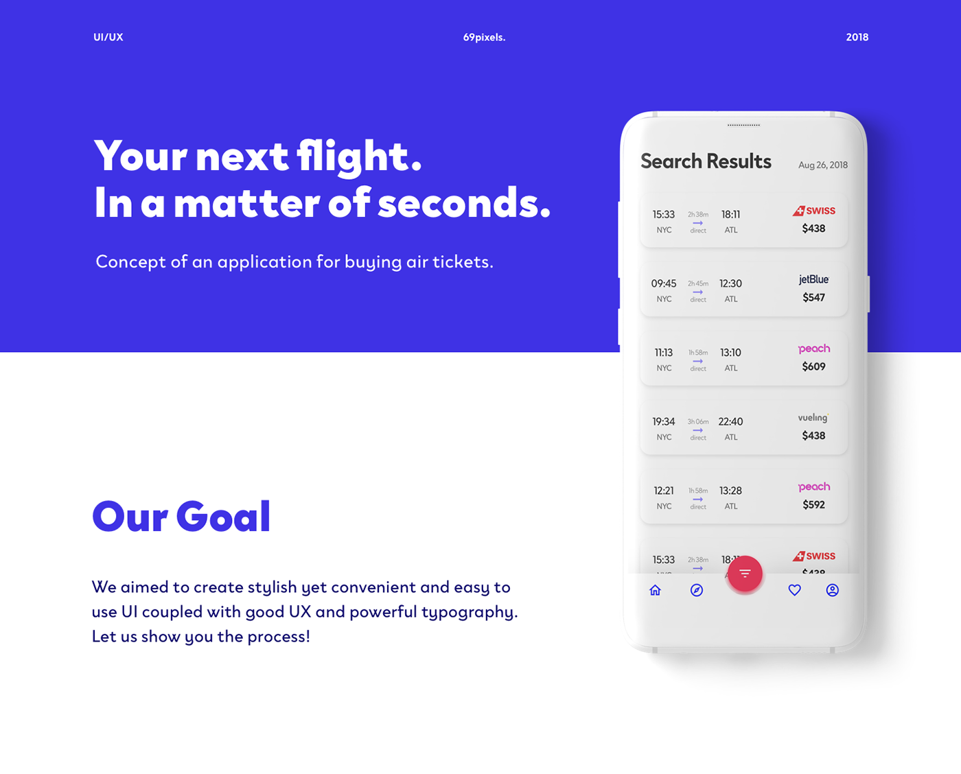
Mobile Flights App Concept

Citybank mobile app redesign
Hello everyone, we re-designed the banking application for Сitybank. It was a difficult and not an easy task, since hundreds of thousands of application users from all over the world should receive truly valuable experience. City, Citygroup, Citybank 👍
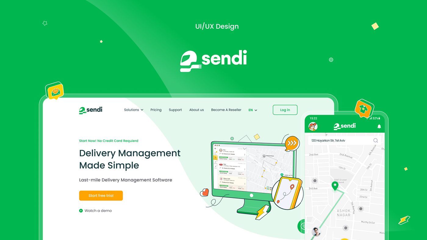
Sendi - delivery website and mobile app
Sendy will give you the opportunity to combine new orders with free couriers - this will help you save time. Track the feedback of each delivery, as well as track the movement of the courier using GPS in your phone.

Mobile app to search for game consoles
Mobile app to search for game consoles .
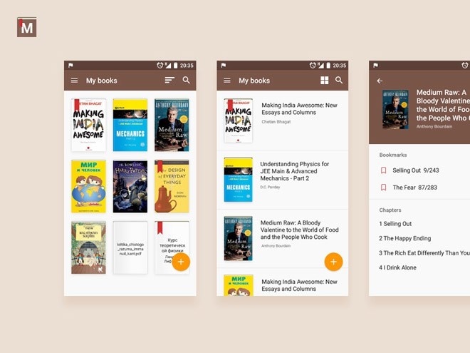
Mobile Book Reader App UI PSD
Concept design for Disney+ mobile app
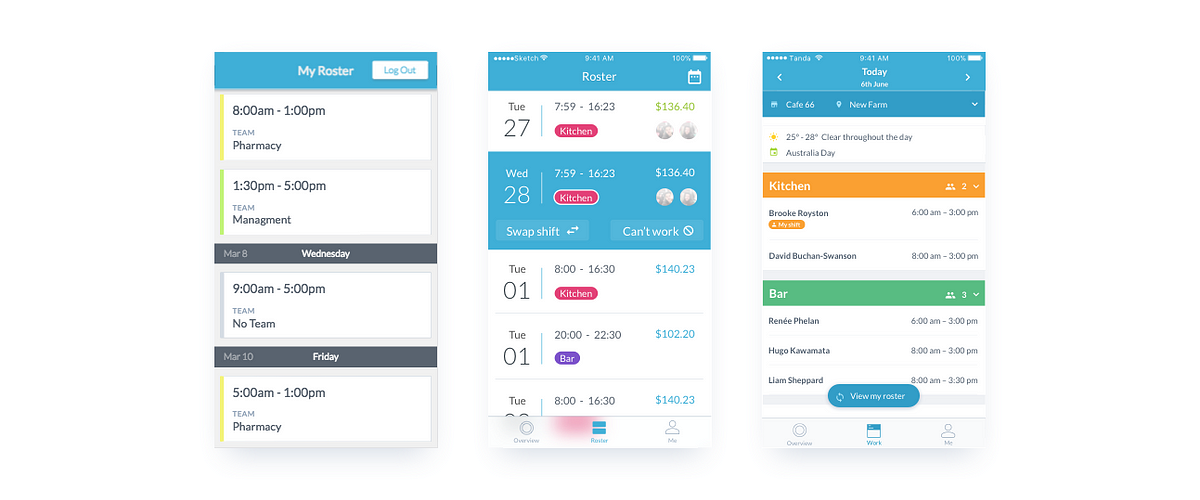
Designing Rosters in the Tanda Mobile App

UX design for Wings flight search mobile app
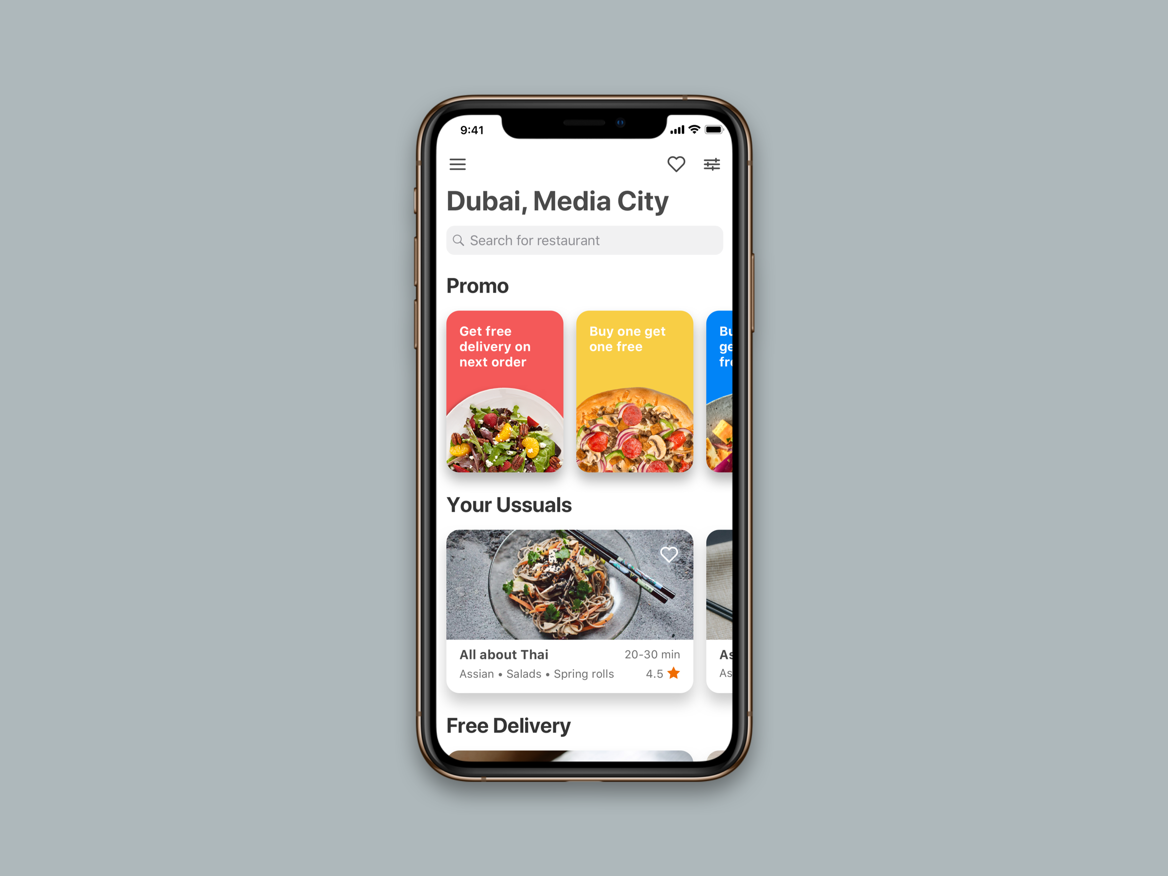
FeedMe Mobile App
Clear and user-friendly design of food ordering mobile app.
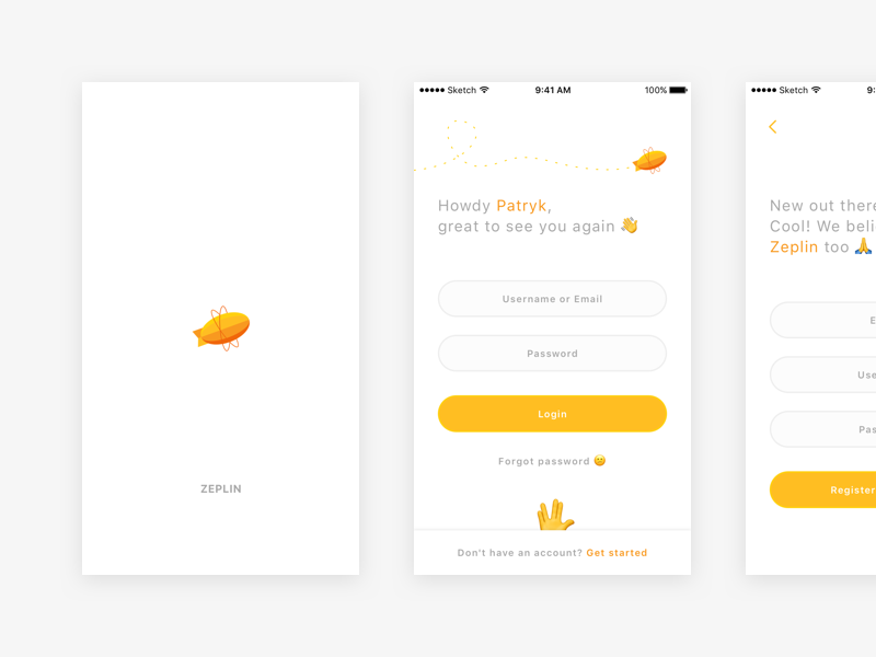
🎈 Zeplin – mobile app
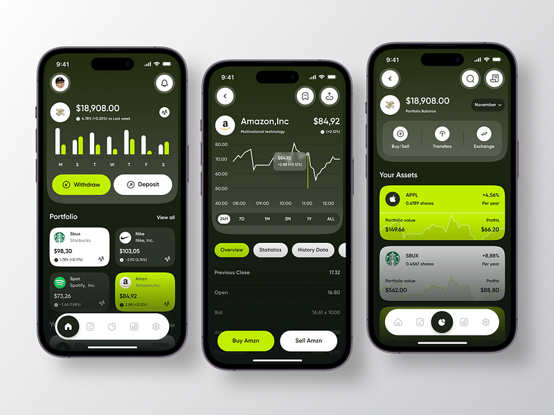
Investment Mobile App 💸
App Mobile
Social Mobile App
“Color is a power which directly influences the soul.” Wassily Kandinsky I am open to new projects! an.marinicheva@gmail.com Tips, freebies and giveaways on my Instagram 🎁
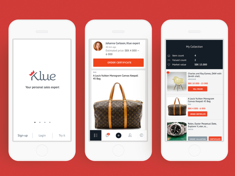
Klue mobile app
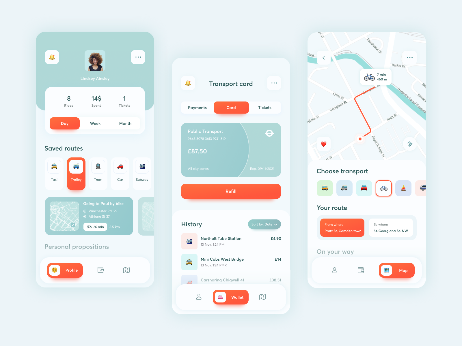
Public Transport Mobile App
👉 Instagram 👉 Behance Public transport is the essential thing of everyday life. I can confidently say it’s the app I’ve always wanted to have in my smartphone: navigation app and wallet, the possibilities to navigate easily 🗺️ and refill my transport card 💳 just in two taps. The main focus - big and easy-to-tap buttons, required minimum of functions. Handy to use on the go. All public transport in your hand. Literally. My friends Toma Li / Ivan / Sergey from Blacklead Studio create amazing things. Check their stuff.
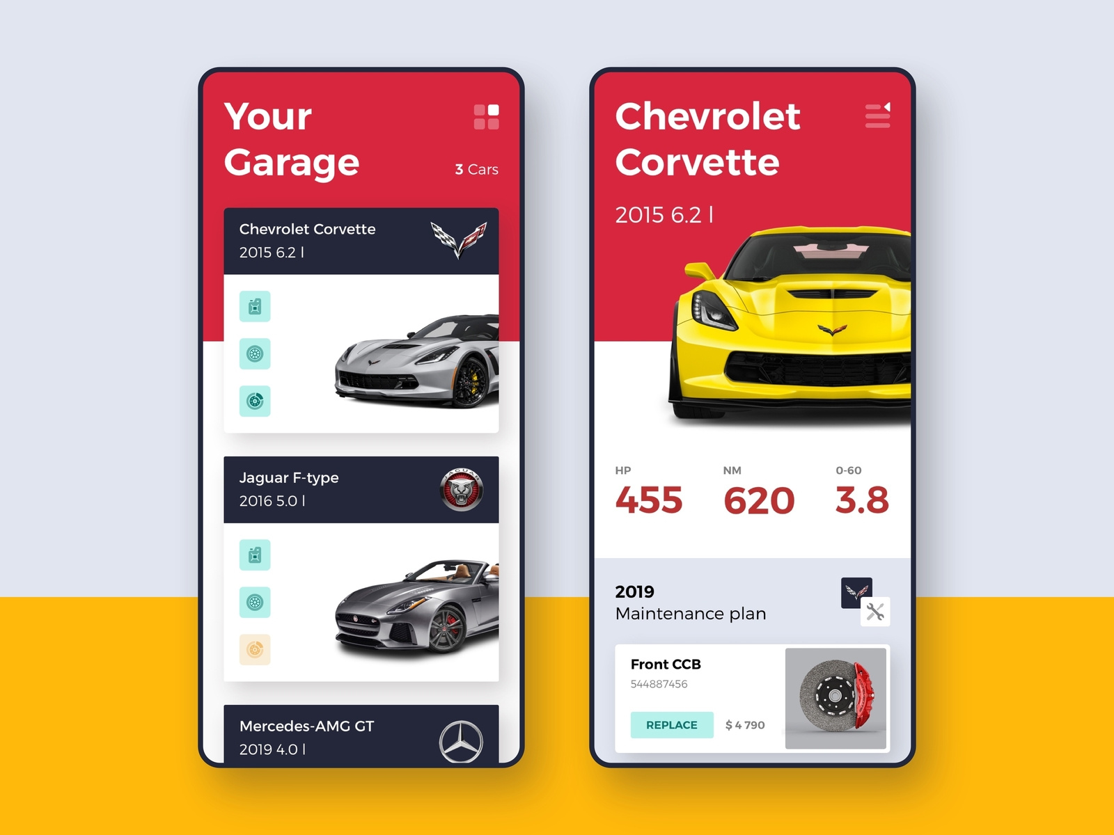
Drivelab | Mobile App
Hey guys, Here is a new wip app for a motorsport service company. The app reminds you about future maintenance, allows you to make the online reservations and ask your serviceman in case you need any help. Hope you'll like it. Have a project for us? We're currently available and If you have a project in mind just hit us at hello@materio.agency Cheers!
Drivelab | Mobile App
Get access to thousands of freshly updated design inspiration pieces by adding Muzli to your browser.
Loved by 800k designers worldwide, Muzli is the leading go-to browser extension for creative professionals.
How to design a Mobile App
Designing a mobile app is a dynamic blend of creativity and usability. In today's fast-paced digital landscape, creating a mobile app that captures users' attention while delivering a seamless experience is essential for success. In this article, we'll explore the key considerations for designers when embarking on a mobile app design project.
User-Centric Design
Your mobile app's journey begins with a user-centric approach. Dive into user research, create detailed user personas, and actively seek feedback to ensure your app meets the unique needs and expectations of your target audience.
Platform Guidelines
Both iOS and Android have their design guidelines that are indispensable for creating a cohesive and native experience. Adhering to these guidelines ensures your app feels at home on the platform and makes navigation intuitive for users.
Responsive Design
Mobile devices come in all shapes and sizes. Your app must adapt seamlessly to various screen sizes and orientations. Prioritize responsive design principles to create an app that looks and functions flawlessly on devices ranging from compact smartphones to larger tablets.
Intuitive Navigation
Simplicity is key to navigation within a mobile app. Establish a clear hierarchy and use common navigation patterns, such as tab bars, navigation drawers, and gesture-based interactions. Make sure users can explore your app effortlessly and without confusion.
Typography and Readability
Typography is a crucial aspect of mobile app design. Choose legible fonts and maintain a clear hierarchy of text sizes to guide users through your app's content. Pay close attention to factors like line spacing, contrast, and color choices to ensure readability.
Visual Consistency
Consistency is the backbone of an exceptional mobile app. Maintain a unified color scheme, typography, and iconography across your app to create a visually pleasing and coherent user experience.
Icon Design
Icons serve as visual cues for actions and features within your app. Craft icons that are visually appealing, easily recognizable, and align with platform-specific design principles. Vector-based icons can help maintain a sharp appearance on various screen sizes.
Accessibility
Ensure your mobile app is accessible to all users, including those with disabilities. Implement features like scalable text, alternative text for images, and compatibility with screen readers to provide an inclusive experience for everyone.
Performance and Speed
A snappy and responsive mobile app is key to retaining users' interest. Optimize images and animations, minimize unnecessary network requests, and utilize techniques like lazy loading to enhance loading times. Slow-loading apps can lead to user frustration and abandonment.
User Testing and Iteration
User testing is invaluable. Continuously collect feedback from real users and use it to refine your design. Embrace an iterative approach to ensure your app evolves and improves, addressing usability issues as they arise.
Designing a mobile app is a dynamic journey that fuses aesthetics with functionality. Embrace user-centric design, adhere to platform-specific guidelines, and focus on essential elements like navigation, typography, and performance to create a mobile app that captivates users and excels in a competitive digital landscape. Remember, your journey doesn't conclude with the app's launch; it's an ongoing process of enhancement and refinement to provide a top-notch user experience that keeps your audience engaged and satisfied.