
Get thousands of Contact page examples for free
Join over 700k others who enjoy Muzli design inspiration hub.
We curate topical collections around design to inspire you in the design process.
This constantly-updated list featuring what find on the always-fresh Muzli inventory.
Last update: 4/24/2024

How can your customer reach you? If a client arrives on your website after searching on Google, what can they do to take the next step in a relationship with your brand, without buying anything? One of the primary aims of any website is to drive conversions. However, it usually takes between 5 and 8 […]


Every great website needs a contact page. You can set this up on a static HTML site or a CMS like WordPress which offers a lot of flexibility &... The post Designing A Usable Contact Page In WordPress: Tips & Trends appeared first on Onextrapixel.

One page personal portfolio psd template .if you hire me? contact me : siocoders@gmail.com

Visitors who come to your website have many different reasons to stop by your contact page whether you’re a social… The post 7 contact page design tips your visitors will love you for appeared first on 99designs.

Contact Us Landing Page Concept Art- Vector Illustration
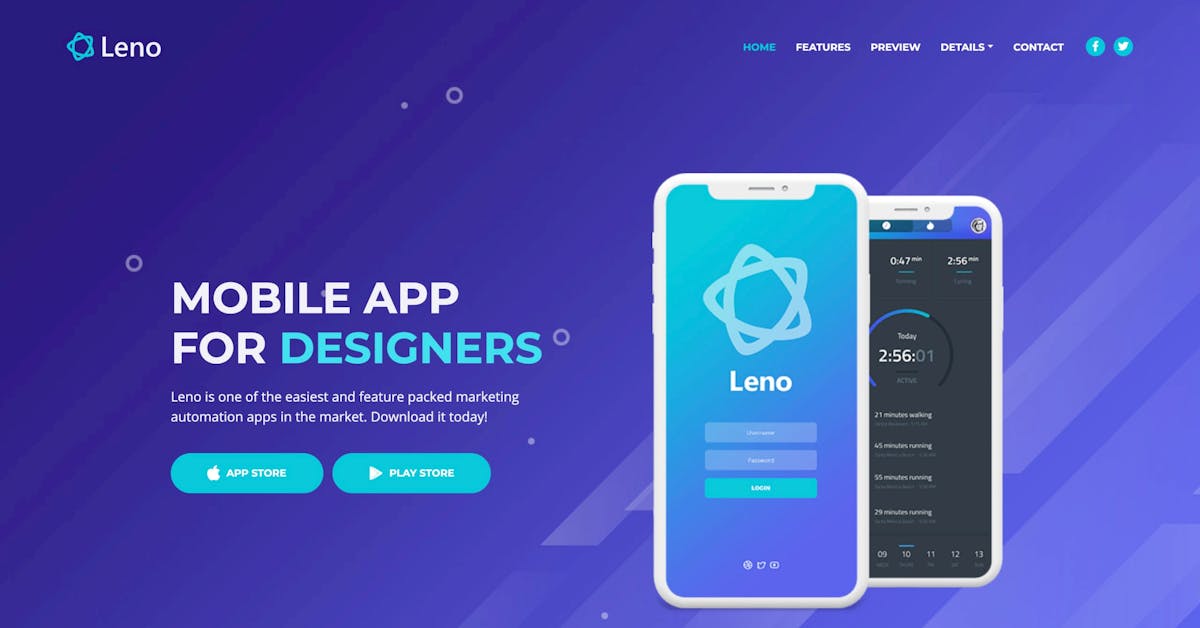
‘Leno’ is a free One Page HTML app template built by Inovatik. Features include a sticky header navigation that smooth scrolls to sections, clear intro CTA buttons with alongside devices, testimonial slider, impressive feature carousal, video modal, slick lightbox functionality, stats and a contact form. This is one of the better free Landing Page templates […]

A properly designed and functioning website landing page is a thing of beauty. It greets customers warmly, informs leads, and even collects customer contact information. It presents news and information relevant to its industry, and shares internal and external communications.

Digital Agency Website TemplateCheck out this new landing page design idea for Digital Agency. Let me know your feedback, So feel free to leave your comment 👇If need any help, Please contact me at tarik@bluespace.agencySkype: toushif.tarik

One page personal Creative portfolio psd templatecontact me : siocoders@gmail.com

Hello GuysSaaS Hosting is useful template and web elements for hosting company, modern colors, elegant curves and simple forms, free and bonus icons and Helvetica Neue Fonts. Each PSD file is well organized. And also if you need more additional page then contact me without any Hesitation. If you Like my work don’t forget to give a thumbs up or Press L

Hi There,Great to see you guys again. Let’s meet my latest work. My latest work is a Food Landing Page Website Design. This can help you find your food from the website and app.Show your ❤️and stay with us.📩 Contact us for your upcoming projects We are available for new projects uixzonebd@gmail.comFollow UsInstagramBehance

Hello GuysSaaS Age is a template for startups and companies who make business out of software and saas products. It comes with numerous customizable and reusable components that are designed to fit as many purposes as possible. And also if you need more additional page then contact me without any Hesitation.If you Like my work don’t forget to give a thumbs up or Press L

Hello GuysThe Landing page for your new online shop. It comes with numerous customisable and reusable components that are designed to fit as many purposes as possible. And also if you need more additional page then contact me without any Hesitation.If you Like my work don’t forget to give a thumbs up or Press L
Hello GuysSaaS Age is a template for startups and companies who make business out of software and saas products. It comes with numerous customizable and reusable components that are designed to fit as many purposes as possible. And also if you need more additional page then contact me without any Hesitation.If you Like my work don’t forget to give a thumbs up or Press L
“Powers That Be” Established in 2018 and launched earlier this year, Dimple is a new daily disposable contact lens subscription service in Australia. Looking to stand apart from the four manufacturers that control 97% of the contact lens market in Australia, Dimple is a direct-to-consumer brand and focuses on the millennial market. As a bonus, $1 from every monthly order goes to Guide Dogs Australia. The identity and packaging for Dimple has been designed by Sydney, Australia-based Universal Favourite. Logo. Although there isn't much to the logo at a quick glance, there is actually a lot going on here with the subtle angles in various places, particularly the "l" and the "e". They almost look like mistakes and I'm not sure how much they are needed but they certainly add a touch of quirkiness. Other than that, it's a fairly innocuous sans serif with a colorful tittle. The identity we created comes from the fact that, for the most part, everyone's left and right eye prescription is different. We created an illustrative suite of 60 colourful, complementary circles that correspond to each power number (from -12.00 to +6.00) and combine to show the vast number of combinations of individual prescriptions.Universal Favourite project page Unique visual "IDs" for each power number. All the IDs. And the brand system doesn't just look beautiful, but answers a huge flaw in existing contact lens blister packs. By creating these custom patterns (IDs) for each individual power number and displaying them boldly on each blister, it's significantly easier for users to identify the pack that's specific to each eye... especially when they don't have their contacts in.Universal Favourite project page How they work together when depicting left and right eye combinations. The real hero in this identity is the icon system that assigns a graphic representation for each prescription power increase. Although it might be tempting to try to derive meaning from each configuration or be sarcastic by saying "Of course, two half circles in lavender and orange mean +01.75" the system is about providing each consumer two distinct visuals for them to associate with their left and right eyes and I can empathize: Once outside their packaging, I have to write with a black marker "L" or "R" on the "blister" packs of my contacts because I can never remember which one is my fucked up eye that needs the -2.75 power. (It's my left, btw.) Aside from being helpful, the combination of power IDs look great and it's quite amazing that Dimple committed to printing them on the blisters, which I am sure was the path less traveled in the industry. Website. Packaging was a hugely important component to this task. As a direct-to-consumer company, we wanted the unboxing experience to be an utterly unexpected delight. From the blister packs coated in our custom pattern IDs to the boxes, mailers, sleeves and monthly information cards, we designed the entire packaging suite with our millennial market at the forefront of our minds.Universal Favourite project page Outer packaging. Inner packaging. Lots of packaging. The packaging is quite nice, with a strong set of colors for each "layer" of packaging, starting with green on the outside, orange holding the two blue boxes, and culminating in bright white blister packs with the colorful ID accents. It's a really nice set of gradual steps and the design is kept minimal and attractive. The only thing I question, on the packaging and website in general, is the combination of the light serif and medium weight sans serif... I sort of like it, but maybe it needed one more degree of separation, perhaps one bolder weight on the sans. Nonetheless, it's a minor quibble in an otherwise nice identity. The art direction we took for the launch centres on a vibrant community of contact lens wearers and packs a highly visual punch. Shot by Jonathan May, it celebrates the individual quirks of each member of the community and the freedom to have fun that contact lenses provide them.By partnering with the Benito Martin and Jessica Johnson dream team for our product shoot and Lyndon Foss for our lifestyle shoot, we built a comprehensive and flexible suite of brand assets that could be used across web, communications, social and advertising in the year following the launch.Universal Favourite project page Lifestyle and promotional shots. Your browser does not support the video tag. Promo video. While the identity and packaging are simply strong, attractive designs that don't overly pander to the millennial crowd, the lifestyle photography and promo video go a little more heavy to the deep end of that spectrum which, to an older crowd, like me, can be off-putting but, hey, you gotta play to your core audience. My only real question to millennials, after seeing the very final scene of the video, is are you really always dancing to everything? But I digress, overall, this is a strong entry into the market, with an identity and packaging that feel clinical enough to shove the product into your eyeball but fun enough to take a photo with it for your Insta fam.

Hope you like it.For you need help related landing page designcontact: mahbubuiux@gmail.com

Mechanic WordPress theme - Auto mechanic car repair workshop theme is created as a wonderful solution for any cars and automobile websites, cars repair workshops, auto blogs, car services and other industrial websites that require special cars niche functionality and auto service presentation https://visualmodo.com/theme/mechanic-wordpress-theme/Mechanic Car Repair theme features fully designed and integrated WooCommerce shop plugin compatibility, as well as many shortcodes to show your auto products and car parts. You can add pricing tables on your website as well as showcase your car repair services as a gallery http://www.mojomarketplace.com/item/mechanic-wordpress Build any mechanic site design without coding! You can have a fully equipped website up and running within just a few minutes. Mechanic WordPress theme is not just a template, it’s a collection of amazing examples with tons of features.🚙🚘🚗🚐🚍🚛 #WordPress #Theme #Mechanic #Services #Blog #Responsive #SiteBuilder #WebDesign #Business #WorkshopPreview site https://theme.visualmodo.com/mechanic/

Hello GuysSaaS Age is a template for startups and companies who make business out of software and saas products. It comes with numerous customizable and reusable components that are designed to fit as many purposes as possible. And also if you need more additional page then contact me without any Hesitation.If you Like my work don’t forget to give a thumbs up or Press L
One of the main drivers of business success is good customer relations. Companies must listen to their customers and take appropriate action. Many online businesses collect feedback from their customers through online forms. You can see these forms on the contact page of almost every website. They ask for the following basic information: Name Email...
My new print - 4 colour silkscreen printed on paper 270gsm, 30 x 42 cm, limited edition. This prints is hand screenedby studio @thearchivistproject now available for order Even number contact my email rukkit_k@hotmail.com , or my page Facebook.com/rukkitworks Odd number contact The Archivist Singapore contact Habitual
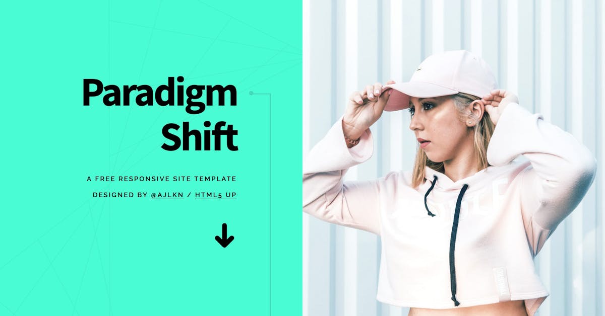
‘Paradigm Shift’ is a centrally-divided but also long-scrolling One Page HTML template by HTML5 Up. The freebie offers everything you’ll need to for a personal or portfolio website including big image intro, biography/about, multiple image galleries (with big image pop-up browsing) and ends with contact details with alongside enquiry form. If you want the attribution-free […]

Hello GuysHere is the Home & Search page for FoodPie App, I will design all the page for the app, and if you need any page for that app, just contact me, Thank YouCheck The Log in Page: https://www.uplabs.com/posts/log-in-page-for-food-app

Hello Designers :)Try to make a minimalist travel landing page to easier list the destination.Let me know your Awesome FeedbackDont forget to Like❤ it :)Thankyou !!📩 Contact us for your upcoming projects We are available for new projects uixzonebd@gmail.comFollow UsInstagramBehanceDribbble

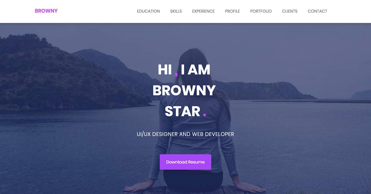
‘Browny’ is a free CV-style One Page HTML template built on the Bootstrap Framework. The long-scrolling resume template features a fixed header navigation that smooth scrolls to sections, and intro biography, skills graph, work history timeline, a simple portfolio section that needs to link out, client logos and ends with a contact form. Thanks for […]

Hello GuysHere is the Home & Search page for FoodPie App, I will design all the page for the app, and if you need any page for that app, just contact me, Thank You

Hello GuysHere is the log in page for FoodPie App, I will design all the page for the app, and if you need any page for that app, just contact me, Thank You

Hello GuysHere is the log in page for FoodPie App, I will design all the page for the app, and if you need any page for that app, just contact me, Thank You

SinglePro is a product landing page PSD template. It is suitable for online product marketing purpose. Any company or marketer can marketing their product with the landing page.If you Need any Design, Don't Hesitated to Contact Me Thank You

Hi lovers!Here is the another minimal Product Landing concept. Hope you guys love it. :)Watch landing page design. Press 'L' for show love and give your valuable feedback.Hope you guys will like it...!!!Do you have any project ?Feel Free to Contact me :alaminhossen.75bd@gmail.com
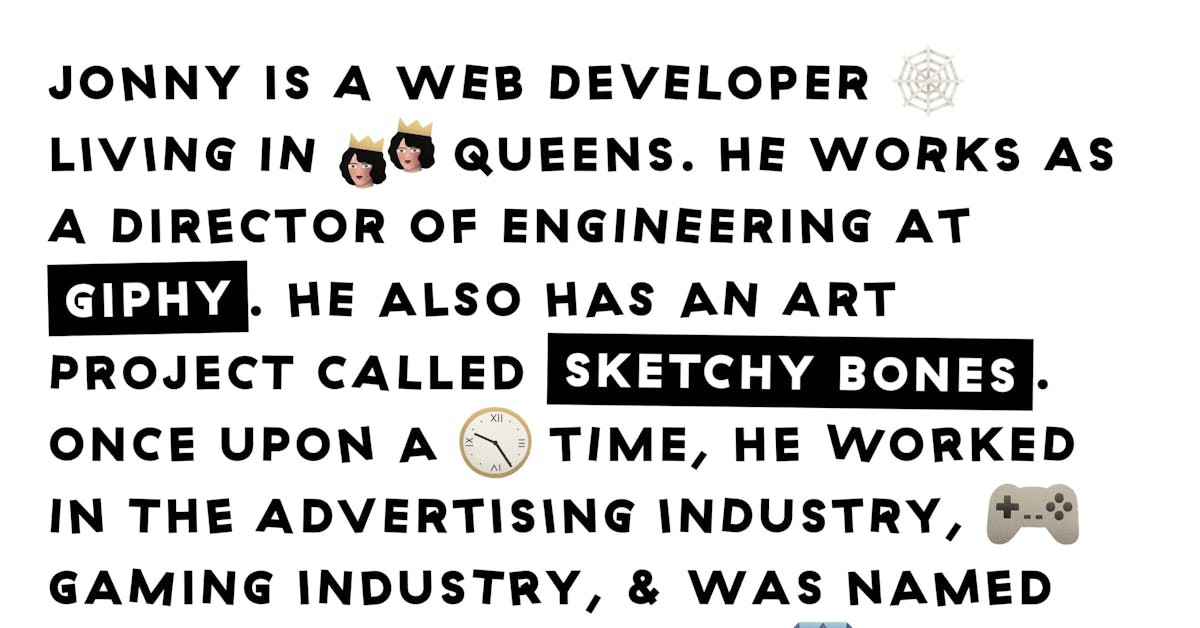
Such a fun One Pager for front-end developer & illustrator Jonny McLaughlin featuring interactive tiger claws that bash the page content around. Just when you think you’ve experienced it all, you hit the contact link and a massive claw swipes the content away revealing his social links. Bravo! Full Review | Direct Link

Hello Guys,This is one of the new App concepts for virtual reality. If you need any additional page, contact me directly. Thanks

I wanted to have a more classic material in my portfolio, so back to tiles I went. I had a lot of fun mimicking zbrush style sculpting again. I got inspired by this video from Arte: https://www.youtube.com/watch?v=sQMg_EwiUzU that made me wonder why everywhere is getting boring squared tiles. 100% procedural, 100% Substance designer. Rendered in Marmoset Toolbag ------ Artworks on this page are protected by copyright and may not be used for any commercial or non-commercial purpose without the express written permission of the copyright holder. Any unauthorized use of the artwork, including but not limited to AI training, is strictly prohibited and may result in legal action. By accessing this page, you agree to abide by these terms and conditions and to respect the copyright of the artwork displayed on this page. The copyright holder reserves the right to modify these terms and conditions at any time without notice. By using this artwork/picture for any commercial or non-commercial purpose, including but not limited to AI training, without specific prior agreement with the copyright holder, you agree to contact and pay the copyright holder 5 thousand billion dollars.

Hello guys, This is my new template for business, I used all kind of design tool to create this, if you need any other page, contact me. Thanks
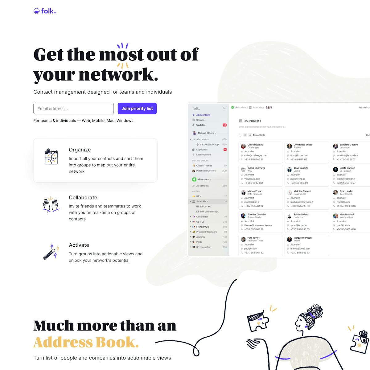
Long-scrolling Landing Page for contact management app Folk. The previews are comprehensive with interactive big image screenshots sorted by use-case. Full Review

See the Code - See it Full Page - See Details A responsive 3d contact form. This Pen uses: HTML, CSS, JavaScript, and
A lot of people mistakenly consider the app stores for the only sources of traffic to their mobile apps. That’s not the case.The truth is that you will actually need a central hub of marketing your app — somewhere you can grow your mobile app’s audience by creating an overall sense of excitement around it.That’s the exact reason for which every mobile app needs a well-made and optimized landing page.Alright, so What’s a Landing Page?You can think of it as a very specific, targeted web page which is solely created to promote a product or a service. It’s typically used by marketers in order to capture leads through online forms or any other content which is behind the gate.Hence, a mobile app landing page will be specifically designed to promote your mobile app. It should properly describe the features of your app and its value proposition so that everyone who goes through it will be enticed to click, download, and consequently install.Keep in mind, though, that this is likely to be the first contact between your mobile app’s brand and your potential customer. This is why it needs to be absolutely crystal clear regarding the problems your app is solving.There are plenty of tips for designing an effective landing page in 2019 that you can take advantage of. Below, however, we’re going to go through some basic elements that you need to keep in mind.Main Elements of an Effective Mobile App Landing PageWhile that’s not necessarily true for every mobile app landing page, these are the elements that you can expect in the majority.The Call-to-Action (CTA)The CTA is likely to be one of the most important things that you would have to consider when creating your landing page, or when you have someone create it for you.It’s that propeller which is going to drive action from the user — something that prompts him to react. Usually, call-to-actions are spread throughout the entire landing page.It’s important to be both subtle and, at the same time, tempting enough to cause an action. Regardless of whether you’re using a button, a form, or a simple text link, this CTA is one of the most important elements that your landing page will need.The HeadlineYour headline is another critical element of your landing page design because it’s the first thing your reader will see.You need to guarantee that it properly communicates the value of your application. It’s not necessary for it to be witty or clever — it just needs to drive the point home that your reader needs your app. Or, at the very least, it needs to intrigue him enough to stay on the page.The Body CopyThis is usually the part of your landing page where you are going to list out some strong suits of your app — its benefits. You need to provide as much copy in order to answer your readers’ unasked questions.You should also satisfy their motivation to get to your landing page — why did they do it in the first place?Now, there’s no pre-set rule of how long your copy needs to be. Typically, the shorter it is — the better. After all, you don’t want your reader to be overburdened with text.The Social ProofSocial proof is very powerful and that’s why it is omnipresent in a range of different mobile app landing page designs.You need to figure out a way to show to your reader that your mobile app is trustworthy. Normally, a lot of designers would showcase the glowing user reviews or any testimonials from some big-name customers. You can also display any awards that the application has managed to get or any recognition if there is some.Enticing and Attractive MediaThat’s the only thing that’s going to make your mobile app landing page stand out and be different than the rest.Media — your chosen images and videos, will become the eye candy to your page — it’s as simple as that.The goal of your visuals isn’t to build a beautiful app landing page but to enhance the overall story that your body copy is trying to tell.Hence, it’s particularly important not to disconnect the media elements from the overall vision for the app and what your story’s about.Some Extra Tips and TricksNow that we have the basics all sorted out, allow us to throw in a few extra tips that will make your landing page a lot better.#1 Keep it ShortAs we hinted above, your copy is better off if it is short. Why? Well, because of attention spans. You need to make sure that you only keep body copy which adds value to your page and take out all the filler.You can use bullet points in order to outline the essential information — this is something particularly important.#2 Make it SpecificIf you can attribute your application to a certain community — that would be awesome. In fact, that’s one of the things that you ought to be aiming for.It’s a lot easier to start getting a relatively smaller group of targeted people excited about your mobile app than the general public. You can leverage communities to increase mobile app downloads.It’s a common misconception that your app should be targeting a large audience. While there’s nothing wrong with that, it’s also a lot more challenging to make it successful, and it will take a whole lot more of your resources.#3 ExplainMake sure that the benefits of your app and the problems that it solves are properly communicated. If you can sell your users on the value proposition early enough, you will be able to convert them into a customer fairly quickly.Keep in mind, thought — the simpler your copy is, the better.ConclusionA landing page for your mobile app is something that can undoubtedly enhance its overall online presence. Moreover, it can be used as a hub for all of your marketing efforts, bridging the gap between your mobile app and your potential customers.How to Create a Mobile App Landing Page That Drives Downloads was originally published in Muzli - Design Inspiration on Medium, where people are continuing the conversation by highlighting and responding to this story.

Hello Friends,This is a home page of Directory listing template. you can create beautiful directory listing site using this template. if you need any other page, contact me. Thanks

Hello GuysAppDot is the only App Landing Page you will ever need, this design has an extremely well layered where you will be able to find everything you need in an instance.. if you need any inner page, please don't hesitate to contact me.

Hello GuysBitcoin is a clean, modern and industry-specific PSD template, Do you want to create the ICO website and ICO landing page? So this template is perfect for you ICO website. if you need any inner page, please don't hesitate to contact me.
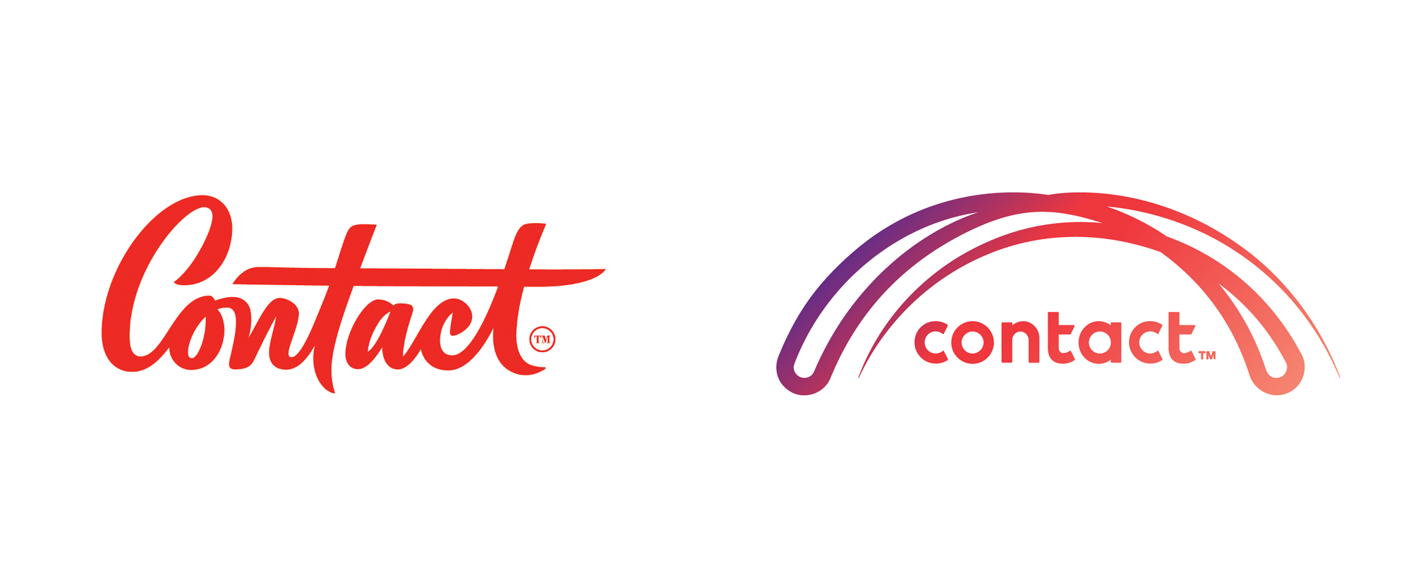
“Arch-nemesis” (Est. 1996) "Contact Energy is one of New Zealand's leading energy generators and retailers. We supply electricity, natural gas and LPG to 562,000 customers across the country, with a focus on delivering great value, products and services. Contact owns and operates power stations throughout New Zealand. These include hydro power stations on the Clutha River in Central Otago, geothermal plants around Taupō, and gas-fired power stations in Taranaki, and the Waikato. We're especially proud of our world-class expertise in the development of geothermal energy projects. Contact's an integral part of the national economy and our local communities. We empower the over 1,050 people who work with us to achieve great things, and our sponsorships and partnerships reflect our deep connection and commitment to the communities in which we live, work and operate." Design by Bob’s Your Uncle (Auckland, New Zealand Related links Bob's Your Uncle project pageContact press release2013 Brand New Review Relevant quoteThe design, which we are calling the arc, has been chosen as a symbol of the energy that connects and surrounds us. It represents our desire to be continually growing and striving to the future. We think it suits us to a tee. It shows that we genuinely care for our customers, our communities, our people and shareholders every step of the way. Images (opinion after) Logo. Your browser does not support the video tag. Logo animation. Ads. "Fairness" and "Control" spots. Opinion Not to repeat myself too much from the 2013 Review but the old logo was a great piece of lettering… for the wrong company. It simply didn’t look like a major energy company and while I’m all for breaking conventions some conventions are better left unbroken, like an energy company looking like a big corporation and not an art supply store. The new logo, for better or worse, brings back Contact into the realm of looking like a corporation. Unfortunately, I do think think it’s for the worse as the logo has a weird, unbalanced, and trite approach. The mega swoosh that bounces back and forth atop the wordmark is stiff and harsh and huge in relationship to the wordmark which has suffered the usual case of custom-itis in trying to turn a geometric sans serif into something more than it needs to be. The gradient doesn’t do the logo any favors either and simply adds to its visual noise. Both the logo animation and the animated graphics in the video show more potential than the logo itself — I think the bouncy-arc-bridge-thing could have been salvaged with a better execution and the more “human” style of the flourishes in the video could have been a better, um, bridge between corporate coldness and human warmth.

The luxurious - hotel booking PSD template is a cutting-edge Photoshop template for a hotel booking online website that gives designers the ability to produce a polished final product. the ideal template for hotels, resorts, villas, guesthouses, and other lodging establishments that wish to showcase all rooms in the best light. This PSD template is simple to modify since each PSD file is carefully layered and provides a list of the groups and layers hierarchies for quick access. With just a few clicks, you can quickly replace any photo with one of your own.Live Preview : https://maraviyainfotech.com/projects/luxurious-psd/Hope you guys enjoy and press "L" if you like it ❤️FEATURES :15 layered PSD filesClean and modern designBased on 1300px Grid System.All pages is fully layered and organized with proper names.Professional and Creative DesignEasily customizable Photoshop files.Pixel Perfect.Free icons usedExtended documentationGreat support 24/7And many more…PSD files include:Home pageAbout-us pageBlog-classic pageBlog-details pageContact-us pageFAQS pageGallery pageHotel-Facilities pagePricing pageRestaurant pageRoom pageRoom-details pageServices pageSpa pageTeam pageFonts:RobotoCardoResources:Icons :www.flaticon.comImages :www.freepik.comThe images used in the template are not included in the main download file, they are only for the preview purpose.

Hey, buddyThis is a Plant Shop Landing Page Design...Hope you guys will like it.Contact me for personal projects:Say hello: E-mail- arifat085@gmail.comFollow Me - Facebook | instagram

‘Export’ is a free HTML template by Free-Template.co. The template can be used as a portfolio and even product/service Landing Page. Features include sticky header navigation (that smooth scrolls to sections), good whitespace, statistics, project slider with Lightbox gallery functionality, neat testimonial slider, services slider, pricing table, video modal, contact form and newsletter sign up […]

Hello Folks,Please have a look at the Contact Us Page DesignLet us know your opinion and Stay with me Happy Designing :)Share the love by pressing 'L' if you like this shot :)for Project Inquiry email: sohidurr358@gmail.comFeedback is always appreciatedThank you!Follow me: Dribbble | Behance | Twitter | LinkedIn | Instagram
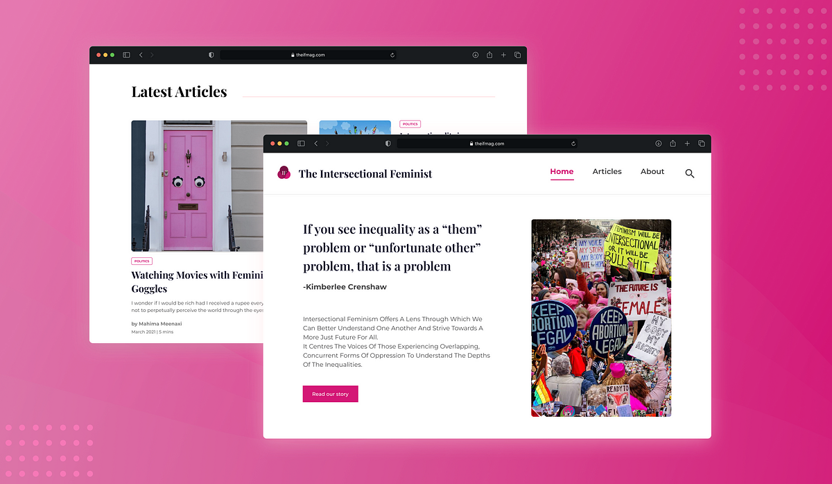
This project elaborates on the design decisions taken while redesigning a website for The Intersectional Feminist from scratch. The project took about a month and a half to design & develop.IntroductionThe Intersectional Feminist is a pioneer online magazine dedicated to creating content relating to intersectionality, which looks into promoting social & political equity amongst all segments of society.Who are the clientsThe magazine is powered by a group of passionate women from all walks of life-lawyers, engineers, young editors, and illustrators from varied regional, cultural, and educational backgrounds.“We strive to celebrate diversity by representing varied geopolitical, ideological, and linguistic identities through our writing.”Scope of workTo redesign & develop the entire website to enhance the look & feel.To capture the essence of their story and spin a narrative around that.To create a more engaging experience for readers, while educating first-time readers about the breadth of topics they specialize in.Note: The design of the website was a collaborative effort. We tried multiple design options that appealed to our design sensibilities before going live.The singular focus of the IF team towards striving for equality struck a chord in me & further fueled the desire to create a meaningful design for the cause.Here’s a preview of the website. Do have a look at the website, since it is now liveHere’s a sneak peek of what the redesigned home page looks like!https://medium.com/media/ae04c8827be474bf4ccd1d34ac5afe14/hrefIdentifying high-level problemsSince there was no preliminary data on what the website readers were feeling, preliminary assumptions were made on what improvements could be made.Brand identity is not cohesive: There is no indication of what the website’s vibe is, nor is their clarity on what the website’s core functions are.No defined color scheme: Too many different colors are used throughout the site. These are inconsistent with the logo & create visual chaos.Multiple typography styles: Multiple types of font result in a lack of visual cohesiveness.Complex navigation: Having six tabs for a growing website where content is still being generated leads to unnecessary complications while exploring different sections of the website.Competitive AnalysisTo begin with, other competitor blogs were studied & the UI was thoroughly analyzed. This was a starting point in defining what vibe the website would exude. Awwwards & Site Inspire were referred to for drawing inspiration in the preliminary stage.Home PageProblems with the old designHero section lacks context: For a first-time user, there is no context about what the website is about. There is also no information about what intersectional feminism is.‘Editor’s choice’ section lacks visual appeal: Having a carousel to view articles may not be the best experience, as it prevents a user from viewing multiple articles at one glance. The background was drawing attention away from the article cards.No scroll journey on the home page: This is the page where ample information about the organization’s goals & stories could have been mentioned, to provide ample context to the user.Confusing navigation: Having 6 tabs for a website that is still growing seemed unnecessary. Toggling between these tabs repeatedly was complicated. The tab does not signify the active page. This can lead to confusion in the user’s mind about which page they’re currently viewing.Two headers create visual chaos: Especially since they are visually distinct with a number of elements ( i.e. tabs, social media icons, contact details) The contact details, social media handles are de-emphasized too much.Footer is not aligned with the home page colorsBefore vs After-The Design Process1. Improving navigationFor a team that was still growing & scaling the amount of content on the platform, providing lesser tabs seemed like the primary change to the design. Improving the brand identity of the team was also essential.2. Enhancing brand identity-Landing pageHaving a single quote that defined The Intersectional Feminist was not sufficient in providing adequate context to readers.On every screen, a user must have clarity in the functions that ought to be performed. Providing relevant context to readers is of the utmost importance.3. Editor’s Choice & Latest ArticlesThe intent was to showcase a diverse series of articles, so as to appeal to a larger audience. It was also essential to highlight the relevant data points keeping in mind the visual hierarchy.Displaying only 1 article with a carousel does not do justice to the quantum of work done by the IFMAG team & results in an average browsing experience, from the reader’s perspective.The Editor’s Choice & Latest Articles sections are also separated from one another to minimize the visual load for the reader.4. Redesigning the footerThe dark backdrop in the old design was not cohesive with the brand identity. Also, there were too many visual elements that needed to be simplified.Exploring Articles1. Article categories:Currently, a user must use the drop-down menu to toggle between different categories. This hinders the reading & discoverability of new content for a user. This transition between different articles can be a lot more friction-less.Discovery of article categories must be seamless. A reader must be able to toggle between different categories with ease.Collapsible header categories seemed to be the simplest, most easy to use & implement, so those were adopted.2. Redesigning the article card:The visual hierarchy of data points in an article card needed to be refined, so that data was easier to digest. It was also essential to include the average reading time per article.About PageProblems with the old designVisually chaotic cards: This makes the team lack cohesion as a single unit.‘Read more CTA’ is distracting: Having a concise copy would negate the need for a CTA & improves the scannability of data.One of my favorite parts of the entire redesign for this website was the ‘about page card hover state.’ Check out the redesigned about page below.https://medium.com/media/859ae07f79cfb437208eb2139312f402/hrefRebrandingDefining the typography & color schemeThe design brief was to incorporate pink as the primary color, since it was in the logo. But to pair it with other accents that would bring out the beauty of the brand. A new typeface seemed like a mandatory change as well. The intent was to have a reader instantly know what the website was about. Using a serif font seemed like the perfect choice!User Testing8–10 users were interviewed over a video call/phone call & the website was showcased to them. They shared feedback on what their views on each screen were & how they felt on each screen.This was an important stage in the process as it made us relook at the design from the user’s perspective & further refine the website.Check out the Figjam file to take a closer look at what our users had to say!That's a wrap!Big, big thank you to Abhishek Nair, my buddy who helped with the design process & handled the website development. Also, for incorporating all the little tweaks that I requested him to make while coding & for giving me a glimpse into the world of development.This was a blast to work on! Not only did I get to hone my skills as a designer, but I also got to take a peek into the world of development & how design translates into code. Shout out to Amrita Nair for entrusting us with this project!A while back, I had also published other case studies on topics as well. Do have a look at them too :)Case Study: Introducing Adopteroo, A new app to connect pets, adopters & existing pet parentsCase study: Introducing Spotify snippets, a new feature to enhance podcast based learningCase study: How to enhance the user experience of a pizzeria appThanks for your time! Hope you found this interesting to read :DCase Study: Redesigning the website for ‘The Intersectional Feminist’ was originally published in Muzli - Design Inspiration on Medium, where people are continuing the conversation by highlighting and responding to this story.

Hello GuysAppDot is the only App Landing Page you will ever need, this design has an extremely well layered where you will be able to find everything you need in an instance.. if you need any inner page, please don't hesitate to contact me.
One of the main drivers of business success is good customer relations. Companies must listen to their customers and take appropriate action. Many online businesses collect feedback from their customers through online forms. You can see these forms on the contact page of almost every website. They ask for the following basic information: Name Email...
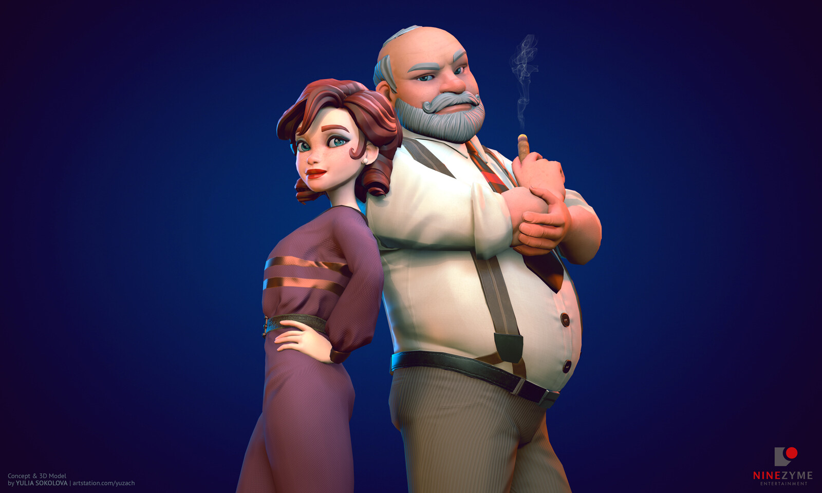
Hi all! ♥ It's time to share another character that I've made for the upcoming game by NineZyme: Laura Bow and the Mechanical Codex. As previously, I’ve been working both on the concept and 3D model of this serious-looking gentleman (as well as the detective lady, you've might already seen her in my previous post here, on Artstation)! https://www.artstation.com/artwork/Ya6ZDY If you want to know more about the game itself, NineZyme have launched their official website with all the info and even more art! Follow this link: http://ninezyme.com Also make sure to subscribe for their newsletter in the bottom of the page if you wanna get updates every month including new wallpapers and blog posts about how the game is developing (WIPs of environment, character animations, concepts and more interesting stuff). For any questions and more information, don’t hesitate to contact NineZyme directly: info@ninezyme.com
‘Zample’ is a One Page WordPress theme perfect for musicians. The long-scrolling layout features a big text load animation, a music player, album list, gig guide, pop-up image slider, video modals, WooCommerce store integration, contact form, Instagram feed and ends with a newsletter sign up block. Great to know Zample also includes 7 additional long-scrolling […]

Hello Guys.This is the concept Landing Page for Answering Question, If you Need any other page fot this design then feel free to contact me, Also if you like this work please upvote the post & follow me, Thanks

Hey Dribblers!👋🏻 Here's a visual exploration of Login page for Mojo ! Hope you guys like it! Dont forget to hit the 'L' Button if you like it! Contact for work queries @ vivekjose23@gmail.com Instagram | Behance | Uplabs

Hello Friends,This is a home page of Directory listing template. you can create beautiful directory listing site using this template. if you need any other page, contact me. Thanks

Hello GuysHostZoone is useful template and web elements for Hosting & Domain company, modern colors, elegant curves and simple forms, free and bonus icons . The PSD file is well organized. And also if you need more additional page then contact me without any Hesitation.If you Like my work don’t forget to give a thumbs up or Press L

Hello GuysSaaS Hosting is useful template and web elements for hosting company, modern colors, elegant curves and simple forms, free and bonus icons and Helvetica Neue Fonts. Each PSD file is well organized. And also if you need more additional page then contact me without any Hesitation.If you Like my work don’t forget to give a thumbs up or Press L
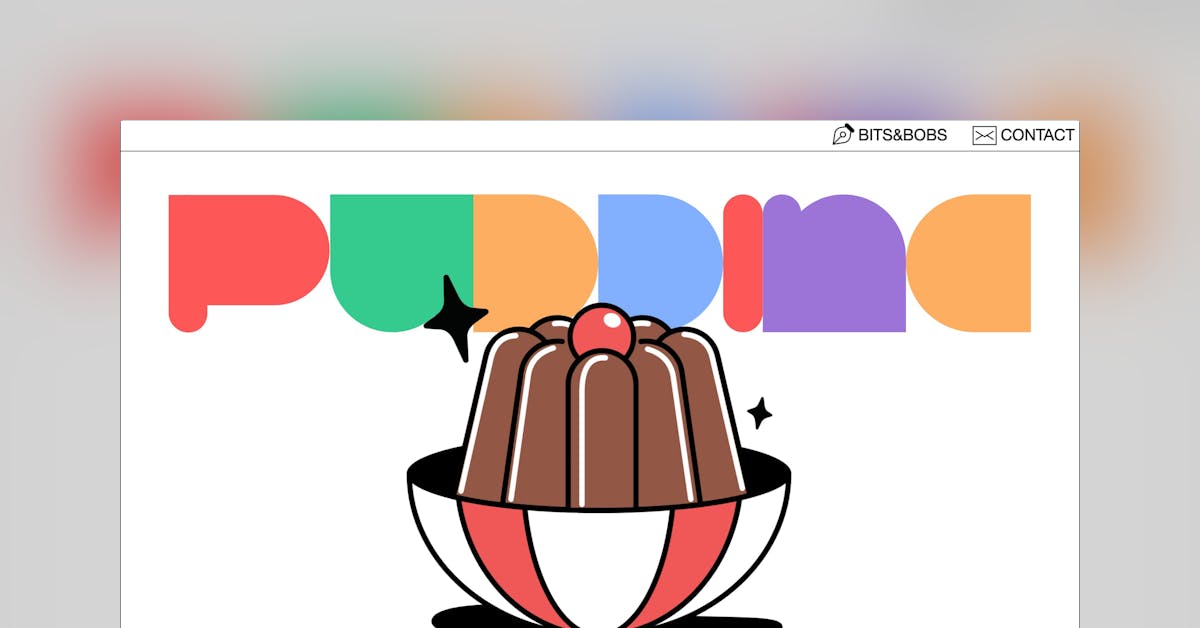
Cannot get enough of this mega long scrolling One Page portfolio for Pudding Studio. I’ve raved about both members personal sites in the past, so it’s wonderful to see a new studio site for their shared clients. Will be adding the ginormous contact form and earnest big footer to our new UI component section soon. […]
Experience design inspiration like never before with Muzli. Loved by 700k+ designers worldwide, Muzli is the leading go-to browser extension for creative professionals.
Get Muzli for Firefox