
Get thousands of Banners & ads examples for free
Join over 700k others who enjoy Muzli design inspiration hub.
We curate topical collections around design to inspire you in the design process.
This constantly-updated list featuring what find on the always-fresh Muzli inventory.
Last update: 4/28/2024
If you’re hoping to boost your online traffic with banner ads, you may be asking yourself: how can I create… The post 15 banner ad design tips to get more clicks appeared first on 99designs.
We don’t have to tell you that the interwebs is a cluttered space—and if you want to make an impact… The post 37 banner ad ideas to inspire you appeared first on 99designs.
These photo-realistic banner mockup PSD templates for Photoshop are all easy to use and will help turn your artistic vision into reality. The post The 20+ Best Banner Mockup Templates for Photoshop appeared first on Speckyboy Design Magazine.
By Matt HaltomDownload this free .sketch file resource

Shifting toward a more sustainable world requires radical change: structural reconfiguration of supply chains, pivoting from harsh chemicals and single-use plastics and beyond. The Guggenheim Museum Bilbao’s newest banner ad campaign for their upcoming exhibition, Olafur Eliasson: In Real Life, proves that these changes can also be remarkably subtle. All 250 of the banners act as air-purifiers capable of catching and cleaning volatile components. The …
“Archery” Opened in 1873, Alexandra Palace (Ally Pally to friends) is a culture, sports, and entertainment venue in London, UK, hosting exhibitions, conferences, festivals, corporate events, and more. An Act of Parliament in 1936 established that Alexandra Park and Palace would have to be made available for the free use and recreation of the public forever regardless of who the trustee in charge was. Located in a 196-acre estate, Ally Pally offers eight different rooms and halls within the palace that can accommodate more than 10,000 people. The palace has been host to major events from its inauguration in the late 1800s to serving as a refugee camp in WWI to hosting the world's first regular high-definition public television broadcast that took place from the BBC studios that were then housed at the Palace. Needless to say, a lot of history has played out here. Recently, coinciding with the planned renovation of its East Court and Victorian theatre, Alexandra Palace is introducing a new identity designed by London-based Lovers. (The identity is not live online yet but has been implemented on site.) Ally Pally (as it's fondly known to Londoners) has been a multi-recreational Mecca since 1875. But without a coherent brand identity to champion its historic and contemporary significance, the palace's efforts were feeling fragmented. Lovers stepped in to help the brand reclaim its cherished place in the hearts of audiences.No London cultural centre contains as much eclecticism as Ally Pally; music stages, sporting arenas, skate park, theatre, boating lake and 196 acres of parkland. Our 'pleasure dome simplicity' logo seeks to put a lid on it all, along with a colour palette that celebrates breadth.Lovers project page Logo. The old logo looked elegant but that was about it, unless we want to unpack the swash in the "A" which was a little stiff and not very useful. The new logo is a direct reference to the iconic arches of Ally Pally's Great Hall. The length of "ALEXANDRA" lends itself quite well to the arch treatment -- especially with book-ending "A"s at the start and end -- and works nicely over "PALACE". Unlike other arch or type-on-a-curve wordmarks that typically look cool but without a particular reason, this one looks cool and AND is warranted. Typeset in Ganby, the arch logo serves as the more serious hinge of the identity. Business cards. Letterhead. "AP" monogram references. Complementing the wordmark is an "AP" monogram that can be found physically in certain details of the Palace and provides a charming antique ornament that speaks to the history of the venue. Used large or small, it's a quirky and peculiar device that provides a striking contrast to the main logo. Monogram totes. Notebook. Custom font. To complement the wordmark AND the monogram is a custom font that's sort of a cross between the serif in the old logo and carnival typography, yielding a very, VERY unique typeface with a lot of personality. It's hard to hate it because it's having so much fun just existing. It's a very unexpected identity element but I like how it's evocative of the architectural excess of the venue and serves as a way to convey the joy and diversity of the many events that take place here. "I AP Ally Pally" applications. Ally Pally's new brand voice channels a colourful cast of characters from its past and present, borrowing vocal techniques from BBC pioneers, Victorian daredevils and other dreamers. We jotted the recipes in a pocket book for easy reference by the palace's brand team.Lovers project page Brand voice book. Ad. Banner ad. Pencils. Coaster. Exhibit area. Banner. It's a little hard to judge the actual application as, so far, there isn't an evident system that comes through in the images shown. Yes, there is the display typeface and Granby but it's kind of hard to connect the "Whatever Next?" banner with the coaster with the image directly above. But maybe that's the point... providing these ingredients that can be mixed and matched as necessary depending on the subject matter. Signage. The examples of the signage and wayfinding look great, mixing Granby with some ornate icons. The grate-like applications are excellent, adding to the already rich textures of the building. Overall, without knowing what the old identity used to look like (but I imagine wasn't much to look at), this is a great update that manages to feel buttoned up, which is something you want as an event manager, as well as loads of fun, which is what you want as a patron.

Food Menu Instagram promotional social media ad banner templateThis template is well-organized and structured. Images, text, and colors can be fully edited. You can edit it quickly and easily. Layer by name and group. The image container is Smart-Objexts to make it easy for you to add images and edit files.Templates File Features:Free Font UsedFully Editable TemplateSize: 1080×1080 Pixels(RGB Color,72 DPI)The image is not included. The image is only for presentation.Support: If you need any help using the file or special customizing, please feel free to contact.

Thanks for enjoying my worksPlease hit on upvoted button, if you like my design.If you need logo design, mobile UI design,website design,flyer design,stationery design,Dashboard design and more, order now andFollow me on <a href="https://www.behance.net/tahsintamanna612" rel="nofollow noreferrer"> Behance|</a><a href="https://www.pinterest.com/tsquare611/boards/" rel="nofollow noreferrer"> Pinterest|</a><a href="https://www.instagram.com/tahsin_tamanna/" rel="nofollow noreferrer"> Instagram|</a><a href="https://www.linkedin.com/in/tahsin-tamanna/" rel="nofollow noreferrer"> LinkedIn</a>
“Round Hole in a Square Peg” Established in 2006 (originally as Museu Nacional Honestino Guimarães in honor of the activist who was president of the Federation of Students of the University of Brasília and was arrested four times, disappearing after the last), Museu Nacional da República is a public art museum in Brasília, the federal capital of Brazil, administered by the government and devoted to promoting Brazilian culture and artists. The building is part of the Complexo Cultural da República ("Cultural Complex of the Republic" in Portuguese) along with the National Library building, both of which were designed by Oscar Niemeyer, considered to be one of the key figures in the development of modern architecture. Looking to increase visitation, collaborations, and profitability, the museum introduced a new identity late last year designed by Brooklyn, NY-based Porto Rocha who were commissioned by Brasília and São Paulo, Brazil-based Manufatura. The circle and square join together to create a modern symbol for Museu Nacional. As a central feature of the identity, it represents the aerial view of Niemeyer's dome while establishing the idea of "inside and outside", contrasting the relationship between these two spaces. More than what it encloses, the surrounding area of the museum acts as a bustling social hub where citizens congregate, musicians perform, activists protest, others practice yoga and so on. Like a portal, the circle also functions as a graphic device that contains different imagery, be it photography, architecture, art or video, connecting and juxtaposing these two spaces in a constant state of dialogue and tension. A contemporary take on a traditionally modern typographic style, the use of Founders Grotesk recalls the visual language employed during Brasília's early urban development while its circular letterforms allude to the museum's infinitely curved walls.Porto Rocha project page The museum. The museum from above. Logo. I probably don't have to tell you that that the old logo was... not good. A ground-level view drawing of the museum was a good idea but the execution was downright baffling and as if I didn't dislike Gill Sans enough already, seeing it stretched at least 200% wider than it is, is doubly offensive. The new logo shifts the view of the building to be seen from above and translates it into an abstract, Modernist- and Minimalist-satisfying black square with a white circle. Typically, this could come across as gratuitous Modernism/Minimalism from a museum identity but, in this case, it's perfectly appropriate as it not only aptly represents the physical space and context of the museum but reflects the building's Modernist origin. It also looks kind of bad-ass in its confidence. The wordmark emphasizes "Museu" as, reportedly, that's how locals refer to the museum, rather than by its long name, and the uppercase setting yields a very nice block of type that aligns, again, so satisfyingly, with the icon above. The "NACIONAL DA REPÚBLICA" underneath may be a tad tiny, perhaps allowing it to occupy 75% of the width instead of 50% would have been a nice gesture. The logo also includes a horizontal version (seen below) where all the type is the same size and broken into lines, which is fine but loses the really nice balance of the stacked logo. Business card. Stationery. Though the museum operates upon inclusive values that seek to provide free access to contemporary art and culture, the museum (and fine art itself) can feel intimidating and elitist. With this in mind, our utilitarian visual language paired with a warm tone of voice work together to strengthen the relationship between the museum and the people. This sentiment is reinforced through the wordplay of "SEU MUSEU", an anagram created by Manufatura meaning "YOUR MUSEUM", which highlights each individual's role within Museu Nacional's dynamic ecosystem, fostered by its contributors, crew and visitors.It is the balance between the identity's modernist rigor and the otherwise inviting tone of voice that creates a uniquely modern-Brazilian sensibility referencing both the country's significant contributions to modernist architecture and the warm energy of its people. Much like the symbiotic relationship between the museum's interior and exterior, each component of this identity comes together to form a similar notion of universality that surrounds the museum: a place for everyone.Porto Rocha project page Layout configurations. Sample layouts. Brochure. Museum guide. Poster. Instagram post and email newsletter. Instagram Stories. Instagram profile. Shelter ads. The applications are all quite nice but definitely operate within the Brutalist-lite style that is a year or two too late. Perhaps it's unfair to raise the comparison as I do think the design approach makes perfect sense in this identity and I enjoy it but there is a strong sense of Been There Done That. One great detail that I would love to see more of is in the first shelter ad above where the icon is placed over a photograph for a hollow effect, which is also exaggerated in the ambitious banner shown below -- if that ever became real, it would win application of the year. Banner. Employee ID. Tote bag. Plastic bag. Wall graphics. Entrance. This is so good. Overall, this is perfectly executed and even though for us Brand New folk the style may seem repetitive this is highly appropriate for the museum, presenting it in an elevated aesthetic that should, in turn, help elevate the status of the museum.
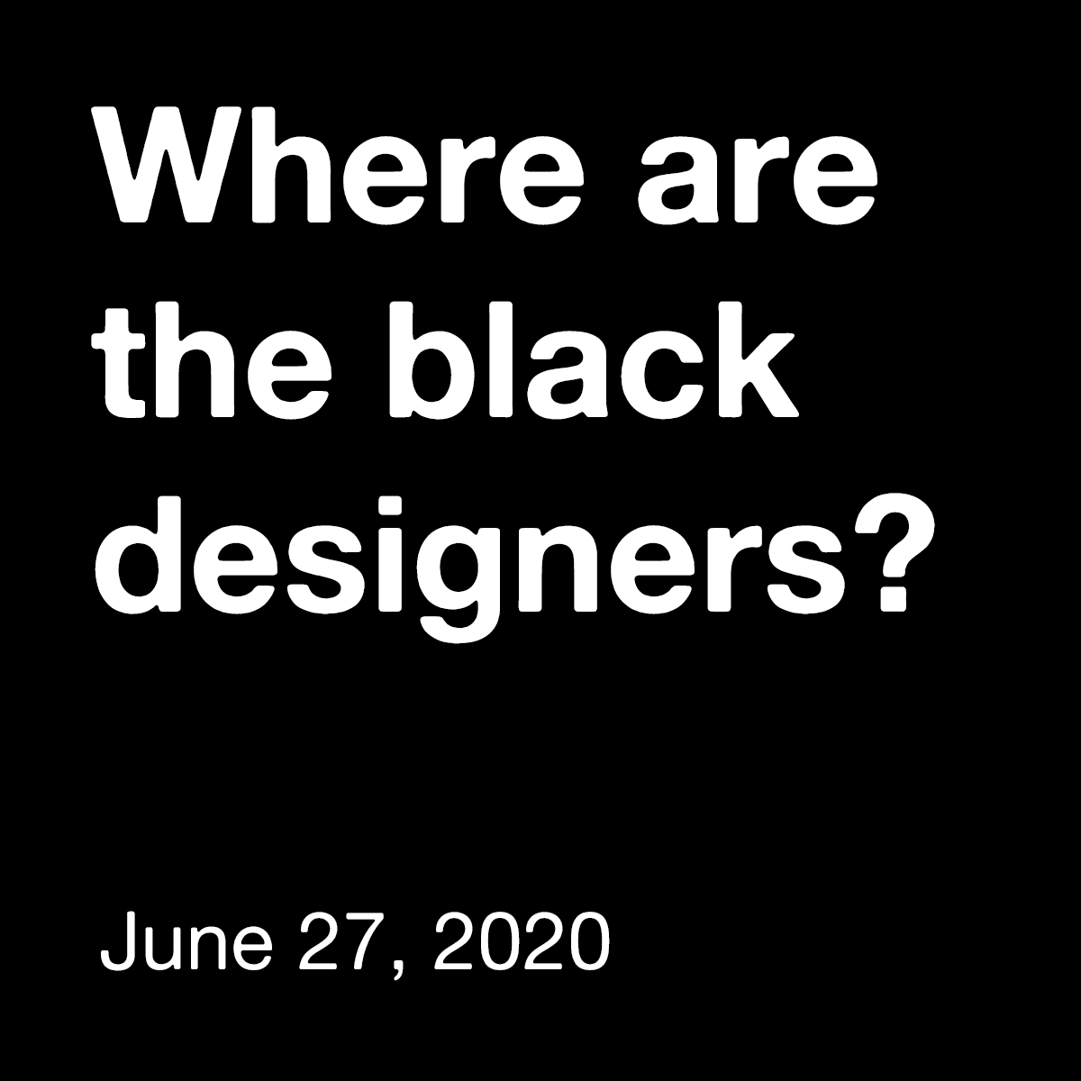
“Brand New” The design industry is lacking black voices. The 2019 AIGA Design Census reports that only 3% of designers, across disciplines, are black. How can we "design for change" when the design industry is part of the problem? Where are the Black Designers is an initiative which aims to give a platform to creatives of color. By connecting designers, educators, and creative leaders we hope to start a dialogue about change in and out of the design industry. Join us virtually for our first annual conference and step forward in initiating this conversation. The initiative will kick off with a virtual conference on June 27 that will contain a panel of designers, educators, and creative leaders who will also be giving lectures and running workshops on how we can come to together and use our skills to creatively resolves issues within this racist system as well as tackle the diversity issue within the creative and tech field. If you are interested in speaking at this event, have a question for us, or simply want to support us in this event that is open to everyone, not just designers, please head over to wherearetheblackdesigners.com where you can also RSVP for the event. Ed.'s Note: This post (and the banner ad you will see on Brand New) are being provided free of charge to the initiative. This is one small way for us to contribute to the current conversation about racism and stand in solidarity with Black Lives Matter. We would be delighted to help amplify others' similar efforts and messages intended to reach a design audience, so please don't hesitate to reach out to me at armin@underconsideration.com if you think we can help.
“Just do (a B)it” Dating back to 1778 but established as it's known today in 1905, Debenhams is one of the largest department store chains in the UK with 182 retail locations (ranging anywhere from 15,000 square feet to over 200,000 square feet for its flagship stores) offering a range of clothing, household items, and furniture, as well as services like cafes, personal shopping assistance, hairdressing and beauty treatments, nail bars and wedding gift services. Last year Debenhams announced it would undergo some significant changes (PDF) and that included ending its eight-year relationship with agency of record, J. Walter Thompson. Coinciding with the launch of a new store this September, Debenhams introduced a new campaign and identity designed by the London, UK, office of Mother Design. Debenhams came to us for a brand repositioning to echo the changes that are taking place internally and with the aim of bringing joy and excitement back into the shopping experience. We decided that instead of a loud call to action telling shoppers how to behave, what they needed was a friendly invitation to remind people how fun shopping can be.We created a new identity, brand purpose and visual language where every touchpoint is designed to champion the unapologetic joy of shopping once more.Mother Design project page Logo. Logo on a photo. The old logo was quite nice and it looked very convincing as a high-but-not-super-high-end beacon for a department store. (Disclaimer: I have never been into a Debenhams so that's what I gathered from my tour on Google Images.) The subtle serifs, uppercase setting, and loose spacing made it look sophisticated and somewhat timeless. The new logo is so heavy-handed not just in the literal sense that it's heavy in its weight but everything about it is, like, too much: too high a contrast between the thicks and the thins, too tight a spacing, and too dramatic the few serifs that are there. The open "D" is also very confusing and unrelated to anything else anywhere in the identity. There are some nice moments in the wordmark -- like the "ebe" relationship or how the slope of the "nh" is aligned -- but overall, it feels too dramatic and the opposite of joyful, which seems to be the overarching goal in the identity and corporate strategy. The campaign, as I'll get to below, achieves this better than the logo. Custom font based on Swiss Typeface's SangBleu. The custom type family, where the character shapes are less exaggerated than the logo, is pretty nice and manages to capture some of the elegance of the old logo while also adding personality. The new logo typeset in perhaps a middle weight of this font would have done the trick. Bags. Signage. Not much in terms of applications. Bags look nice but nothing exciting. Signage looks nice too. I know that that's not much of an opinion but that's the extent of my emotions generated by it. Campaign ads. The campaign around the slightly awkward banner of "Do a bit of Debenhams" does manage to infuse this project with some relative joy. The images and concepts can verge on the cheesy but the executions are charming and eye-catching. They also show that the logo is not quite successful as it breaks apart at small sizes and simply looks weird against the much nicer typography above it. Print ad. Sample social media. Postcards. Overall, the logo definitely signals a change that I don't know how many people will react to positively but at the same time brick-and-mortar retailers are in such a twilight zone era at the moment that I'm not sure anything they do is good or bad for them but, I guess, worth trying. To the identity's credit, one thing it does well is separate it from the recent John Lewis redesign and helps chart it into a different territory than its competitor.
How do illustrations make a brand unique, recognizable, and loved by users?Illustration: OutcrowdMany people are plagued by outdated stereotypes, believing that illustration lies squarely in the realm of art and has nothing to do with business. (Try telling that to Warner Brothers or Walt Disney Studios!) This archaic view holds your company back and makes it less profitable because today’s digital illustration is all about business.So let’s dispel these harmful misconceptions. Illustration is a marketing tool, no matter how nice and beautiful it looks. Its goal is to advance business, provide information, and attract people.Let’s take a look at the areas where illustration is especially effective. Maybe some of it will be useful for your own business.Fruits & Vegetables Delivery — Mobile App Design1. Brandingefficient visual marketingMany businesses spend huge money to stand out among the competition, make themselves noticed, and create a customer base. Forging an emotional connection and trust between your brand and the audience is a very difficult marketing task.The use of illustration in brand campaigns is a surprisingly simple and cost-effective solution.How so? Illustration is a wonderful medium of communication. Being visually concise, illustrations provide immediate recognition, make complex things easier to understand, build trust, and are effortlessly memorable. It is a psychological feature of human visual perception, happily exploited by all the smart marketers.Vertical — Branding for Music SchoolAny brand that uses illustration gains uniqueness and character. Images can tell the company’s history in a fun and informative way, addressing the audience at a visceral, emotional level.Illustrations are human. The deeper we go down the digital rabbit hole, the more important these clusters of humanity become. Handmade drawings signal your willingness to treat your users with care and affection, to address them as fellow human beings.https://medium.com/media/20d28ee9ee8473047337f1e94070825a/hrefillustrated logoThis is the best choice for startups, companies with large competition, or any businesses that want to make themselves noticed and be immediately recognized. To the average consumer, even the nicest-sounding name is nothing but a bunch of letters that they will quickly forget or fail to understand in the first place (this especially applies to acronym logos).An illustrated logo solves all these problems: it focuses attention, it makes the offer immediately apparent, it is visually memorable. Combined logos that incorporate both image and text are the most popular.Depending on the type of business and brand goals, the logo can be either a neat, abstract image or an elaborate, detailed picture.mascotA mascot is your business’s virtual ambassador. It embodies the values of your brand and audience, “talks” to people, and creates positive emotions. Mascots are so memorable you can’t forget them if you tried.brand managementIllustration can help you present your corporate culture, express your brand values, and motivate your team in a friendly way. Employees always like “inside illustrations,” as they bridge the gap between the management and the workforce and help convey the necessary message.Outcrowd Corporate DesignBranding illustrations are made on the basis of their visual identity (corporate style, logo, color palette, fonts, etc.) according to the brand requirements and current marketing tasks. To be effective, the illustrations must be geared toward specific goals, being functional rather than decorative.2. Advertising campaignsbannersAn illustrated banner is a perennial trend due to the features of human visual perception. A banner with a creative illustration is often more effective than one with a photo. The reason? Even the most minimalist of photos have lots of distracting details. You can be focused on the drops of sweat on an athlete’s forehead or admire his muscles and not even notice that it’s actually an ad for running shoes.This kind of thing doesn’t happen with illustrations. Today’s illustrations mostly convey meaning rather than imagery. Any potential distractions are eliminated. It’s a message that goes straight to the heart.printed productsIllustrated business cards, booklets, leaflets, catalogs, posters, and calendars can present your brand in an effective and original way, make an impression that will have a memorable effect. Good pictures can make promo materials so attractive that people will find them hard to throw away — or at least, not immediately. So they will keep your promos around for some time, which is all to your benefit.souvenirsIllustrations can also be used to make branded souvenirs, such as printed t-shirts or caps, mugs, pens, notebooks, etc.Outcrowd Corporate Design3. Online presencepresenting the companyIt’s increasingly more difficult to be noticed among the competition online. Unique illustrations are a great way to make your company’s online presence memorable, whether it’s a website, landing page, or social media profile. Illustrations liven up the design, spark interest in the content, establish an emotional connection with users. Custom illustrations increase a website’s conversion rates at least 7×. They are geared toward a specific audience (i.e. customer-oriented), they are emotionally engaging, and they make the interface friendlier.NFT Marketplace with IllustrationsAn illustrated character, visual metaphors, your corporate style, and the latest trends in digital illustration will all help your website design to make a vivid and lasting first impression on the users.presenting products or servicesA presentation implies drawing attention to an object or a piece of information. Illustration does this instantly, immediately winning the audience’s favor.If your product or service is difficult to describe in words, it should be illustrated. This saves your website from being overcluttered with extra content and makes the information more comprehensible.Illustration is a great seller of products and services. And it works for free!social media & mailing listsWe are bombarded with so much advertising that most offers simply go ignored. An illustrated message, however, always stands out from the bulk of formulaic ads, drawing the eye and making us interested in spite of ourselves.Creative illustrations are an easy way to draw attention to your posts and boost your brand recognition.If you regularly mail out letters or ads to your clients, illustrations will become a part of your signature style and make your mailouts friendlier and more interesting to the users.Illustration is also a useful tool for drawing attention to text. Even a small drawing is often more effective than a photo, which is nothing special these days. A drawing is a distinctive visual anchor. It encourages to read the text or at least the first paragraph. For instance, which section is your eye immediately drawn to — the left or the right one?4. Packaging designIllustration helps sell physical goods as well as digital products. Illustration is a versatile solution for packaging all kinds of products. It looks equally good on a box of pastries or a box of high-tech gadgetry. It is universally liked by both male and female audiences, regardless of age.Packaging and Branding — Wendy’s Granny ChocolateIn conclusionAs we have seen, there are many areas of business where illustration can work miracles and make your brand:stand out among the competition;fun and recognizable;easily comprehensible;emotionally engaging;trustworthy;memorable.Of course, this applies to professional illustration, not just any drawings. Before using illustration in any way, do some marketing research to determine whether it makes sense for your business and which areas will benefit from it the most.Once you’ve done it, take the time to examine the portfolios of different agencies and pick the style that best fits your business and brand character. The visual concept must always be created by marketing experts, and only then realized by artists and designers. This is the best way to turn illustration into an invaluable marketing tool that will work effectively to your company’s advantage.Illustration: OutcrowdHow to Use Illustration in Design as a Marketing Tool was originally published in Muzli - Design Inspiration on Medium, where people are continuing the conversation by highlighting and responding to this story.

Special Food Instagram promotional social media ad banner templateThis template is well-organized and structured. Images, text, and colors can be fully edited. You can edit it quickly and easily. Layer by name and group. The image container is Smart-Objexts to make it easy for you to add images and edit files.Templates File Features:Free Font UsedFully Editable TemplateSize: 1080×1080 Pixels(RGB Color,72 DPI)The image is not included. The image is only for presentation.Support: If you need any help using the file or special customizing, please feel free to contact.
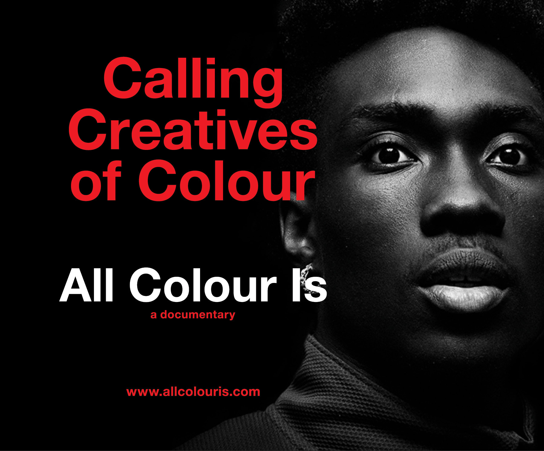
“Brand New” All Colour Is is a documentary film project into the journeys of BIPOC Creatives across various disciplines. It will tell their stories on the desire to succeed, the peaks and valleys and being more than a visible minority in one of the largest industries in the world - Design. We're wanting to speak with creatives from Graphic Design, Industrial Design, Interior Design, Architecture, Fashion, Advertising, Illustration or Photography. Those who are willing to share their stories and their insights on how and what it took to continue to do what they enjoy as a profession. If you, or know someone who would like to share their story, please get in touch: EmailInstagramLinkedInFacebook From the moment we were tearing through our first set of crayons, we knew we were creative and we knew we were different. Our challenges are and have been both both internal and external. From looking to be taken seriously and seen with respect to how we worked our way through design school, jobs and our relationships with superiors, colleagues, friends and even family. However, how would the world be able to see us if we couldn't even see ourselves in the world? What we BIPOC Creatives also share is the unique experience of not having certain opportunities and not occupying certain creative spaces because we have what the majority of individuals in creative industries do not - a darker shade of pale. Yet in spite of this uphill battle we continue to find the joy and purpose as Creatives.Michael Sinanan, director To learn about how this project came to be, you can read this post. Ed.'s Note: This post (and the banner ad you will see on Brand New) are being provided free of charge to the initiative. This is one small way for us to contribute to the current conversation about racism and stand in solidarity with Black Lives Matter. We would be delighted to help amplify others' similar efforts and messages intended to reach a design audience, so please don't hesitate to reach out to me at armin@underconsideration.com if you think we can help.


Delicious Burger Menu Instagram promotional social media ad post template. This template is elementary to use and flexible. You can edit the text & transform each element quickly, providing total freedom for your creativity and saving more of your time.Features:Size 1080 x 1080 Perfect for Any Instagram Social Media TemplateEasy to Editable100% color changeableEasy To Change Text, Color, and Image

Modeling, Textures, Lighting, Rendering, Compositing, CGI, 3D, 2d, light, Creative, Direction, Illustration, Production, Advertising, ad, adobe, post-production, wacom, engine, print, autodesk, art, composing, design, retouching, scenes, style, unique, graphic, metal, digital, sculpting, cg artwork, 3d artwork, strategy, marketing, agency, premium, luxury, identity, idea, method, trend, international, composition, effective, key, visual, business, concept, solution, press, design studio, brand, case, ads, making of, color, colour, inspiration, photoshop, mood, art direction, business, graphics, collection, geometry, texture, prints, digital art, startup, drawing, sketch, freelance, award, awarded, outdoor, presentation, visual, client, modern, concept, billboard, poster, brief, freelancer, digital art, trendy, skill, mood, art direction, studio, brand, editorial, sustainability, indoor, visual, architecture, presentation, landscape, unique, best, PR, banner, art direction, technique

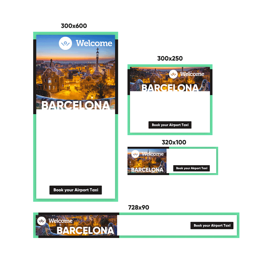
Travel Banner Ad

Delicious Food Menu Instagram promotional social media ad banner templateThis template is well-organized and structured. Images, text, and colors can be fully edited. You can edit it quickly and easily. Layer by name and group. The image container is Smart-Objexts to make it easy for you to add images and edit files.Templates File Features:Free Font UsedFully Editable TemplateSize: 1080×1080 Pixels(RGB Color,72 DPI)The image is not included. The image is only for presentation.Support: If you need any help using the file or special customizing, please feel free to contact.
News of the week about design, products and toolsHIGHLIGHTElon Musk unveils Neuralink’s plans for brain-reading ‘threads’ and a robot to insert them.ARTICLESA Product Designer’s Guide on Relaxation.Typography in Design Systems.WATCHiMac 2019 and iPhone XI concepts.Incredible archive of Apple’s promotional photos and ads.TOOLS & RESOURCESA library of a customizable avatar component for Sketch.308 Free Resources for Marketing.A little ffmpeg wrapper app for some video shortcuts.GET INSPIRED4fresh app / onboarding conceptDashboard video tutorialDIABLO Y BANANAThe DeadlinePrevious Design Digest #94.Follow us on Twitter, Facebook, Instagram, Dribbble and rivercity.ioDESIGN DIGEST 95 was originally published in Muzli - Design Inspiration on Medium, where people are continuing the conversation by highlighting and responding to this story.

Today's Special Food Menu Instagram promotional social media ad banner templateThis template is well-organized and structured. Images, text, and colors can be fully edited. You can edit it quickly and easily. Layer by name and group. The image container is Smart-Objexts to make it easy for you to add images and edit files.Templates File Features:Free Font UsedFully Editable TemplateSize: 1080×1080 Pixels(RGB Color,72 DPI)The image is not included. The image is only for presentation.Support: If you need any help using the file or special customizing, please feel free to contact.

Perfect for your Friday Club Dj Party Flyer Instagram Ad Social Media Post And Web Banner Template. This template is elementary to use and flexible. You can edit the text & transform each element quickly, providing total freedom for your creativity and saving more time.Features:✔ Size 1080 x 1080 Perfect for Any Instagram Social Media Template✔ Easy to Editable✔ 100% colour changeable✔ Easy To Change Text, Color, and Image✔ Used Free Font✔ etc.Source file: ✔ PSD✔ JPGPlease rate this item, If you like it. Thanks!!
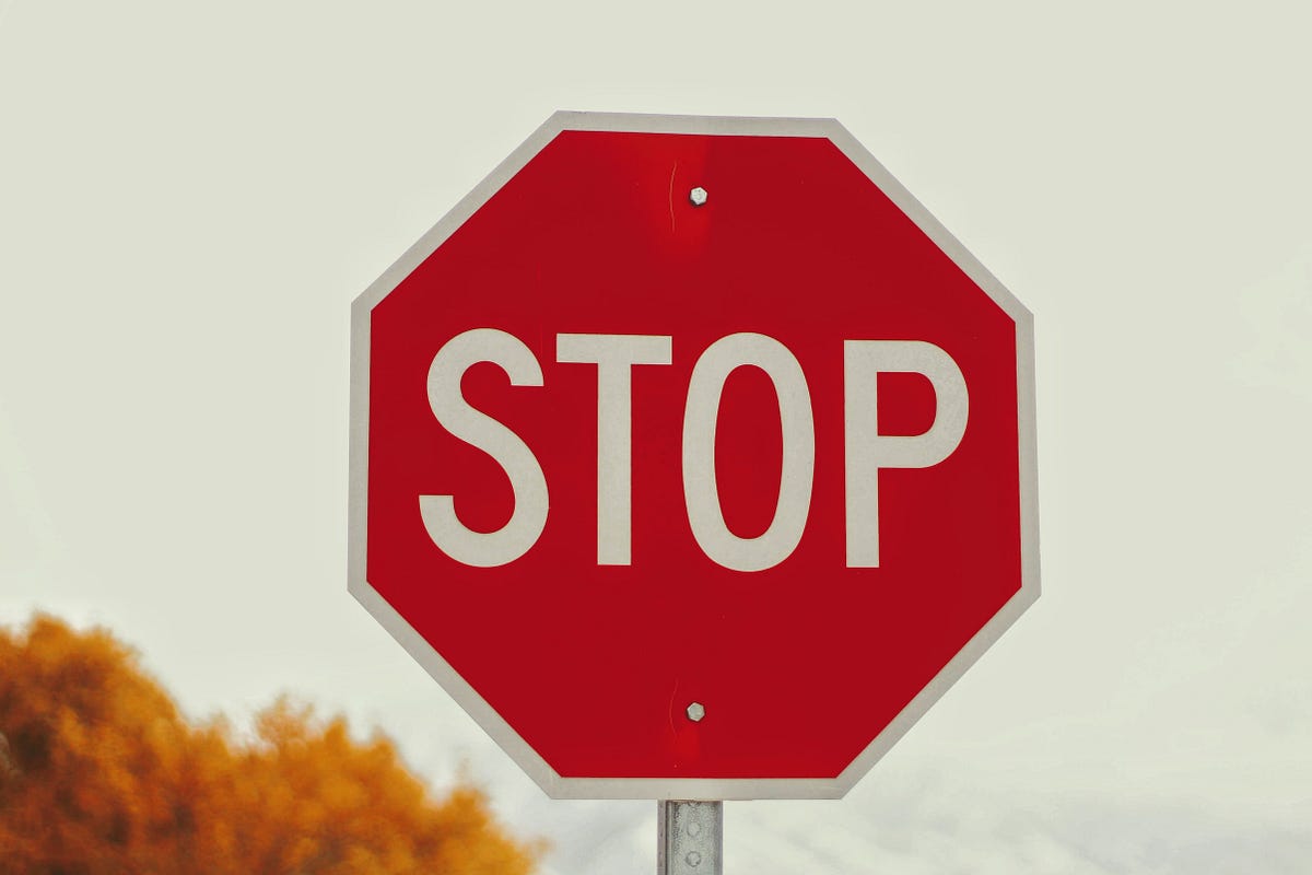
Unconscious Recognition in Visual Web DesignImage from https://unsplash.com/photos/WPrTKRw8KRQLet’s be honest, you’ve probably driven through a stop sign at least once in your life. Maybe you’re a little bit reckless and see stop signs as more of a suggestion. Or maybe you were in a hurry that one time and literally did not have any time to stop. Or maybe it just wasn’t your fault!I like to think that the last reason is usually my excuse. Recently, I was driving home from work on a different route than normal, and suddenly a car going the opposite direction tapped his horn at me. Weird. Wait, why was he stopped in the middle of the road? Wait, why is there the back of a hexagonal-shaped sign in my rear-view mirror? Oh, I just ran a stop sign. Nice.But it wasn’t my fault, right? The stop sign was placed about 10 feet to the right of the road, and partially covered by a tree. I literally did not see it (or at least, I don’t remember seeing it). But how could I miss something as obvious as a bright red sign with “STOP” written on it?More often than we realize, what we think is most obvious is actually seen the least. Think about the last website you visited. How much did you really notice? What were the banner ads? What was the title of the article you read? Who wrote the article? Were there any pictures? Understanding what users automatically and unconsciously see in visual experiences is key to an effective and engaging design.PlacementLike it or not, users already have ingrained habits that dictate how they will view your website. If you open a book, you automatically look to the top left portion of the text and begin reading towards the right. Websites are actually viewed in the same way, as users initially follow an F-shaped pattern across the page.Image from https://www.nngroup.com/articles/f-shaped-pattern-reading-web-content/If the most important information is not in that F-shaped area, users are not likely to find it. If something the user is looking for isn’t in that area, they will quickly move on to another website to find their answer. Yes, the rest of the page is important, but to quickly engage your users, you must place the most relevant information where they can immediately find it.An interesting thing to note is that the F-shaped heat map above does not include the right-side banner ad imploring viewers to “enjoy every hearty bite.” In fact, I would bet that you had no idea what the banner ad said and just looked up to see I wasn’t making it up. Don’t tell the advertising companies that their ads aren’t effective (you probably need the revenue), but also don’t make the mistake of putting something important on that rightmost pane. Your users probably won’t see it, just like a stop sign that’s too far over.Pleasant SurpriseAs discussed above, you want to make sure that what your user is looking for is placed in a location that they will quickly find it. But what about what they aren’t looking for? To really engage your users, there is value in providing them with a pleasant surprise. In his TED Talk, Al Seckel talks about optical illusions and how they violate our expectations, leaving us intrigued and wanting more.Google PhotosFor example, occasionally I will open up my Google Photos app to view an image I recently took or share it with a friend. My purpose is clear, and I know how to get it done. But, at the top of the page, there is often a little blue circle showing that I took some pictures one year ago today. Suddenly, I’m looking at the great times I had on a vacation this time last year, surprised and delighted that I could relive the experience. The reminder of my past photos wasn’t obtrusive, and I could have ignored it if I were really in a hurry, but it was a small pleasant surprise that enhanced my experience.What can you add to your website that will surprise and delight your users? What if you were driving and saw a green sign that said “GO” on the side of the road? How can you make the experience more pleasing for your users?Visual DistinctionWhen was the last time you actually read a stop sign? I hope that you actually stop at each sign, but when was the last time you consciously read the word “STOP”? If you didn’t actually read it, how did you know it was there and how to respond? While the actual word printed on the sign is nice, the sign really grabs your attention because of its unique shape and color. If you see a red hexagon, you know exactly what the message is and what to do.In an effort to promote healthy eating (or discourage unhealthy eating), the Chilean government mandated that small stickers be placed on foods that are high in sugar, fat, sodium, or calories as a warning to consumers. Not coincidentally, these stickers are hexagonal-shaped, playing on the unconscious association of a hexagon with stopping.From Ministerio de Salud de Chile, https://www.minsal.cl/ley-de-alimentos-nuevo-etiquetado-de-alimentos/On your website, it can be helpful to use shape, color, size, or orientation to really make the important things stand out. Notice on an Amazon product page the relative lack of color. A white background with black, blue, and red text is rather unimpressive visual design. But, the glaring orange of “Add to Cart” and brighter orange of “Buy Now” incessantly call you to action. This page clearly has one purpose, and that is to get you to exchange your money for an Echo Plus.amazon.comWhat do you want your users to accomplish on your website? Try using different colors, shapes, or styles to call your users to action. Make it very clear what they should do on your website, and what they should focus on.Take Unconscious ActionIf a cop had seen me drive blindly past a stop sign that afternoon, he probably wouldn’t be sympathetic hearing me say that I really didn’t see it. But if a user doesn’t see something on your website, you can’t blame them. Users have a purpose in mind, and they want to get it done. Users won’t stick around for long if your website doesn’t quickly meet their needs by placing the important information in the right location, pleasantly surprising them with additional benefits, or calling them obviously to appropriate actions.So, the next time you’re stopped at a stop sign, think about how you got there and what made you stop. The unconscious acts you take every day aren’t all that different from the actions your users make on your website.What Stop Sign? was originally published in Muzli - Design Inspiration on Medium, where people are continuing the conversation by highlighting and responding to this story.

Sunday Special Restaurant promotional social media ad banner templateThis template is well-organized and structured. Images, text, and colors can be fully edited. You can edit it quickly and easily. Layer by name and group. The image container is Smart-Objexts to make it easy for you to add images and edit files.Templates File Features:Free Font UsedFully Editable TemplateSize: 1080×1080 Pixels(RGB Color,72 DPI)The image is not included. The image is only for presentation.Support: If you need any help using the file or special customizing, please feel free to contact.

Delicious Pizza Restaurant promotional social media banner templateThis template is well-organized and structured. Images, text, and colors can be fully edited. You can edit it quickly and easily. Layer by name and group. The image container is Smart-Objexts to make it easy for you to add images and edit files.Templates File Features:Free Font UsedFully Editable TemplateSize: 1080×1080 Pixels(RGB Color,72 DPI)The image is not included. The image is only for presentation.Support: If you need any help using the file or special customizing, please feel free to contact.

Food Menu Instagram promotional social media ad banner templateThis template is well-organized and structured. Images, text, and colors can be fully edited. You can edit it quickly and easily. Layer by name and group. The image container is Smart-Objexts to make it easy for you to add images and edit files.Templates File Features:Free Font UsedFully Editable TemplateSize: 1080×1080 Pixels(RGB Color,72 DPI)The image is not included. The image is only for presentation.Support: If you need any help using the file or special customizing, please feel free to contact.

Delicious Fried Chicken Instagram promotional social media ad banner templateThis template is well-organized and structured. Images, text, and colors can be fully edited. You can edit it quickly and easily. Layer by name and group. The image container is Smart-Objexts to make it easy for you to add images and edit files.Exclusive Discount + Delicious Food Menu + Delicious Fried ChickenTemplates File Features:Free Font UsedFully Editable TemplateSize: 1080×1080 Pixels(RGB Color,72 DPI)The image is not included. The image is only for presentation.Support: If you need any help using the file or special customizing, please feel free to contact.

Delicious Chicken Nugget Instagram promotional social media ad banner templateThis template is well-organized and structured. Images, text, and colors can be fully edited. You can edit it quickly and easily. Layer by name and group. The image container is Smart-Objexts to make it easy for you to add images and edit files.Templates File Features:Free Font UsedFully Editable TemplateSize: 1080×1080 Pixels(RGB Color,72 DPI)The image is not included. The image is only for presentation.Support: If you need any help using the file or special customizing, please feel free to contact.
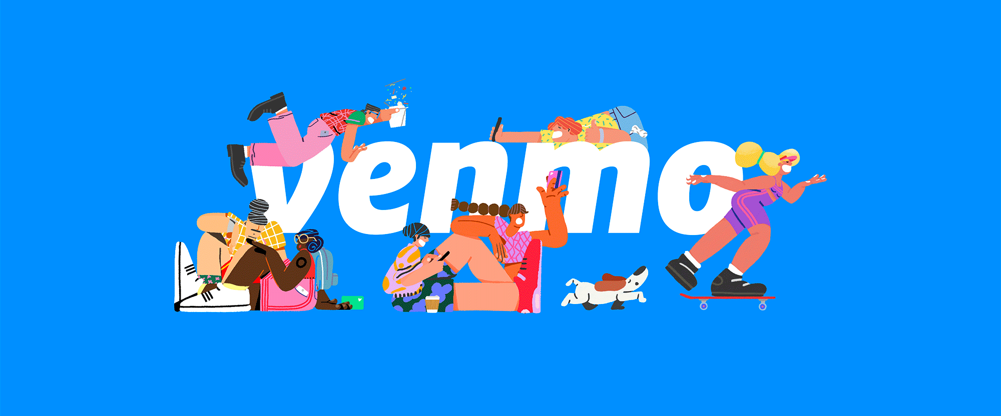
“Mo’ Money” Established in 2009, Venmo is a mobile payment service that allows people to quickly send each other money through their app. Unlike PayPal (although owned by PayPal since 2013) where there are multiple clicks and screens required to send money to a friend, the Venmo app makes this process relatively easier and quicker (at least once you have located your friends -- the few times I have used it, finding people, the right people, was confusing and uncertain). Transactions are free as long as the money is coming from a linked bank account, with money being made by PayPal from credit card transactions and from select merchants who accept Venmo as payment. In 2018, when Venmo's popularity began to rise, it processed $12 billion in volume in the first quarter alone. Apart from the ease of use, what makes Venmo interesting is that its home screen is a feed of other users transactions so you can see either complete strangers' or your friends' payment activity -- no specific amounts just who they paid and for what -- which, call me old fashioned, but the first time I realized that my transaction subjects were public it felt very invasive. You can opt out of making your transactions public, yet this is what makes Venmo, Venmo... officially a "social payments app". Starting with their social media, Venmo is rolling out a new identity designed by Koto. The new electric blue retains the heritage of the original Venmo blue. It's been tweaked to work harder and more consistently across all applications, on screen and off. A broader palette of complementary colours now sits alongside it. With its flexibility to be either bold or controlled, Athletics is the perfect typeface for Venmo, more than matching the energy of the rest of the brand. Scto Grotesk is a more functional secondary partner that still holds its own.Koto project page Logo, before and after. No, your eyes do not deceive you, there is nothing different about the logo, which remains exactly the same. The only difference is the tone of blue, which seems frivolous but, at least as a sample audience of one person, the first time I ever used Venmo, the shade of blue gave me pause in whether I would trust the service or not -- it felt like a cheap color for an app from the mid 2000s. It didn't seem right. The new blue is obviously on trend but it now fits within the vibrant Instagram/Facebook/WhatsApp shades. In terms of the logo, it's a nice wordmark with a distinctive curly-esque "v". Examples of OLD identity. I have never seen any ads from Venmo so the above image is news to me and it does look direly boring. Created in collaboration with Sebastian Curi, the new set of illustrations bring to life all the many experiences behind Venmo payments, from road trips to ramen.Koto project page Your browser does not support the video tag. Illustrations, from sketches to finished drawings. Since day one, Venmo's users have made it what it is. That's why we've evolved the brand to celebrate the story behind a payment. Dinner tabs. A dollar to say hi. Last-minute concert tickets. The $6.8M spend on 🍕 last year alone. It's an identity that reflects the real-life experiences users share - from the everyday to the totally random.Koto project page Your browser does not support the video tag. Your browser does not support the video tag. Sample illustrations. Color palette. App icon with illustrations. The new identity revolves around illustrations by Vancouver, Canada-based Sebastian Curi and, no doubt, they are pretty awesome, fun, vibrant, and exciting. You can see many more samples on his Behance project page. I do wonder, however, how sustainable this is beyond a couple of years? It looks like there is a wide library of illustrations but for how long and for how many messages can they be used? Maybe the answer is that it doesn't matter and this is indeed part of a 2- or 3-year plan as Venmo escalates into its next stage and will then be able to shed this for whatever makes sense in the future. Right now, though, the message is: This is fun, jump in, ask questions later. Already a key part of the product experience, we've rendered the Venmo payment feed as a graphic framework. This allows us to represent the app experience - and all the daily payments - in fresh and interesting ways.Koto project page Your browser does not support the video tag. Translating the feed into a visual language for ads and other applications. Sample ads. The main application, if I am understanding this correctly from the samples above, is that ads will highlight either one transaction or multiple transactions, paired with relevant illustrations and then you are supposed to understand what Venmo does. Even though I already understand what Venmo does, the three examples above confuse me. It's hard to tell if they are sample UI screens, actual ads, or just random stuff put inside a 1920 × 1080 canvas. I mean, they are fun to look at and I like the typography but I have no idea what exactly is going on. Your browser does not support the video tag. Sample of the feed on the left, sample of not sure what on the right. Your browser does not support the video tag. Socks on the left, Venmo card animation on the right. Banner ad campaign. Your browser does not support the video tag. Your browser does not support the video tag. Social media posts. Even the banner ads and social media posts which are a little more restrained in amount of elements are sort of ambiguous about the messaging, placing maybe too much emphasis on the weird ways people describe their payments or even making it too much about the names seen in the ads. I dunno, maybe I'm getting old -- today's my 42nd birthday actually, so that's probably not it, LOL -- or maybe I am expecting more straightforward messaging to appease the relative awkwardness of the app and its social component. In any case, this all makes Venmo look fun, accessible, and relevant for a younger generation with less hang-ups than me.
“In Leagues of their Own” Established in 2010, the United Soccer League (USL) began as a Division III league with 15 teams. In the time since, the USL has strengthened its ties with the MLS, establishing affiliate connections between their teams and last year the U.S. Soccer Federation granted the USL Division II status. Beginning in 2019, as the league continues to grow, it will be introducing a new structure, akin to European leagues, where USL becomes the corporate brand of multiple leagues: USL Championship replaces what we all knew as USL proper and becomes the pinnacle of the USL; the Premier Development League becomes USL League Two, a development soccer league; and USL Division III will become USL League One, targeting cities with a population of 150,000 to one million, mostly in cities currently without a professional team. As part of the restructuring, USL has introduced a new identity system designed by Brooklyn, NY-based Athletics. Athletics was tasked with extending the USL brand across all of the organization's events and leagues: The USL Championship, USL League 1, and USL League 2. We designed a modular color and logo system to create a flexible look and feel between each league, using a shared visual language to connect the initiatives together and with the USL brand.Athletics project page Introduction of new logo system. USL League Two and USL League One logos, before and after. Logo family. Logo explanations. (Open the image in a new tab/window for a bigger view.) The USL's new corporate logo symbolizes the growth of professional soccer in North America, incorporating 13 stripes to represent the U.S. flag. The blue letters pay homage to the league's past while the new, modern logo and the white sphere represents a soccer ball in motion - propelling our sport forward into the future.USL press release Corporate logo. The pinnacle of competition - the USL Championship features a new gold design and represents the ultimate goal for players, coaches, fans and communities, all of whom aspire for excellence both on and off the field.The foundation of professional soccer - USL League One makes its mark with a vibrant, colorful identity, as it gears up for its debut in the 2019 season with league leadership and ownership that will forge a unique identity - driven by determination, unity and inspiration.The #Path2Pro - the PDL will become USL League Two - […] maintaining its heritage with a bold, red logo, League Two will continue to forge the game's future, delivering the first taste of premier competition in an authentic national soccer environment with a hyper-local focus.USL press release Championship logo. USL League One logo. USL League Two logo. Color and configuration variations. I know there were a lot of images to scroll through before getting to any text but this wasn't a straightforward logo redesign that showed a simple before/after and I think that the main logo has to be addressed in context of all the new logos, so... In principle, the "USL" logo that was introduced in 2015 and that we've come to know well remains as is, which is good, because it's a good logo. It now serves as the anchor for the new league structure and its logos. First up is the "corporate" logo that, in a way, replaces the 2015 logo. The biggest change here is the addition of a new icon, a speeding ball leaving a trail of 13 stripes (as in the U.S. flag), which I think is pretty fantastic -- not for its patriotic-ness per se but for it's appropriateness and smart use of it. The icon has an old-school feel that goes back to the good age of minimalism and not just minimalism for minimalism's sake. The icon ties in nicely with the notches in the USL wordmark and it establishes a square element to build on with the rest of the logos. For the main league, now USL Championship, the square houses a star in a gold background. It's pretty straightforward and it does convey a sense of being the most important in the system. I get some U.S. Army logo vibes but when this lives in the context of soccer, there is not much confusion. The League One and League Two logos simply have a number in there. Again, very straightforward but also as nicely executed as it gets. All logos are now (or can be) accompanied by a geometric sans serif, Hurme Geometric Sans No.2, that, as unsurprising as it is, works very well in this system and as a complement to the logo elements. The same type family, in its various weights, is used as the brand typography throughout. Logos with brand pattern. Type treatments. Screen graphics. Instagram. Ad. Banner. Not much in terms of applications as this identity won't kick in fully until the start of next season but there is some clear potential seen here through bold but simple typographic treatments and some color coding of black and white images. Overall, the system may come across as simple and an obvious approach but the result is remarkably smart, restrained, and crisply executed.

Perfect for your Super delicious burger advertisement Ad Post Design or Instagram Web Banner. This template is elementary to use and flexible. You can edit the text & transform each element quickly, providing total freedom for your creativity and saving more of your time.Features:✔ Size 1080 x 1080 Perfect for Any Instagram Social Media Template✔ Easy to Editable✔ 100% colour changeable✔ Easy To Change Text, Color, and Image✔ Used Free Font✔ etc.Source file: ✔ PSD✔ JPGPlease rate this item, If you like it. Thanks!!

Grilled Cheese Burger food Instagram promotional social media ad post template. This template is elementary to use and flexible. You can edit the text & transform each element quickly, providing total freedom for your creativity and saving more of your time.Features:Size 1080 x 1080 Perfect for Any Instagram Social Media TemplateEasy to Editable100% color changeableEasy To Change Text, Color, and Image

Perfect for your Car Rental Online Booking Service Instagram Ad Social Media Post Web Banner. This template is elementary to use and flexible. You can edit the text & transform each element quickly, providing total freedom for your creativity and saving more of your time.Features:✔ Size 1080 x 1080 Perfect for Any Instagram Social Media Template✔ Easy to Editable✔ 100% colour changeable✔ Easy To Change Text, Color, and Image✔ Used Free Font✔ and etc.Source file: ✔ PSD✔ JPGPlease rate this item, If you like it. Thanks!!
By Matt HaltomDownload this free .sketch file resource

Perfect for your Digital marketing Instagram agency corporate social media post template. This template is elementary to use and flexible. You can edit the text & transform each element quickly, providing total freedom for your creativity and saving more time.Features:✔ Size 1080 x 1080 Perfect for Any Instagram Social Media Template✔ Easy to Editable✔ 100% colour changeable✔ Easy To Change Text, Color, and Image✔ Used Free Font✔ etc.Source file: ✔ PSD✔ JPGPlease rate this item, If you like it. Thanks!!
Nobody seems to talk about!In this article, I’m going to tell you about my own ideas for dealing with the problems I’ve come across while working with global target audiences and their unique interpretations of colours.HistoryWe as human beings have the primitive ability to interpret colour meanings by the emotions we get when we see it. In nature, most poisonous fruits are either red or yellow like Berries and European Spindle. Poisonous animals are usually marked with red and yellow colours like Death Stalker Scorpion, Brazilian Wandering Spider etc.So colour interpretation is very important for our survival as humans, right?Cultural DifferencesDuring the history, every culture created its own interpretation of colours based on beliefs, religions, the local nature, weather and the general colours of the landscape like yellow deserts or snow white mountains. The seasons made us interpret colours by their “warmth” so blue usually symbolizes cold while red and orange symbolize warmth.The red colour in the western civilization is interpreted completely different from the interpretation, it is given in the far east like China. In China red is a colour of joy and good fortune so it’s used until today for weddings and holiday celebrations. Red is strictly forbidden at funerals as it is the colour of happiness.Different cultures don’t even name the colours in the same way. In English, there are 11 words for colours while the Russian language has 12 (Light Blue = Galuboy).In the Chinese culture black is the colour of heaven. This is why the black colour is interpreted to be a holy colour. Unlike the westerns that wear black for funerals, and white for weddings, the Chinese, on the other hand, wear black and red for weddings and white for funerals since white is interpreted in China as the colour of mourning.Double MeaningDifferent cultures interpret the same colour very differently, but this is just one of the problems.We tend to interpret colours very differently from one another, even if two people from the same country or even the same city, could respond completely different to the same exact colour.While some see green as the colour of growth, nature and prosperity, maybe even positivity, others may see it as the colour of greed. As a matter of fact, Every colour has a mass variety of feelings and interpretations created by itself. The right use of the colour can get the right emotion triggered. A red dot has a different effect than a whole red background.VariationsWhen we approach design, we must take in the count so many variations to make it work. The culture it’s presented to, the different interpretations that specific colour produces and the right amount of it, the time and the placement it is going to appear in.If our target audience is a Chinese man for example, and he’s going to see our ad on Facebook at 21:00 pm, we might want to use certain colours to talk in his language and make him feel as much home and comfort as we can.Placement is one of the most important factors for choosing the right colors and if it’s really on Facebook, according to the previous example, there is a theory that says that colors work best on Facebook are red-orange and yellow so if we are targeting China, we must investigate and be sure that the colors are used properly according to what our target audience feels about it.For example, an ad that is completely red might reflect danger or high-energy or passion for a western, The same exact add is going to create feelings of joy and fortune in the far east.SaturationThe way I try to treat these interpretation problems is by playing with brightness and saturation until I manage to create a decent balance.Much like in composition, there must be a balance in our colour saturation. If we use highly saturated, vivid red for a background, in most cases the content will drown in this background color no matter what emotion we were trying to get, but if we use a little less saturated red and add a little bit of black for dark red, velvet or add white to make it pinkish, it will stand out less and the won’t steal as much of focus, but still will be able to provide some of the emotions, simple red would provide.Usually, we even have to make our target audience feel a combination of a few emotions at once, but if we use red and green together in the same exact amount, they will probably fight each other for attention and the result will not be as pleasing, but if we take one of them get it darker or a little brighter and use less space with them, for example, instead of getting half page red and half green, we would use a third of dark green and 2/3 of bright red, they will suddenly stop disturbing each other and start complementing the whole composition.Actually one will make the other stand out while we will still have the emotions of both colours if we would like. If we have decided to use vivid saturated text, we must use either very dark or a very bright background colour.When choosing a colour, we must take in count the feelings it provides for the specific target audience we are designing for. Otherwise, we could provide a completely different interpretation and a mistaken emotion, that not only will not be successful but could also make our target audience angry and associate a feeling we never meant to be associated with.Thank you for reading so far, I really hope you enjoyed it and if you did, you should definitely visit my blog:www.pentocreative.comDo you have your own ways for dealing with colour issues?Please comment below 💬 or find me on Facebook and Twitter.Yours Truly,Mark Zusmanovichwww.pentocreative.comColour Issues that could destroy your campaign was originally published in Muzli - Design Inspiration on Medium, where people are continuing the conversation by highlighting and responding to this story.

Food Menu Instagram promotional social media ad banner templateThis template is well-organized and structured. Images, text, and colors can be fully edited. You can edit it quickly and easily. Layer by name and group. The image container is Smart-Objexts to make it easy for you to add images and edit files.Templates File Features:Free Font UsedFully Editable TemplateSize: 1080×1080 Pixels(RGB Color,72 DPI)The image is not included. The image is only for presentation.Support: If you need any help using the file or special customizing, please feel free to contact.

Exclusive Discount Food Menu social media ad banner templatesThis template is well-organized and structured. Images, text, and colors can be fully edited. You can edit it quickly and easily. Layer by name and group. The image container is Smart-Objexts to make it easy for you to add images and edit files.Exclusive Discount + Delicious Food Menu + Delicious Fried ChickenTemplates File Features:Free Font UsedFully Editable TemplateSize: 1080×1080 Pixels(RGB Color,72 DPI)The image is not included. The image is only for presentation.Support: If you need any help using the file or special customizing, please feel free to contact.

Exclusive Discount Food Menu social media ad banner templatesThis template is well-organized and structured. Images, text, and colors can be fully edited. You can edit it quickly and easily. Layer by name and group. The image container is Smart-Objexts to make it easy for you to add images and edit files.Exclusive Discount + Delicious Food Menu + Delicious Fried ChickenTemplates File Features:Free Font UsedFully Editable TemplateSize: 1080×1080 Pixels(RGB Color,72 DPI)The image is not included. The image is only for presentation.Support: If you need any help using the file or special customizing, please feel free to contact.

Delicious Food Menu Instagram promotional social media ad banner templateThis template is well-organized and structured. Images, text, and colors can be fully edited. You can edit it quickly and easily. Layer by name and group. The image container is Smart-Objexts to make it easy for you to add images and edit files.Templates File Features:Free Font UsedFully Editable TemplateSize: 1080×1080 Pixels(RGB Color,72 DPI)The image is not included. The image is only for presentation.Support: If you need any help using the file or special customizing, please feel free to contact.

Delicious Food Menu Restaurant promotional social media banner templateThis template is well-organized and structured. Images, text, and colors can be fully edited. You can edit it quickly and easily. Layer by name and group. The image container is Smart-Objexts to make it easy for you to add images and edit files.Templates File Features:Free Font UsedFully Editable TemplateSize: 1080×1080 Pixels(RGB Color,72 DPI)The image is not included. The image is only for presentation.Support: If you need any help using the file or special customizing, please feel free to contact.
Working in tech means dealing with really complex problems. You usually feel trapped. There’s no way out. These kind of situations are generated every time you move within a system that’s composed of processes and people. Most of the time, finding a suitable solution involves taking more than one action or modifying several processes that affect the company as a whole.Written by Juan Manuel AbrigoFor quite some time now at Lateral View we have been using design as a transforming force. It is easy to limit design to an area that only intercedes in the creation of a certain product. It’s much more than that. I’ve already mentioned this on previous articles but let me focus on this idea once more: Every company is a design company. Design improves processes and helps define strategies for entire organizations, especially in times like these where it’s so difficult to determine which actions to take in order to tackle certain issues without getting completely lost.This is the reason why we began using this simple but effective decision-making framework. It’s an adaptation of the Lightning Decision Jam created by AJ&Smart. The idea behind this is to replace the traditional pointless meetings where problems are discussed without any clear structure wasting a lot of time (and money), by a clear and practical process.This decision-making process has already come in handy in several areas such as product design, marketing, sales and development. Our design processes are much more polished and efficient, development retrospectives have become more useful and we’ve improved our sales flow.Also, it has helped us solve several of our clients’ problems such as how to improve a certain product’s delivery process, how to differentiate from a competitor or how to achieve a better on-boarding of a product.What You’ll Need:First things first: find an issue you need to correct, improve or analyze. Then, you’ll need to gather a team of people that are related with it. 3 to 5 participants is enough.The idea is to carry out this activity in a meeting room, free of telephones and interruptions. You’ll also need some stationary materials: sticky-notes, sticky-dots, markers, a timer (we like the Time Timer) and a whiteboard. This activity takes up just 1 uninterrupted hour that’s divided into small specific exercises. It is also key to choose a facilitator. They will be in charge of getting each exercise done on time.Steps:#1 Identify problems10 minThe first step consists of each member of the team writing down on sticky notes the problems they identify regarding the issue you are dealing with. This first step is individual. The idea is to write each problem on a different sticky note.#2 Present problems4 min per personEach participant sticks their sticky notes on the whiteboard and briefly explains each of the problems. This can not take up more than 4 minutes per person. The rest of the team is not allowed to speak.#3 Vote which problems to solve6 minEach participant has two votes. They will use them to choose the problem or problems they consider are the most relevant. After voting, the moderator organizes the problems according to the number of votes.#4 Reformulate Problems into How Might We6 minDuring this steps participants will reformulate the most voted problems using the HMW format of the Design Sprint. This will allow the team to change their perspective and think about the problem as a challenge. For example, if the original problem is “I don’t know what’s going on in the projects that I don’t participate in.” its HMW format would be: “How could we get to know what happens in the projects that we do not participate in? “.#5 List Solutions7 minsParticipants will now think of solutions to the HMWs. Each member of the team has 7 minutes to write down solutions in their sticky notes. No debate allowed. This step is all about quantity not quality. Each participant needs to write as many solutions as they can think of. After the time is up, all the solutions are stuck on the whiteboard.#6 Vote10 minEach participant will have 6 votes to decide which are the most interesting solutions. They can devote all of their votes to one solution, divide them between two, vote six different, it’s free.#7 Establish Priorities1 minThe moderator will organize the solutions from the most voted to the least voted. The solutions with less than two votes will be ignored.#8 Decide10 minWe need to draw a graph. Label the x axis “effort” and y axis “impact”. Afterwards, the moderator will ask the team to help him or her choose where to stick each of the most voted solutions. It is crucial that this done by the moderator and that participants just give directions.After doing this participants will have a much clearer view of all the solutions that have been proposed. Those that imply the greatest impact and the least effort are the ones that must be activated asap.#9 Transform solutions into actionable items5 minThe moderator sets apart the solutions the team is going to apply and together with the participants writes a list of actionable items that will help to implement this solution. Actionable items = tasks and actions you the team can complete within one or two weeks. After this period of time passes the company should be able to evaluate and measure if solutions are working or not.This is the end of the activity. The team involved in solving a certain issue will know which are the different paths they may take and which of them involve more effort ad more impact. There has been a discussion but it was structured and timed with no interruptions. This kind of activities help teams to align and focus on detecting and solving problems in a realistic way.We can clearly see how this kind of activities help us to align a team and to focus on solving any problems, deep down they are a transforming element that allow us to be innovative.How to Solve Any Problem in Just 1 Hour With No Pain was originally published in Muzli - Design Inspiration on Medium, where people are continuing the conversation by highlighting and responding to this story.

Perfect for your Modern Shoes social media Instagram ad Post advertising square banner template. This template is very easy to use and flexible. You can edit the text & transform each element easily, total freedom for your creativity and saving more of your time.Features:✔ Size 1080 x 1080 Perfect for Any Instagram Social Media Template✔ Easy to Editable✔ 100% colour changeable✔ Easy To Change Text, Color, and Image✔ Used Free Font✔ and etc.Source file: ✔ PSD✔ EPS✔ JPGPlease rate this item, If you like it. Thanks!!

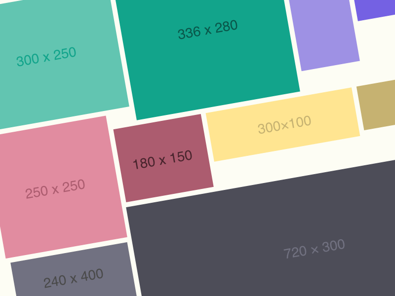
** N O T E :** The Mock-up and photos are not included.**O V E R V I EW :** -------**Travel Banners Ad PSD Template** Promote your Products and services with this great looking Banner Set.**H I G H L I G H T S**-------* 15 PSD Template file included* Easy Customizable and Editable* Google Adwords Size & Facebook Banner Ad (1200x1200px & 1200x628px)* Clean Layout Design**B A N N E R S I Z E S**-------* 120×600 – Skyscraper* 160×600 – Wide Skyscraper* 180×150 – Rectangle* 200×200 – Small Square* 240×400 – Vertical Rectangle* 250×250 – Square* 300×250 – Medium Rectangle* 300×600 – Half Page Banner* 320×50 – Mobile Leaderboard* 468×60 – Full Banner* 720×300 – Pop-Under* 728×90 – Leaderboard* 970×90 – Large Leaderboard* 970×250 – Billboard* 1200x1200 - Facebook Post* 1200x628 - Facebook NewsFeed**F O N T S**-------* https://www.dafont.com/jane-austen.font* https://fonts.google.com/specimen/Poppins

Perfect for your Summer Party Flyer Instagram Social Media Ad Post Web Banner Template Design. This template is elementary to use and flexible. You can edit the text & transform each element quickly, providing total freedom for your creativity and saving more time.Features:✔ Size 1080 x 1080 Perfect for Any Instagram Social Media Template✔ Easy to Editable✔ 100% colour changeable✔ Easy To Change Text, Color, and Image✔ Used Free Font✔ etc.Source file: ✔ PSD✔ JPGPlease rate this item, If you like it. Thanks!!

**O V E R V I EW :** -------**Creative Agency Banners Ad PSD Template** Promote your Products and services with this great looking Banner Set.**H I G H L I G H T S**-------* 15 PSD Template file included* Easy Customizable and Editable* Google Adwords Size & Facebook Banner Ad (1200x1200px & 1200x628px)* Clean Layout Design**B A N N E R S I Z E S**-------* 120×600 – Skyscraper* 160×600 – Wide Skyscraper* 180×150 – Rectangle* 200×200 – Small Square* 240×400 – Vertical Rectangle* 250×250 – Square* 300×250 – Medium Rectangle* 300×600 – Half Page Banner* 320×50 – Mobile Leaderboard* 468×60 – Full Banner* 720×300 – Pop-Under* 728×90 – Leaderboard* 970×90 – Large Leaderboard* 970×250 – Billboard* 1200x1200 - Facebook Post* 1200x628 - Facebook NewsFeed**F O N T S**-------* https://fonts.google.com/specimen/Syne* https://fonts.google.com/specimen/Manrope

Perfect for your Summer Dj Party Flyer Instagram Social Media Ad Post Square Web Banner Template. This template is elementary to use and flexible. You can edit the text & transform each element quickly, providing total freedom for your creativity and saving more time.Features:✔ Size 1080 x 1080 Perfect for Any Instagram Social Media Template✔ Easy to Editable✔ 100% colour changeable✔ Easy To Change Text, Color, and Image✔ Used Free Font✔ etc.Source file: ✔ PSD✔ JPGPlease rate this item, If you like it. Thanks!!

** N O T E :** The Mock-up and photos are not included.**O V E R V I EW :** -------**Life Coach Banners Ad PSD Template** Promote your Products and services with this great looking Banner Set.**H I G H L I G H T S**-------* 15 PSD Template file included* Easy Customizable and Editable* Google Adwords Size & Facebook Banner Ad (1200x1200px & 1200x628px)* Clean Layout Design**B A N N E R S I Z E S**-------* 120×600 – Skyscraper* 160×600 – Wide Skyscraper* 180×150 – Rectangle* 200×200 – Small Square* 240×400 – Vertical Rectangle* 250×250 – Square* 300×250 – Medium Rectangle* 300×600 – Half Page Banner* 320×50 – Mobile Leaderboard* 468×60 – Full Banner* 720×300 – Pop-Under* 728×90 – Leaderboard* 970×90 – Large Leaderboard* 970×250 – Billboard* 1200x1200 - Facebook Post* 1200x628 - Facebook NewsFeed**F O N T S**-------* https://fonts.google.com/specimen/Shippori+Mincho+B1* https://fonts.google.com/specimen/Archivo

Business Banner – SEA Ad Templates are perfectly designed banners for SEA display ad campaigns with nice colors and shapes made for business ads. Download it now for free and if you like it please give it a +heart. Thanks :-) Download here --- The Graphic Ghost helps you to find free graphics, vector art, illustrations, icons, psd files, website templates, fonts and mock-ups for using in all your projects like ads, interfaces, websites, banners, invitation cards, brochures, presentations, magazines, ... Graphic Ghost www.graphicghost.com

Advertise your Restaurant Offers / Discounts, with a stunning collection of banners. Use this Retro themed Banners collection to drive people to your website and to your Restaurant Offers / Discounts. Customize it with your text, brand, logo and prices and launch it online. It included all the layered 22 PSD files.

GYM Ad Banner Design PSD Download. Professional and creative GYM Ad Banner Design PSD for your small and medium professional, business, company, personal, Fitness, Health etc. Fully layered and well organized PSD files. In this showcase we are presenting some High-Quality GYM Ad Banner Design PSD.

**O V E R V I EW :** -------**LGBT Community Banners Ad PSD Template** Promote your Products and services with this great looking Banner Set.**H I G H L I G H T S**-------* 15 PSD Template file included* Easy Customizable and Editable* Google Adwords Size & Facebook Banner Ad (1200x1200px & 1200x628px)* Clean Layout Design**B A N N E R S I Z E S**-------* 120×600 – Skyscraper* 160×600 – Wide Skyscraper* 180×150 – Rectangle* 200×200 – Small Square* 240×400 – Vertical Rectangle* 250×250 – Square* 300×250 – Medium Rectangle* 300×600 – Half Page Banner* 320×50 – Mobile Leaderboard* 468×60 – Full Banner* 720×300 – Pop-Under* 728×90 – Leaderboard* 970×90 – Large Leaderboard* 970×250 – Billboard* 1200x1200 - Facebook Post* 1200x628 - Facebook NewsFeed**F O N T S**-------* https://fonts.google.com/specimen/Poppins* https://fonts.google.com/specimen/Shippori+Mincho+B1

** N O T E :** The Mock-up and photos are not included.**O V E R V I EW :** -------**White Party Banners Ad PSD Template** Promote your Products and services with this great looking Banner Set.**H I G H L I G H T S**-------* 15 PSD Template file included* Easy Customizable and Editable* Google Adwords Size & Facebook Banner Ad (1200x1200px & 1200x628px)* Clean Layout Design**B A N N E R S I Z E S**-------* 120×600 – Skyscraper* 160×600 – Wide Skyscraper* 180×150 – Rectangle* 200×200 – Small Square* 240×400 – Vertical Rectangle* 250×250 – Square* 300×250 – Medium Rectangle* 300×600 – Half Page Banner* 320×50 – Mobile Leaderboard* 468×60 – Full Banner* 720×300 – Pop-Under* 728×90 – Leaderboard* 970×90 – Large Leaderboard* 970×250 – Billboard* 1200x1200 - Facebook Post* 1200x628 - Facebook NewsFeed**F O N T S**-------* https://elements.envato.com/chaviera-YKFC74Z* https://fonts.google.com/specimen/Space+Grotesk

** N O T E :** The Mock-up and photos are not included.**O V E R V I EW :** -------**NFT Marketplace and Cryptocurrency Exchange Banners Ad PSD Template** Promote your Products and services with this great looking Banner Set.**H I G H L I G H T S**-------* 15 PSD Template file included* Easy Customizable and Editable* Google Adwords Size & Facebook Banner Ad (1200x1200px & 1200x628px)* Clean Layout Design**B A N N E R S I Z E S**-------* 120×600 – Skyscraper* 160×600 – Wide Skyscraper* 180×150 – Rectangle* 200×200 – Small Square* 240×400 – Vertical Rectangle* 250×250 – Square* 300×250 – Medium Rectangle* 300×600 – Half Page Banner* 320×50 – Mobile Leaderboard* 468×60 – Full Banner* 720×300 – Pop-Under* 728×90 – Leaderboard* 970×90 – Large Leaderboard* 970×250 – Billboard* 1200x1200 - Facebook Post* 1200x628 - Facebook NewsFeed**F O N T S**-------https://fonts.google.com/specimen/Manrope

Ad Banner Collection- Google adsense Size.All the Size:120×600 – Skyscraper 160×600 – Wide Skyscraper 200×200 – Small Square 240×400 – Vertical Rectangle 250×250 – Square 300×250 – Medium Rectangle 300×600 – Half Page Banner 320×50 – Mobile Leaderboard 320×100 – Large Mobile Banner336×280 – Large Rectangle 468×60 – Full Banner 720×300 – Pop-Under 728×90 – Leaderboard 970×90 – Large Leaderboard970×250 – Billboard1080×1080 – Instagram banner 1200×628 – Facebook banner (with 20% text overlay)1200x1200 - Facebook Post

Advertise your Car Advertisements, with a stunning collection of banners. Use this unique themed Banners collection to drive people to your website and to your Car Advertisements. Customize it with your text, brand, logo and prices and launch it online. It included all the layered 10 PSD files.

** N O T E :** The Mock-up and photos are not included.**O V E R V I EW :** -------**Car Dealer, Rental and Listing Banners Ad PSD Template** Promote your Products and services with this great looking Banner Set.**H I G H L I G H T S**-------* 15 PSD Template file included* Easy Customizable and Editable* Google Adwords Size & Facebook Banner Ad (1200x1200px & 1200x628px)* Clean Layout Design**B A N N E R S I Z E S**-------* 120×600 – Skyscraper* 160×600 – Wide Skyscraper* 180×150 – Rectangle* 200×200 – Small Square* 240×400 – Vertical Rectangle* 250×250 – Square* 300×250 – Medium Rectangle* 300×600 – Half Page Banner* 320×50 – Mobile Leaderboard* 468×60 – Full Banner* 720×300 – Pop-Under* 728×90 – Leaderboard* 970×90 – Large Leaderboard* 970×250 – Billboard* 1200x1200 - Facebook Post* 1200x628 - Facebook NewsFeed**F O N T S**-------* https://fonts.google.com/specimen/Oxanium

** N O T E :** The Mock-up and photos are not included.**O V E R V I EW :** -------**Business Banners Ad PSD Template** Promote your Products and services with this great looking Banner Set.**H I G H L I G H T S**-------* 15 PSD Template file included* Easy Customizable and Editable* Google Adwords Size & Facebook Banner Ad (1200x1200px & 1200x628px)* Clean Layout Design**B A N N E R S I Z E S**-------* 120×600 – Skyscraper* 160×600 – Wide Skyscraper* 180×150 – Rectangle* 200×200 – Small Square* 240×400 – Vertical Rectangle* 250×250 – Square* 300×250 – Medium Rectangle* 300×600 – Half Page Banner* 320×50 – Mobile Leaderboard* 468×60 – Full Banner* 720×300 – Pop-Under* 728×90 – Leaderboard* 970×90 – Large Leaderboard* 970×250 – Billboard* 1200x1200 - Facebook Post* 1200x628 - Facebook NewsFeed**F O N T S**-------* https://fonts.google.com/specimen/Archivo* https://www.dafont.com/prestige-signature-script.font


**O V E R V I EW :** -------**SEO Advisors Banners Ad PSD Template** Promote your Products and services with this great looking Banner Set.**H I G H L I G H T S**-------* 15 PSD Template file included* Easy Customizable and Editable* Google Adwords Size & Facebook Banner Ad (1200x1200px & 1200x628px)* Clean Layout Design**B A N N E R S I Z E S**-------* 120×600 – Skyscraper* 160×600 – Wide Skyscraper* 180×150 – Rectangle* 200×200 – Small Square* 240×400 – Vertical Rectangle* 250×250 – Square* 300×250 – Medium Rectangle* 300×600 – Half Page Banner* 320×50 – Mobile Leaderboard* 468×60 – Full Banner* 720×300 – Pop-Under* 728×90 – Leaderboard* 970×90 – Large Leaderboard* 970×250 – Billboard* 1200x1200 - Facebook Post* 1200x628 - Facebook NewsFeed**F O N T S**-------* https://fonts.google.com/specimen/Bebas+Neue* https://fonts.google.com/specimen/Poppins
Experience design inspiration like never before with Muzli. Loved by 700k+ designers worldwide, Muzli is the leading go-to browser extension for creative professionals.
Get Muzli for ChromeA well-designed banner can be the gateway to capturing your audience's attention and conveying your message promptly. Whether it's on your website's homepage, a landing page, or an online advertisement, a good banner can make a lasting impression. Here are some valuable tips to help you create an impactful and engaging banner:
1. Define Your Objective: Begin by clarifying the purpose of your banner. Are you promoting a product, announcing a sale, or encouraging sign-ups? Understanding your goal will guide your design decisions and ensure that your banner delivers a focused message.
2. Keep It Simple: Simplicity is key when it comes to banners. Avoid cluttering the design with excessive text, images, or elements. A clear, concise message with a single focal point will have a stronger impact.
3. High-Quality Imagery: Use high-resolution images that are relevant to your message. Visuals should complement your text and resonate with your target audience. Avoid pixelated or stretched images, as they can diminish the overall quality of your banner.
4. Compelling Copy: Craft a brief and compelling headline or tagline that conveys the essence of your message. Use concise, action-oriented language that encourages users to take the desired action.
5. Legible Typography: Choose a legible font that aligns with your brand's style and message. Ensure that the text is easy to read even from a distance. Maintain a good balance between font sizes for different elements, such as headline, subtext, and call-to-action.
6. Color Harmony: Opt for a color palette that aligns with your brand identity and evokes the desired emotional response. Use contrasting colors to make important elements, like your CTA button, stand out. However, don't overwhelm your banner with too many colors – stick to a harmonious combination.
7. Consistent Branding: Your banner is an extension of your brand. Incorporate your logo, brand colors, and typography to maintain consistency across all your visual assets. This helps in building brand recognition and trust.
8. Strategic Placement: Position your banner where it will receive the most visibility. Above the fold on your website's homepage or at the top of a landing page are common locations. Ensure that the banner's placement doesn't interfere with the overall user experience.
9. Use Negative Space: Allow for adequate negative space around your banner elements. This not only enhances the visual appeal but also prevents a cluttered appearance.
10. Clear Call-to-Action (CTA): If your banner has a specific action you want users to take, such as "Shop Now" or "Learn More," make sure the CTA button is prominently displayed. Use contrasting colors and persuasive language to encourage clicks.
11. Mobile-Friendly Design: Given the prevalence of mobile device usage, design your banner to be responsive. Ensure that it looks appealing and functions well on various screen sizes.
12. A/B Testing: Before finalizing your banner, consider running A/B tests with slight variations to see which design elements resonate better with your audience. This data-driven approach can help you refine your banner for optimal performance.
In conclusion, a good banner combines compelling visuals, concise messaging, and strategic design to convey your message effectively. By focusing on simplicity, quality, and alignment with your brand identity, you can create banners that capture attention, engage users, and drive desired actions.