
Get thousands of World Cup Art examples for free
Join over 700k others who enjoy Muzli design inspiration hub.
We curate topical collections around design to inspire you in the design process.
This constantly-updated list featuring what find on the always-fresh Muzli inventory.
Last update: 4/26/2024
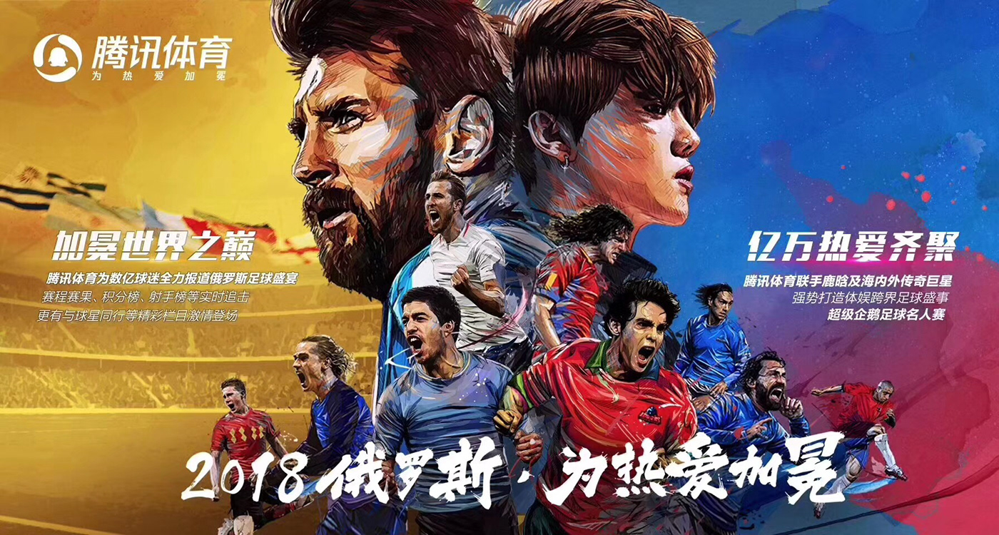
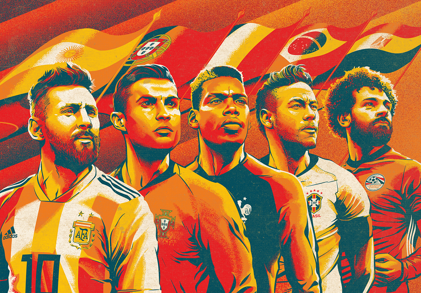
An order from the Chinese agency Seviceplan for Tencent. A painting for the World cup in Russia with a partnership with the Chinese idol Luhan. This is a composition with Luhan and legendaries of soccer . Messi/ Luhan / Nesta / Pirlo / Roberto Carlos / Kaka / Suarez / Debruyne / Puyol / Griezmann.
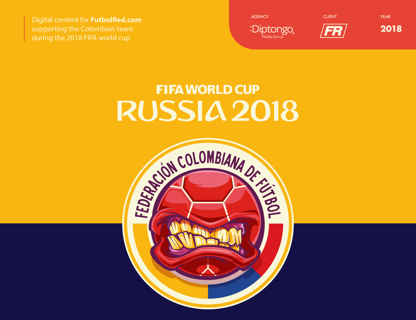
Digital content for FutbolRed.com supporting the Colombian team during the 2018 FIFA world cup. Ilustraciones Selección Colombia Mundial Rusia 2018
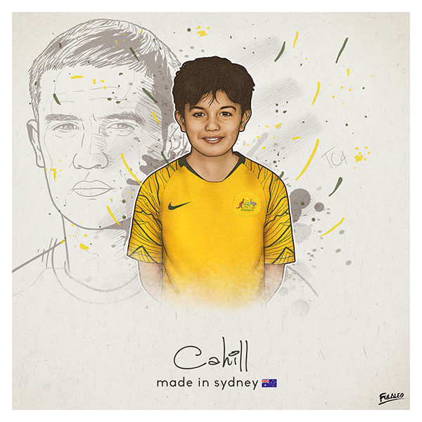
Inspired in the dreams that each human can have. Dream big as a child, you will be enormous as an adult.


the arena's design is inspired by the sails of traditional dhow boats and aims to highlight the region's traditional industries. The post zaha hadid’s al wakrah stadium opens in qatar ahead of 2022 world cup appeared first on designboom | architecture & design magazine.


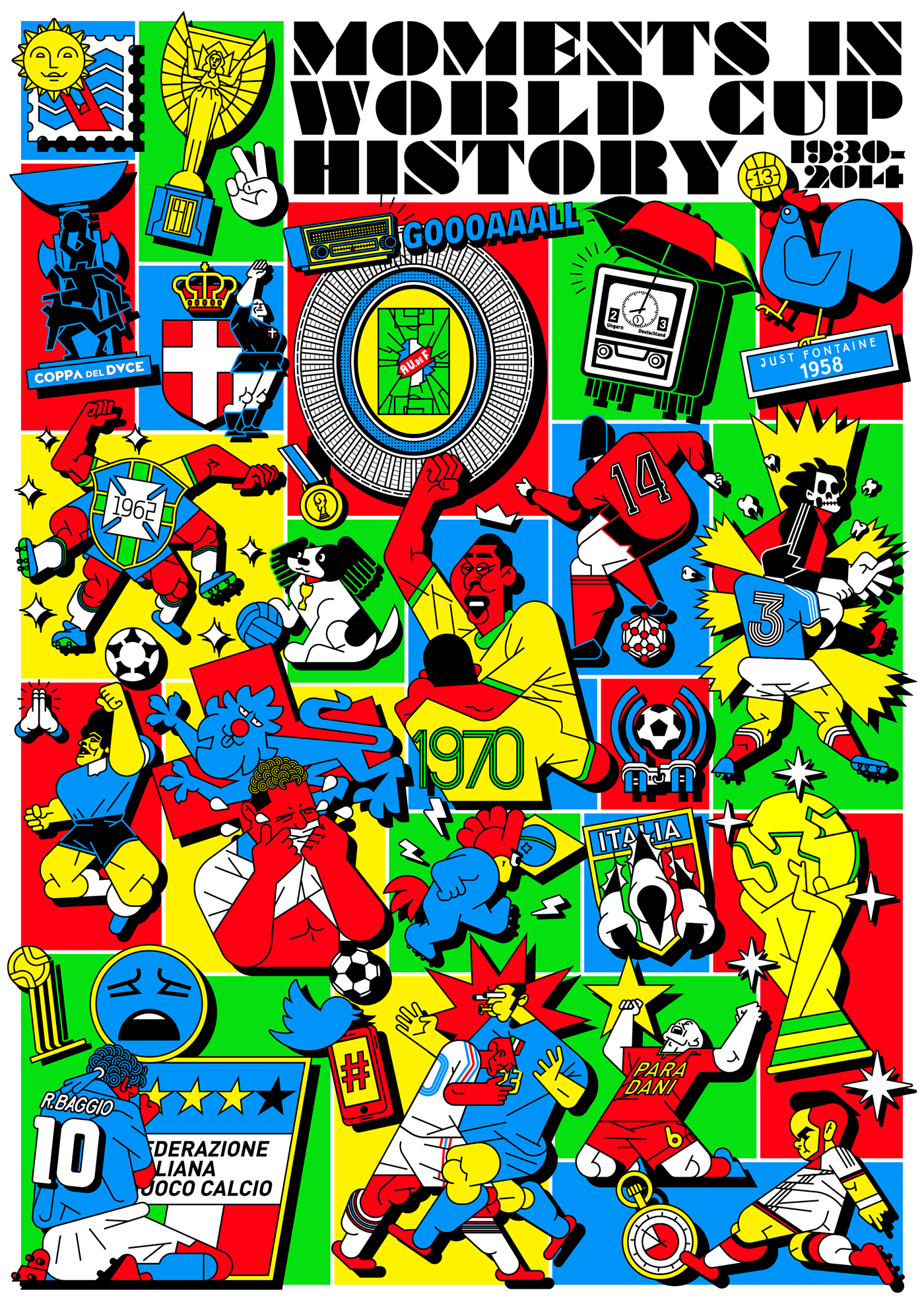
Iconic Moments in World Cup History ranging 1930 to 2014
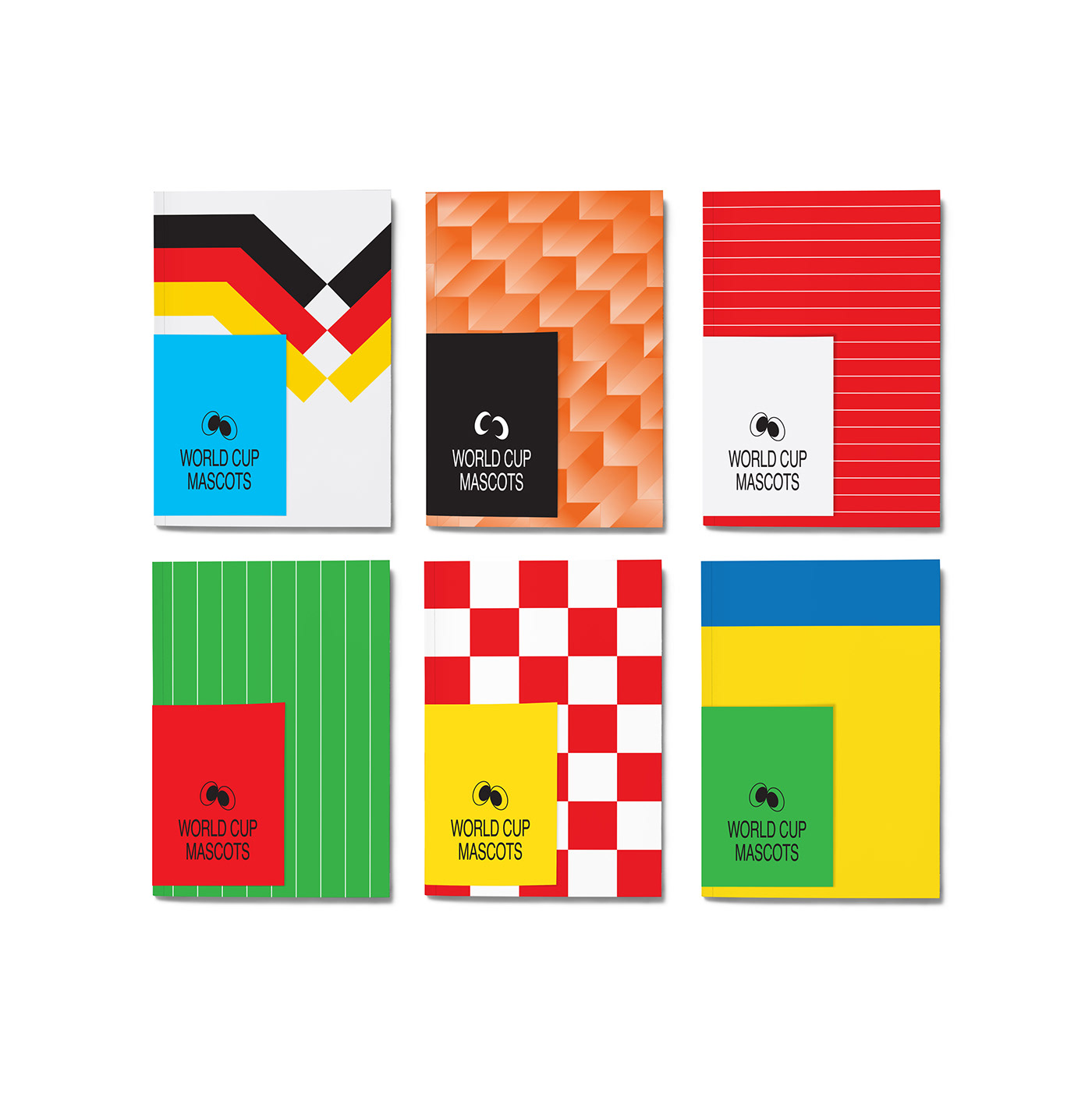
For this self-initiated project, I tried to create a set of fictional World Cup mascots. As you may understand, there is no such thing as World Cup 1965 or World Cup 1977.. I just wanted to add an extra depth to my characters By designing the logo to their own Cup.

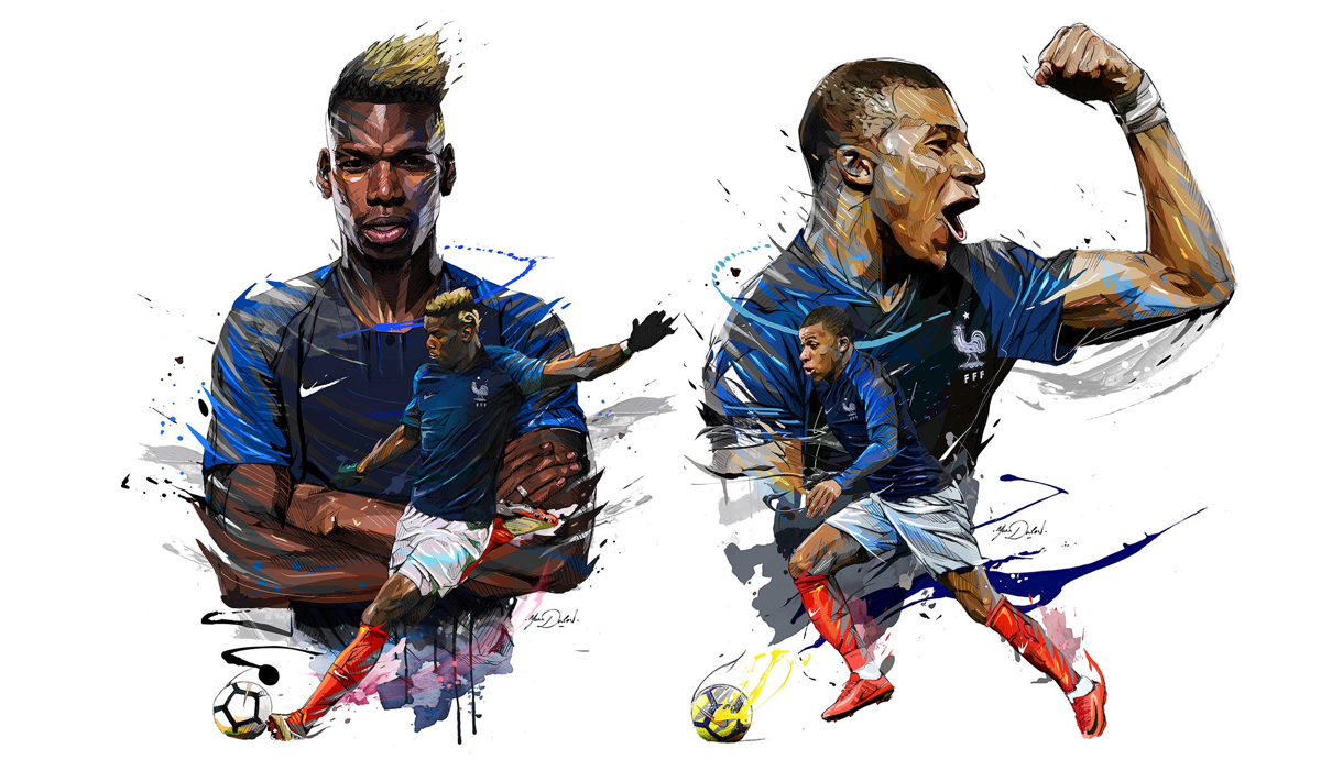
World Cup 2018 Illustrations: Félicitations les Bleus (France) AoiroStudio Jul 16, 2018 In case you have been outside this beautiful planet, today marked the day where France won the World Cup 2018 against the superb team of Croatia in Luzhniki Stadium, Russia. This is their second World Cup title since 1998, well Félicitations les Bleus! For the occasion, we are sharing the work of Yann Dalon who is an illustrator from Paris, France. We are honouring his work for the French Football Federation (FFF) the decoration of the Russian Hotel for the World Cup 2018 in the town of Istra, Russia. I' m very proud of this work, An order of the French Football Federation (FFF) the decoration of the Russian Hotel for the WorlCup 2018 in the town of Istra. 23 compositions for the doors of each bedroom off he players and 4 for the coach Didier Deschamps and the staff, and 2 big wall murals. More Links Learn more about Yann Dalon Follow Yann's work on Behance Previous feature on ABDZ world cup world cup 2018 illustration france
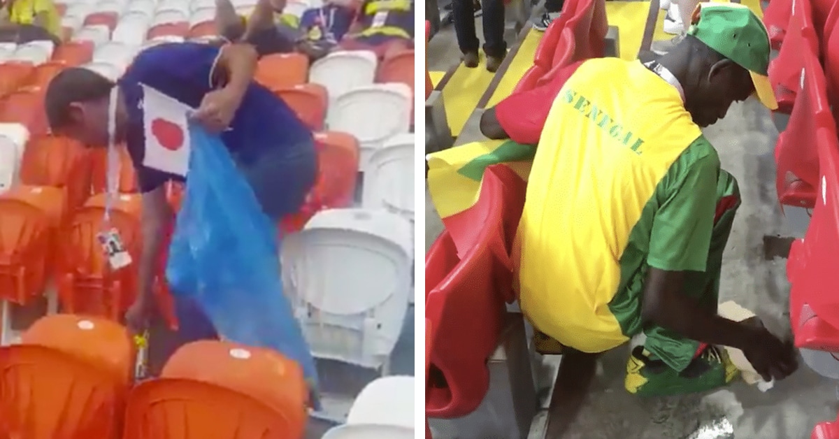
Japanese fans pick up trash after World Cup match Attending a World Cup game is an undoubtedly exciting event—especially if your team comes out on top. To certain fans, however, celebrating a big win comes second to very different task: cleaning up the stadium. During this year's World Cup in Russia, groups of considerate spectators […] The post Japan’s Soccer Fans Clean Up After World Cup and Inspire Other Countries’ Fans to Do the Same appeared first on My Modern Met.

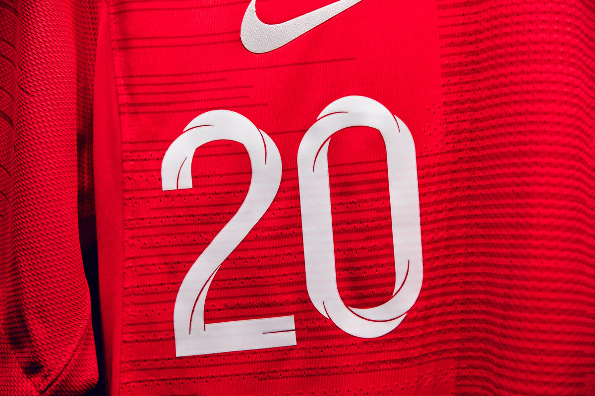
Nigeria's 2018 World Cup kit reflects the spirit and swagger of contemporary Nigeria - we talked to Nike's Design Director Pete Hoppins about the inspiration for the design The post Designing Nigeria’s World Cup kit appeared first on Creative Review.

A selection of sketches created during World Cup 2018.

I' m very proud of this work, An order of the French Football Federation (FFF) the decoration of the Russian Hotel for the WorlCup 2018 in the town of Istra. 23 compositions for the doors of each bedroom off he players and 4 for the coach Didier Deschamps and the staff, and 2 big wall murals.

From a Sustainable Coastlines Hawaii partnership to less public efforts at keeping beaches clean Walking along the Kaʻena Point Trail along the northwestern most point of Oahu is a beautiful sight—so long as you don’t look down. For when you do, you’ll find nearly endless stretches of bottle caps, disposable razors, toothbrushes and various shards of other plastics. Seeing the overwhelming and seemingly ordered fashion …

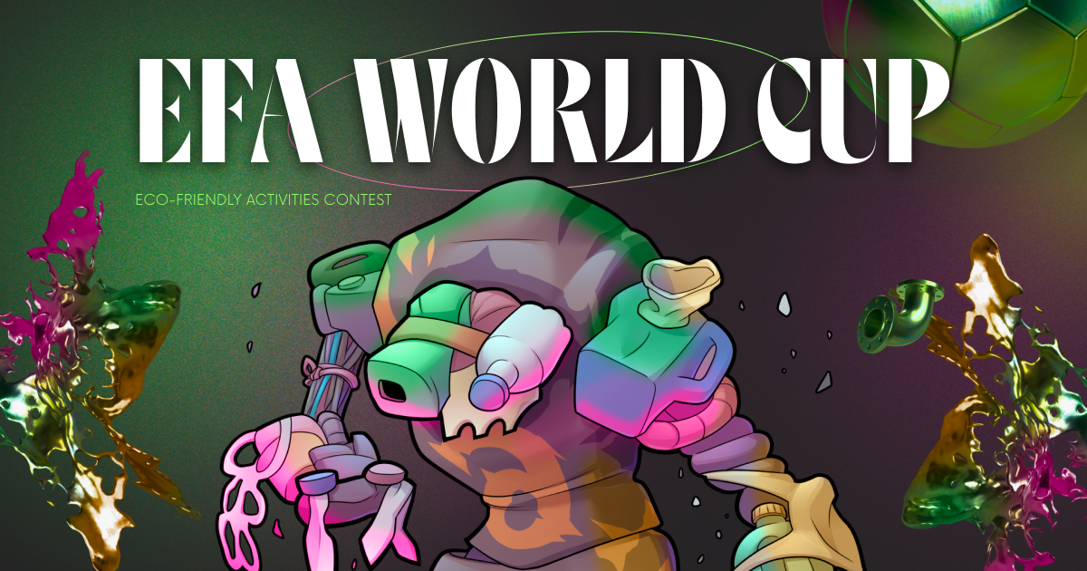
Eco-friendly activities contest
COME ON ENGLAND! #ENGBEL #WorldCup2018 #worldcup Illustration: @SteveScott2000 pic.twitter.com/S01WnPZuAe — Jelly London (@JellyLondon) June 28, 2018 After nearly a month, the 2018 World Cup has come to a close. Each game leading up to France's victory over Croatia in the final has had its share of excitement. However, what has happened off the field has […] The post 15 of the Best Illustrations of the 2018 World Cup appeared first on My Modern Met.
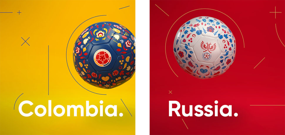
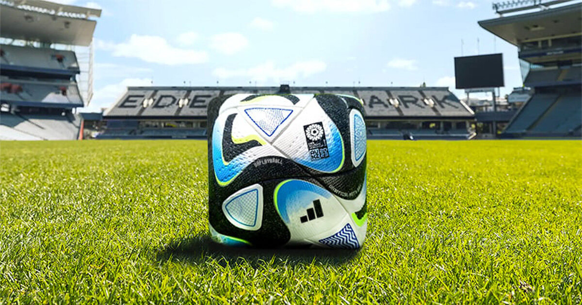
There are a few things that bring people, especially man, together: food, sports, and beer. 2018 has been an eventful year already. For soccer teams from all over the world, this is the year when they can prove their talent, hard work, and passion again. The 2018 FIFA World Cup is at its 21 edition... Read More at World Cup 2018 Amazing Soccer Ball Designs

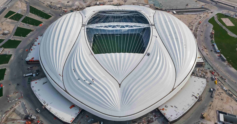
the stadium structure is now complete, while work is progressing on the internal finishes, the retractable roof, and the façade. The post zaha hadid-designed stadium in qatar nears completion ahead of 2022 world cup appeared first on designboom | architecture & design magazine.
the conceptual football for the 2023 women's world cup advocates for a more inclusive future in sports. The post conceptual square football for women’s world cup challenges gender inequality appeared first on designboom | architecture & design magazine.
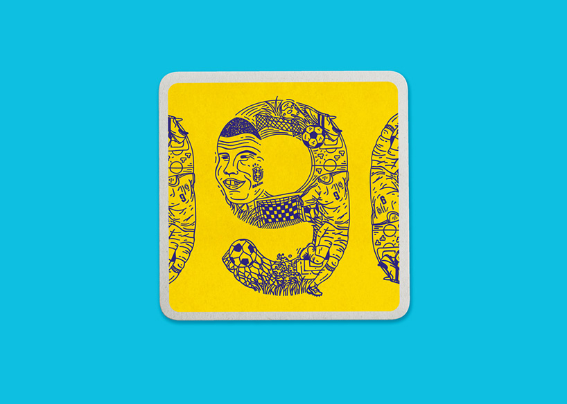
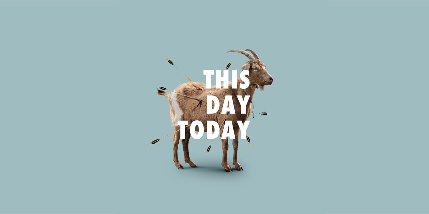
historic moments from FIFA world cup history have been printed on beer mats to raise money for charity. The post world cup, charity, beer? best summer ever appeared first on designboom | architecture & design magazine.
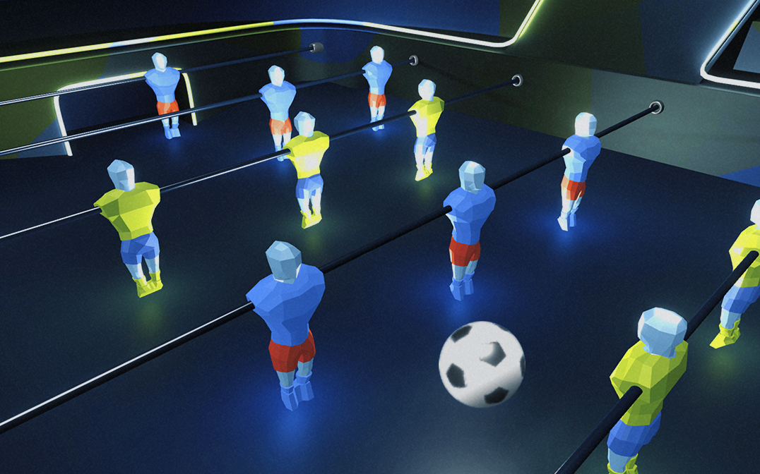
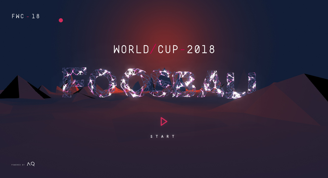
FWA of the day 03 July 2018: Foosball World Cup 18 Project Link The 2018 Foosball World Cup is an interactive game, created to celebrate the FIFA World Cup and all the foosball lovers. #FOTD #thefwa

As part of our dedicated World Cup 2018 coverage, Nick Asbury reviews the fan-written slogans chosen to appear on each team's bus The post The Slogan World Cup 2018 appeared first on Creative Review.
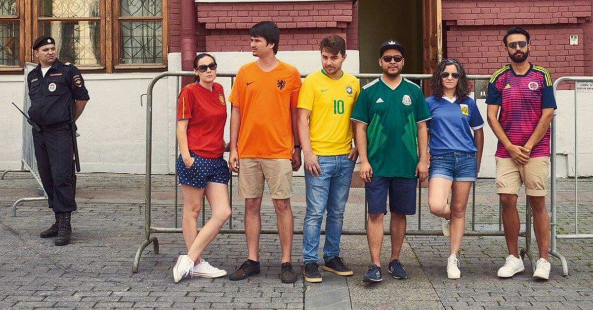
“In the plain light of day, in front of the Russian authorities, Russian society and the whole world, we wave the flag with pride,” six international activists whose project is dubbed the Hidden Flag said in their mission statement. Follow the link in our bio for more. (Photo by thehiddenflag.org) #LGBT #HiddenFlag #rainbowflag #hiddenrainbow A […] The post World Cup Fans Used Their Countries’ Soccer Jerseys to Protest Russia’s Anti-LGBTQ Policies appeared first on My Modern Met.
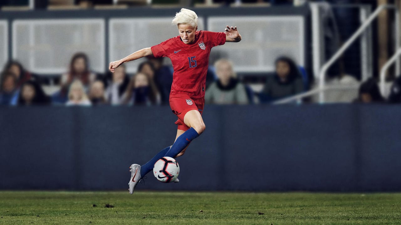
with the 2019 women’s world cup just months away, NIKE has revealed the soccer uniforms of 14 federations, from the inspiring match jerseys to the empowering training kits. with styles changing and new technologies emerging between each tournament, the sportswear brand’s 2019 kits make a big impact on aesthetics, fit and sustainability. first and foremost, […] The post NIKE weaves 2019 women’s world cup kits from recycled plastic bottles appeared first on designboom | architecture & design magazine.
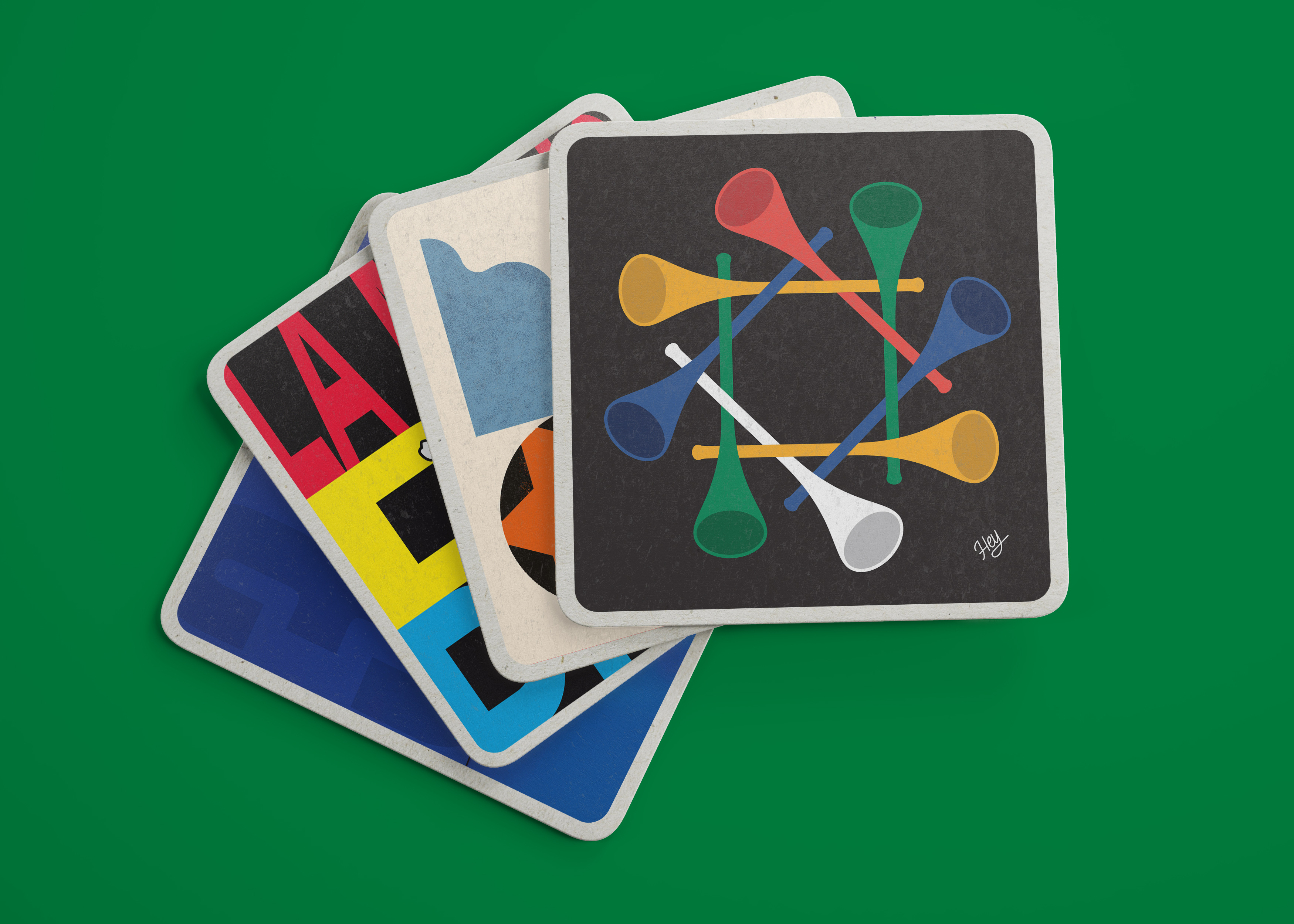
Weird World Cup x Football Beyond Borders AoiroStudio Jun 20, 2018 Our good friend Gordon Reid and in collaboration with designer Callum Stephenson have set up a fun World Cup project. For this project they have commissioned 20 artists and designers from Yarza Twins, Velvet Spectrum, Brand Nu, Hey Studio, Craig Oldhamm, and to name a few. Why? To celebrate their favourite weird or hilarious moment from previous World Cups. All of the original pieces are then to be printed on beer mats and 'exhibited' in pubs around London in time for the World Cup. Check it out! We invited twenty leading designers, illustrators and creatives to celebrate their favourite hilarious, weird and wonderful moments of previous World Cups by creating a piece of work to represent that moment. These pieces have then been printed onto limited edition beer mats and are being ‘exhibited’ in pubs around London right in time for the World Cup. More Links Get yourself a Weird World Cup Mixed Pack All of the money raised will be going to a charity we love, Football Beyond Borders. They are currently fundraising for a new multi purpose space in the Angell Town Estate in Brixton where the plan is to turn this space into an office, an FBB learning hub used for non-FBB Schools programmes and a safe haven for young people in London from disadvantaged backgrounds. Weird World Cup illustration world cup

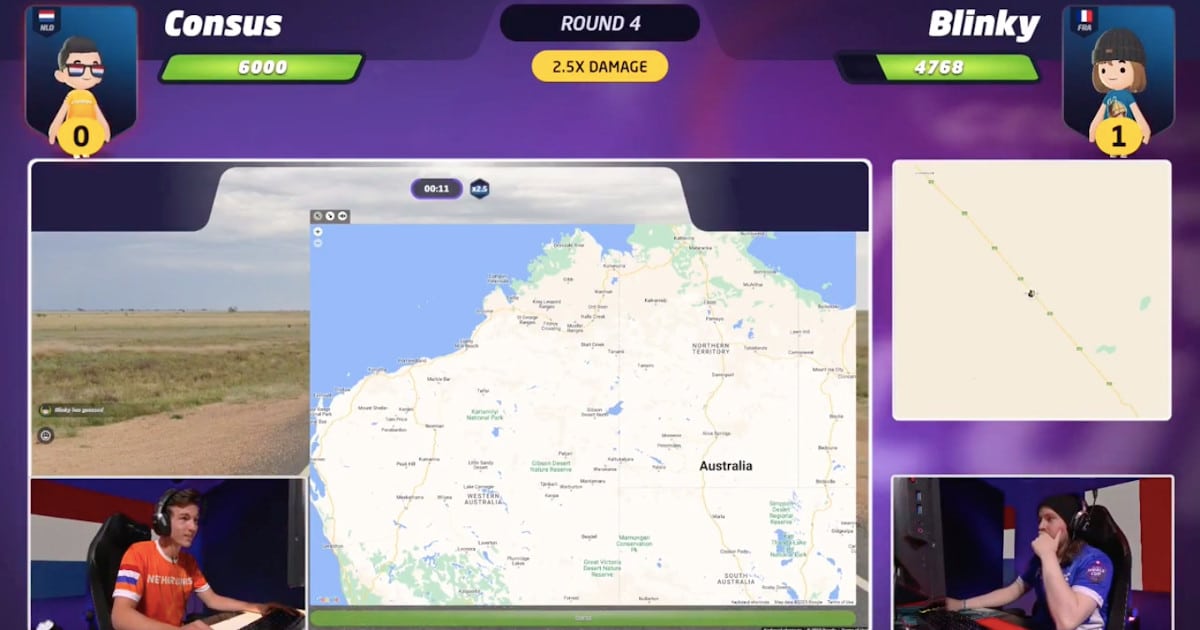
First-Ever ‘GeoGuessr World Cup’ Celebrates an E-Sport for People Who Love Geography Insane guess by both players in Geoguessr Worldcup Final. byu/daggerwound innextfuckinglevel E-sports are all the rage now. While many of the most thrilling tournaments feature world-famous franchises such as League of Legends or Call of Duty, a different kind of game has recently enthralled audiences. GeoGuessr just celebrated its first-ever world cup, bringing together loving […] READ: First-Ever ‘GeoGuessr World Cup’ Celebrates an E-Sport for People Who Love Geography
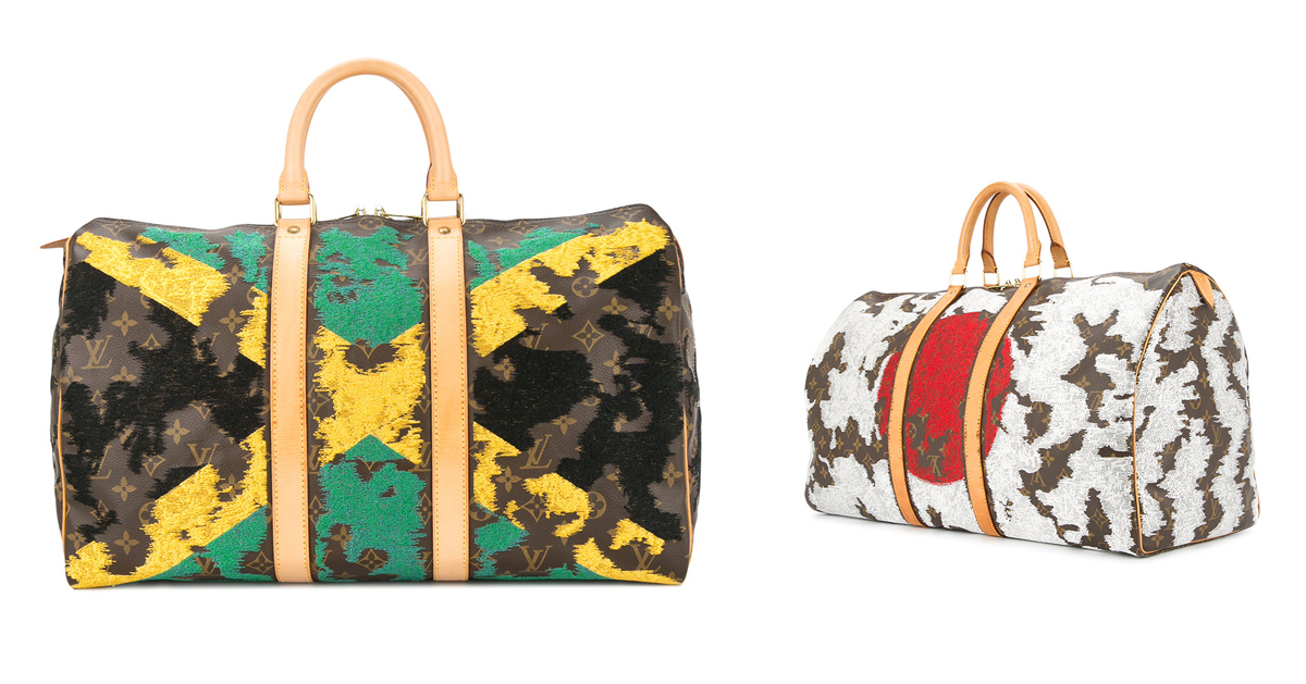
womenswear label JAY AHR launches a selection of repurposed louis vuitton bags featuring decades old embroidery techniques. The post flag-embroidered louis vuitton bags illustrate a lingering patriotism following world cup appeared first on designboom | architecture & design magazine.

Every World Cup comes with an official poster, offering a history of both football and graphic design through the decades. Here, Ned Read, editor and founder of football mag Pickles, analyses the posters for CR The post A World Cup history in posters appeared first on Creative Review.
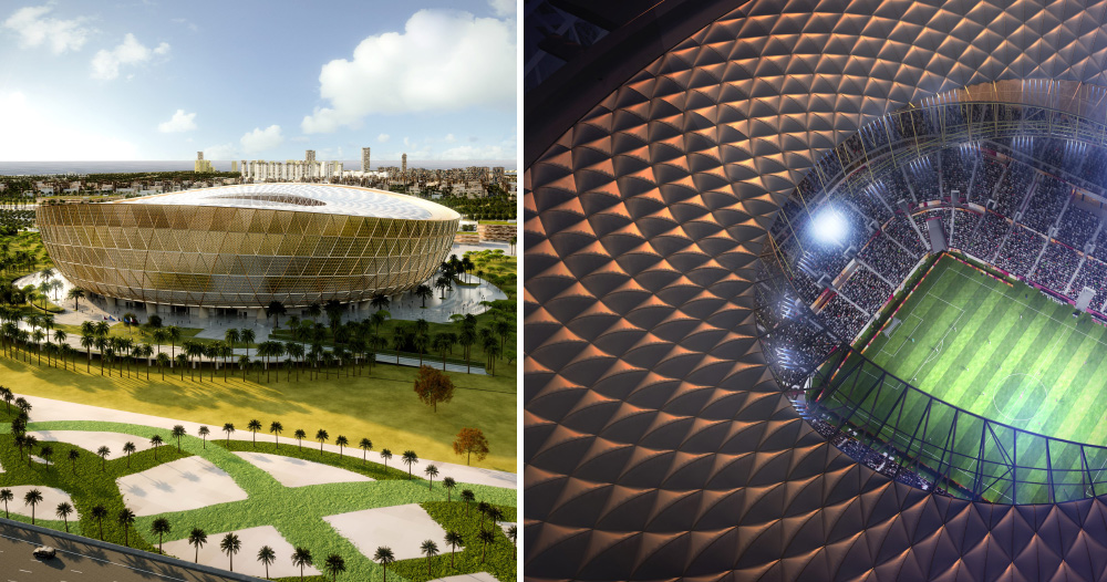
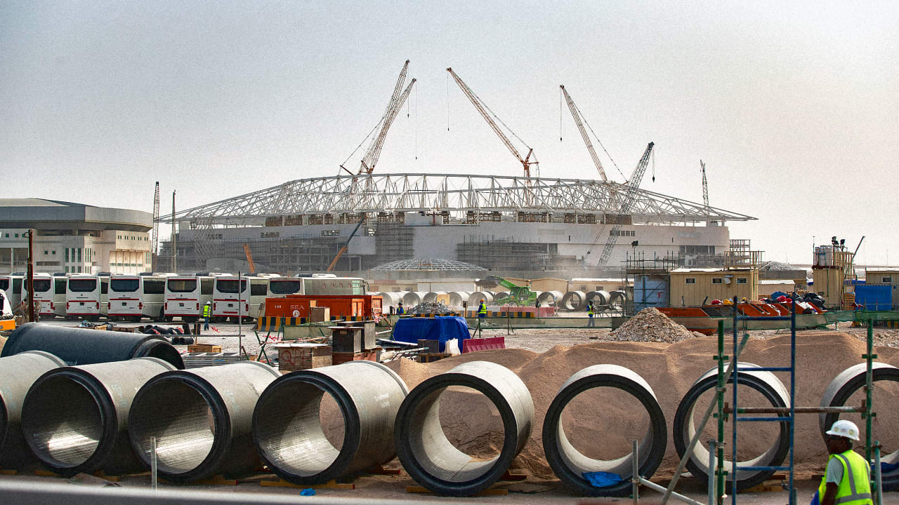
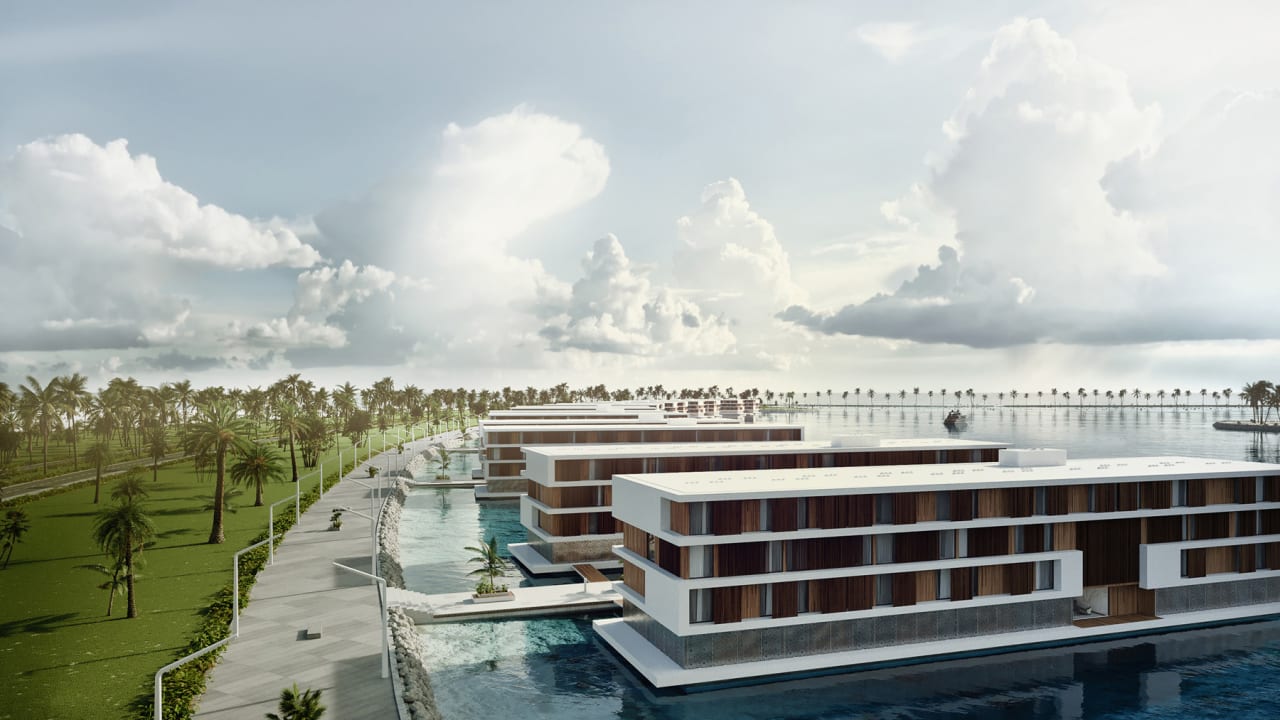
the venue will be the largest used during the tournament, which is scheduled to kick off on november 21, 2022. The post foster + partners designs 80,000-seat lusail stadium for 2022 world cup in qatar appeared first on designboom | architecture & design magazine.

After a surprising rise to the quarter finals in the 2016 Euros - and beating England on the way - Iceland has entered the World Cup with realistic optimism. A photo story titled The First Time, investigates football culture and fandom in the country. The post Iceland’s World Cup dreams, in photos appeared first on Creative Review.
“We Shawl See” "The 2022 FIFA World Cup is scheduled to be the 22nd edition of the FIFA World Cup, the quadrennial international men's association football championship contested by the national teams of the member associations of FIFA. It is scheduled to take place in Qatar in 2022. This will be the first World Cup ever to be held in the Arab world and the first in a Muslim-majority country. This will be the second World Cup held entirely in Asia after the 2002 tournament in South Korea and Japan. In addition, the tournament will be the last to involve 32 teams, with an increase to 48 teams scheduled for the 2026 tournament. The reigning World Cup champions are France." (Wikipedia) Design by N/A Related links FIFA press release Relevant quoteThe emblem’s design embodies the vision of an event that connects and engages the entire world, while also featuring striking elements of local and regional Arab culture and allusions to the beautiful game.The swooping curves of the emblem represent the undulations of desert dunes and the unbroken loop depicts both the number eight – a reminder of the eight astonishing stadiums that will host matches – and the infinity symbol, reflecting the interconnected nature of the event. Besides echoing the shape of the iconic FIFA World Cup Trophy, the emblem’s central form takes inspiration from a traditional woollen shawl. During winter months, shawls are worn around the world and in the Arab and Gulf region in particular by a variety of people and in various styles.The intricate embroidered detail that often adorns shawls in the Arab world is featured and takes inspiration from various cultures across Asia, celebrating the continent’s second hosting of a FIFA World Cup tournament and Qatar’s diverse population. The regionally inspired winter garment also alludes to the tournament’s start dates and the fact that it will be the first FIFA World Cup™ to be played in November and December.The new typeface created to accompany the emblem reimagines traditional Arabic calligraphy in a new, contemporary font, taking inspiration from the region and Asia, and fusing tradition with modernity. Images (opinion after) Logo. Logo introduction video. Emblem-only animation. Opinion As I’m looking at the logo and reading the description I just find myself nodding along. Even if a little exaggerated on the metaphors and rhetoric, all the reasoning for all the elements and structure of the emblem make sense and it’s been executed quite nicely, echoing the shape of the trophy and having just enough graphic elements to make it evocative of the region. The only weird thing is the top front of the shawl that sort of maybe creates a heart shape but it’s like the shawl got all bunched up. The “Qatar 2022” wordmark is pretty nice too and the extended connection, emulating Arabic typography, also helps to quickly establish a connection to the host city. My only major complaint would be the size of “FIFA WORLD CUP”, which is huge and reveals how not pretty that whole wordmark is. Eager to see how the visual language of this develops.
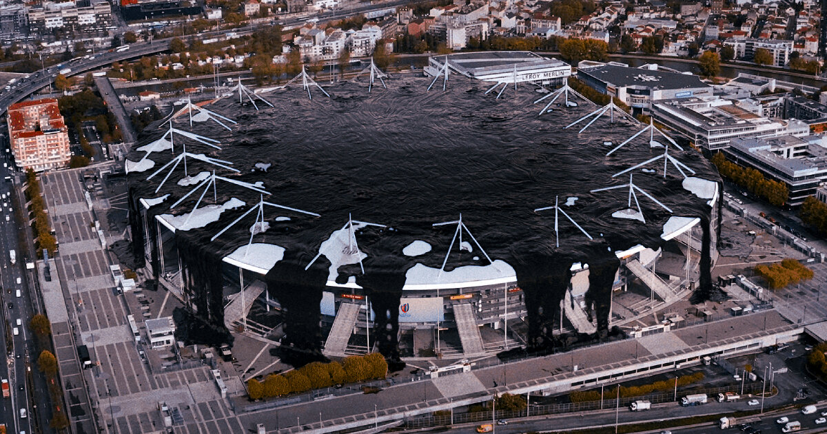
greenpeace france and studio birthplace release their campaign film against the sponsorship of energy company totalenergies in the rugby world cup 2023. The post rugby world cup 2023 stadium in france drowns in crude oil to call out fossil fuel sponsorship appeared first on designboom | architecture & design magazine.
there will be pain, suffering, beauty and joy as goliaths fall and davids rise. The post the world cup stadiums that have had the biggest impact on cities and sport appeared first on designboom | architecture & design magazine.


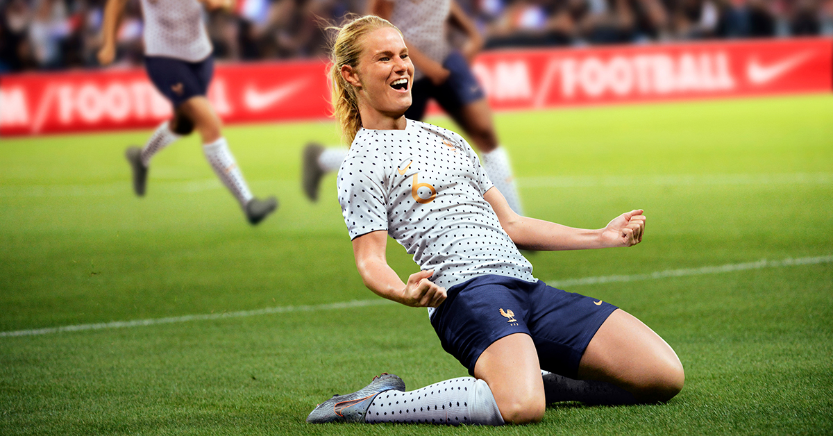
The spoken word campaign by Grey London looks to put the spotlight on the star players from England’s Lionesses squad, and the flourishing women’s game more generally The post Lucozade rewrites Three Lions for Women’s World Cup appeared first on Creative Review.
“Ribb On, Ribb Off” First held in France in 1954, the Rugby League World Cup is contested by teams from the 19 countries that are members of the Rugby League International Federation. Celebrated every four years since 2013 (and at irregular intervals before then), Rugby League World Cup is considered to be the foremost competition in the "league" variant of the sport and the Australian national rugby league team, the Kangaroos, has dominated the competition with 11 titles, including the most recent in 2017. The 2021 edition will be held in England and, for the first time, it will carry out the men's, women's, and wheelchair competitions (played since 2010 and 2008 respectively) at the same time and on the same stage. The identity for the 2021 Rugby League World Cup has been designed by Belfast, Ireland-based Mammoth. The trophy has been the traditional symbol of the Rugby League World Cup for many years - it's the global pinnacle of Rugby League, coveted by each and every nation. The identity has been created using the trophy's ribbons to embody the three tournaments (men, women and wheelchair with red, orange, and yellow) and to symbolise our close connection to fans, nations, communities, teams and players.The ribbon symbolises the connection to the world cup and to the world. It's our visual metaphor to represent the brand, creating an identity that flexes out into a brand system that unites cities, countries and fans. The continuous ribbon creates the perfect link between teams, hosts, nations and events. It bends, travels and creates shapes building a unique visual language that not only identifies the RLWC--but differentiates it.Mammoth project page Logo. I am assuming the before logo was an interim one between the time it was announced that the event would be held in England and the time they introduced the after version, which is very welcome because the old logo looked like a rejected comp from a horror movie poster with its splatter typography and matching-but-not-really trophy depiction. The new logo is both a more festive and more aggressive interpretation in its two contrasting elements: a ribbon-based trophy icon and a spiky-notched wordmark. Both are good within their genres but I'm not sure they belong together. The trophy has some nice volume to it with the ribbons following the shape of the actual trophy with subtle shadows on each crease. I'm not sure why the white ribbons for the handles don't have a shadow as those pieces feel flat. The little nub at the top is a hard element to resolve with the ribbon effect as it starts to look like a beach ball but I think they solved it as well as possible. The wordmark is fine if you are into the spiky type treatment which, at least in this case, is the lesser offensive style with the spikes going inward. It's fortunate that in the words "WORLD CUP" they were able to alternate whether the spike was on the top or bottom, which creates some added rhythm in the wordmark. I kind of like the secondary type used in the smaller bits of text in the wordmark better and wouldn't have minded that being used big as well but I can understand the impetus behind the spikes. The Saint George's Cross detail in the bottom line is quite nice. Logo animation. Logo variations and icon construction. Wordmark animation. Short-Hand Identity - Small size, big impact. There will be times where the main identity will be unsuitable due to format/legibility so we have created our short-hand version. The short-hand identity is bold and impactful, communicating the key message while remaining compact and versatile.Mammoth project page Shorthand logo. The shorthand version is useful given how detailed and large the full logo is and, at first glance, it looks fine but there are some questionable decisions. The "RLWC" part is okay but the "2021" is not quite okay. The spikes in the "02" look like eyelashes and the two "2"s are different, which I understand maybe why they wanted to do that but the result is strange, especially when you look at the bottom of the first "2" where a spike is forced on it creating a weird bump that at first I thought it was an SVG rendering issue but, nope, it's very much on purpose. The Saint George's Cross feels too heavy and its spherized effect is strange and oddly resolved. I know they were trying to make it look like a trophy but the distortion is not quite right and clashes with the straightness of the type above it. Tagline. Typography. For the custom typeface, once more letters mix and match, the upper and lower positioning of the notches creates odd rhythms throughout. Perhaps this needed an OpenType feature that would shift the notches to create more of that nice up-down-up-down variance from the wordmark. Ribbons, animated. Stationery. Various applications. Out of home advertising. Posters. In application, there are a lot of ribbons and swooshes in different configurations and uses. I'm not a huge fan of any of it but it's not bad or wrong by any means. Things feel lively and bold, in part thanks to the effective color palette, and the variety of approaches will probably help the organizers create the myriad applications needed as the event approaches. Mobile cases. Hoodie. T-shirts. Other swag. New look presentation. (Probably not done by Mammoth.) Overall, I have a number of reservations about this but they are mostly personal and this all works fairly well, feeling like a celebratory and momentous event through all the effusive ribbons while also reminding the audience that it's a hard-hitting sport through the bold, spiky typography, which sums this up for me as mixed feelings.

The BBC has remade hip-hop artist Fort Minor's track Remember The Name for its Women's Football World Cup spot, putting a female voice and women athletes in focus The post BBC’s fierce film for the 2019 FIFA Women’s World Cup appeared first on Creative Review.
Experience design inspiration like never before with Muzli. Loved by 700k+ designers worldwide, Muzli is the leading go-to browser extension for creative professionals.
Get Muzli for Chrome