
Get thousands of Pricing & plans page examples for free
Join over 700k others who enjoy Muzli design inspiration hub.
We curate topical collections around design to inspire you in the design process.
This constantly-updated list featuring what find on the always-fresh Muzli inventory.
Last update: 4/24/2024

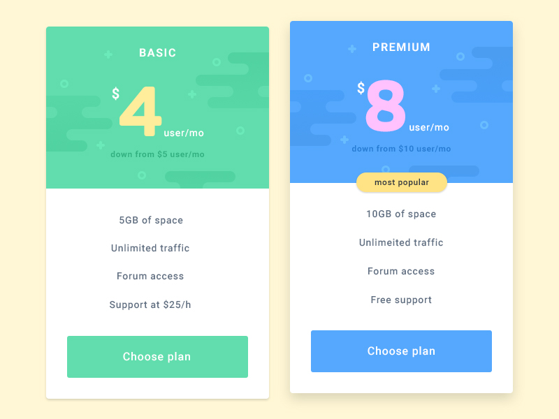
pricing plan for web application

Hey Folks! 👋 ,Today I want to share with you the Pricing Plan Page.What do you guys think? Let me know in the comments section!Hope you guys enjoy it. Press "L" if you like it. ⚡⚡⚡❤ Thanks for watching.🚀 Let’s create something together: info@zethic.com🌎 Visit: https://zethic.com/📲 Stay with us: Instagram | Facebook | Twitter | Dribbble | Behance | Uplabs


Pricing plan concept for bikroy.comBikroy is the largest marketplace in Bangladesh!

A simple pricing plan segment/section for your business website.

Pricing Plan Design Concept is modernly crafted for Figma which can be used for your personal or commercial app user interface needs. **Features**+ Google font used+ Edit with online website editor Figma+ All groups and layers are neatly organized**File included**+ 1 Figma file+ 1 PSD file+ Documentation**All images are for preview/ display purpose only and not included in download files.**Thanks for downloading

Pricing plan cards | Daily UI challenge - Day 030/100 ______ Download PSD ______ ______ Download PSD (Backup Link) ______ Follow on Behance , Instagram, Dribbble Press 'L' to show some love and drop your comment. don't forget to follow me. Thanks!

Pricing Plan Design Concept is modernly crafted for Figma which can be used for your personal or commercial app user interface needs. **Features**+ Google font used+ Edit with online website editor Figma+ All groups and layers are neatly organized**File included**+ 1 Figma file+ 1 PSD file+ Documentation**All images are for preview/ display purpose only and not included in download files.**Thanks for downloading

Pricing Plan Design Concept is modernly crafted for Figma which can be used for your personal or commercial app user interface needs. **Features**+ Google font used+ Edit with online website editor Figma+ All groups and layers are neatly organized**File included**+ 1 Figma file+ 1 PSD file+ Documentation**All images are for preview/ display purpose only and not included in download files.**Thanks for downloading

Pricing Plan Design Concept is modernly crafted for Figma which can be used for your personal or commercial app user interface needs. **Features**+ Google font used+ Edit with online website editor Figma+ All groups and layers are neatly organized**File included**+ 1 Figma file+ 1 PSD file+ Documentation**All images are for preview/ display purpose only and not included in download files.**Thanks for downloading


Pricing Plan Design Concept is modernly crafted for Figma which can be used for your personal or commercial app user interface needs. **Features**+ Google font used+ Edit with online website editor Figma+ All groups and layers are neatly organized**File included**+ 1 Figma file+ 1 PSD file+ Documentation**All images are for preview/ display purpose only and not included in download files.**Thanks for downloading

Pricing Plan Design Concept is modernly crafted for Figma which can be used for your personal or commercial app user interface needs. **Features**+ Google font used+ Edit with online website editor Figma+ All groups and layers are neatly organized**File included**+ 1 Figma file+ 1 PSD file+ Documentation**All images are for preview/ display purpose only and not included in download files.**Thanks for downloading

Pricing Plan Design Concept is modernly crafted for Figma which can be used for your personal or commercial app user interface needs. **Features**+ Google font used+ Edit with online website editor Figma+ All groups and layers are neatly organized**File included**+ 1 Figma file+ 1 PSD file+ Documentation**All images are for preview/ display purpose only and not included in download files.**Thanks for downloading

Pricing Plan SaaS Landing Pages. hope you guys will like it. Your feedback and appreciation are always welcome. Share the love by pressing 'U' if you like this shot :-)Follow Me : Dribbble I Uplabs I Instagram📩 If you have any queries, let me know at: forhadul.uix@gmail.com

Free - Pricing Plan MinimalI've used Adobe XD, Adobe Photoshop for this design. Hope you guys like it and feel free to give your feedback.Thank you

Pricing plan XD template- axxitudeTech


App concept for pricing and plan page for a product website
Pricing Plan designed by Consuela Onighi. Connect with them on Dribbble; the global community for designers and creative professionals.

Web Pricing Plan Section Template is modernly crafted website template which can be used for your personal or commercial website needs. **Features**+ 10 Pricing Plan Section template ready made design+ Light and dark style+ Figma and Photoshop file included,+ All text and objects are editable+ Only use fonts from Google FontsNote: All photo images are for display/ preview purpose only and NOT included in final download template kitWe hope you like it. Thanks for downloading!

Hi there,This is my exploration of a Virtual Meeting Video Conferencing pricing planpage.A minimal and clean concept with dominant blue color. Hope you like this.---------Press the (L) button show some like👍 and share your thoughtsHave a nice day!


Pricing Plan Design Concept is modernly crafted for Figma which can be used for your personal or commercial app user interface needs. **Features**+ Google font used+ Edit with online website editor Figma+ All groups and layers are neatly organized**File included**+ 1 Figma file+ 1 PSD file+ Documentation**All images are for preview/ display purpose only and not included in download files.**Thanks for downloading


Sass Landing Pricing Plan Kit Pages exploration. hope you guys will like it. Your feedback and appreciation are always welcome. Share the love by pressing 'U' if you like this shot :-)Follow Me : Dribbble I Uplabs I Instagram📩 If you have any query, let me know at: forhadul.uix@gmail.com


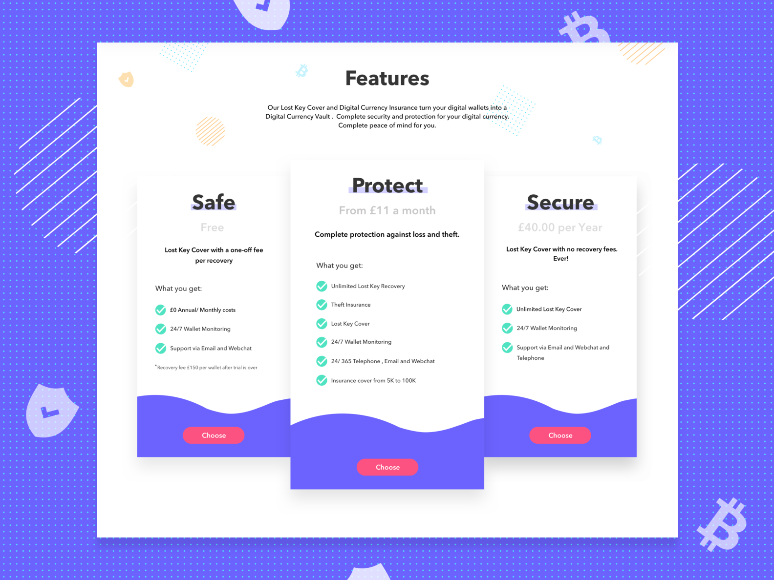
A pricing table should help users pick the most appropriate plan for them.For more information visit www.alphonic.inor mail us at maninderkaur1705@gmail.comFollow Me at Behance & Dribbble

Hello to everyone!I'm excited to share with you the Pricing Section design I made.I will share with you in the coming days.Please give your opinion!Thank you <3

Hello Everyone! Here I Love to present Pricing Plan project based on Web Hosting / Domain Hosting. Full Design : https://www.behance.net/gallery/73001981/Web-Hosting-Domain-Hosting-Full-Website-Presentation Available for freelance project! E-mail: sabbirjr333@gmail.com Show some love by press "L" Thanks

Hello everyone,Have a nice first day of the week,Glad to share my latest work,Onboard screen for Pricing Plan - 3 onboard screens, hope my design will touch your favorite,Thanks for your Comment, Like and Follow me.
Hello everyone,Have a nice first day of the week,Glad to share my latest work,Onboard screen for Pricing Plan - 3 onboard screens, hope my design will touch your favorite,Thanks for your Comment, Like and Follow me.
Hello everyone,Have a nice first day of the week,Glad to share my latest work,Onboard screen for Pricing Plan - 3 onboard screens, hope my design will touch your favorite,Thanks for your Comment, Like and Follow me.

Multipurpose Web UI Kit is a Modern & Professional web Template which is perfectly suitable for the Agency, Marketing, Consulting, start-up, IT Solutions, and Services Company related any business website. It is clean, modern and simple design. **Features**+ 14 selected screens+ Google font used+ Edit with online website editor Figma and Adobe Photoshop+ All groups and layers are neatly organized**Screen List**+ Homepage 1+ Homepage 2+ About Us+ Our Services+ Services Detail+ Portfolio+ Portfolio Detail+ Team+ Team Detail+ Pricing Plan+ Blog+ Single Blog Post+ FAQ+ Contact Us**File included**+ 1 Figma file+ 14 PSD file+ Documentation, Links information**All images are for preview/ display purpose only and not included in download files.**Thanks for downloading


ROBEK is a creative, professional, modern crafted HTML template which can be used for the mobile app, application and any kind of related app landing page.Here you will get 8 HTML files with an easily customizable code with pixel perfect design With 8 different Home type.3 Home Variation8 HTML FilesApps Documentation PagePrivacy Policy Page Signup Modal Login Modal Pricing Plan Service FormPixel Perfect CodingEasy to customizeGoogle fontLatest BootstrapWorking PHP formWell Documented

Have a project in mind? Let me know ✅💌 Email: Message us😍Instagram: Follow us🥳Product: Creative Market | Gumroad | Uplabs-----------------------I'm available for freelance projects. So let's talk or hit me up through email at arubel781@gmail.com

How to design a pricing page (13 examples)The options you give the user will ultimately decide whether they buy your product or not. Let’s take a look at some inspiring UX writing and pricing page design examples that can help to optimize your pricing page and increase conversions.Pricing is one of the most important elements on the screenBack in the day, I planned the UX of a crucial pricing page for Sodastream, one of the biggest e-commerce stores that has come out of Israel. During this time, I looked at a zillion different pricing pages, and it was critical for me to find the most relevant examples.What pricing model should I chose?!The pricing plan we created actually challenged the business model of the company as a whole, offering a completely different business strategy — instead of one-time offers, we would switch to subscriptions of the products. So even though it was “only” a design and writing decision, it had an impact worth billions of dollars. When the company was sold later in the year, we published the website for more than $3B.Pricing pages are the places where the users ultimately decide whether they should pay for your product or not. When done right, it will increase the revenue of your organization. On top of this, it can give you a mahoosive indicator of who your clients, customers and users are.So what features make a pricing page stand out? If you are going to build or update a pricing page, or if you’re just into , and content strategy in general, here are my top 12 pricing page examples!Note: The UX Writing Hub and the author of the article is not affiliated with any of the brands below.1. TunnelBear — smart illustrationsAre you a cub or a grizzly bear? VPN services TunnelBear uses illustrations of bears to show you their different pricing plans. Simple but effective, and totally in line with their brand.Buy TunnelBear VPN with Credit Card, Bitcoin2. HubSpot’s price calculatorIf you’re new to tech, it can be hard to understand what HubSpot does. It’s also hard to work out a budget for their CRM services since they offer so many different plans.That’s why they decided to create a price calculator — a smart move for pricing pages with lots of alternatives.Marketing Software Pricing | HubSpot3. Teamdeck — a playful calculatorCalculators have become a staple on SaaS businesses’ pricing pages-they’re helpful when you offer a lot of alternatives. Teamdeck is based on a pay-per-seat model, so your ultimate price tag depends on the number of people you onboard to your app, and what roles you pick for them.The calculator is in line with Teamdeck’s marine-themed branding.As you increase the number of seats in your plan, the accompanying illustration evolves as well: from a small fishing boat to a sleek yacht and finally a cruise ship. Interacting with the calculator is engaging and allows people to learn about Teamdeck’s pricing model without it feeling like a chore.Teamdeck - pricing that suits your company's needs4. G Suite — clearly indicate the best dealA smart way to funnel a user towards a specific path is to simply highlight it. Google’s G Suite indicates clearly which deal gives the best possible value.Pricing Plans | G Suite5. Zapier — free trialsIf you want to convert users fast, be sure to give them a free option.Mailchimp has been doing this for years (the first 2K emails are free) and now Zapier does it too.Zapier is a great little tool that connects different apps and accounts you use regularly and helps you to automate simple actions. As you can see in the image below, they even go further and let you try all available plans without paying a cent.Plans & Pricing6. Webflow — use first, pay laterAllowing users to create sophisticated websites without code, Webflow has been hailed as the go-to future tool for web development.They understand that you are much more likely to pay for a plan once you have a web project up and running — and that’s why they allow you to use the tool for free until you are ready to launch. Genius.Plans & pricing | Webflow7. Simplecast — good variety of plansAs a newbie podcaster (shoutout to the Writers in Tech podcast ), Simplecast’s podcast hosting services have been fantastic. It was important for me to know that there is a plan for every podcaster.Features & Pricing8. Zoom — informative tooltipsMy favorite part about the video communication tool Zoom’s pricing options is the super-informative tooltips that appear when hovering over the information icon. A great way to explain every aspect of the products and leave no doubts.9. Invision — authentic feel and cool detailsWhile it is clear from Invision’s pricing page that they target enterprise clients, the “most popular” indication gives the page an authentic feel. The save 10% doodles arrow is another nice touch — a small detail like this can make a big differencehttps://www.invisionapp.com/plans10. Trello — be nice to new usersSay hello to Sir Trello, son of Atlassian and brother of Jira. This task management tool clearly focuses on collaborative efforts and teams, and perhaps that’s why the pricing page is very kind to new solo users. In fact, their free trial is so generous that I never had the chance to pay them (does that make me a bad team player?).https://trello.com/en-US/pricing11. Spotify — offer unbeatable valueIsn’t the best way to persuade people to pay simply to offer great value in relation to the price? Spotify had me at “no ad interruptions”, others may be persuaded to hit the green button by the Listen online or High audio quality options.https://www.spotify.com//premium/12. Jira — affordable plans and pricing calculatorBig brother’s turn. The ultimate project management tool for developers pricing page has a fancy pricing calculator and super-affordable plans.https://www.atlassian.com/software/jira/pricing13. Adobe creative suite — plans for clearly defined usersAdobe understands that if you’re on their pricing page, you are probably familiar with their apps already. They suggest different tracks not just based on groups (individuals, businesses, schools etc.) but also on your professional needs (designer, photographer, video editor and so on).The awesome part is that this pricing page is a reincarnation of their earlier business model, in which you’ve had to buy each software separately. Yikes.https://www.adobe.com/creativecloud/plans.htmlThat’s it for now!Pricing pages are the bread and butter of an online business. Use them wisely, test and optimize them. Play around with different copy and design elements and track your conversion rates.If you want to create fantastic pricing pages, try our free UX writing course!Edited by Anja WedbergOf course, there are tons more pricing pages out there worth sharing — what’s your favorite and why?Originally published at http://uxwritinghub.com on January 19, 2020.Top 13 Pricing Plan Pages Examples was originally published in Muzli - Design Inspiration on Medium, where people are continuing the conversation by highlighting and responding to this story.

Hello everyone,Have a nice first day of the week,Glad to share my latest work,Onboard screen for Pricing Plan - 3 onboard screens, hope my design will touch your favorite,Thanks for your Comment, Like and Follow me.
Data visualization helps to present data visually to users and internal stakeholders, which will reveal previously unseen patterns. This article shares with you the top 8 data visualization tools to empower your UX design and business.Today, we are living in a world where everything revolves around data. Without data, no business can achieve its goal. A good presentation of information is becoming more and more important in the modern web world as the content of the Internet becomes more complex and data-driven. Therefore, in order to keep the visitor’s interest, web designers need to be on top of their visualization game when using a prototyping tool to present data visually to users and internal stakeholders.In this article, we will explore what data visualization is, why designers need to use it, and also share with you the 8 best data visualization tools that empower your businesses to recognize trends, conduct analyses, make informed decisions, and set realistic goals. Now, let’s dive in.What is data visualization?By definition, data visualization is the practice of translating information into a visual context, such as in a pictorial or graphical format to make data easier to be understood. It is an element of the broader data presentation architecture (DPA) discipline, which aims to identify, locate, manipulate, format and deliver data in the most efficient way possible. If designers efficiently use data visualization, the difficult concepts or new patterns in their design can be easily grasped, which could certainly help to improve the user experience and enhance its conversion rate.Why to use data visualization in your UX design?As the “age of Big Data” kicks into high-gear, UX designers have access to more data than ever before. This is great when it comes to product development, but UX designers need to ensure that they get real insights from the data glut. A good visualization tells a story, removing the noise from data and highlighting useful information. It can help designers grab visitors’ interest and keep their eyes on the message. If visitors see a chart, they quickly see trends and outliers. If visitors see a massive spreadsheet of data and couldn’t see a trend, the user experience can greatly deteriorate.Alt: Premade chart components from Mockplus help simplify your data visualization.All in all, data visualization can be beneficial for UX Designers in two main ways:Data visualization helps to improve the design process: UX designers need to conduct user research and collect data before creating a product design, data visualization can help them get a clearer user persona, thus creating a design that suits the user better;Data visualization helps to improve the user experience:the most stunning visualization could utterly fail at conveying the right message or it could speak volumes, thus the information can be easily understood and grasped, which could certainly help to improve the user experience and enhance its conversion rate.Once data is visualized and contextualized into journey maps, infographics and charts, designers can start to prototype solutions. Luckily, if you choose a prototyping tool like Mockplus, it can allow you to incorporate real user data into your prototypes!Top 8 data visualization tools for UX DesignersThere are a lot of data visualization tools out there to help UX designers get a handle on the information. Choosing them for your products or websites can be a daunting task. Here we will share with you 10 of the best data visualization tools, hope you can get the one that meets your needs. Now let’s check the list.DatawrapperDataWrapper is a data visualization tool for creating charts, maps and tables. It is an easy-to-use tool that almost anyone can create charts, tables, graphs, and more, without possessing any software or design skills. It is also an excellent choice for data visualizations for news sites and journalists often use it to embed live charts into their news articles.Key features:It has an easy and simplified UI;It does require code or design skills;It offers print-ready graphics;It is compatible with all operating systems;It provides 20 chart types, maps, and tables that include search and heatmaps;It allows team collaboration with Slack integration and admin permissions;Its visualizations can be exported as PNG, SVG, and PDF.Pricing:Datawrapper is free for designing some basic charts. Its plan starts at $599 per month and Enterprise pricing is upon request.2. Google ChartsGoogle Chart is a powerful freemium data visualization tool for browsers and mobile devices.If you prefer data visualization tools used on search engines, this is the right thing. It can also give you more control over the charts you create and will enable you to zoom the charts.Key features:It is simple to learn and user-friendly;It is easy to embed the chart on your web page by using JavaScript;It allows access to data from most data sources, including third-party data providers;It is easy to integrate with additional Google tools and products;It offers a wide variety of chart formats;It is cross-browser compatible and highly interactive.Pricing:Google Charts is completely free of charge.3. TableauTableau is one of the most popular data visualization tools on the market among non-developers. It is very easy to use but incredibly powerful. It offers both solid support and sample visualizations that help newbies get going. The public version of Tableau is free to use for anyone looking for a powerful way to create data visualizations that can be used in a variety of settings.Key features:It has hundreds of data import options;It provides lots of video tutorials to walk you through how to use Tableau;It provides extensive options to secure data without scripting;It allows you to perform data blending easily;Teams can perform real-time analysis of their data on Tableau;It offers JavaScript extensions and APIs for custom reports via JavaScript charting libraries;It comes with different versions, such as the Tableau server, cloud, and desktop.Pricing:Tableau provides a 14-day free trial but the free version doesn’t allow you to keep data analyses private. It offers different plans for individuals and organizations. The paid plans start from $15 per user/month and range up to $70 per user/month.4. InfogramInfogram is a great option for non-designers as well as designers. The drag-and-drop editor makes it easy to create professional-looking designs without a lot of visual design skills. With real-time permissions and version history, it allows entire teams to work on a project in real time. What’s more, it’s easy to use and any member of the team can tell an engaging story in just a few clicks without having to know the code.Key features:It offers lots of ready-to-use templates;It provides interactive charts and maps that include links, tabs, tooltips, and clickable legends;It has an extensive library of icons and photos to create stunning visuals;Its responsive infographics that look neat on all devices and on most social media;It has powerful analytics that tracks user activity on a website.Pricing:Infogram offers users a free version, but it has limited capabilities. Paid plans start at $19 for Personal plans and go as high as $149 for Enterprise plans.5. PlotlyPlotly is another data visualization tool that lets you create presentations, charts, and dashboards. It helps designers to create and steward the leading open-source data visualization and app-building libraries for ML, data science, engineering, and the sciences.Key features:It is web-based and easy to use;It has a substantial number of chart design options;It is easy to import data and create amazing graphics with the help of their visualization library and online chart creation tool;It has built-in software that lets you analyze your data using Excel, Javascript or Matlab;Pricing:Potly offers users a free version, but it has limited capabilities. If you submit your personal information to its website, you can get a customized paid plan.6. SisenseSisense is a business intelligence tool for creating data visualizations that help your business to gain insights. It is specially created to visualize large amounts of data. The platform also helps designers or business owners create their own dashboards according to their needs.Key features:It allows deploy your work on the cloud using Windows or Linux;It filters data by dropping fields on the canvas;It is very flexible and allows for easy customization;Users can export data to CSV, PDF, Excel, Images and other formats;It allows users to export files in multiple formats such as PPT, Excel, MS Word, PDF, etc.Pricing:If you are interested in this tool, you need to schedule a call with the Sales team who will understand the requirements and make a custom model based on them.7. ChartBlocksChartBlocks is another quick and easy data visualization tool, which allows you to combine data from multiple sources into one comprehensive graphic. Charts with ChartBlocks are hosted with D3.js, and are fully responsive to share on any platform and to view on any device.Key features:It is fully customizable, and can be adjusted to fit brand guidelines or a project’s color palette;The data for its charts can be imported from spreadsheets or SQL, or entered manually;It is easy to use and its learning curve isn’t steep;It was integrated with Ceros and it is an interactive content creation tool.Pricing:ChartBlocks offers a free plan that allows up to 50 active charts, which is perfect for beginners. The paid plans go up to $65/month with additional features like API integration and live data polling.8. D3.jsD3.js is another data visualization tool, which allows you to manipulate elements of a webpage in the context of a data set. It also offers rare functions such as curve-generation, associating data with an HTML element, and code reusability.Key features:It is very powerful and extremely flexible;It supports large datasets and has huge number of chart types;It supports the visualization of HTML, CSS, and SVG data;It helps you with Document Object Model (DOM) manipulation.Pricing:For individuals, its pricing starts from $ 7 per user/month. For a team with an organization account, D3.js pricing starts from $ 9 per user/month.Wrap upThe enlisted data visualization tools above are great and cover several possible purposes and use cases. Just spend some time exploring the various available options then choose the one best for your business. As UX designers, you need to rely on data to make important decisions throughout the UX design and development process and these tools can help you make a better design. However, if you want to have a design that suits your clients’ requirements best, you can choose Mockplus, which provides bar charts, radar charts, column charts and etc, efficiently getting your data visualized on screen and optimizing the way you design!Other related articles:Top 16 Responsive Website Design Tools for Design BeginnersTop 25 User Flow Tools & Templates for Smooth UX10 Best UI Animation Tools for Great Modern Designs in 2020Top 8 Data Visualization Tools for UX Designers in 2022 was originally published in Muzli - Design Inspiration on Medium, where people are continuing the conversation by highlighting and responding to this story.


Hello everyone,Have a nice first day of the week,Glad to share my latest work,Onboard screen for Pricing Plan - 3 onboard screens, hope my design will touch your favorite,Thanks for your Comment, Like and Follow me.

Multipurpose Web UI Kit is a Modern & Professional web Template which is perfectly suitable for the Agency, Marketing, Consulting, start-up, IT Solutions, and Services Company related any business website. It is clean, modern and simple design. **Features**+ 14 selected screens+ Google font used+ Edit with online website editor Figma and Adobe Photoshop+ All groups and layers are neatly organized**Screen List**+ Homepage 1+ Homepage 2+ About Us+ Our Services+ Services Detail+ Portfolio+ Portfolio Detail+ Team+ Team Detail+ Pricing Plan+ Blog+ Single Blog Post+ FAQ+ Contact Us**File included**+ 1 Figma file+ 14 PSD file+ Documentation, Links information**All images are for preview/ display purpose only and not included in download files.**Thanks for downloading


**Emas - Investment Landing Page**Emas - Investment Landing Page is modernly crafted website template which can be used for your personal or commercial investment website needs. **Features**+ Header+ Hero+ Media Coverage+ Why Us+ Investment Products+ Learn More+ Pricing Plan+ Testimonials+ Call To Action+ FooterUsing Avenir Font (https://www.dafontfree.io/avenir-font/)**File included**+ 1 Sketch file+ 1 Figma file+ 1 Adobe XD file+ 1 .pdf DocumentationList: website, vector, investment, trading, web, template, marketing, concept, business, background, internet, site, technology, people, layout, abstract, design, illustration, successful, icon, symbol, banner, company, page, button, corporate, bar, home, mobile, menu, modern, chart, capital, world, finance, brochure, finances, blank, pictograph, landing, services, news, sign, app, development, flat, contact, object, interface, card


false


Hello to everyone!I'm excited to share with you the Pricing Section design I madeThere are 3 versions. I will share with you in the coming days.Please give your opinion!Thank you <3


false
Experience design inspiration like never before with Muzli. Loved by 700k+ designers worldwide, Muzli is the leading go-to browser extension for creative professionals.
Get Muzli for Firefox