Design Inspiration
App icon design examples
Hundreds of creative, innovative, well designed user app icon ideas & examples.
We curate topical collections around design to inspire you in the design process.
This constantly-updated list featuring what find on the always-fresh Muzli inventory.
Last update: 7/22/2025
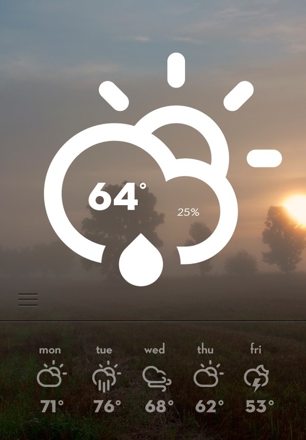
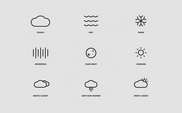
Weather_big #weather #app #icons
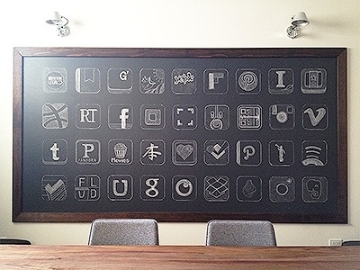
Dribbble - Chalkboard App Icons by Garrett Gee #icon #logo #app #chalkboard
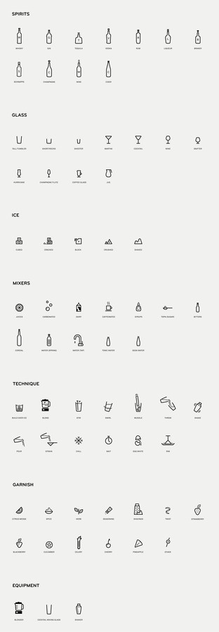
Mixionary | MAUD #iconography #icon #icons #system #app
Flat app icons.
Flat App icons collection 2018
Food App Icons on the Behance Network #icon #iphone #app #food

Redesigning the Office App Icons to Embrace a New World of Work
Let’s talk about white app icons
Icons for Value Appraisal App #icon #picto #symbol
App Icons March 2012 March
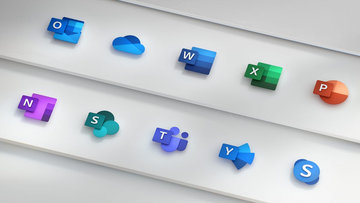
Redesigning the Office App Icons to Embrace a New World of Work
App Icons March 2012 March
App Icons March 2012 March 2013 on Behance ipad design icons iphone app
Best App Icons by Ramotion
The best app icons designed by Ramotion design agency
Mobile app icons
A small set of icons that are an integral part of our mobile applications!
Mixionary | MAUD #icon #app #icons #iconography

iOS App Icons on Behance ipad
iOS App Icons on Behance ipad design icons iphone app
The design guide to iOS and Android app icons
Despite the small size, an icon promotes an application in the App Store and Google Play, presents the user with it and also helps to find it on the Home screen after installation. It’s a great responsibility, and it depends on a designer if an icon can cope with that.When I faced the challenge of drawing an app icon for the first time, I had a lot of questions. I found answers on some of them only after a couple of completed projects. I decided to write this article to help the same beginners as I was, but I hope that experienced designers will find it useful too. Well, let’s get started!Why every app needs an iconAn app icon is a unique image added for every mobile application. It’s the first users see when they find an app on the App Store and Google Play. At this stage, the user decides if he wants to find more about an app; if not — he scrolls further. A good icon generates interest, provide confidence, assure the user that an app might be useful for him. At the same time, a bad icon does twice as much, but the other way around. It confuses and casts doubt on the benefit of an app. When the user installs an app, the icon’s goal changes. Now it assists in the search for the app on the Home screen among other icons. But what makes an app icon “good”?There are a lot of articles on the topic and most of them relate to Paul Rand’s design principles. And that’s not surprising! An app icon is a piece of branding. However, it’s not a logo.A logo and an app icon have different goals, ways of using and requirements respectively. It doesn’t mean a logo can’t overlap with an icon. Not at all! Popular applications often use logos in icons: Twitter, Medium, Reddit and others. But they don’t do it for no reason. They are a number of aspects that we need to take into account. Let me tell you about them by drawing on the experience and using beautiful headlines.ScalabilityAn app icon has to be small. That’s the point, and the user can’t stretch it to examine. Therefore, it’s important that an icon maintains its legibility regardless of size. Look, how small app icons are in Settings!App icons in iOS and Android SettingsThe user shouldn’t strain his eyes trying to understand the designer’s idea. Make sure to try out an icon on real devices in multiple sizes and, if necessary, finalize it. The loss of details due the reduction in the number of pixels is inevitably, but the idea has always to be clear. And that brings us to the second aspect of an app icon.RecognizabilityIf the user can’t understand your idea, you can’t hook him and he’ll move on to the next app. Designers advise simplifying app icons to increase recognizability. And it’s important to understand it right. Simplify doesn’t mean to make primitive. Look, aren’t these icons detailed?Hello Neighbor, Tiny wings, Prune, Pandora Music, Silly Sausage in Meat Land, Old Man’s JourneySimplify means to concentrate on an idea and get rid of unnecessary and repeating elements. Everything should work for the idea and help the user to understand it. However, the user hasn’t only to understand it, but also has to get interested in it.UniquenessThere are almost 2 million applications in the App Store and 2,1 million in Google Play, and each of them has an app icon. All these icons compete for the user’s attention. Big brands use their logos to draw attention, but what to do less-known applications? Show something new and unusual!Todoist uses the standard for task managers tick in an interesting compositionSpend some time on a research before starting to draw, search for the main competitors and simply applications from the same category. Think of how to stand out! If most icons are colourful, consider using a monochrome palette. If there are a lot of images of one particular item — abandon it and show something different. Always search for your way to solve problems!It’s difficult to come up with something new. Make mood boards, create mind maps, ask friends and coworkers for advice. You never know where you’ll find a great idea. But it is important not to lose touch with an application in the pursuit of originality.ConsistencyAn icon is the part of an application, they have to work hand-in-hand. An icon should describe an app and show its main features. This is especially important for games where an app can get 1 million downloads because of only one game mechanic.Slack is a good example of consistency between app and iconNo one will like if he gets a different application than expected. Don’t include screenshots and interface elements in an icon — it can mislead the user. Instead, insinuate the functionality of an app, use the same style and colours. There should not be any doubts to which app relates an icon. And guidelines can help you to achieve this!Compliance with guidelinesDespite the fact that iOS and Android starting to look the same, there are still a lot of differences which prevent us from using the same app icon on both operating systems: proportions, visual techniques and special features. Users get used to their operating systems. The less we distance from it, the more trust to an app is given.iOS (on the left) and Android (on the right) icons of the same appsIt doesn’t mean you need to draw different app icons; rather, big differences will reduce app recognition. Sometimes it’s enough to adjust the size, but in some cases it’s better to make more changes.Phew! That’s what we should pay attention to when developing an app icon. Now it’s time to create! Of course, if you don’t have even more questions along the way… What size a canvas should be? How to use grids? How to export an icon? It’s time to go deep into the technical part and find answers. Let’s start with iOS.iOS app iconsThere is much useful information in the iOS Human Interface Guidelines, but we’ll focus on the App Icon section where Apple describes technical requirements and makes recommendations on a design. We’ll follow the path of creating icons and get to the bottom of this. I use Sketch, but any other graphics editor will work too.Drawing an iOS app iconThere are many templates for creating icons, but we won’t use them for now. Let’s say we already studied the market, identified the idea, perhaps, even made a sketch by hand. And of course, created a new document in the editor.Let’s choose a canvas size first. In iOS, an icon can be found in different sizes from 40px × 40px to 1024px × 1024px. Because it’s always easier to reduce the image size, we’ll create a larger canvas. Designers who work in Sketch can cheat and create twice smaller canvas (512px × 512px) and increase it later on export.The next step is to add a grid. You can download it, find in templates and even draw. Grids help to maintain unity and integrity of the composition, control sizes and spacing. Try to place the main object within a large circle. If a grid interferes and limits your creative impulse — break it. Even structure should be limited.Finally, we can start drawing! I won’t bore you with the details, but my icon went through the manager and came back with feedback from the client a couple of times until it was ready:To present the icon, I made a simple animation:This and other stuff I share on DribbbleThe icon is ready! Let’s export it.Export an iOS app iconBefore exporting we need to remove rounded corners and stroke because the system adds it automatically. Don’t forget to hide the grid too.An icon should be exported in png with no transparency. But what about various sizes? Do we really need to do it manually? Thanks to our community, we don’t! For example, we can use Sketch plugin AEIconizer to multiply it. Besides, there are a lot of websites like MakeAppIcon, App Icon Maker and App Icon Generator that can do the same. And templates! For instance, template by Every Interaction not only exports an icon in various sizes but also shows how it’ll look on the Home screen and in the App Store.It wasn’t as hard as it looked. The next is an Android app icon!Android app iconsIn the material design specification, Google split information about Android app icons into two sections: about the style and technical requirements.Drawing an Android app iconIn Android, app icons are used in various sizes too and the largest is identical to iOS: 1024px × 1024px.Adding a grid, pay attention to a safe zone. Depending on the device, Android applies different shaped masks. Place an image within a safe zone so it won’t be clipped. The grid itself shows all the basic shapes which are used in the system: circle, square, vertical and horizontal rectangles.The final version of my icon:Export an Android app iconBefore exporting we also remove rounded corners, stroke and grid.Android Studio can multiply an icon in all required sizes, so we need only one png image with no transparency.Android Oreo introduced a new app icon format with parallax and scale effects. You can separate the foreground from the background, so then these layers will move independently on the device applying the effects. Accordingly, the foreground may include transparency.https://medium.com/media/0347507ebe7b693722c88a204c8a7c80/hrefParallax effect cannot be seen on a solid background, but it can bring dynamic in your design if you have a complex composition. In that case, you need to provide two png images for both layers. Just be ready that not all users will see the effects. At the time of writing, only 12% of all Android users use Android Oreo.Instead of a thousand wordsThe user starts to get know an app with an icon which accompanies his journey up to the end. The role of an icon is important and multifaceted, that’s why the designer should put emphasis on it. Yet never forget about an app itself! After all, it only takes a few taps to delete an app. No matter how cool your icon is, if an app isn’t useful, the user will delete it.Don’t forget to find out how to design an accessible user interface. You can find more stuff from me here: Dribbble, Behance, Instagram, Medium.The design guide to iOS and Android app icons was originally published in Muzli - Design Inspiration on Medium, where people are continuing the conversation by highlighting and responding to this story.
L-I-V-I-N-G app design #logomark #branding #color #icons #texture #clean #iphone #brand #app #identity #logo #life
WHTR sneak peak #screensaver #weather #icon #icons #set #app #concept #layout #osx

Naughty Icons Set from the FUTURAMO ICONS App to boost your appetite ;-)
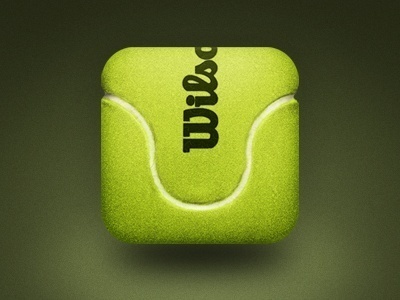
Tennis Ball Mobile App Icon by Mike Beecham. 25 Clever Mobile App Icons #icons #mobile #app #design #inspiration
App icons - series 2
Another series of 3D icons. PROCESS: You can check the hourglass process attached. On adobe illustrator, i use simple shapes to create a 3D effect. And a bit of clipping masks for shadows. No scripts or anything else used.
homee App Icons
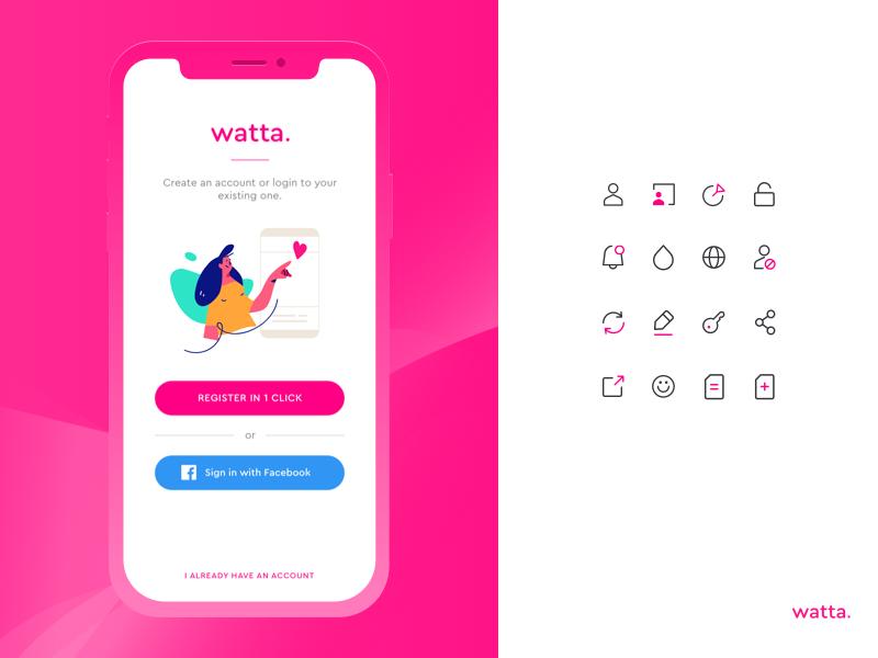
Illustration & Icons for Watta Dating App
Check the full presentation here: https://www.behance.net/gallery/70495989/WATTA-Dating-app-with-a-social-twist Great team work with @[1088904:Vitalii Razgulin] Cheers!
Icons for Language Learning app
Icons in SOHU TV APP
Icons for Documentation App
Icons designed for the app to record experimental data in the mobile app. MOre to come soon. Middle icon is selected (just as a part of the reference to give an overview of how it looks like when user select an option)

Cascable 6 - Alternate App Icons
In addition to revising the primary Cascable 6 iOS app icon, we also created a bunch of alternate icons to choose from. These are some of my favorites 😍
#32 Icons for investment app

Feature cards icons of photo beautification app (source)
Attached is the sketch file. You can use these icons anywhere, personally professionally. Thanks
Scoot App Icons
Ecommerce App Icons
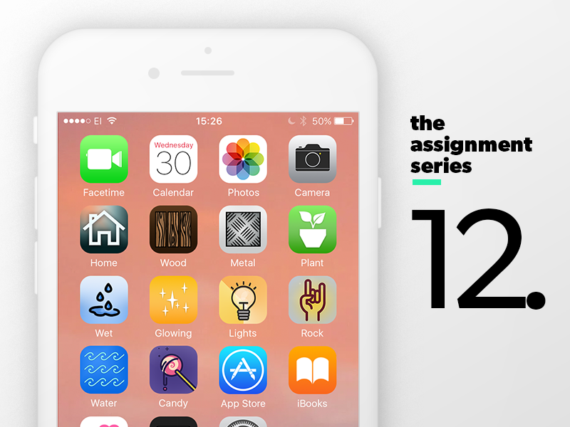
Assignment 12.1: 10 Unique App Icons

Editorial icons for a web app
Visiolab Sweet Home App Icons
Hey Dreibbblers! 👋 Here are some icons set for our sweet-home app, try to make more colorful and playful in style 🧑🎨 will be glad to hear your thoughts! will be ❤️ full to hear your thoughts down below. 🧑🎨 you can write comments or Press "L" to show us some ❤️ to inspire and motivate, to share more work with you! Thanks! Follow for more updates! Design by Tati

Tenant app icons set (Available for sell)
If you like it, you can buy this. Shoot me an email: prakharsharma800@gmail.com Created in Sketch as the source file. All components are in vectors so compatible with XD, Figma, and obviously Sketch ;) Many thanks for watching it :)
App Icons made by Adobe XD
I have created app icon design : The Combinations Behind 24 icons models. Get more updates here Behance | Instagram
reWork App Icons
We are creating a app for common and fast jobs like plumber etc, where people will search for jobs or workers. Now we need to choose the app icon and came up with this options, help us choose. Which one do you guys like the most? Designed @[1672926:duallstudio] 🔥 https://www.instagram.com/duall.studio/ https://twitter.com/DuallStudio https://www.facebook.com/duallstudio/ https://www.linkedin.com/company/duall-studio/ Press [L] and love this dribbble shot 💖 Check out team profile @[1672926:Duall Studio]

Custom app icons in Todoist ✨
You can now make Todoist stand out from the crowd (or coordinate with the rest of your palette) by customizing the color of your Android app icon. Go here to learn more: https://beta.todoist.com/help/articles/whats-new
Icons for a Tithing App

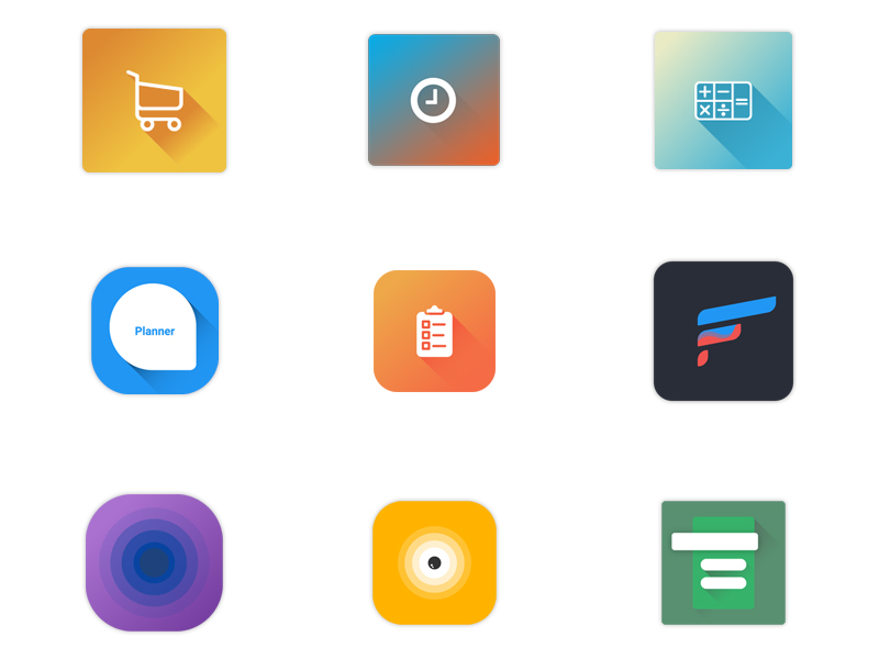
app icons 2

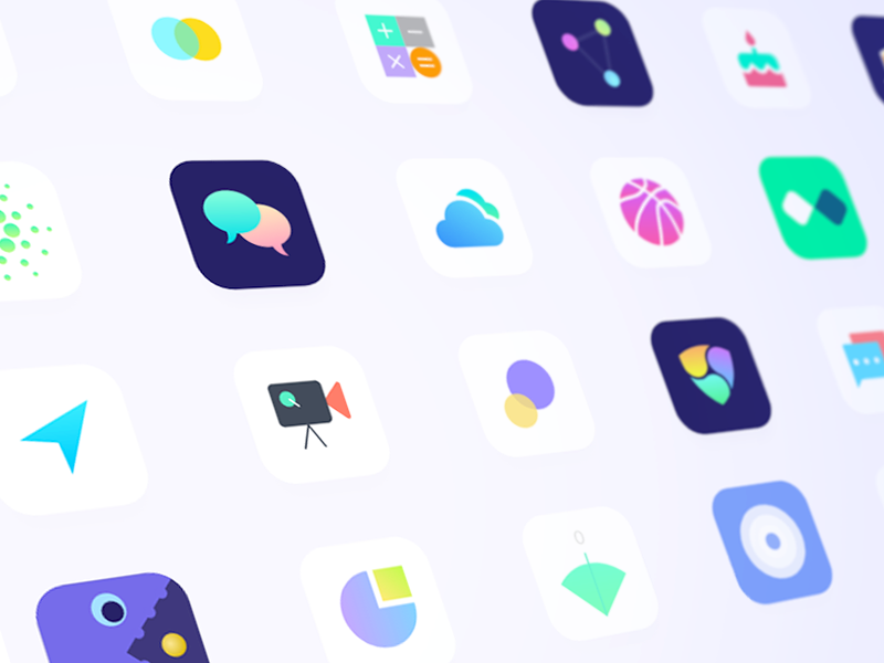
Anasen: Web-App Icons (Part 5/8)
Even more icons we designed for Anasen, a web-application for data analysis and data processing. ——— Done in a collaboration with Kangkikur in Inipagi Studio. See more of our works on our website » inipagi.com
Gps & Expense tracking App Icons

Medical app icons

Food App Icons

Health App Icons

Festival App Icons

iOS App Icons on Behance ipad
iOS App Icons on Behance ipad design icons iphone app

Parcel App Icons
I got to go wild with color and styles for the Parcel app icon and it's alternate options.

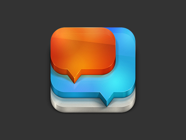
Chat App Icons

app icons 1/2
that's so good
Ladder Client and Ladder Coach app icons
Hey guys, The Ladder team asked me to create a different app icon for Ladder coach version that will help delineate between the Ladder (Client) side of the platform and the Ladder (Coach) side of the platform. Coach, the fitness star! This is how I call this concept and the idea that should reflect the icon. I used for construction the similar polygons for both logos to keep the consistency of brand identity.
Icons for FreeCharge App
Icons for health app
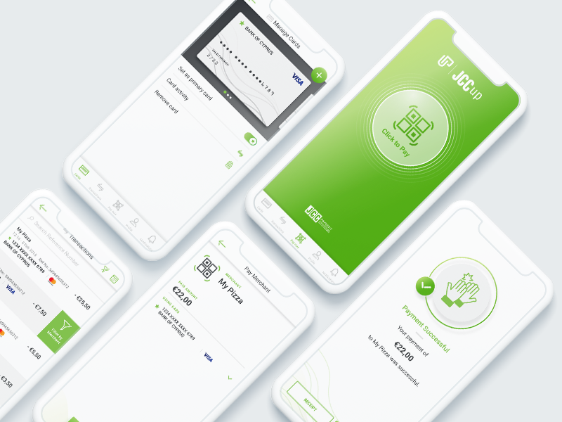
JCCup - Mobile Payment App Design & Icons Illustration
User Interface App Designs and Icons Illustrations for a new way of digital payments. View our case study here for more info: https://www.blenddigital.com/en/case-studies/jccup ........ All Works Copyright © 2019 BLEND Digital Agency https://www.blenddigital.com

Category Icons of Ogenii App
Bunch of mobile app icons
App Icons
Icons for upcoming web app
App Icons – Gretel
For Gretel, we designed six unique and high fidelity icons for their built-in apps like file storage, team chat, objective management and countless integrations.Each icon have their own custom color palette that feels like one suite of apps.Check out the Gretel case study here
App Icons – Gretel
Get access to thousands of freshly updated design inspiration pieces by adding Muzli to your browser.
Loved by 800k designers worldwide, Muzli is the leading go-to browser extension for creative professionals.
Mobile App Icon: Do's and Don'ts
The mobile app icon is often the first interaction users have with your app. It acts as the digital 'face' of your application and plays a crucial role in influencing user impressions and download decisions. Crafting a compelling icon requires attention to detail and an understanding of design best practices. Let's delve into the do's and don'ts of mobile app icon design.
Do's:
1. Prioritize Simplicity
Choose a clean and straightforward design that clearly represents your app's purpose. Avoid overly intricate details that can be lost on small screens.
2. Ensure Recognizability
Design an icon that stands out in a sea of other apps. It should be memorable and instantly associated with your app's functionality or brand.
3. Maintain Consistency with Your Brand
Ensure that the app icon aligns with your brand's colors, style, and ethos. Consistency reinforces brand recall and trustworthiness.
4. Test Across Different Backgrounds
Ensure your icon looks good against both light and dark backgrounds, considering the various themes users might have on their devices.
5. Update Periodically
As design trends evolve, consider refreshing your app icon to stay modern and relevant.
Don'ts:
1. Avoid Using Words or Letters
Text can be challenging to read at small sizes. Rely on visual imagery rather than words or letters, unless it's a recognized brand logo or initial.
2. Don't Neglect Sizing and Resolution
Icons may appear on various devices with differing resolutions. Ensure you provide high-quality icons that look crisp on all screens.
3. Avoid Generic Designs
Steer clear of overused motifs or generic imagery. Your icon should uniquely represent your app and not be easily confused with others.
4. Don't Overcomplicate with Colors
While color is essential, using too many can make the icon appear chaotic. Stick to a limited color palette that aligns with your brand.
Conclusion:
Designing a captivating mobile app icon is a blend of art and strategy. By following these do's and don'ts, designers can create compelling icons that not only attract users but also encapsulate the essence of the app and the brand it represents.