
Get thousands of Dark mode screen examples for free
Join over 700k others who enjoy Muzli design inspiration hub.
We curate topical collections around design to inspire you in the design process.
This constantly-updated list featuring what find on the always-fresh Muzli inventory.
Last update: 4/24/2024


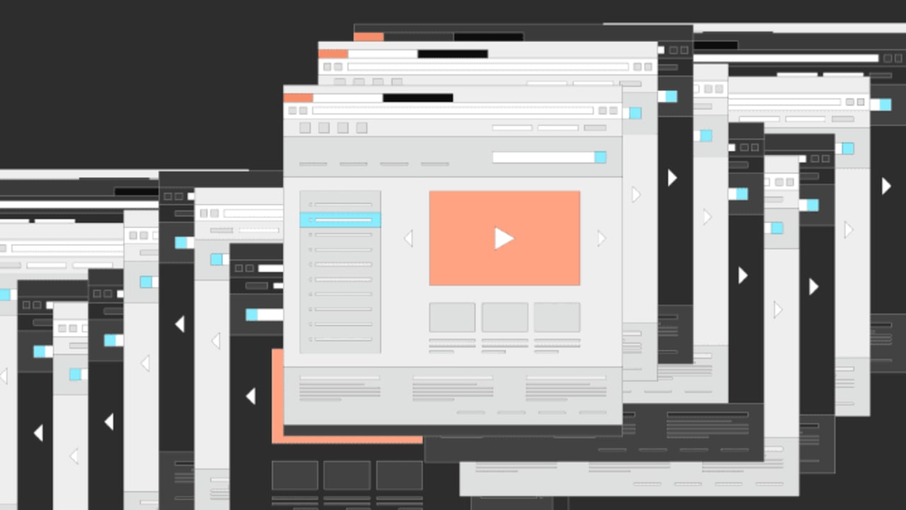
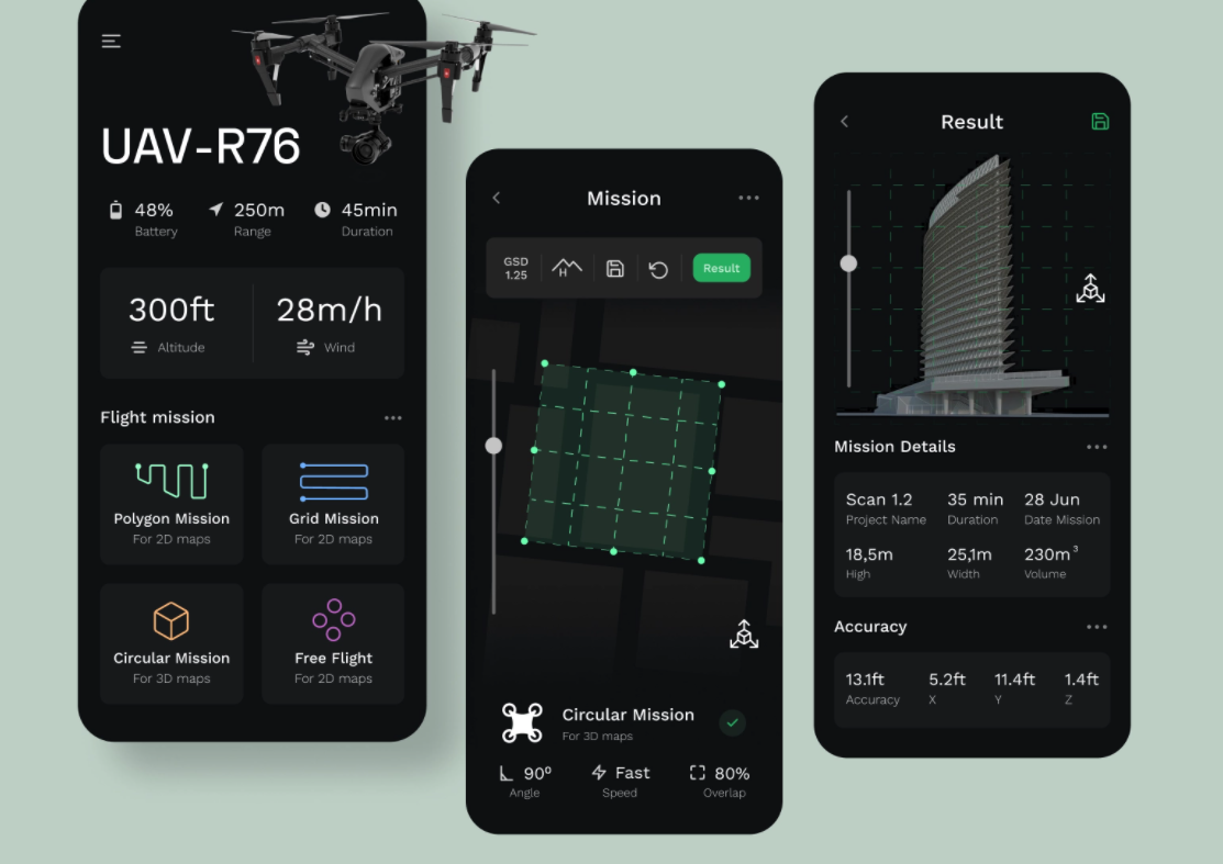
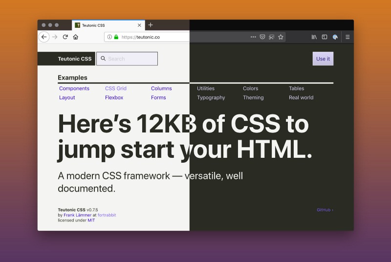
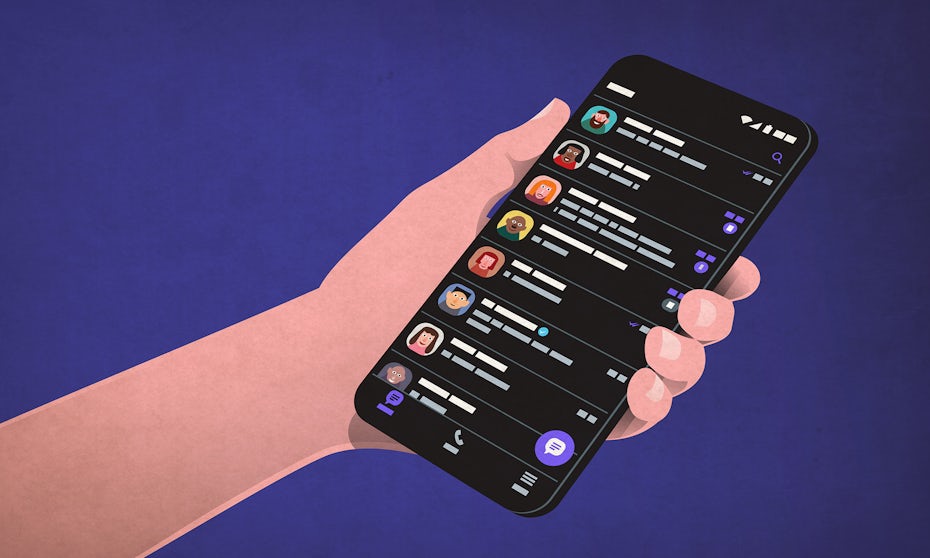
Dark mode Login and Signup App UI Design


There are a lot of concerns about how the technology we use affects us physically and emotionally. Too much time at a computer can lead to eye strain, back problems, and carpal tunnel syndrome. Using smartphones, tablets, and other blue-light emitting screens can disrupt our sleep cycles. Even time spent on social media can lead to feelings of negative self-worth. Then there’s Dark Mode…


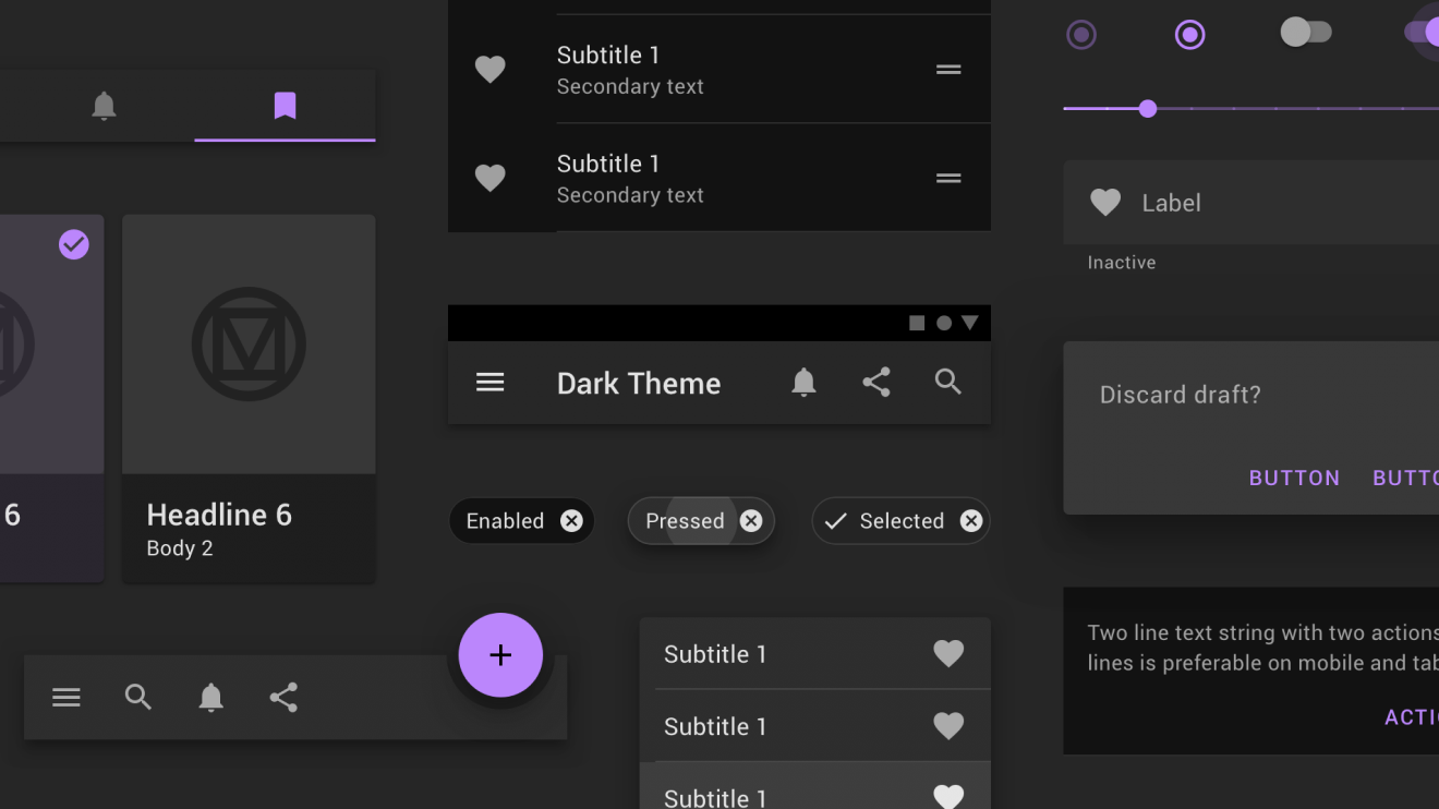
Dashboard Interface UI kit- Dark ModeHigh quality100% editableFollow me onDribbble | Behance | Instagram
Dark themes are everywhere these days. As human beings continue to spend more of their time interacting with technology, dark themes provide a more relaxing way to engage with the digital world. More often than not, these themes are easier on the eyes, more attractive, and perfect for the dedicated user. Throughout 2020, countless leading […]

Taking a stab in the dark is taking on a new meaning with the rise of dark mode design. One of the most requested features over the past few years, both Apple and Google have made a dark theme an essential part of their UI. But why is this? What are the benefits? Are there […]

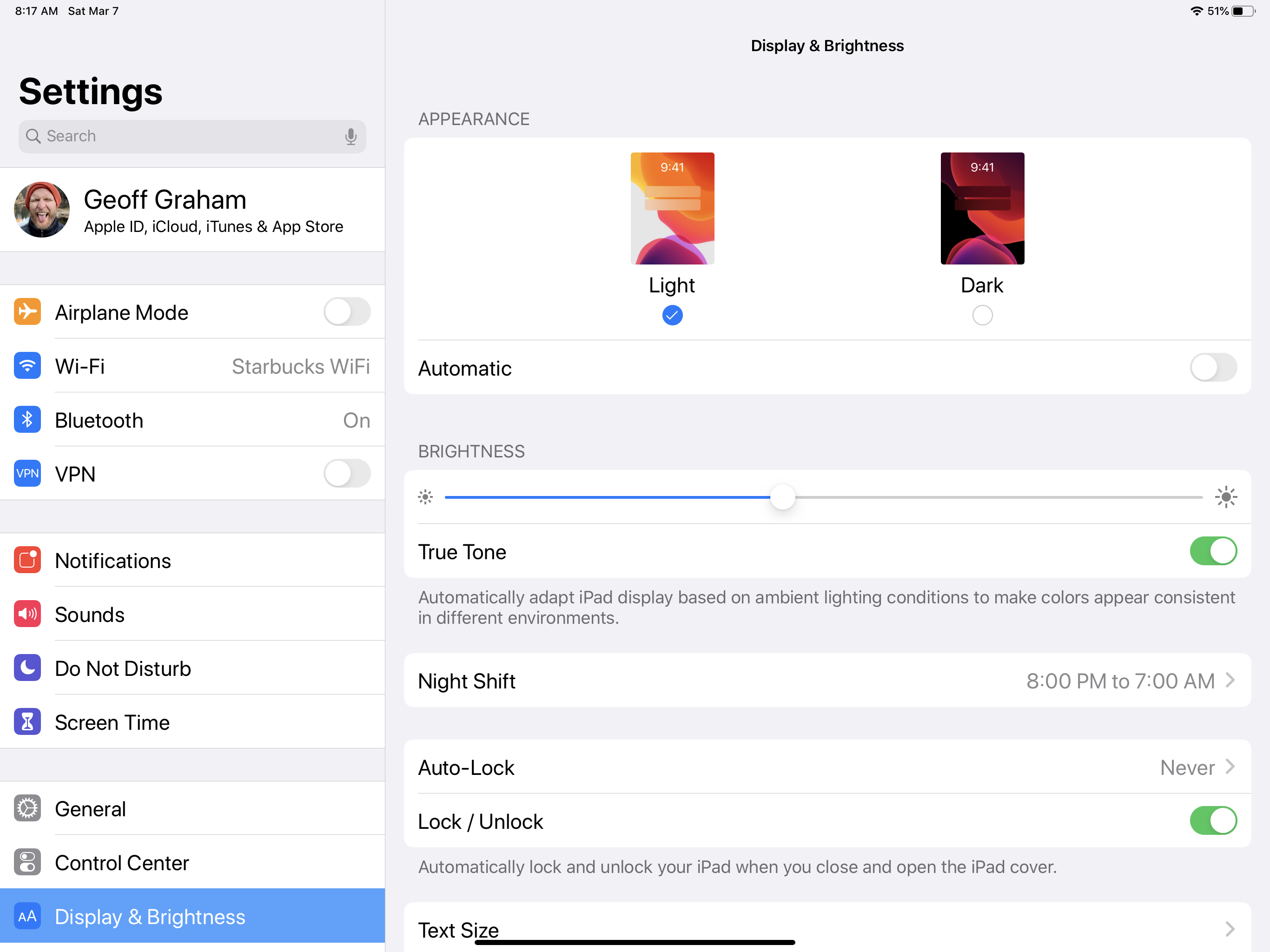
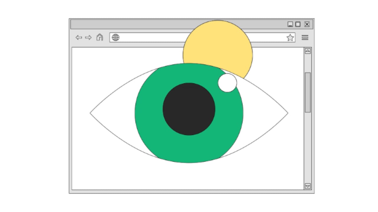

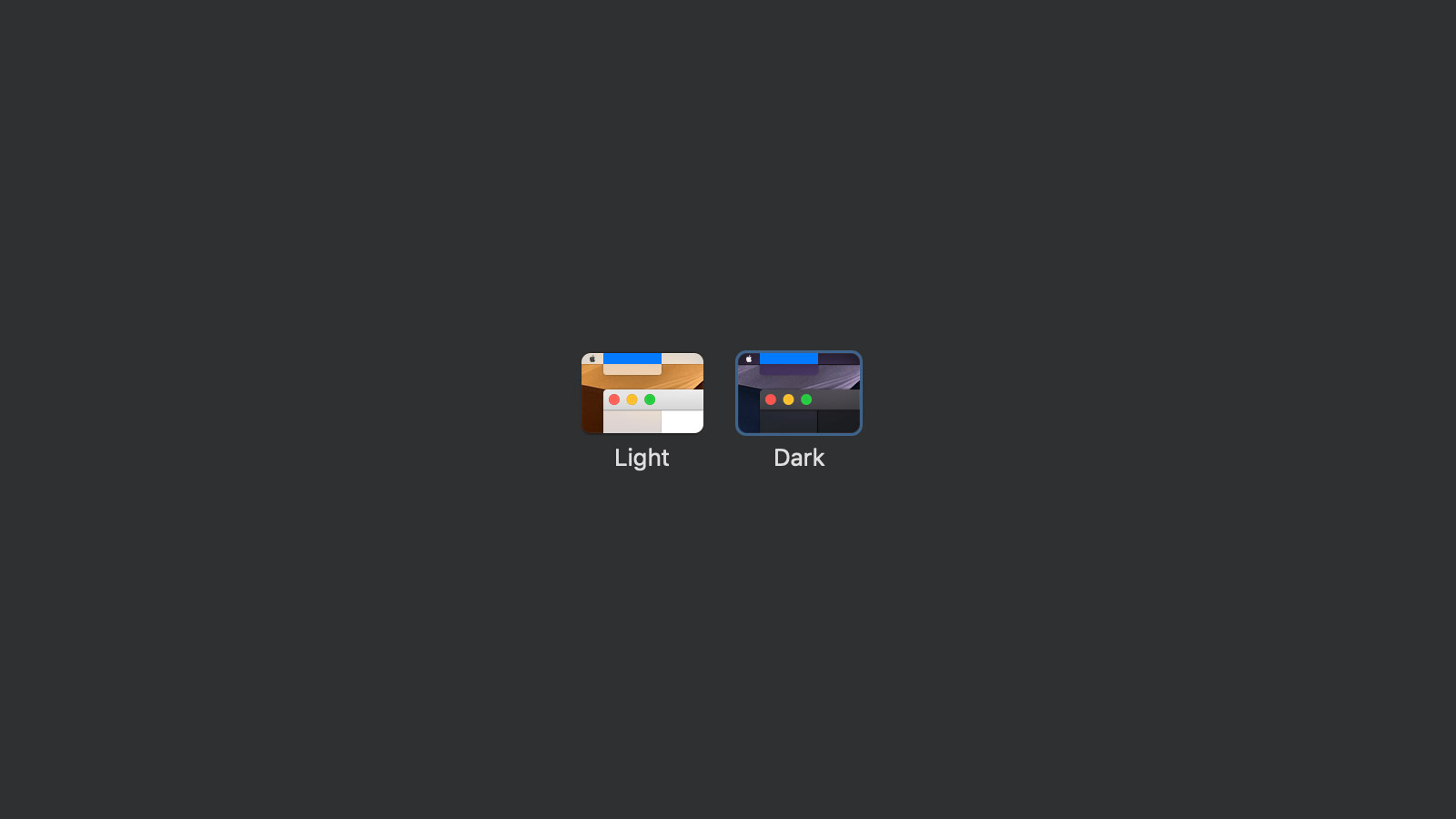
Dark Mode

Dark mode is more popular than ever. More and more web designs, apps, and products have started offering a dark mode option to their users – catering for a unique stylistic demand in the market that has been, until now, a desire exclusive to coders. Where typical UI’s have focused on using dark colors on...
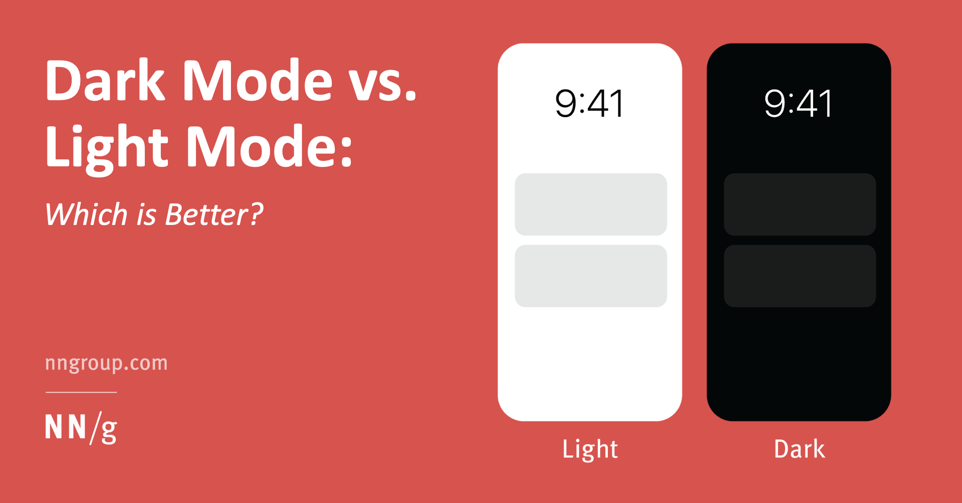
Source: DribbbleBy 2020, the dark theme in UI design has become nearly a key trend. Following Apple and Android, other major market players like Google, What’s App, Instagram, etc. switched to the dark mode vs. light mode. No wonder even nowadays, dark-themed interfaces are loved for many reasons. Let’s see which’s better, light or dark, and why.What is Light Mode?‘Contrast polarity is a term used to describe the contrast between text and background. Positive contrast polarity is a definition that refers to text with a dark font on a light background (Light Mode).’ (NN Group)For people with normal vision, from a physiological point of view, the content of any text is better perceived in Light Mode, but some people are more comfortable working in Dark Mode.Examples of Light ModeHere are some awesome examples of beautifully designed light-themed UI from Fireart Studio:Smart Home App ConceptWhat is Dark Mode?Like in the first case, the negative contrast polarity rather indicates a combination of light text on a dark background, and such black or other dark background is called a Dark Mode.Dark interface modes are designed to display less light than Light Mode displays and extend the battery life or serve as an eye vision relief for tired eyes. The amount of light in the environment affects the energy consumption or physical state of the eyes, and our data perception, as well. How your eye responds to the amount of light in the environment is the key to understanding how to build effective dark-themed interfaces.Examples of Dark ModeHere’s some dark vs light theme designs worth your attentionhttps://dribbble.com/shots/16831141-Connect-to-metaverseHow does your environment affect your visualization in some way?Though the Dark Mode is increasingly used in mobile and desktop applications, some manufacturers of electronic devices claim that a dark interface, compared to a white background, is less stressful for the eyes and positively affects vision. True or false, all considerations should be made based on the eye sensitivity and screen tests made in environments with various lightning intense.Eye sensitivityTo learn how a dark theme affects vision, you need to understand how the eye reacts to different colors.Colors that are too bright are irritating to the eyes.Pure white can also cause discomfort, especially in the dark: it is dazzling. Imagine that a flashlight beam is directed directly into your eyes — the same sensations arise from a bright light monitor.Calm tones are more convenient for perception: light green, blue, gray.The black screen color protects the eyes in high contrast lighting. If the user looks at a black screen in a dark room, then nothing glares or dazzles the eyes.The main thing to remember is that the eyes get very tired with a sharp drop in contrast. This can lead to headaches and other discomforts.The screensBright or white light from a gadget screen is especially harmful in high-contrast lighting conditions — when a person looks at the phone screen in a dark room.A single bright light source in a dark room can also reduce vision. Therefore, in the evening in digital devices, decreasing the screen brightness or setting the night mode are recommended.Research confirms that black text on a white background is more readable for a test participant when the room is lighter than white text on a black background. This is due to the fact that when looking at black screens of any size, the pupils dilate, due to which vision may be slightly distorted. But when looking at a light screen, the pupils remain narrow, and distortion does not occur.All that should be carefully considered while considering the light mode vs dark mode UI concepts.Exchanging AppSo which is preferable: dark or light mode?Some dark interfaces are designed to minimize computer vision syndrome. This is a real problem that millions of people face every day, because, with the rise of digital technology, we look at screens most of the day. Anything from computer overuse to regular exposure to bright light can provoke computer vision syndrome. The main symptoms are headache, neck pain, loss of visual acuity, and burning eyes.Can this be avoided? The developers have been thinking about this for a long time. For example, business SaaS products and media editing applications are typically used for several hours at a time. Many have been designed with a dark interface to reduce is eye strain. In doing so, they maintain visual clarity at an optimal level. However, this approach requires a thorough preliminary design assessment. Again the question is more controversial rather than absolute truth.Which mode is better for UX?Here the views also may differ. One says that it’s light. Another would say that it’s dark for sure because it’s a definite upward trend. Anyway, in UX, we say that it’s better not to trust what users say but test out various UI mode performances under multiple conditions.Thus, is dark mode better than light mode rather depends? Nevertheless, we can’t simply avoid the real pros of the dark theme which may turn significant for your UX design:Dark mode saves energy for gadgets with OLED displays, such as those used in TVs, computers, iPods, smartwatches, and smartphones.On displays, then a color image or background is used, the charge is consumed by the backlight of the screen.For black, backlighting is not needed, while white, on the contrary, consumes the most energy. This means that if you make the background of the screen dark, the gadget will drain more slowly.A dark background is useful when editing images: it emphasizes the visual part and helps focus on the graphics. The user sees the image and concentrates only on it.Finally, Dark Mode is comfortable for people with photophobia — a disorder that is accompanied by increased photosensitivity. A bright screen irritates eyes with such pathology and tires them to such an extent that a person simply cannot look at the screen at all.ConclusionThus, before you stick to dark mode and light mode considerations for your next UX project, mind the differences and the quality of impact both themes may have on the user and their focus.We all use phones, computers, watch TV — these devices are adjusted so that the eye perceives them quite naturally. Black text on a white background is perceived with the contrast and does not contribute to the eye overload — mainly if the appropriate correction is applied.On the contrary, the eye perceives white text on a dark background with distortion — like headlights in the dark, when halos are formed. Such micro halos may also be formed around the light text (not white) on a dark background and blur the outlines of letters. This increases eye strain and can lead to excessive visual fatigue. Mind that while choosing dark mode vs. light mode next time.Update:Originally published at https://fireart.studio on December 16, 2021.Light Mode vs. Dark Mode: What is Better? was originally published in Muzli - Design Inspiration on Medium, where people are continuing the conversation by highlighting and responding to this story.
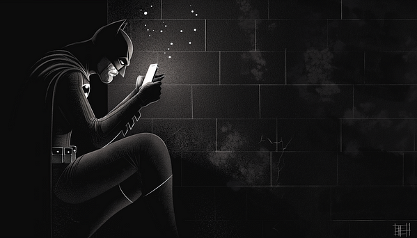
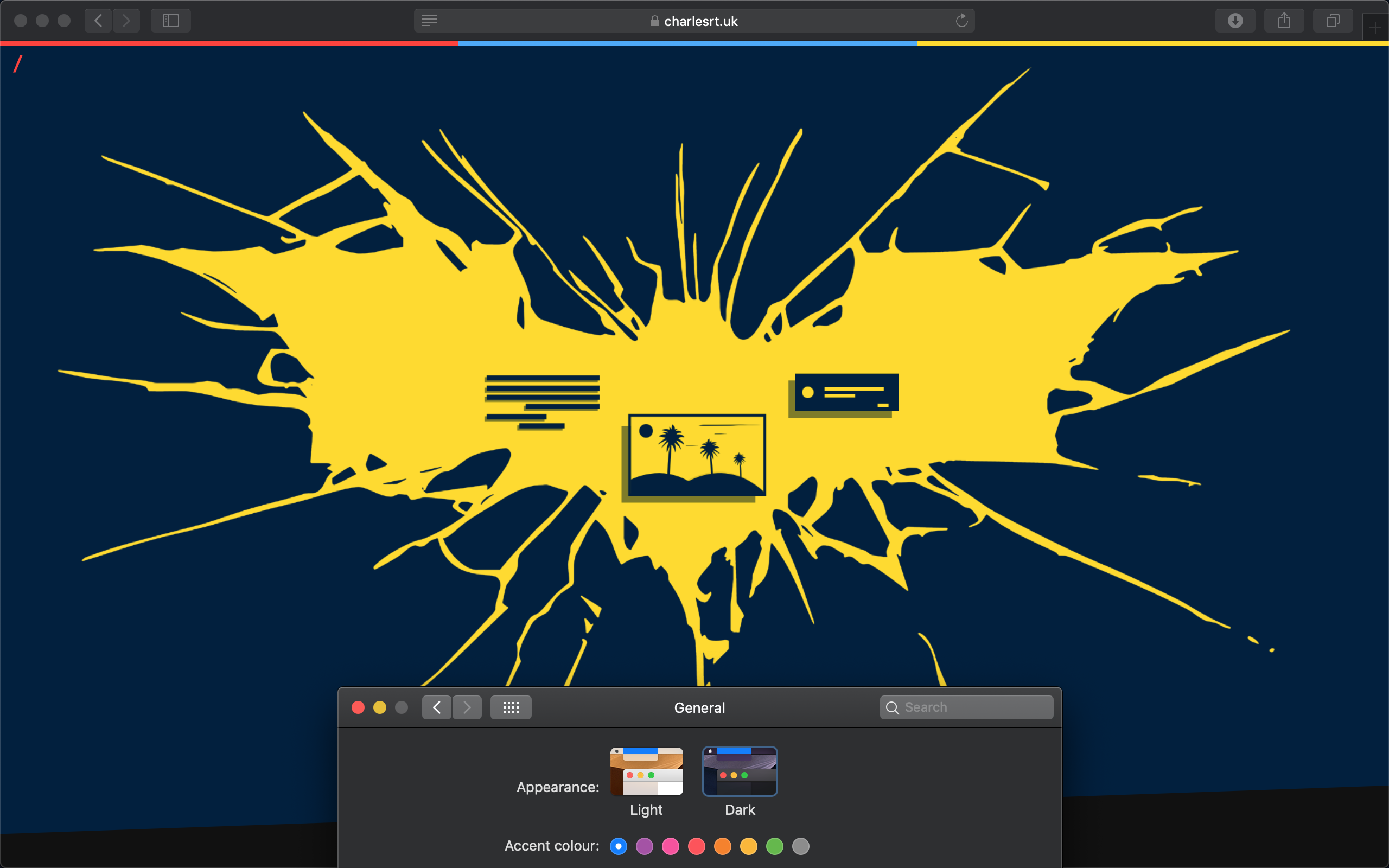
via Muzli design inspirationLooking for more daily inspiration?Download Muzli extension — your go-to source for design inspiration!Hey, Muzli lads and lasses!I’m Eyal Zuri, a designer, and co-founder of Muzli, that yummy design inspiration tool. Besides wrestling pixels and obsessing over UX and UI in our beloved realm of design, I have to confess, I am somewhat of a fanboy of trends and, yes, Dark Mode.Enough about me though, let’s dive into the mystery that’s been looming in the design sphere like Batman over Gotham: the phenomenon of dark mode UI.The question is, is dark mode simply an attractive pixeled outfit everyone wants to wear now, or does it hide some serious functional benefits under its sleek black garb? Grab your design goggles, because we are about to dive deep into the sea of dark mode UI!There’s no denying the undeniable charm of the dark mode UI. It’s the James Bond of design — sleek, sophisticated, and seems to favor martinis served “shaken, not stirred”.Dark Mode — the Trendsetter or Gamechanger? This is the question.Dark mode, a.k.a the digital world’s ‘nightclub’ experience. Everyone is jumping into this dark ship, from Twitter and Whatsapp to individual app developers rapidly launching dark versions. But let’s face it: Just like in fashion, not all trends are necessarily practical or necessary (like those needle-thin ties or extra ripped jeans).For instance, a good use case for dark mode can be found in a car navigation application. The darkened screen at night prevents glare and ensures the driver’s visibility remains uncompromised during travel.On the contrary, a poor example of dark mode implementation might be seen in a blog featuring lengthy articles. Reading white text on a black background can strain the eyes and make it difficult for users to digest the content effectively.Show me the (Dark) MoneySo, the real question is: To Dark Mode or not to Dark Mode? To answer this, let’s weigh the pros and cons.Certainly, I’d love to expand on those points for you.Pros:1. Reduce Eye Strain: Dark mode is known for significantly lowering eye strain, particularly in low-light conditions. Late night web surfers and after-dark app users can heave a sigh of relief — no more squinting at brilliant white screens!2. Save Energy: If you’re an environmentally conscious user or just looking to save on battery life, dark mode is your friend. Display technologies like OLED or AMOLED use less power while utilizing dark mode, giving a boost to your energy conservation efforts.3. Aesthetically Pleasing: Done correctly, dark mode is a feast for the eyes. Its warmth and depth can give designs a sleek, modern, and often luxurious feeling, enhancing user engagement and delight.4. Increase Focus: Some users report increased focus while working in a darker interface as it reduces the distraction caused by other elements on the screen.5. Market Appeal: Dark mode isn’t just power-efficient and easier on the eyes, it can also be a total eye candy! A sleek, striking, and sexy interface can be a powerful tool to attract and retain users.Cons:1. Legibility Issues: While dark mode can ease eye strain, it doesn’t always guarantee easy readability. Contrast between the text and background needs careful calibration, otherwise, the text may become hard to decipher, causing user discomfort. A classic example is Google’s Calendar app, where the dark mode has made it harder to distinguish between past and upcoming events.2. Inconsistent Results Across Displays: The effectiveness of dark mode depends largely on the type of screen it’s viewed on. While it may look splendid on OLED displays, the results can be underwhelming on LCD screens because of their incapacity to completely switch off pixels.3. Color Distortion: Dark mode can lead to color distortion, particularly with bright, vibrant hues. It makes them appear more saturated, affecting the overall visual consistency.4. Not Suitable For All Content Types: Some types of content are better suited for light mode. For instance, if an application is text-heavy, using light mode can enhance readability as dark texts on a light background are generally easier to read.5. Outdoor Visibility: Outdoor lighting conditions can pose a challenge for dark mode users. In bright sunlight, it can be hard to see and work on a dark screen as it introduces heavy screen glare. The contrast issue also becomes prominent as it becomes tough to distinguish different elements on the screen. This means that if your users are frequently outdoors, they might not be as thrilled with the dark mode.Summing it up — The Dark Mode PlaybookLike practically everything in life, there’s no one-size-fits-all answer. Sometimes, you might want to jump into the dark mode bandwagon, and sometimes not.If you opt for the dark side, meticulously play around with contrast levels, typography sizes, and test it across multiple displays. Never compromise on the most important aspect: a smooth, user-friendly experience.If you decide to keep things light, that’s alright too. Maybe top it up with a cheeky little ‘currently sunbathing’ notification. Add a little extra color to your user’s day!So, dear Muzli-ans, till the next design trend makes its grand appearance, may your pixels be perfectly aligned, your colors be on point, and most importantly, may you keep loving every step of this glorious design journey!Anyway, back to our dark mode discussion or should we say ‘light-hearted’ debate? 🥁 “Oh well, there goes Eyal, the Dark-Lord again!”Alright, it’s time to sign off before my passion for puns freaks you out! See you around in the other side of the color spectrum!**P.S.**In any case, this entire post was actually an excuse to tell you that we have a new tool for creating color palettes using AI, and guess what, its interface is a super sexy Dark mode.Try nowEnjoy!Shedding Light on Dark Mode design: Fashion Fad or Functional Must-Have? was originally published in Muzli - Design Inspiration on Medium, where people are continuing the conversation by highlighting and responding to this story.


Hello Today, I am back with the concept of Service - Delivery of Goods Application Design and my exploratory documents.We hope you like it and don't hesitate to leave comments and feedback.Thanks..!
Dim the lights, relax your eyes and save your energy. Dark mode UI is one of the biggest trends in… The post Dark mode design: tips for creating dark theme websites and apps appeared first on 99designs.

Wallet App Dark Mode UI Design.There are 3 screens 100% scalable Vectors, Easy to change color style, Compatible with Adobe XD


20+ well organized screens for taxi app

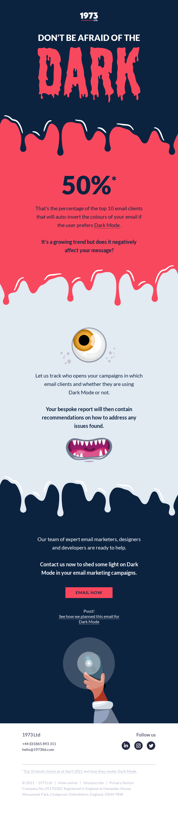
Dark Mode compatibility in emails is transcending from its definition as a “trend” and growing to be a best practice. Owing to its immense popularity, you can conveniently name it as the fastest-growing trend that has cast a magic spell on apps, browsers, and of course email inboxes. It has enhanced the subscriber experience and...

New Exploration about Hotel Booking Dark Mode

Let us know your feedback on commentsFollow us for more Dribbble Instagram BehanceFor Work inquires hello@cohort.work


Hello Community!A usual problem in big cities is to find where to park and how much to pay for it. Parking is an essential part of most trips you, myself, and others make on a daily basis.Parkirin is a parking app which has features :- Find Nearby Parking Area- Book & Park- Extend TimeWith this handcrafted UI Kit, it is a good way to kick start your next parking app project.Light Mode : https://www.uplabs.com/posts/parkirin-parking-app-ui-kitIf you have any feedback, request, question, or anything? Get in touch maulanafip00@gmail.comAfif Maulana • Instagram • Dribbble • UI8

Personal Work Q3 2020

Say hello to our new Dark Mode Social platform UI Kit bringing you many beautiful, pixel-perfect templates for mobile apps.
Experience design inspiration like never before with Muzli. Loved by 700k+ designers worldwide, Muzli is the leading go-to browser extension for creative professionals.
Get Muzli for FirefoxDark mode, sometimes referred to as night mode, has become an increasingly popular feature in UI/UX design. As its prevalence grows, the question arises: Why should applications adopt dark mode, and how should it be implemented effectively? Let's delve into the reasons and best practices.
In low-light environments, a bright screen can strain the eyes. Dark mode reduces the amount of light emitted by screen displays, thus minimizing eye fatigue and reducing the risk of blue light exposure, which can interfere with sleep patterns.
For devices with OLED or AMOLED screens, pixels are individually lit. Dark mode reduces power consumption as fewer pixels need to be lit, especially if the background is pure black.
Many users prefer dark mode simply because of its sleek and modern appearance. Offering a dark mode option can meet these aesthetic preferences and enhance user satisfaction.
By decreasing the overall brightness of the screen, dark mode can reduce screen glare, making it easier to view content in various lighting conditions.
Provide users with an easy option to toggle between dark mode and the standard mode. Some users might prefer one mode over the other depending on the time of day or their activity.
While the background is dark, it's essential to ensure that text and UI elements stand out sufficiently. This doesn't mean making them glaringly bright but ensuring that readability isn't compromised.
Ensure that the dark mode theme is tested extensively across different devices and screen types. Colors might appear differently on various screens, so it's crucial to ensure consistency.
It's not just about inverting colors. Icons, images, and other graphic elements may need to be tweaked to fit the aesthetics of dark mode, ensuring they are visible and appear coherent.
Dark mode isn't just a trendy feature; it offers genuine benefits in terms of user comfort and power efficiency. By understanding the reasons behind its adoption and following best practices in implementation, designers can create an optimal dark-themed user experience.