
Get thousands of Calendar examples for free
Join over 700k others who enjoy Muzli design inspiration hub.
We curate topical collections around design to inspire you in the design process.
This constantly-updated list featuring what find on the always-fresh Muzli inventory.
Last update: 4/26/2024


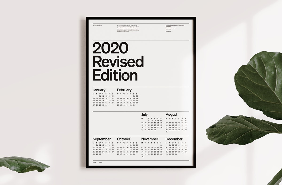
Christopher Doyle’s new calendar design for 2020 chops out four months in a bid to reflect how life has been put on hold during the pandemic The post 2020 gets a new, leaner calendar design appeared first on Creative Review.

The quirky calendar designs of 20 A’ Design Gold Award-winning Katsumi TamuraLauded as the most awarded designer on the A’ Design Award roster, and even sitting on top of the World Designer Ranking with 13 Platinum Awards,...
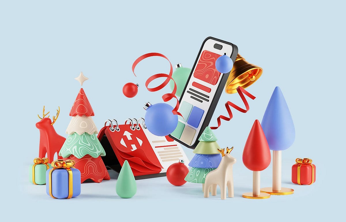
This case study will let you immediately dive into the atmosphere of the winter holidays and catch some bright Christmas vibes. Let us give you a brief overview of the festive and functional advent calendar with original 3D illustrations we designed for Nova Post. Have fun!Project and ClientNova Post is a major Ukrainian postal and courier company that provides logistics and related services involving innovative approaches and technologies. In this project, the tubik team worked on a bright and festive advent calendar of discounts and special offers for the marketing campaign of the winter holiday season. The scope of work included tasks on UI/UX design, graphic design, 3D art, and animation.https://medium.com/media/55888fe60df55b5fbdfee420ee81ddf2/hrefDesign Process and SolutionsIn general, the Nova Post advent calendar was a marketing campaign time-framed in December, when users of Nova Post digital products were presented with a collection of special offers and discounts from company partners. Various brands and services popular all over the country were engaged in this campaign, and each day, users were offered a particular option from a specific brand, echoing the concept of a classic advent calendar when each day you open a box or pocket and get a treat.We had to make the calendar festive, beautiful, playful, and engaging while keeping a consistent and recognizable visual connection with the popular postal service’s general brand style. Moreover, the identity of the diverse partners that took part and shared their discounts or special offers via the calendar also needed balanced and consistent integration.One more essential thing to consider was making the calendar work and look good on various devices and screen sizes, as the audience using the company’s products is very wide and uses it from diverse gadgets.So, the primary design tasks for this project included:designing the user interface of the calendarcreating the massive gallery of 3D graphics for different days of the advent calendarworking on eye-pleasing interface animation and 3D animationWorking on the user interface design, we offered the client different options for the content presentation:blockstimelineflip calendarcardholderlong story parallax calendar.The concept of blocks was chosen as the final option and developed into the user interface.The UI was designed to be super intuitive, straightforward, and adapted to multiple formats users could try. And one of the primary objectives was to consider how it would be integrated into the general brand style and user experience of Nova Post company products. So, the interface and graphics use brand family colors, object rounding and shapes style, and brand graphics to make the visual association with Nova Post consistent and immediate.The central element that adds a Christmas mood and represents the theme of winter holidays from the first seconds is illustrations. Each offer of the day was presented with a particular illustration, and all together, they formed a massive gallery of 3D images, reflecting the theme of gifts and e-commerce as well as echoing all the well-recognized stuff associated with Christmas: Christmas tree, cookies, reindeer, Santa Claus hat, candles, bells, baubles, candy canes, presents, toys, snowman, etc. Smooth, eye-pleasing animation made interaction even more lively and emotional.https://medium.com/media/30d402b7e1ea2cb8e6452c7d41aabf10/hrefSo, as a result, the client got efficient design support for their marketing campaign idea and implementation, while their users got an emotionally appealing, aesthetic, and memorable customer experience.New design case studies from our team are coming soon. Stay tuned!More Design Case StudiesHere’s a set of more case studies sharing the design solutions and approaches for some of the design projects done by the Tubik team.HP23. Website and 3D Animation for Prostheses ProducerBlack Friday. Graphic Design for Marketing CampaignAlbert’s. Christmas Cookies Packaging DesignWhite Christmas in Digital Art: Collection of Merry Christmas ImagesFluxWear. Web Design and Development for Health Tech ProductSynthesized 2.0. Web Design for High-Quality Synthetic Data PlatformPhysica Magazine. Web Design and Graphics for Scientific BlogProAgenda. Identity and Website Design for Golf Management ServiceKaiten. Identity and Product Design for Food MarketplaceTHT. Website Design for Electrical Engineering ServiceOriginally written for Tubik BlogWelcome to talk to us and check designs by Tubik via:WebsiteDribbbleBehanceYouTubeTubik ArtsCase Study: Advent Calendar for Nova Post. UI/UX Design and Christmas 3D Art was originally published in Muzli - Design Inspiration on Medium, where people are continuing the conversation by highlighting and responding to this story.

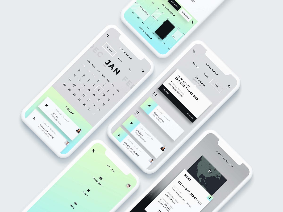
Dashboard Calendar UI Design Wedget

If the right balls tumbled out of Lancelot tomorrow night, the first thing we’d do — after spending an hour or two trying to compose a text to friends and family explaining that, like Robbie Williams back 2001, we’d become rich beyond our wildest dreams — is bop down to the nearest Margaret Howell shop and spend, spend, spend on some very classy clothes. Which we would then take with us on a year-long cruise around the world. Read more
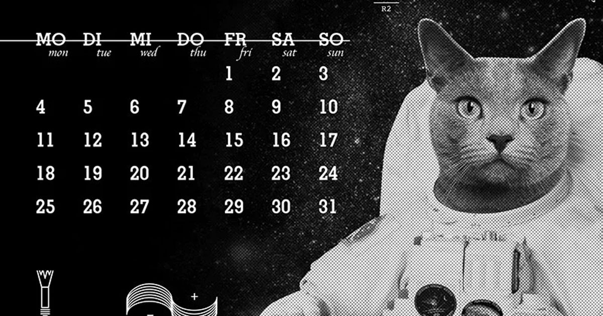
as an homage to apollo 11's 50th anniversary, the calendar's minimal look features bold hues, funky fonts and astronaut cats and dogs. The post otavio santiago designs a retrofuturistic, space-themed pet calendar for 2020 appeared first on designboom | architecture & design magazine.
Bath-based studio Thisaway shares how to stoke year-round enthusiasm for a brand tied to the Olympic calendar.
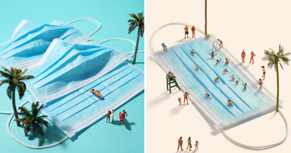
bread beds and brush showers highlight the newfound significance of our domestic environments. The post tatsuya tanaka creates escapist miniature scenes from face masks and household items appeared first on designboom | architecture & design magazine.
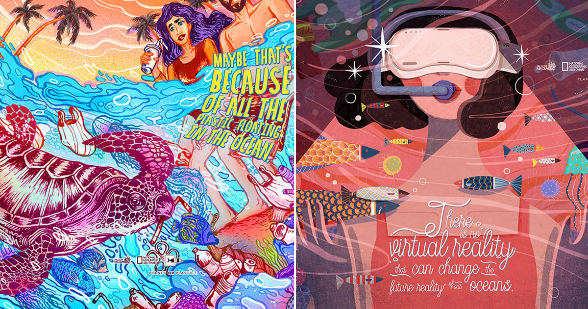
the project aims to raise awareness of the 9 million tons of plastic we currently throw away every year. The post national geographic uses art to promote its ‘planet or plastic?’ initiative appeared first on designboom | architecture & design magazine.
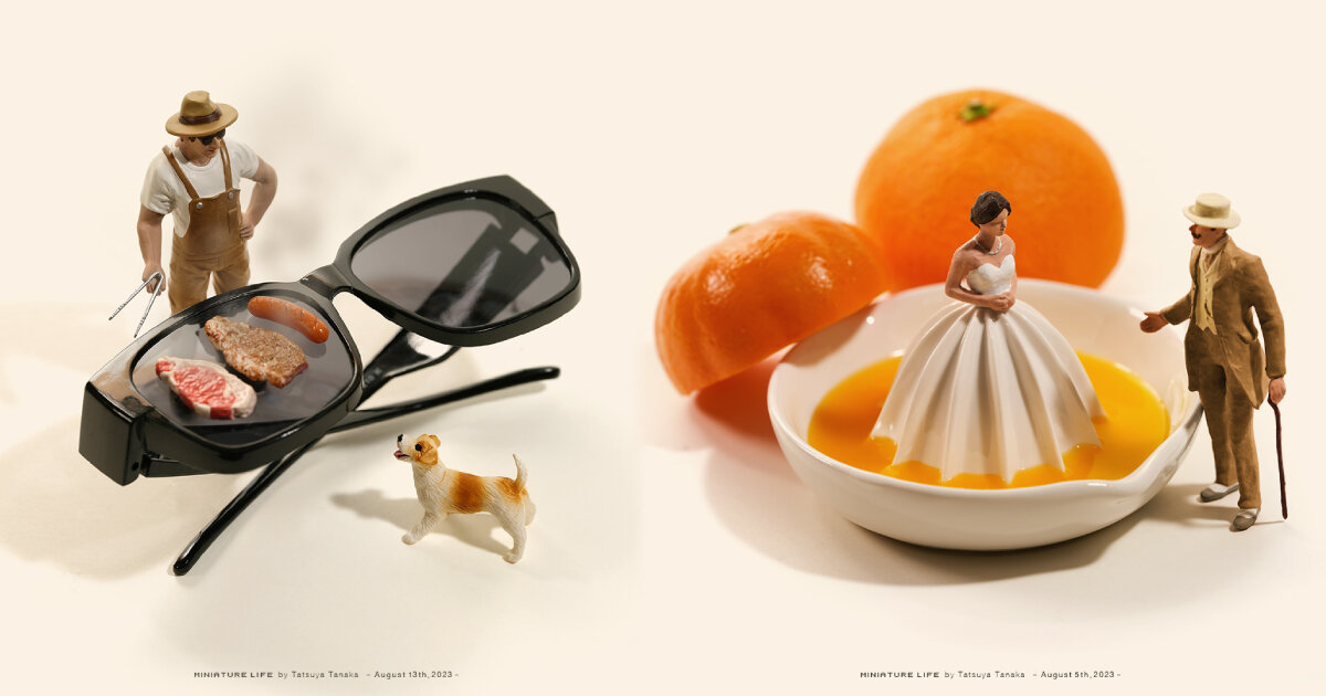
in august 2023, tatsuya tanaka imagines cups as drums, chocolate as interior walls, and more for his yearly calendar miniature art. The post tatsuya tanaka captures everyday life in a calendar of miniature objects and tiny figurines appeared first on designboom | architecture & design magazine.
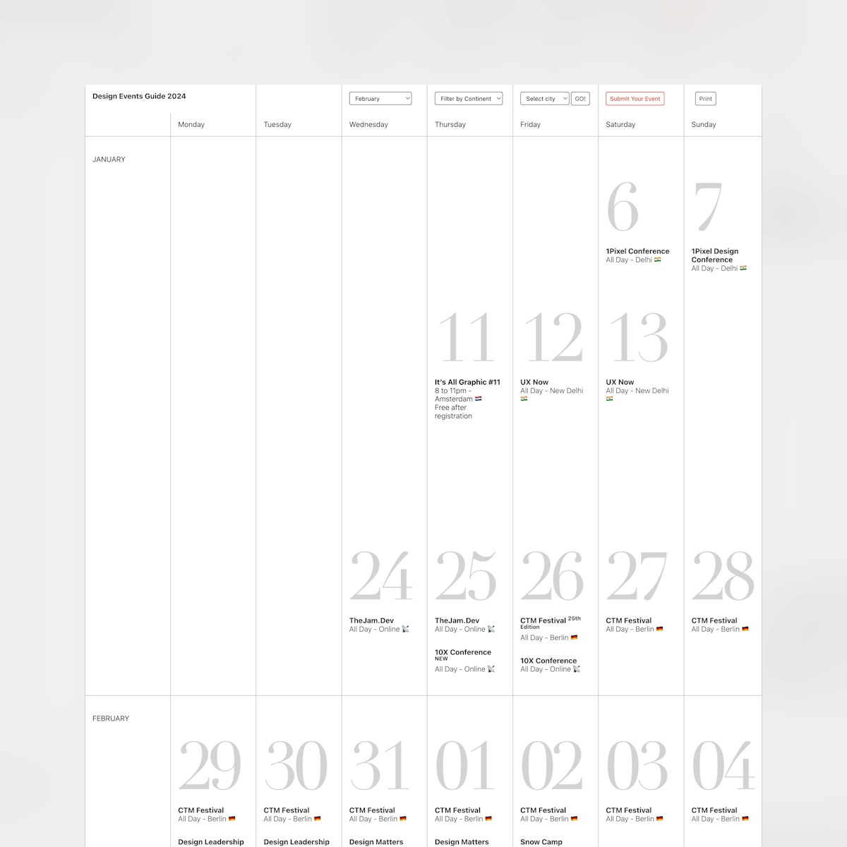
Calendar-style One Pager listing all announced design events happening around the world in 2024. Full Review

after three years of development and engineering processes, the 'U.F.O 2.0' is ready to be built through a crowdfunding calendar. The post pierpaolo lazzarini proposes to build the ‘unidentified floating object’ through crowdfunding appeared first on designboom | architecture & design magazine.
discover our guide to milan design week 2023, the week in the calendar where the design world converges on the italian city. The post designboom’s ultimate guide to milan design week 2023 appeared first on designboom | architecture & design magazine.
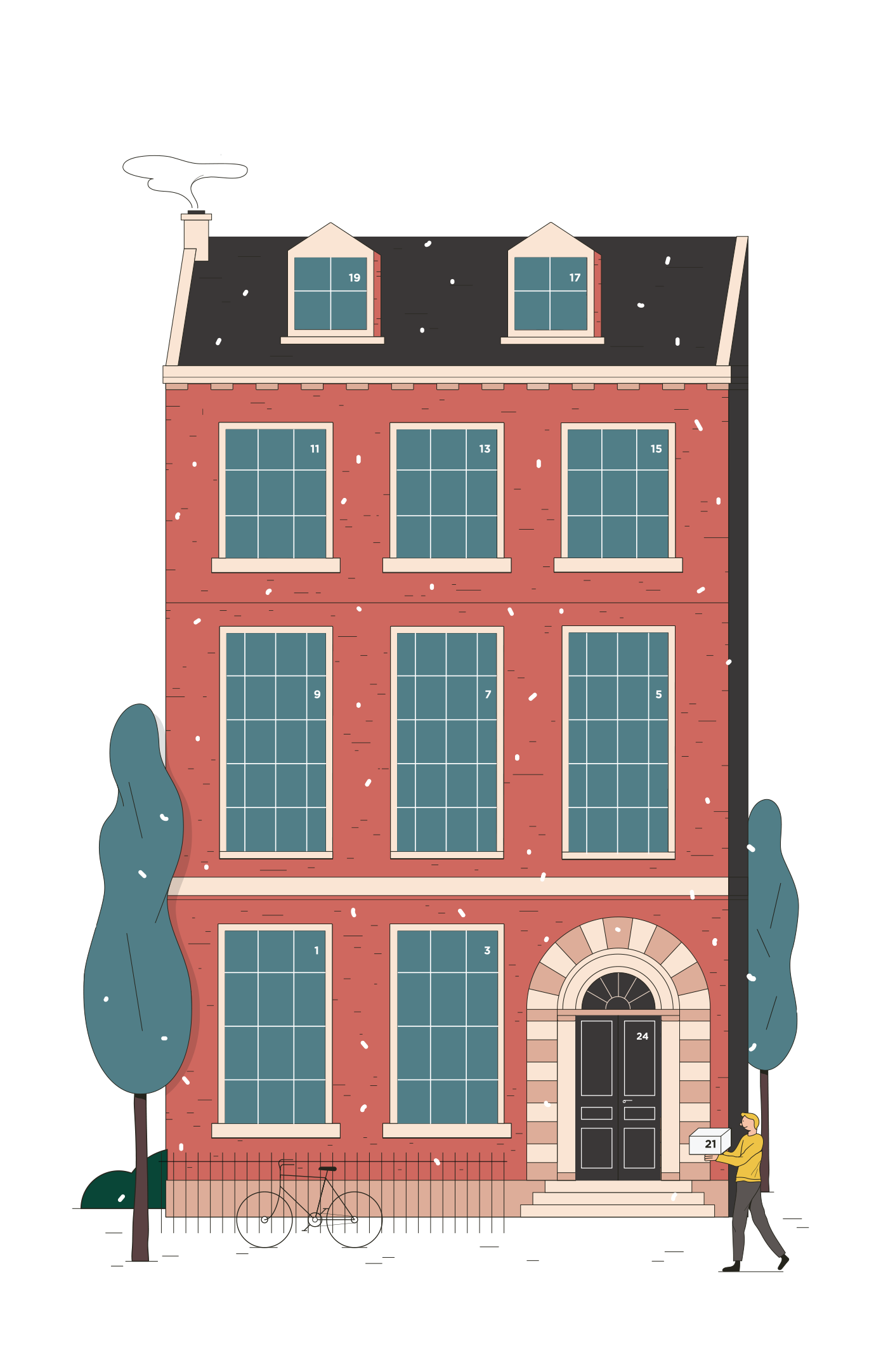
Christmas Calendar Design and Illustration of a Bustling London Town House for Studio29 Architects, London – DIN A4, CMYK Print with lasercut flap doors and writable back
2019 Biggest UI Design Trend abduzeedoJun 20, 2019 So we have a new UI design trend all over us and it deserves a post here on ABDZ. It’s quite clear to notice it, just spend some time on Dribbble and you will spot it right away. This post is literally from three or for Dribbble pages of beautiful mocks. The interesting thing, and what drove me to write this post was when I saw the new Facebook product called Calibra. It features all the same UI patterns, rounded corners that in some way match the phone and screen rounded corners. My interpretation is that as phones become bezeless the screens now match the hardware form, so the software follows the same direction. Apple and Samsung have been exploring this for quite a bit, but now it seems to be all over the place. Anyways, enough talk and here is a collection of designs with the new super rounded corner widgets. UI Design Trends

THE ? TOUCHING ? MOMENT ? Share The Warmth - ?????? - ?????????????????????????????????????????????????????? ????????????????????????????????????12????????????????????? ??????????????????????????????????????????????????? ?????????????????????????????????????????? ???????????17?????????????????????????????? ???????????????????????????????????????????????? Design Project for 2020 Calendar A cooperation project with Polytrade Paper, we believed that paper printings are able to convey the messages with warmth, and the combination between design, paper, and printing is the important element to form the classic. Inspired by the touching moment of receiving the cards and the moment of touching the papers, we combined both feelings to create the celebrating moments for each month and present the message behind by the paper texture. With the most complicated structure and layers recently, we take the stand as the basic structure and included a hanging greeting card for each month.
We roundup our favorites from Stockholm Design Week which has become the most important week on the Scandinavian design calendar.
Ready is the first calendar that solves the meeting problem. It stops them from crowding your day and makes the ones you have worth their weight. Ready have powerful new tools to make every meetingworth having. For the Digital Product Design, I create a series of illustration and characters - The Makeshifters. My role | 3D ilustration, Design Client | Ready
Daily Design Inspiration AoiroStudioDec 21, 2018 The unfamous Daily Design Inspiration series that started it all on Abduzeedo. Where you'll find the most interesting designs/artworks/concepts curated by one of us to utterly inspire your day. Besides that, it's an opportunity to feature work from other designers, artists, and creators in general that we haven't had the chance to write or featured. For this Daily we are selecting in graphic design, branding, illustration and more; our sources are usually from Behance, Dribbble or Unsplash. Until further notice, we'll display the images and the titles added to them. Because of little issues we had in the past, the images are still linked to their authors, we just won't mention who shared them like we used to. We are going to stick with a simple format of images and links. I hope you will enjoy and share them via Twitter or our Tumblr. Daily Design Inspiration
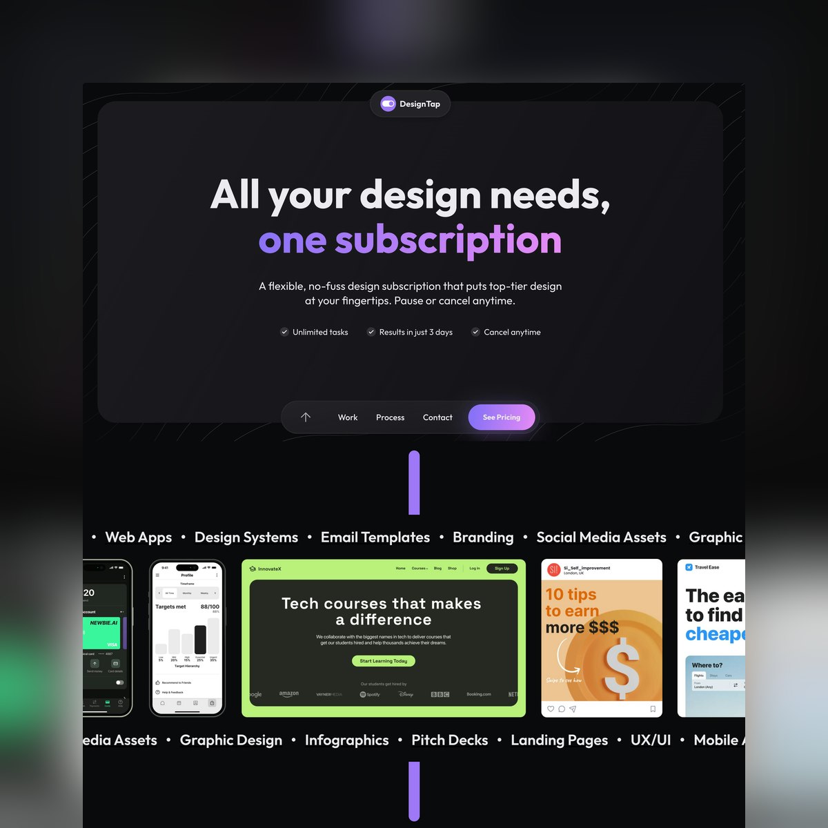
Fun animated arrow as you scroll down this One Pager (built with Webflow) for design subscription service DesignTap. Make sure you take the contact link (in the sticky footer nav) for a spin to experience the impressive calendar pop-up! Full Review
via Muzli design inspirationDesigners’ Secret SourceThe best design inspiration — expertly curated for you.Muzli is a new-tab Chrome extension that instantly delivers relevant design stories and inspiration. Learn moreWeb Calendar App by Fireart StudioLanding page: header by Vladimir GruevHomeFinder WebApp Design by Shekh Al RaihanSmoóth Magazine by Rron BerishaGlassmorphism App Onboarding Screens by Mikołaj Gałęziowskihttps://medium.com/media/37836e0571ec92af1cf07a5f751d6010/hrefvision by chubasanPOST DRIBBLE 2 by PaihemeTangled by Alexandra ZuttoBird Dog by by Paul GorsuchMOMO Mid-Autumn Festival GIFT BOX by momo design teamLove — Typography Experiments by Andrew FootitSenses — Coffee by Guilherme VissottoCH-LAB 2021 GIFT丨牛年加油包 by CH-LAB DESIGN STUDIO,Corporate Design for an Exhibition Builder by ONOGRIT Creative StudioWeekly Design Inspiration #297 was originally published in Muzli - Design Inspiration on Medium, where people are continuing the conversation by highlighting and responding to this story.
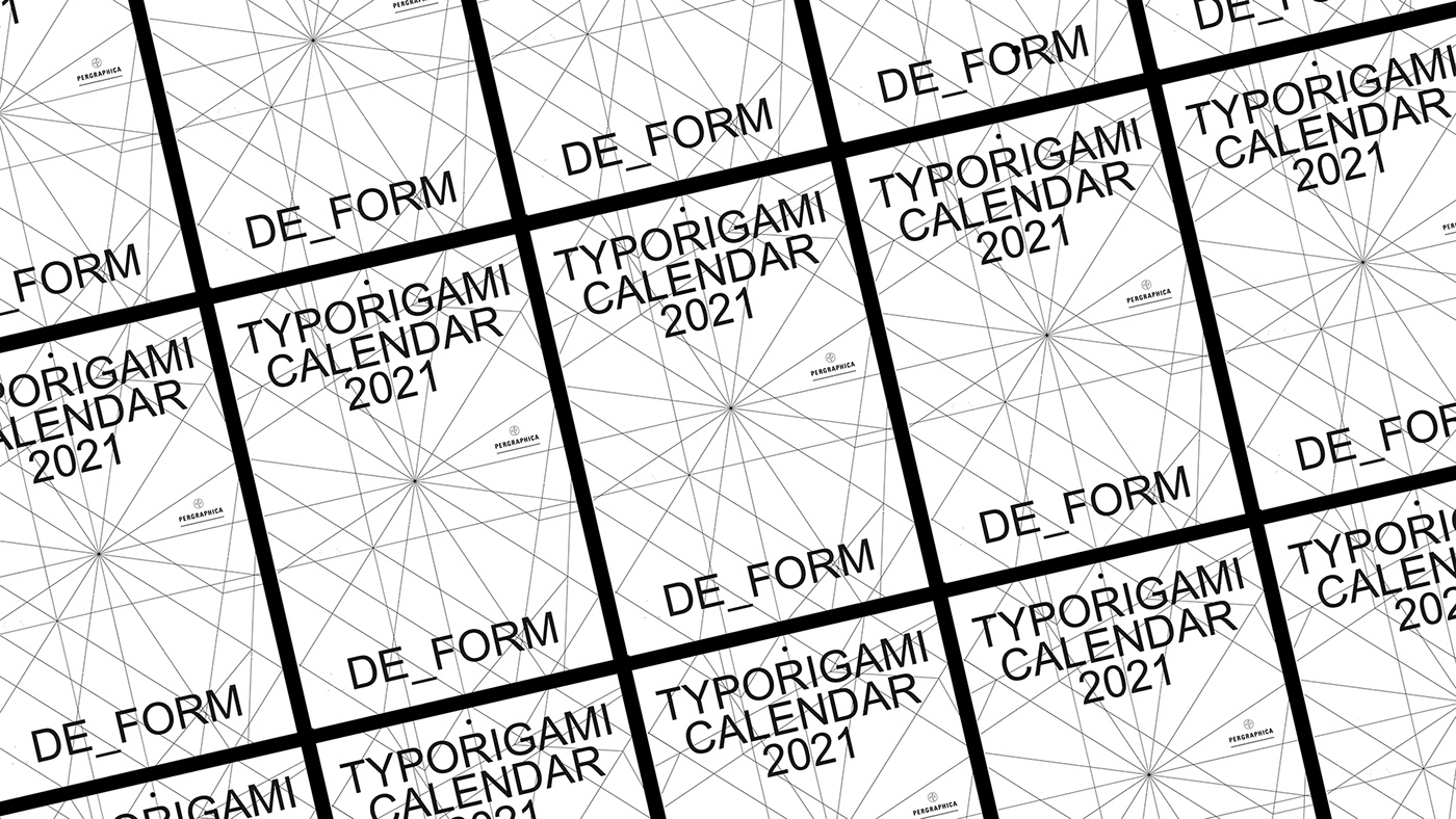
This year all of us have struggled a lot with Covid-19. In many people's lives, the pandemic caused a lack of work, financial issues, physical or mental health problems, or total social isolation. We try to be optimistic but know, we should be patient in this situation. Every year we design a calendar and try to reflect on the exact months, but now we really don't know what will happen next year. We invite you to play with this patience based origami calendar for the year 2021. Printed on PERGRAPHICA® High White Rough 90 g/m2 Produced by Mondi Sponsored by Europapier

via Muzli design inspirationThe best design inspiration — expertly curated for you.Muzli is a new-tab Chrome extension that instantly delivers relevant design stories and inspiration. Learn moreWebsitesBoba Ice Cream.Goals.The Search For Work Happiness Book.Tiny Tracks.Design resourcesSynapse — Event Website TemplateSet the stage for an unforgettable event celebrating the infinite potential of AI.Calendar Web app UI kitWe designed Calendar Web and desktop app UI kit to help you kickstart your project, We research and analysis lot of the Calendar web apps before designing this kit so this will surely save your time and effort..Granada — Book Website TemplateElevate Your Writing with Granada Webflow Blog Template — The Granada Webflow blog template is designed for writers who want to showcase their work in a perfect mixed classics preview and modern and minimalist way..Blame! Inflatable 3D FontMake your message bold and grab attentions. This inflatable 3D font set was made specially for designers, marketers, smm creatives, and all who need unique graphics. Perfect for stories, social campaigns, posts and ads..FrogeurFrogeur is a stylish modern serif font characterized by extreme contrast between thick and thin lines. This font has half vertical tension and minimal design thin serifs. This font has alternate and ligature features that give you access to a unique collection of letters. You can use this font for brand projects, product labels, logos, posters and more.Product SpotlightFigma to Lottie Animation InspirationsFigma Prototypes ready to be exported as production-ready Lottie animations using the LottieFiles for Figma plugin..Endless ToolsCreate beautiful visuals with Type or Cover Toolshttps://tools.endlesswork.io/.STUDIO AIThe new age design tool with WebDesignAI inside..SkewDatskew anything & everything in sight within the comfort of everyone’s favorite design program, ehm ehm Figma.Design inspirationModern Houses Company Website by AwsmdSuperlight — Digital Agency by Tosan GarditamaSolidity — Crypto Exchange Mobile App by Arounda MobilePalamidas Olive Oil by MW Branding AgencyFLOVER tea by Elena Astakhova and Timofei PopandopuloTHE ANGRY ROASTER Branding by Terraqueo StudioWeekly Design Inspiration #402 was originally published in Muzli - Design Inspiration on Medium, where people are continuing the conversation by highlighting and responding to this story.

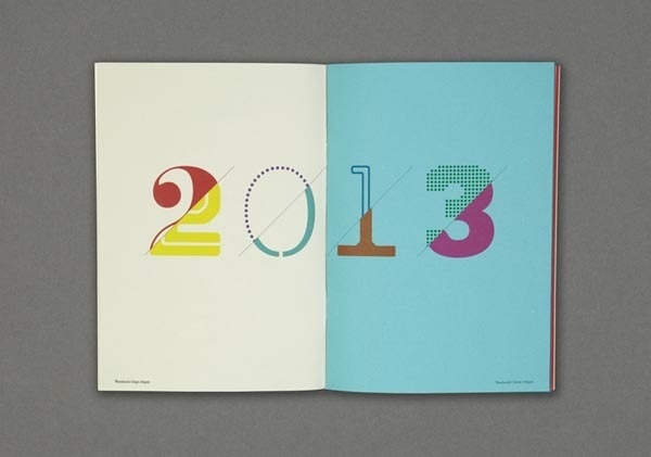
Typography was the inspiration for the design of the 2021 Monthly Calendar. More specifically, the characters of the months are imprinted with different typographic weights, while the numbers of the days (dates) correspond to typographic points. In the title of the diary and in the paragraphs, the superscript refers to the points of the corresponding text, while in each date it specifies the day of the week. Strikethrough in the days indicates the official holidays of the year. For the calendar the equal width typeface PF DIN Mono Pro from Parachute® Typefoundrry and the special paper Colorplan Sorbet Yellow 135gsm from Perrakis Papers were selected. Special edition of 52 numbered copies, as many as the weeks of the year 2021.
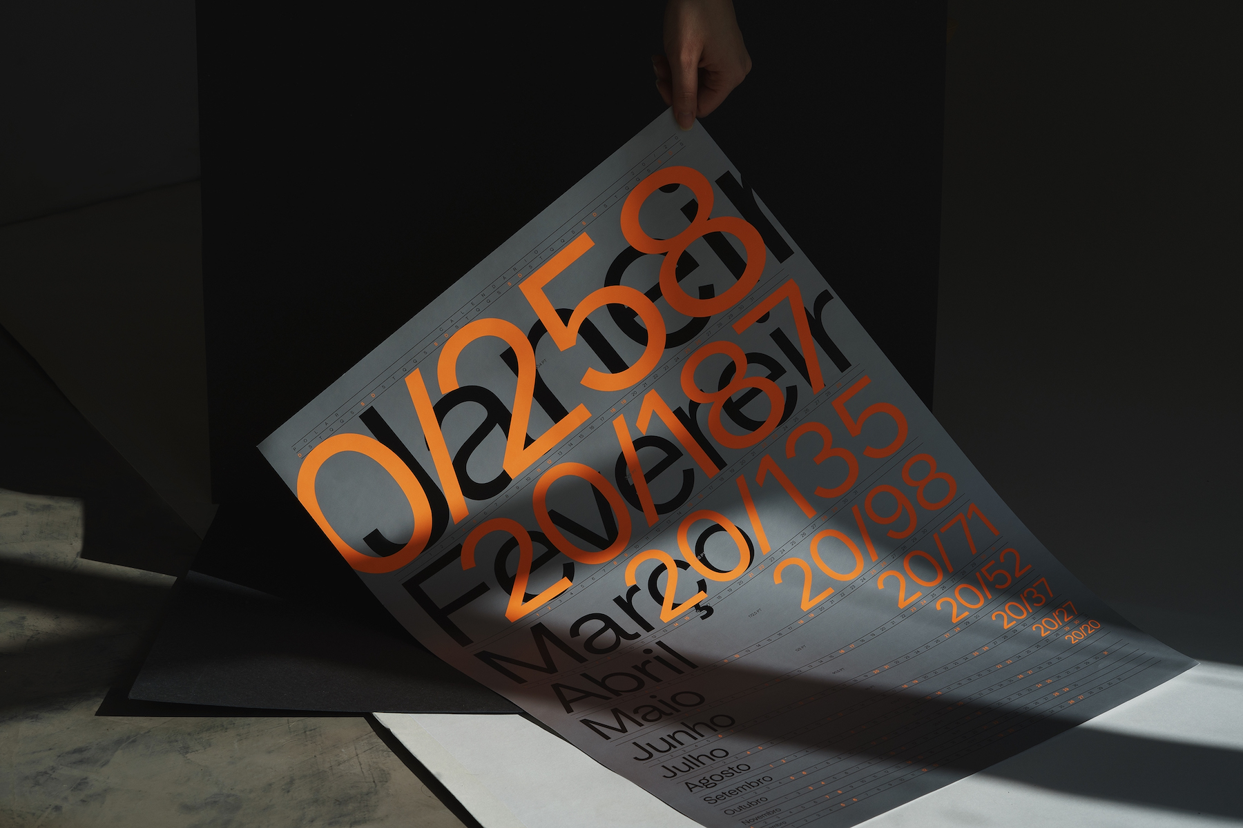
Awesome Calendar Inspired by the 2020 Visual Acuity Test abduzeedo07.06.20 At the beginning of each year Polar, a design studio from Brazil, designs a non-traditional calendar as a gift for friends and customers. Inspired by the 20/20 visual acuity test — or Snellen Chart — the 2020 Polar calendar graphically explores the relationship between typographic scale, distance and time. In the vision considered normal, the observer is able to see the line marked 20/20 at a distance of 20 feet (approximately 6 meters). Polar is a Brazilian office committed to delivering design solutions that balance impact and adequacy. We enhance narratives by translating concepts into strategic visual systems that transit between digital, printed, spatial and audiovisual. Our production has versatility and tooling knowledge of the team as fundamental points. COLOPHON Typography: Universal Sans Format: 420×594 mm Paper: Coated Matte 150g / m2 Printing: Offset Colors: Black, Pantone Lumiset 804C and Pantone Metallic 877C TEAM Design: Bruno Ribeiro, Lais Ikoma, Matheus Sakita, Ralph Mayer and Ronaldo Arthur Vidal Showcase photography: Lais Ikoma and Ronaldo Arthur Vidal For more information make sure to visit https://polar.ltda/ Graphic Design
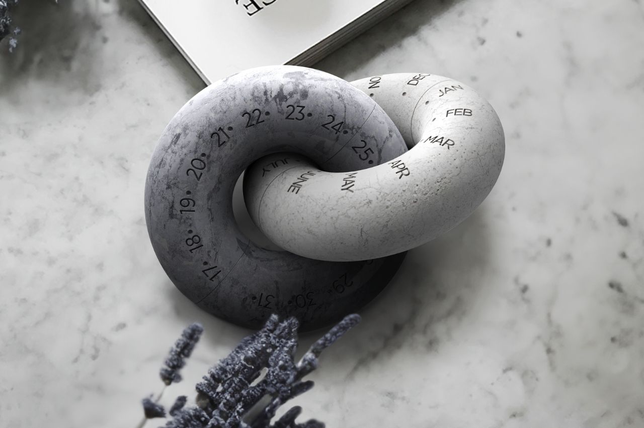
An Intricate Geometric Stone Calendar That Makes You Value Your Time and MemoriesCreating tangible forms from abstract concepts in a basic lesson in a design school. I feel it’s the most vital and coolest class for a...
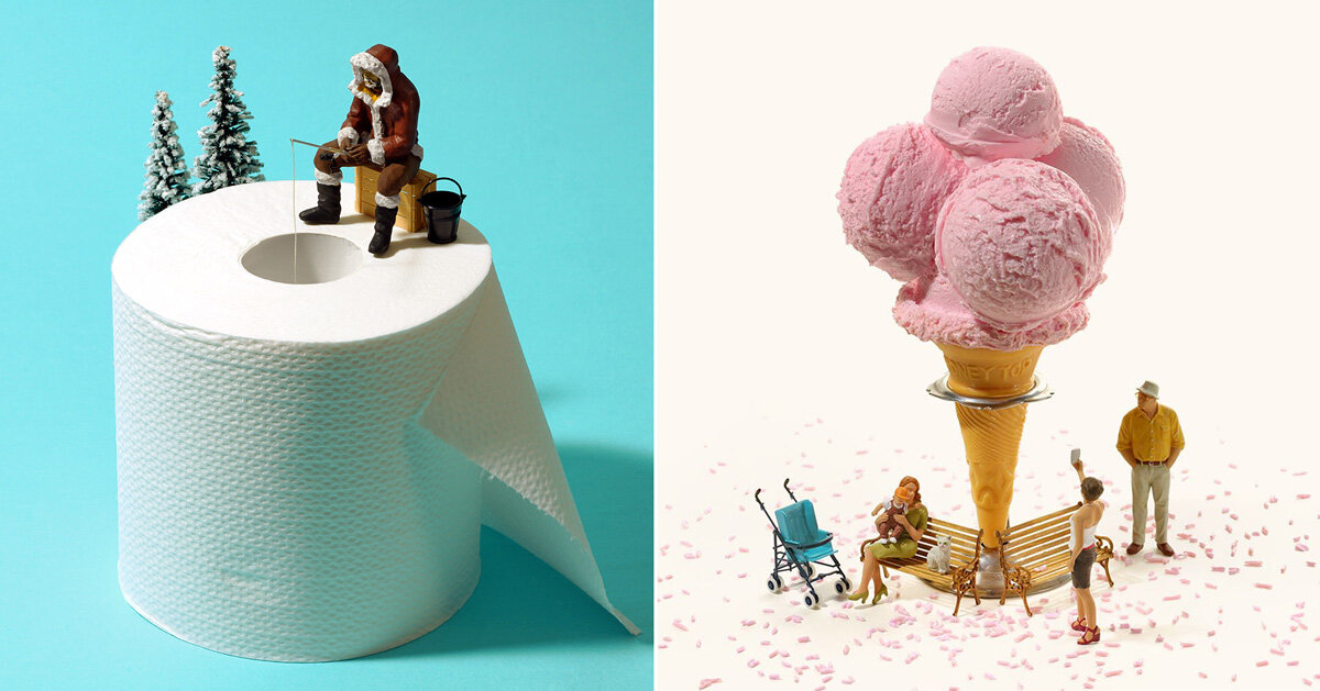
the intricate, tiny worlds of japanese miniature and mitate artist tatsuya tanaka are going on display in museums across japan. 2021 marks the 10-year anniversary of tanaka’s ‘miniature calendar’, where every day he shares a playful recreation of scenes from everyday life. in his pieces, the artist combines common household objects, such as rolls of […] The post explore the intricate miniature worlds of japanese artist tatsuya tanaka appeared first on designboom | architecture & design magazine.
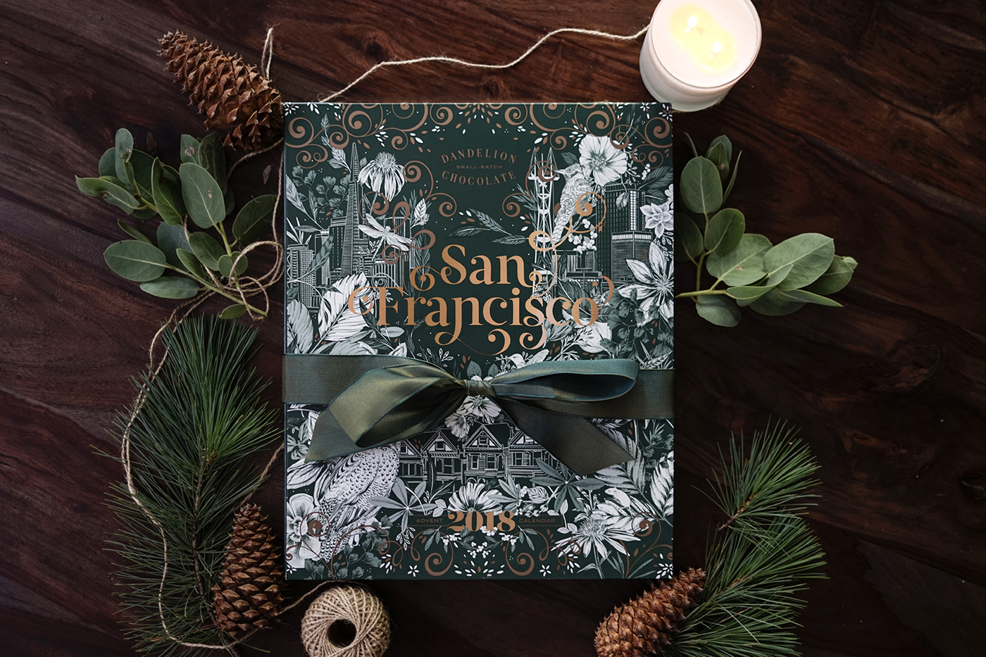
Unique hand illustrated packaging design created for California based company, Dandelion Chocolate. Special edition packaging to support their annual Advent Calendar project. All Flora and Fauna are native to the San Francisco Bay area. "San Francisco" lettering on package cover by Lisa Quine.


Rundle Mall is one of Australia's busiest pedestrian malls, home to more than 700 retailers and host to 24 million annual visitors. In a fast paced and highly competitive environment, we were tasked with delivering a bold rebrand to reinforce Rundle Mall's position as Adelaide's leading retail precinct. Our aim was to achieve the holy grail of branding ? to be recognised not by name, but by icon. To accomplish this, we utilised the famous Mall's Balls sculpture, the precinct's most recognised landmark. By distilling the Mall's Balls into the simple form of two circles, we were able to develop a bold design system flexible enough to support Rundle Mall's busy retail calendar. Reinforcing the icon, we introduced the tagline "Expect it All", phonetically mirroring "Rundle Mall" while encompassing the excitement of the brand and appealing to the emotions and imaginations of consumers.
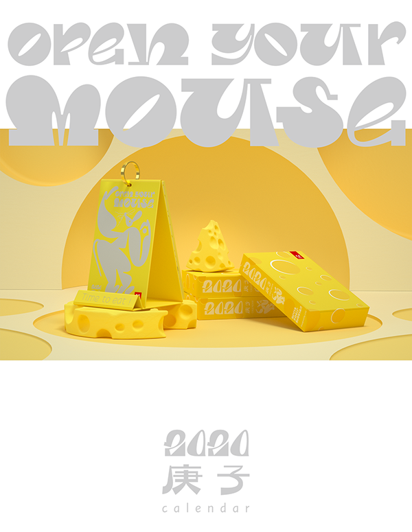
"Open Your mouse, Time to eat!" 🐭 Adobe × LxU 2020 Calendar is fresh out of the oven! For the Year of the Rat, We made this greedy little animal our leading role of a food story! Inside the "cheese", twelve pages of the calendar representing twelve seasonal fruits and vegetables all year around. You can tear off a small part in each page. Flipping from back to front, while pages getting thick, the empty parts form a hole -- just like time being eaten. This is the third year we collaborate with Adobe for a creative calendar design. Happy new year everyone!
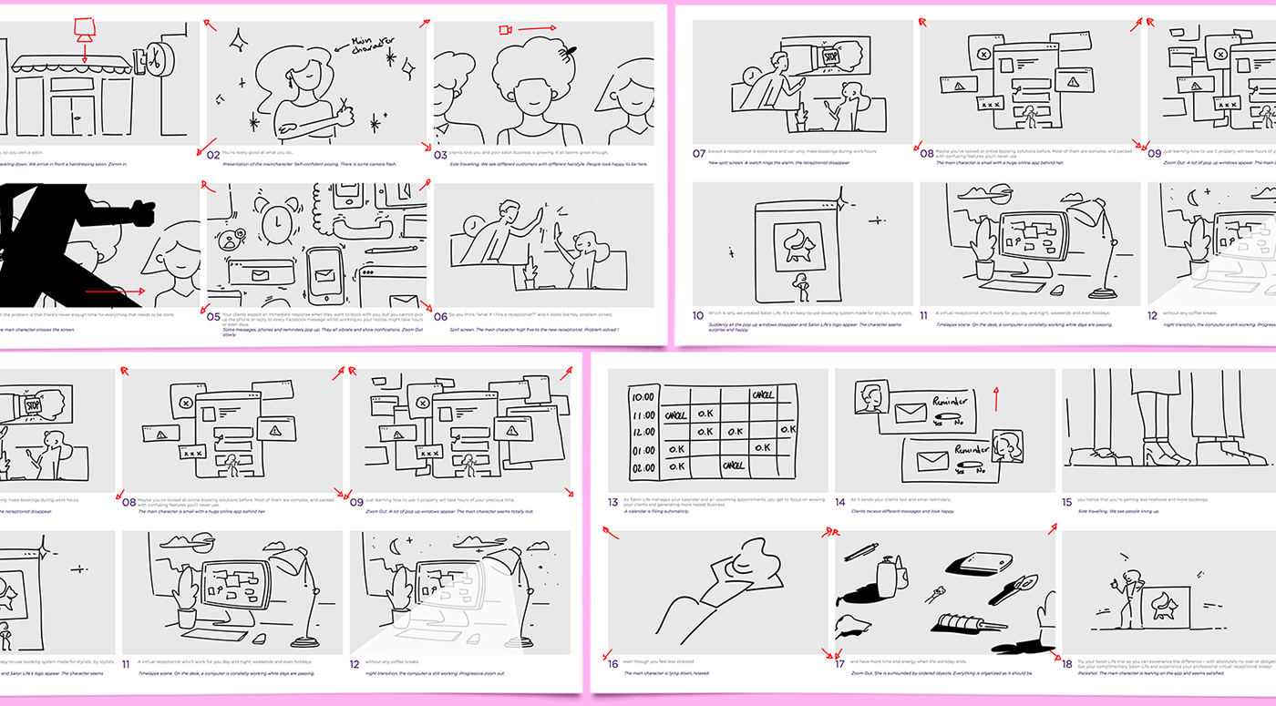
Art direction, illustration and motion design for Salon Life, a all new solution software for hair, nails, lashes, massage and beauty salon that manages your calendar and all upcoming appointments.

Crafted from raw chipboard, maple wood, brass and grosgrain ribbon, TAIT Design Co’s Perpetual Calendar is forever. By using a rotating month and day dial, this calendar can be used every year. Its minimalist, vintage-inflected design is unobtrusive, making it a formidable option for any studio or workspace.

Hi Everyone!Calendar Schedule Management App DesignThis is my work for Calendar Schedule Management App Design. I am excited to share this app design. I hope you like itHighlights:Total 4 ScreensFonts - PoppinsFonts - Raleway100% EditableCompatibility:Adobe XDFigmaContact us if you have any questions!Thanks for your support, it is greatly appreciated.
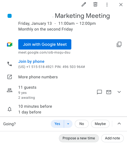
UX Design Heuristics and other design principles that make professional use of software betterGood UX design makes software products navigable, intuitive, and recognizable from interface to interface. This article shows UX design examples that make work easier for individuals, collaborators, and remote workers. Through the lens of UX design examples that align with UI and UX design principles, we will gain a deeper knowledge of UX Design related to B2B software.Businesses rely on apps every single day. From the ability to swiftly book meetings on Google Calendar to producing reports over a video call while screen-sharing on Loom, businesses thrive when UX design meets their needs and expectations. Let’s take a look at 5 inspiring UX design examples.1. Google Calendar syncs the worldUX design feature: invites with integrationsGoogle Calendar has the advantage of being part of the vast Google ecosystem. Its designers have taken full advantage of that by adding many useful integrations that simplify business.Users can add the Google Meet video conferencing app to their Google Calendar invitation with one click. They can attach files and share notes with relevant links.The integration with Google Docs shows how a simple feature can make a big difference. When a user schedules a meeting and pastes a Google Doc URL into the notes section, the top headline (a Title or H1 header) automatically populates as an option to display in place of the link URL. With one click, the user can add the doc’s title as a clickable link inside the notes section. If the invitees cannot access the document, Google Calendar will let the sender know and automatically show a pop-up where they can access the sharing options.Google Calendar integrates with Google Maps as well. This integration is useful when the invitation is linked to a physical place because users can save time and energy navigating.Users can select the integrated Google Meet video app with one click when linking to a virtual call in place of a physical location. They can also link to meetings that go off the Google platform to other platforms like Zoom.UX design feature: collaboration and cooperationUsers can seamlessly invite others when they schedule an event because of the integration with their Google email account. Predictive text populates possible contact suggestions as the user types into the text box to invite others. With one click, users can add the correct contact.If someone can’t make it, they can propose a new time rather than decline an invite. Google Calendar makes it easy for invited parties to RSVP so the organizer knows what to expect. Users can configure the guest list to be private, so no one else can see who is invited or who will be in attendance. This is an example of personalization.It’s simple to add reminders, set a time slot as busy or free, set a time zone, and even make recurring calls at highly customized intervals with specific end dates or after certain occurrences. All of these features together make Google Calendar indispensable to most businesses.2. Respondent helps researchers find qualified research participants fastRespondent UIUser research is critical for companies to prove their hypotheses, understand their target audiences, test prototypes, validate designs, and get the user feedback they need to build products and interfaces with confidence. Respondent helps researchers recruit research participants easily.Researchers already have their hands full, and a smooth participant recruitment experience seamlessly integrating with their research stack is exactly what they need. Respondent simplifies the task of finding and vetting qualified participants, scheduling, sending reminders, and paying the reward incentive, simplifying research operations.UX design feature: Intuitive Research DashboardAt a glance, users learn how many respondents who applied to participate in their study are qualified. Respondent uses its participant bios to vet and pre-qualify applicants, allowing researchers to skip forward to the next steps with quality participants.Respondent participation status can be seen at a glance, too. On a single window, the participant’s LinkedIn link, location, title, industry, gender, qualification, and payment status can be viewed. Users can see the respondent’s response data and when it was collected with one click.The key takeaway is that the dashboard highlights every useful slice of information in a simple and effective layout, enabling quick decision-making for researchers as they look to fill their projects with insightful and relevant participants.3. HubSpot email marketing dashboard provides important information at a glanceUX design feature: email marketing dashboardHubSpot’s email marketing dashboard has good usability. It allows users to see a thumbnail of the email, important details at a glance, and key metrics like open rate and top-engaged subscribers. This dashboard conveys a lot in a simple, easy-to-understand UI.HubSpot adds more value for users through graphs and charts that illustrate more than what metrics alone can convey. Pairing graphics with their associated statistics strengthens the UI. The user is able to glean important details without having to click outside the dashboard. The email marketing dashboard is convenient, efficient, and consistent with HubSpot’s larger design.4. Adobe XD allows designers to produce deliverables and iterate efficientlyAdobe Hi-fi App (left) and web (right) workflows. sourceAdobe XD is a powerful tool with good UX design for multiple reasons. It has a great workflow and makes hand-off work between stakeholders easy. Most of the hand-offs require just one click to push to the next step in the product development lifecycle.UX design feature: design modeUsers can create low or high-fidelity designs. Designers like this kind of flexibility. Sometimes they need smaller lo-fi files that can be used on social media and can be shared quickly because of the file size. Other times they will prefer hi-fi quality, for example, when creating SVG files that need to look high-quality and unpixelated when expanded.UX design feature: prototype modeOnce a design is done, it can go to prototype mode with a single click. Adobe XD allows designers to share their prototypes with stakeholders via a link, facilitating efficient iteration. When the design is validated, XD makes it incredibly easy to hand it off to developers again with a single click hand-off.The app is responsive and fast, with features like pinch zoom and the ability to open Sketch and Photoshop files.Adobe XD shares a short video introhttps://medium.com/media/3501eb1677e8838dfb9a29d0d8cc13bc/hrefAdobe XD has a fantastic UX design that allows ideas to be moved through the development lifecycle from design to prototype to development with just a few clicks.5. Loom creates options for asynchronous updatesLoom UIRemote work is the norm for tech companies. Asynchronous work is necessary when team members are spread over different time zones. Although sometimes a meeting is important for strategy sessions or pitches, a video report can suffice in many instances.With Loom, users can create videos to report to their teams and clients. They can record their screens while simultaneously displaying their face inside an adjustable, moveable circle frame. These features allow the dissemination of complex information via screen share while also increasing engagement by showing human emotion and the person behind the work.Loom is awesome because it reduces the number of meetings people need to do throughout the day. This allows users to focus on what is most important — their work.UX design feature: recognition rather than recallLoom achieves another of Nielsen’s Usability Heuristics, recognition instead of recall. In the image above, at the very bottom, users are shown the hotkey instructions for how to start and end a recording. These instructions reduce the burden of remembering how to control the recording for users.UX design feature: Visibility of system statusLoom’s UI also lets users keep track of what is happening at all times. When know users are recording or not because of recognizable buttons for example, stop recording is the red circle with a rectangle inside it.Users can clearly see what they will be sharing: screen and camera, the screen only, the camera only.It’s intuitive and useful with great usability.6. GitHub’s repository allows anyone and everyone to collaborate, contribute, and learnGitHub is an internet hosting service that uses Git version control for software development projects. Once users learn the hotkeys, GitHub is easily used to collaborate and implement version control. This software has a learning curve, but doing the required learning enables users to collaborate with anyone, anywhere, on any project. Because it is cloud-based, it enables asynchronous work.Users can make projects public, hidden, open to collaboration, or closed. They can commit changes which is equivalent to saving changes, or they can revert changes if something does not work as they need it to. They can revert to any version because of the use of Git. Once the hotkeys to commit or revert changes are typed, the UI shows which version is current and when it was last edited.UX design feature: hierarchyThe project files can be seen in the right column. The left-hand column shows a timeline for creating or editing the files. In the center, the collaborator’s notes. SourceThe visual UI lets users see each file in a file tree and know which version they are looking at, who made changes, and when. GitHub’s use of the visual file tree is an example of the UX design principles of hierarchy.When looking at GitHub’s UI, a user can interpret the file tree visually, as seen in the image below. This view lets users see which coding language the files are written in. For example, in the image below, the files are stored as .js in the build folder, so a user can see the files are written in JaveScript.Also easily gleaned from the image below, a user can understand how many files there are, how many commits there have been to the project, and how many changes have been made overall.Summary:UX design enriches the way users interact with software. From making their journey predictable and intuitive to displaying recognizable icons to providing the necessary context in one place, UX design helps shape user behavior and improve their experience.5 Inspiring B2B UX Design Examples was originally published in Muzli - Design Inspiration on Medium, where people are continuing the conversation by highlighting and responding to this story.
Experience design inspiration like never before with Muzli. Loved by 700k+ designers worldwide, Muzli is the leading go-to browser extension for creative professionals.
Get Muzli for Chrome