
Design Inspiration
Login screen design and inspiration
Login screens are one of the first things that visitors see when they visit your site. Whether they're on a computer, phone, or other device, the login screen is what greets them and helps them get on their way. It's worth putting some thought into how you want to design this screen because it can have an impact on your site's conversion rate.
We curate topical collections around design to inspire you in the design process.
This constantly-updated list featuring what find on the always-fresh Muzli inventory.
Last update: 6/9/2025

WordPress Plugin: Create a Custom Login Screen With The Login Designer

The UX of login codes

IQMS · Login Page ✨

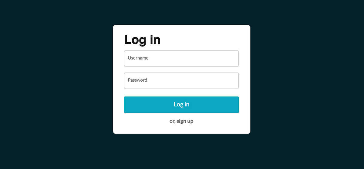
Login

login modal
See the Code - See it Full Page - See Details inspired by Pinterest This Pen uses: HTML, SCSS, Babel, and Babel

Interactive Spooky Login Form
See the Code - See it Full Page - See Details The floating ghost will follow your typing with its eyes, smile when you type a valid email, and cover its eyes when you are writing the password. So there's no peeks, only boos ( This Pen uses: HTML, CSS, Babel, and Babel
A guide to designing successful Login experiences
Design for a login page can seem deceptively simple. I spent a considerable part of 2020 designing login and account flows for a social media giant and learnt this: Ensuring successful and stress-free login for the user requires a lot of thought and experimentation! Here are my top learnings, summarized.What is login?A login experience is an entryway into an app, website or service. It helps users establish their identity.A login flow usually consists of a main login page and a fairly complex recovery flow, which includes ‘forgot password’, resetting password, and alternative methods to login.The primary goal of the login experience is to ensure that the user successfully logs in to their account.What is login intent?Let’s take a moment to define the term ‘login intent’ which is key while making design decisions along the way.Login intent is the user’s willingness to go through with the login flow. In think-aloud terms, it can sound like ‘I want to login’ , ‘I want to check my emails’ , ‘Take me there’ , etc. When a user lands on a login page, they may also express lack of intent. This may sound like: ‘ Hmm, don’t care, I’ll do this later’ or ‘ this is too much work’ or ‘oh no, what do I do now’? Forgetting passwords, hitting a snag along the way, or switching to another tab/ device could all be indicators of lack of intent.We got the intentConserving or increasing the login intent along the login flow is a good goal to have, and the following guidelines are all tailored to this goal.1. Design familiar experiencesThis one is not going to be a designer’s favourite guideline, but it’s important to align with the best in class experiences in the eco-system. Use simple, well- recognized layouts. Use well-known terms and copy. This helps users perform a familiar action with confidence and ease.Keeping design simple also helps the experience scale easily to different form factors and devices .Pinterest has a traditional, center aligned overlay login form. It displays a prominent login primary button in an attention-grabbing red, and Google and Facebook as additional social login options.Scroll to the end — to see my roundup of popular and successful login experiences from around the web.Which brings us to the next point — where’s the room for creativity? Login is a great touchpoint to emphasize your brand. Visually, this might translate to using the brand colors, photography, illustrations, or even a marketing message. As most design problems, this one’s all about the art of balance. The login action should always take center-stage. Additional elements on the page should be extremely measured, and should not take away any attention from the task at hand.👍🏽 A good rule of thumb: The lesser time users spend on the login page, the better. Help them move on to discover the actual goodness and value in the product as quickly as possible!2. Design for focusQuick recap of the thumb rule: The lesser time users spend on the login page, the better. In line with that, the login (or recovery) action should take up all of the user’s attention.It’s best to keep the login form in the centre of the page. If you plan to place in on one side, it’s best to give it primary visual treatment.For copy writing, instructing users what exactly they need to do at a particular step is a great idea! Instead of lengthy explanations, a simple ‘Enter your password’ will get the job done. Humour, complicated jargon, technical terms and flowery language have no place in a login experience.In a recovery experience, it is helpful to break down a complex set of actions into multiple steps. Asking users to do one important thing at a time! Eg: Enter your phone and Enter the code sent to your phone are two separate steps.Facebook retains user context and breaks down the recovery flow into several logical steps.Amazon breaks down it’s recovery flow into several logical steps. It chunks secondary recovery options into the ‘I need more help’ expandable section which helps keep the primary action in focus.Tips to keep the main task in focus:The login form can live in a modal, an overlay, or a page of it’s ownUsing card layoutDivide actions into primary and secondary actionsUse a large and prominent login buttonKeep the number of secondary actions to a minimum — avoid cluttering the page with anything that’s not your core login experience.3. Give clear feedback & provide a helping hand in case users failAt each stage in the login process, users might fail. A wrongly entered email address, mistyped or forgotten passwords, network problems — all of these might cause login intent to plummet. For this reason, it is very important for the login UI to respond to the user in the most appropriate way. Clear, timely, well crafted error messages help here.Error messages contain helpful hints/nudges on what you can do when you failFacebook adds a ‘Sign in with Google’ when you fail at the password step, but you have a gmail ID associatedSome tips to guide users through recovery:Nudging users to try out suitable alternativesAfter they fail, organising alternative login methods while navigating users to a separate pageSurfacing the most useful login methods in context, and being super-responsive to the users in times of crises!4. Retain context whenever possibleIt is important to let the user know that the platform recognizes them — if it does — and provide a welcoming return-user experience. This helps increase login intent of the users.Ways to retain context:Features like ‘remember me’Pre-filling fields from the previous step, eg: pre-filling email ID from the login step while jumping into a recovery flowIn case a two-step login is being used, it is a great idea to surface login methods personalized for the user — is the user more comfortable with phone OTP login? Or email+password? Remembering what user chose the last time can increase user’s login intent, and make the login experience feel natural and seamless to them.In enterprise SSO logins, users may be logged into platforms with multiple accounts. In case multiple accounts are detected, it is best to surface these options to the users and let them choose which account they want to use.5. Multiple login methods provide flexibilityThere is no one-size fits all approach for which login methods your platform should provide. It is best to provide one or two additional methods (beside username+password) so that users have options, in case they forget their password. These could be phone-number based logins, biometric, or the most common, social logins like Google, Twitter, LinkedIn or Facebook. If you are considering social logins, add the most popular and secure options for your platform.A word of caution — adding more methods clutters up the page, and thus might decrease login intent ! Limit additional options to 2 or 3 methods.Optimize for the most used options, and clearly segregate primary and secondary options. These options often prove to be great alternatives to needing to reset password (in case the user forgot password), which is seen as a tedious step. Intelligently surface options and personalise whenever possible. Eg: If the user has come via email, it might help to provide a login with one-time link option.Adding the example of the Medium login form here (regretfully) — while clear and well designed, it does have too many login methods. Will have to check back with the Medium designers if this one works well for them!Password-less methods are fast gaining popularity. Phone-number based authentication are the norm, especially for apps in mobile-only geographies. Fingerprint and FaceID are coming up in many places, making for seamless and secure authentication flows. Find what’s best for your platform (and feasible to build) and use that as a primary options!6. Know that login is a trust-sensitive momentLogin involves users entering sensitive personal data like email, passwords and phone numbers — it is a trust sensitive moment that defines their relationship with your platform!Login forms should represent your brand and any visual changes must be staged out slowly — since a completely changed visual may lead to lack of trust.While reducing friction for regular users is important, it may become important to surface additional authentication if we suspect that the user may be a hacker. This might be a good opportunity to remind users about the measures that can take to amp up the security of their account — eg: strong passwords, 2 factor authentication, etc.7. Find out clues and determine your user typeI’ve said this before, but putting in a fair bit of detective work into knowing the user helps increase login intent!Login is one of those experiences where your user persona can literally be all-encompassing — Everybody on your platform and under the sun might have an account on your service! If it is possible, narrow down your persona.In cases where this is not possible, like mine,(I design for a social media platform) you can try these options:Login funnel — work with PMs to find out the crucial stages where users interact and drop off during the login flow.Login entry points — are users landing on your login page via an email? Via a search engine result? While they are inside a guest experience flow? In an App? You can work with cues from these entry points and surface the most relevant set of options for your users.Known devices — phones, browsers, and known devices can help surface welcoming, personalized experiences for usersUser cohorts — other way of segregating users like web/mobile, age-groups and geographies might help too.Since the user is not logged in, using these clues can increase intent. Taking small steps towards recognising and making things easier for your users can take you a long way towards increasing login success! This in turn leads to more active users for your platform, and everyone wins! :)Best practices with examples:A round-up of my favourite login moments from around the web. These include some frequently visited platforms on my radar. Feel free to recommend more!Views expressed in the captions are all my own*Google trumps the identifier-first format — which is a multi-stage login with email and password in different steps. This format has some security advantages for Google, and can also enable them to provide personalized options for users in the next steps. It is also minimal, all-white and very focused.A simple, uber-focused experience that allows the user to enter their phone number and proceed to the next steps.Facebook has several options that they experiment and AB test with- this one is an example of a right-aligned login form that does a great job of being focused. The space on the left has been used to create a positive brand moment — overall a win!Pinterest does a simple center-aligned overlay form with fat input fields — always inviting for the users! It displays a prominent login primary button in an attention-grabbing red, and some additional social login options as well.Though it does many things right, Airbnb’s login form just feels like a lot of work — it could perhaps be due to the primary phone-based login, or the large number of secondary login options that might lead to a fair amount of cognitive load!LinkedIn does a great job of keeping the login form simple, focused and centered, with a large primary sign-in button.I am on the fence about the Dropbox login page — the illustration is great, but it has similar colors as the UI buttons on the page — an example of how additional elements can lead to scattered attention. Personally, I love daring use of illustrations in UI — but evaluating the context in which illustrations are used helps.Somewhat old in it’s visual design , Amazon’s login form is a great example of managing user’s attention — The large yellow continue button and the lack of distractions on the page make the task seem simple and fast.Probably not a good idea to place an ad on your login page — but Yahoo has a nifty identifier-first login form with some clever functions built in which help reduce typing. (refer to the next image)I wanted to include Figma in the round-up of good login practices — the form is centered in an overlay, the Google sign-on is prominently displayed (perhaps a preferred and promoted form of login for Figma?), and it is wickedly simple, almost wireframe-like. And it gets the job done!More design-guides from my learnings, in case you’re interested:Guide to storytelling through vision-videosGuide to simple usability researchGuide to content-designShout-out to my product partner Apurva for learning with me, along the way! Taking small steps towards recognising and making things easier for your users can take you a long way towards increasing login success! This in turn leads to more active users for your platform, and everyone wins! :) Hope you could relate to this article and found something to apply to your own product and design work.A guide to designing successful Login experiences was originally published in Muzli - Design Inspiration on Medium, where people are continuing the conversation by highlighting and responding to this story.
Login Page

Login Page

Trendy Login screen User Interface
Login Page

Animated Login and Sign up

IQMS Login Page 💫
Login

Login UI Design

Login
Supportium Login Page

Login screen
Login
Login Page

Login - Dropbox

Login

Login UI Design
Xenity Health Login Dashboard

Login page

Login Page — Seen Wireframe UI Kit

Login Page

Cloud Login Page - OpenBox •
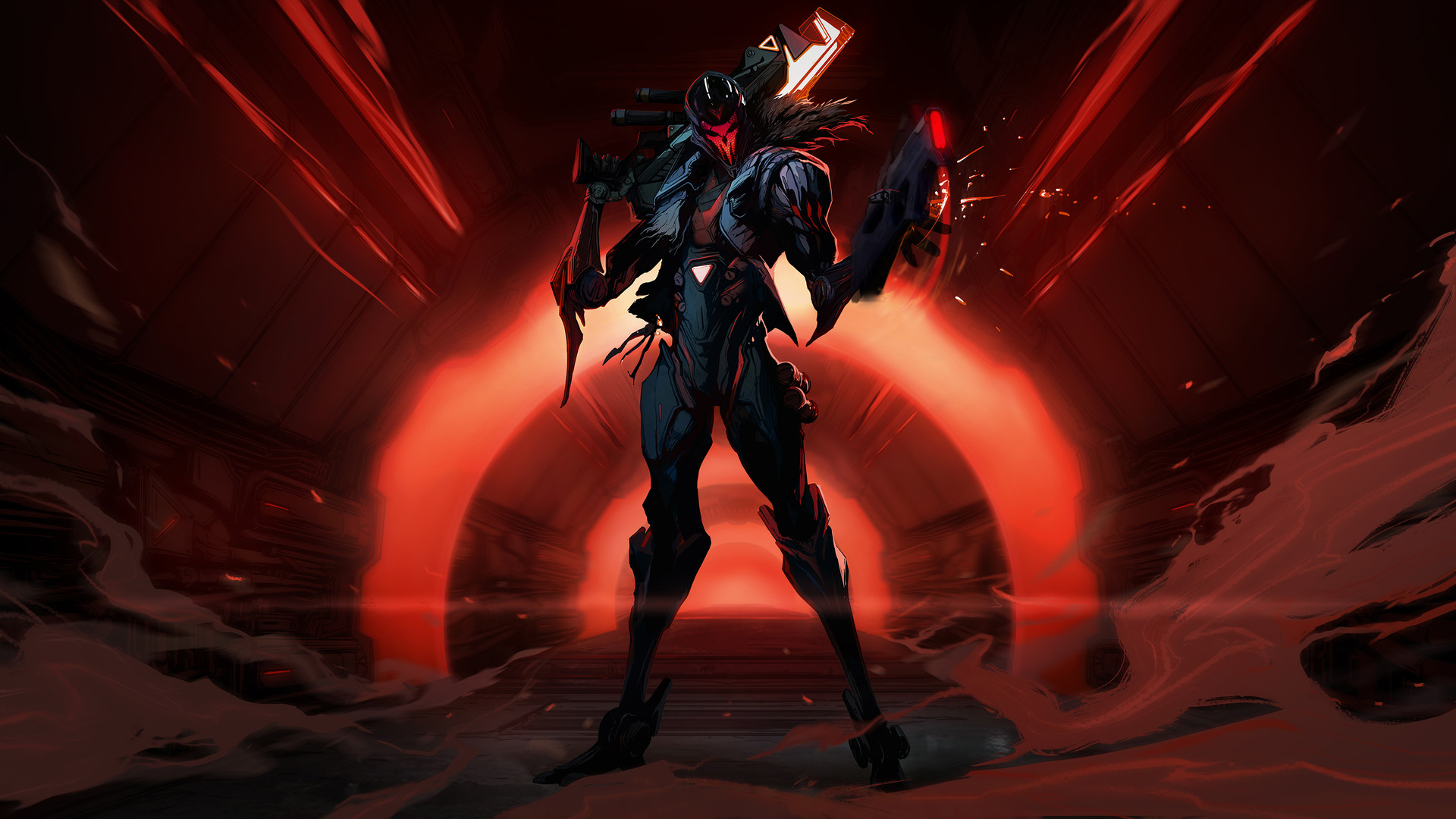
PROJECT: Hunters Login Illustrations for League of Legends 2017 by Mo Yan
Login Page

Login Screen Interaction
Simple Login Page

Login Form ( Only CSS )
Login UI Design
Login Page
RenderWonders Sign Up Login Page

Snowdown 2019 - Fan-made Login Screen by Roanna Peroz
I've had a wonderful experience collaborating on this fanmade login screen with CJ Xander, 2D animator and Alexandros Raptakis (nunbul), music composer. This is a slightly edited version as I've made a few tweaks and done some post processing work on the illustration after it was animated. Links to their profiles: https://www.artstation.com/cjxander https://www.artstation.com/nunbul

Login or Create Account

Dashboard - login

Login modal

EasyTax- Login

Login - Signup
Login Modal
Registration login forgot process

Login Screen - Alternative ID
Sign up and login modals

Login Box 🔑

Brutalist Inspired Login Form with HTML5 Pattern Validation

Simple Login Page

Immortalized Ahri - Login Screen

o/ege: Login and registration

Account Signup & Login Flow
Super App Design Login Onboarding

Login with Patterns 🪴

Login Page ⛰️

Pluralsight Login Clone
See the Code - See it Full Page - See Details This Pen uses: HTML, CSS, JavaScript, and

Login - HR Management Mobile App UI Kit
Login with Rays

Login Screen - Exploration
Login Screen - Exploration
Get access to thousands of freshly updated design inspiration pieces by adding Muzli to your browser.
Loved by 750K designers worldwide, Muzli is the leading go-to browser extension for creative professionals.